6 incredible one-bedroom apartments - huge inspiration for any small space
Not quite a studio, but not lots of space to play with, one bedroom apartment can be tricky, but these homes show how it's done...

When designing the layout of a one-bedroom apartment, there is not copious amounts of space to play with, but you aren't dealing with a totally open studio apartment either. I moved from a studio into a one-bedroom apartment not so long ago and I couldn't wait for the novelty of walls, separate spaces, and some privacy. But actually, I did find I missed the openness of a studio, all the light and easy flow between spaces.
But when decorating an apartment, you have to actually make that flow happen yourself. You almost want to create that wallless feel of a studio apartment rather than the space feeling boxed in and full of walls.
So we asked designers to talk us through their most successful one bedroom apartments, what approach they took to make the most of these smaller homes, and how the layout (both of the rooms and the furniture) worked to really open up the space. So whether you are starting from scratch or just looking for ways to make your current space feel more cohesive, here are six beautiful and brilliant one-bedroom apartments to get you inspired.
1. A semi-open plan apartment in East Village, New York

It's the colors and textures of this apartment, designed by GRT Architects, that almost dictate the layout. Each space feels connected, whether that be through a material or the beautiful wooden flooring that runs throughout the whole apartment, and yet they all have their own character too. This is a key lesson in small apartments, you want the space to feel cohesive to an extent but also each room should feel in some way distinct.
'The owners were looking for a home composed of a series of comfortable rooms rather than a single open space. Therefore, one of the main goals to support this mood was making a number of changes to the space while improving adjacencies, shared natural light, sight lines, and spatial efficiency,' explains the studio's co-founder Tal Schori. 'For example, the entry corridor was slightly straightened, so that it still retains its idiosyncratic character but allows for east-facing views from the moment you walk inside.
'Additionally, the kitchen was previously in a location with the least desirable windows and did not communicate with other spaces, per nineteenth-century custom. We reversed this but took care to recreate three discrete rooms – kitchen, living, dining – each with their own mood.'

'We were fortunate that our renovation completely rethought the apartment’s layout. We created a new collection of rooms, organized by a corridor, that suited to our client’s needs.' adds Tal.
'Starting at the apartment entryway we aimed to open a sightline to the east-facing window in the kitchen. In doing this we created a bit of demarcation via a low counter sitting on brass legs. This counter, the island, and suspended storage imply a room without walls. We mixed simple materials in varied textures and colors to create a playful and functional kitchen. A satin white counter helps blur the line between cooking and living spaces, playing nice with adjacent walls. While the sight lines are open from kitchen to dining to living, a sense of rooms is clearly suggested with color, framing, lighting, and floor finishes.'
'A linear brass pendant and decorative parquet further imply the dining room, while a gently curved plaster cove brings the spaces together. The living room is demised by a herringbone threshold in a framed opening and reinforced with a new material palette. We organized this space around a full wall of built-in shelves which includes a sliding panel that conceals a television. A series of complementary colors emphasize the relief of this composition while oak pulls tie it back to the kitchen. The largest such pull is mounted to a sheet of textured glass which allows east light to reach a small office without compromising privacy,' adds Tal.
'For the principal suite, we revised the corridor to create a sense of privacy between the sleeping area and bathroom to make as gracious a sequence as possible between spaces.'
2. A luxurious apartment in Sydney
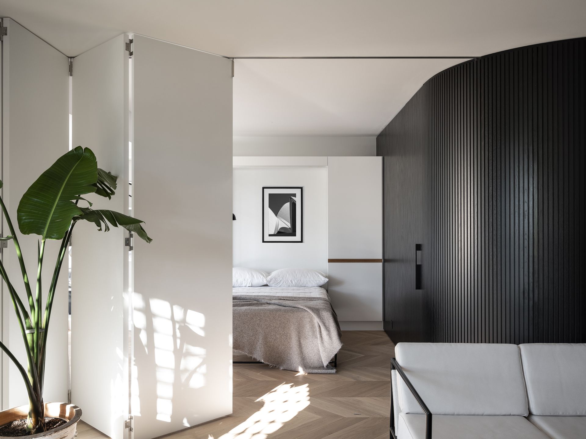
This space designed by Brad Swartz Architects was all about opening up the space and making the small apartment feel bigger – removing walls and whole rooms to create a super flexible one-bedroom apartment that effortlessly flowed and was filled with natural light. A total transformation from the narrow, chopped-up two-bedroom apartment.
'The brief was to convert a two-bedroom harbor-view apartment into a luxurious one-bedroom home, with an optional guest room, and more natural light through the typically long, narrow apartment,' explains director Brad Swartz.
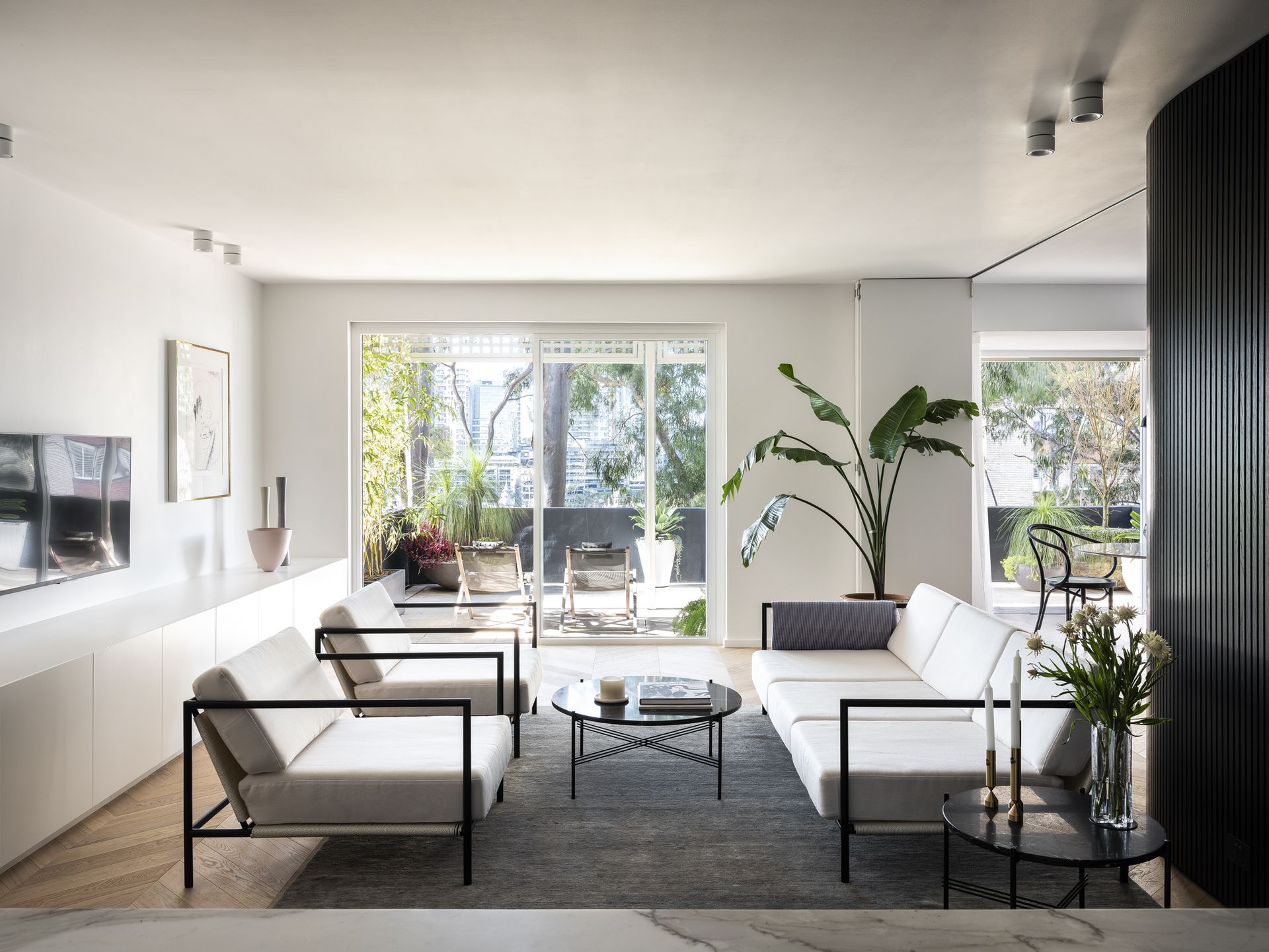
'The second bedroom was converted to a dining room and its walls dismantled. A curved timber wall was then introduced that breaks the apartment’s linear geometry, while connecting the living spaces and concealing private spaces, being the main bedroom, ensuite, and second bathroom.' he explains.
'A new curved timber wall was introduced to connect the living spaces and conceal access to private spaces — the main bedroom, ensuite, and second bathroom. Crafted in black-stained timber segments, this architectural element dramatically punctuates the space between public and private, while ‘bending’ the apartment’s strict geometry.'

Brad adds that 'I think the key when designing a one bedroom apartment is trying not to do too much and focusing on the feeling of space over trying to fill the apartment with storage - that can come later.'
'I’m also a bit of a sucker for smaller apartments having one strong element that binds them. For us that usually means concealing private spaces, bathrooms, bedrooms, robes into the smallest possible area and hiding them. In this apartment, we used a black timber wall, but in other projects, we’ve hidden the amenities of the apartments behind timber joinery. The outcome, or aim of doing this, is to then maximize on the living space, both in terms of square meterage and more importantly to create a sense of calm in the home.' he adds.
3. A colorful apartment in Warsaw
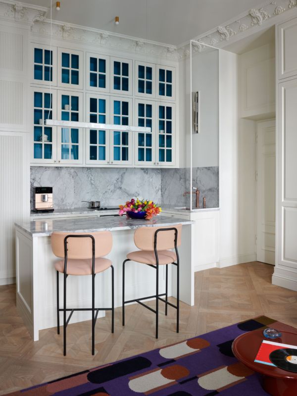
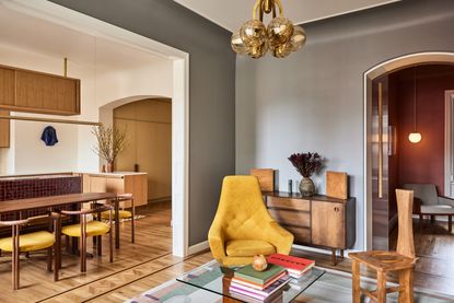
Made up of just three rooms this modern, colorful one-bedroom apartment designed by Colombe, is in an old tenement house and manages to squeeze in a living room, kitchen, and home office into its main room. The towering ceilings help the space feel larger, but the carefully selected small amount of furniture and the clever positioning means the apartment is minimalist but playful, with each piece of furniture and decor making a statement.
The key pieces of furniture set the layout in the open-plan apartment living room, creating that room within a room effect. The positioning of the graphic rug separates the living space from the kitchen but the angel of the sofa ensures the room still feels open.
'This interior was designed in a historic tenement house in the center of Warsaw. For the owners, it is a second home, so there was no need to fit all functions in one space,' explains the studio's founder Marta Chrapka. 'In terms of aesthetics, we wanted to preserve the original character of the tenement house with the reconstruction of historic stucco and references to the original floor cassettes, but with a break in the style with more contemporary motifs and strong colors.'
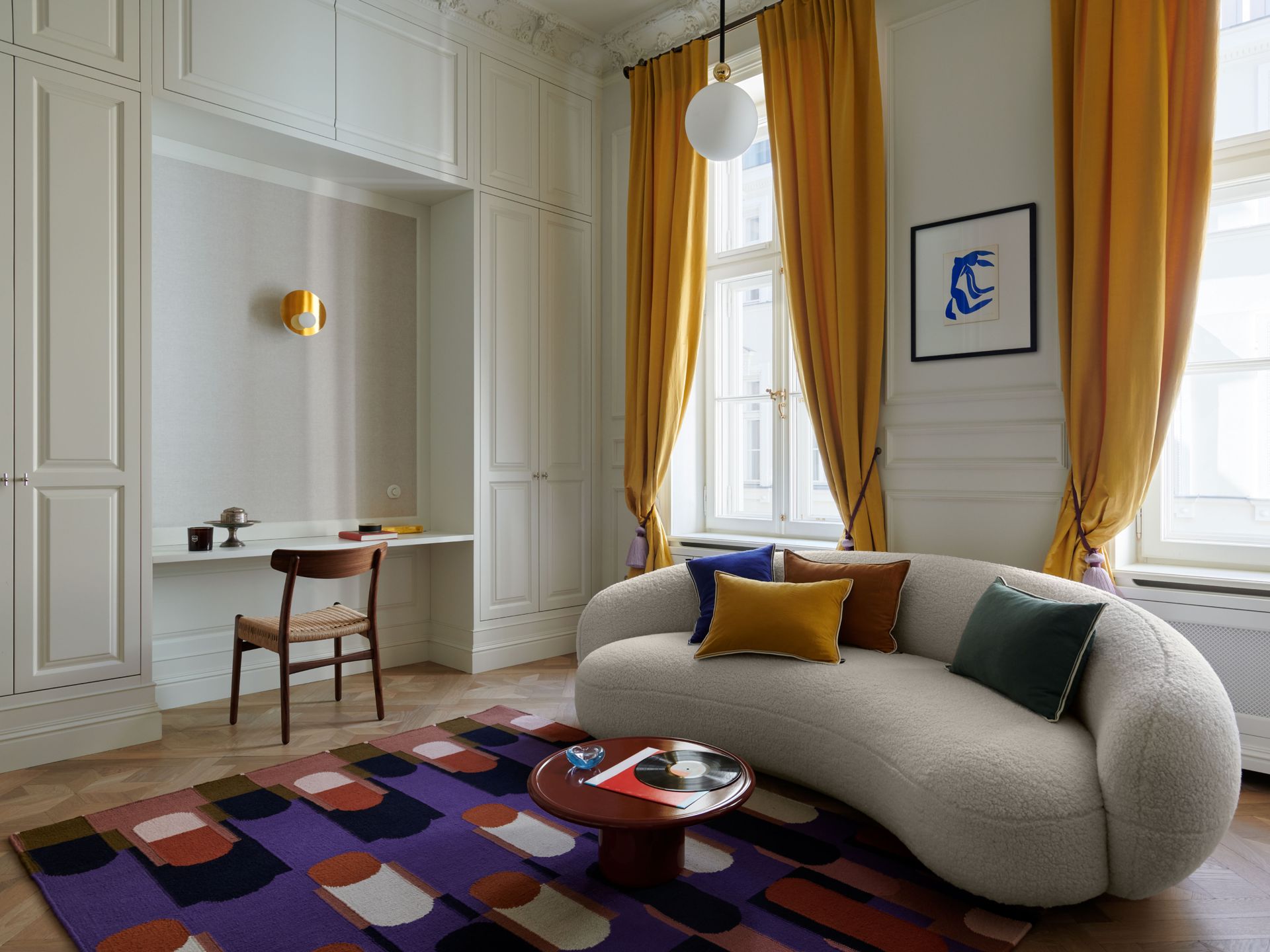
Marta explains that the way she made all the rooms feel connected was a cross-over of color and materials. 'I think it is important to limit the dominant materials here. I would suggest using the same floor in all rooms and the same color of the walls. Also, the motifs, such as the previously mentioned stucco, should not differ significantly in the rooms.'
'The most important thing for me when designing a one bedroom apartment is a well-thought-out combination of room functions, taking into account how many people use the space. For example, if someone studies at night and the other is already in bed at that time, we will not combine the bedroom with a desk or a place to work. So in this apartment, we added the wardrobes and the desk space into the living area.'
'A big challenge in such space is small apartment organization and where to store everything, so there are a lot of wardrobes in this home, all of them are up to the ceiling (although the space is almost 13 feet high). A solution that I really like when space is tight is wardrobes with a niche for a bed - they set the room in the best way.'

4. An innovative micro living apartment in London

This is one bedroom apartment with a twist. Originally, the space wasn't as open plan, more a standard one-bedroom flat with separate rooms, but then Proctor & Shaw got their hands on it and turned it into a beautiful experiment in micro-living, with an open plan layout and a Shoji-inspired sleeping pod.
'A study in materiality, transparency, and enclosure, the project is conceived as a prototype for micro living in existing housing stock characterized by a constrained footprint but traditionally generous ceiling heights,' explains the studio's co-founder John Proctor. 'Poky and uncomfortable cellular rooms are replaced by a generous multi-functional living space arranged around a translucent one-bedroom sleeping ‘pod’ inspired by Japanese Shoji screens. By cleverly stacking accommodation in a single height volume, additional floor area is conjured to provide a real sense of luxury and design quality in just 95 square feet.'
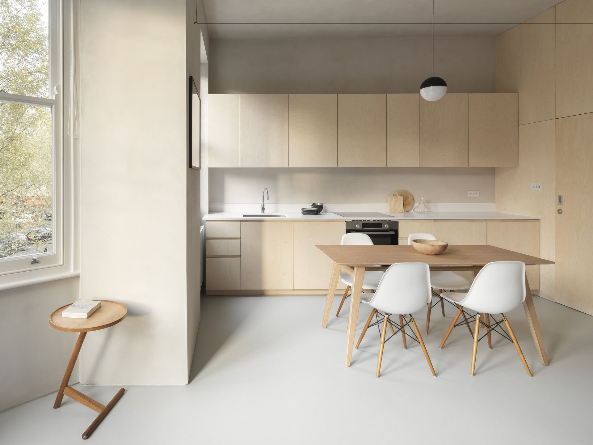
'The client approached us with a desire to transform a cramped first floor one bedroom flat into an open-plan arrangement filled with light and warmth. Often overlooked in single-room accommodation, maximizing useful apartment storage was also a key part of the client brief,' explains John.
'Studio apartments dictate that space must be multi-functional. We explored how these different functional requirements might be reflected in a flexible architecture. Requirements for privacy, enclosure, and sociability were thoughtfully considered whilst analyzing potential layouts. We were taken with the underexploited 3.4-meter ceiling heights in the property and developed a strategy for stacking accommodation vertically in order to maximize the generosity of the plan. A king-size bed is raised on a plinth, accessed via a space-saving plywood staircase, and arranged above a newly created walk-in wardrobe.'
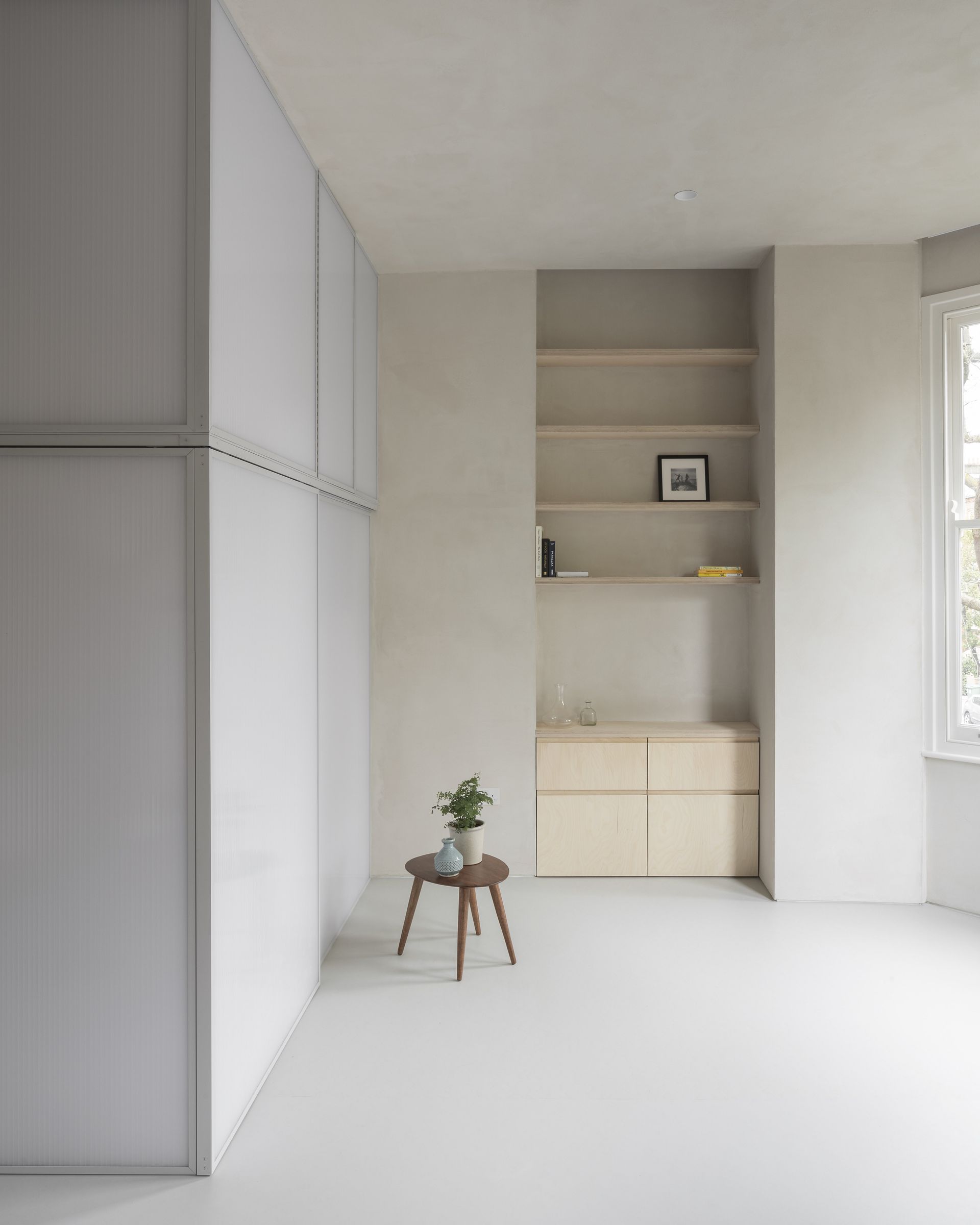
John believes that 'The key to unlocking the potential of small apartment living is light, volume and restrained materiality. Meticulous planning of the apartment is required, in particular the unloved ’serving spaces’ such as storage, utility, and services. Get these right and the maximum amount of space is released for the principal functions, cooking, living, and sleeping.'
'We are particularly adept at designing clever multi-functional furniture pieces that have multiple functions that appear to conjure more space. All of this planning should be articulated around the enjoyment of natural light in the space. Finally, a restrained material palette ensures a cohesive, serene atmosphere in the apartment across what is typically a multi-functional open-plan space.' he explains.
5. A light filled flat in London

Yard Architects totally transformed the layout of this loft style apartment, turning it into an open-plan home with a sizeable bedroom and a mezzanine library. It's the perfect setup for socializing with the large open-plan apartment kitchen and the clever use of glass doors rather than walls used throughout the home keeps the space feeling really open and light-filled.
'The existing apartment had lots of character and architectural features, including three huge arched windows with steel frames overlooking Tate Modern, exposed brick, timber beams, and concrete columns. Our design reinforces the architectural qualities of the space and uses robust materials that are in keeping with the industrial aesthetic of the building. We wanted to create a project which felt like it fitted with the building and would last for many years, without looking out of date,' explains director Simon Graham.
'The apartment layout was the main reason for the refurbishment. There were two open-plan mezzanine bed spaces overlooking the main space, which had no walls or privacy and had very low ceiling heights. This worked for the owners when they had younger children, but now they were adults they needed a proper enclosed bedroom space, more storage and a bigger kitchen for entertaining.'

'Our solution was a complex puzzle of interlocking storage units, varying in height which maximizes the ceiling height where it is needed, but also increases the amount of usable floor space. Wardrobes were reduced in height in order to gain standing space in the room above,' explains Simon.
'The new structure for the mezzanine is completely free-standing with the perimeter walls of the apartment, made from large sections of timber. These mirror the existing ceiling beams, so the new elements feels like a part of the existing building, blending in to create a sense of unity. We included a hidden bedroom for the owner's dog, a double-height shower, and lots of hidden storage. The yellow staircase up to the mezzanine adds a pop of color to the otherwise monochrome palette, and the steps double up as drawers for shoes.'

Simon's tips for creating an open and cohesive one bedroom apartment layout is to ditch the walls and doors and consider sliding or pocket doors instead. 'If you want to be able to keep spaces closed off from each other with doors, consider using frameless pocket doors which disappear completely when they are open, which allows rooms to flow more seamlessly into each other. And think about views and vistas from one room to another which lead the eye onwards, such as a view out of a window or having something placed symmetrically in a doorway view.'
He adds, 'Use continuous floor finishes from one space to the next and the same finishes for ironmongery, small architectural details, and bathroom brassware to create a sense of harmony and cohesion throughout a small space. Consider using glazed partitions, double doors, or curtains to divide spaces but allow them to be quickly opened up to create that larger sense of space.'
6. An industrial vibe apartment in Chelsea, New York

Not quite a studio, not quite a one bedroom apartment, Arsight created this open-plan, versatile home replacing walls with glass panels and curtains. The result is the best of both worlds, the openness of a studio apartment with the privacy of a separate bedroom.
'This residence marries Scandinavian, mid-century, and industrial vibes, presenting a delightful blend of design languages. The Scandinavian influence shines through in its simplistic yet cozy approach marked by light wood shades and toned-down colors. Mid-century aspects surface in the retro furniture and certain architectural touches, echoing renowned designs of the 1900s. The industrial aura emerges through the home's untouched elements, be it the bare brickwork or rugged concrete,' explains Artem Kropovinsky, founder and principal designer.

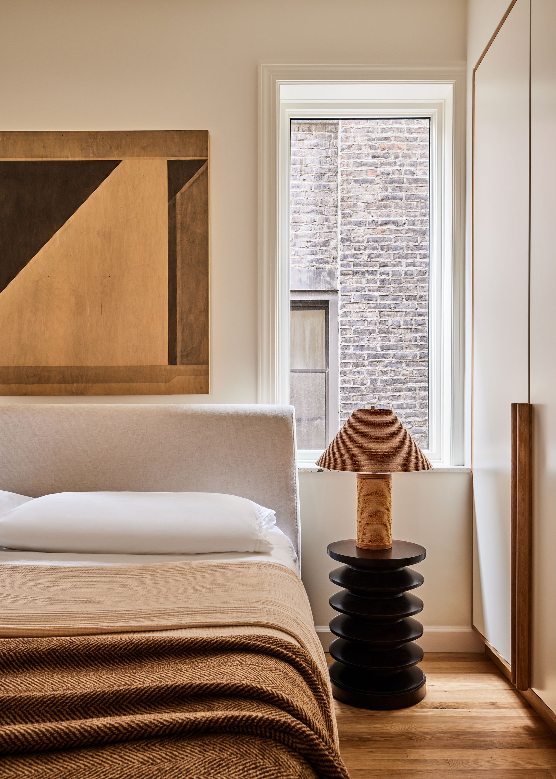
'The apartment bedroom showcases the design's versatility. The occupants desired extensive storage but not the usual walk-in setup. As a solution, one wall became an expansive wooden closet, addressing storage needs while maintaining the wood consistency. A standout feature is the acoustic glass barrier between the bedroom and the neighboring open area, delicately balancing seclusion with openness. Furthermore, the heavy velvet curtains let the occupants adjust the mood as necessary.' adds Artem.
'A striking aspect of the dwelling is the tailored shelving that spans from the floor to the ceiling, serving both practical and decorative needs. The untouched floor, with its authentic allure, fits right in with the home's theme. The recurrent theme of organic materials - be it stone, brick, or wood - is hard to miss. The ribbed glass adds to the allure and sets the ambiance.'

Artem explains that 'Planning an open and interconnected home layout often hinges on certain design tenets. Spaces should interweave effortlessly. Here, acoustic glass barriers ensure visibility while preserving certain private pockets. And there should be a unified color narrative, much like the muted and earthy shades bolstered by brick and wood here, makes the space resonate.'
'Using materials like wood and stone provides depth and makes spaces feel larger and more inviting. And a minimalist touch, especially in a Nordic-inspired setting, offers expansiveness. Versatile furniture and innovative storage, such as the repurposed wall, assist in this mission. Play with dimension too, placing large art pieces or sizable furniture in grand spaces provides a well-curated, balanced atmosphere.'
Be The First To Know
The Livingetc newsletter is your shortcut to the now and the next in home design. Subscribe today to receive a stunning free 200-page book of the best homes from around the world.
Hebe is the Digital Editor of Livingetc; she has a background in lifestyle and interior journalism and a passion for renovating small spaces. You'll usually find her attempting DIY, whether it's spray painting her whole kitchen, don't try that at home, or ever changing the wallpaper in her hallway. Livingetc has been such a huge inspiration and has influenced Hebe's style since she moved into her first rental and finally had a small amount of control over the decor and now loves being able to help others make decisions when decorating their own homes. Last year she moved from renting to owning her first teeny tiny Edwardian flat in London with her whippet Willow (who yes she chose to match her interiors...) and is already on the lookout for her next project.
-
 The 12 Best Table Lamps for Reading —I'm a Certified Bookworm (and Shopping Expert)
When it comes to table lamps for reading, I don't mess around. If you're the same, this edit is for YOU (and your books, or course — and good recommendations?)
By Brigid Kennedy Published
-
 "It's Scandi Meets Californian-Cool" — The New Anthro Collab With Katie Hodges Hits Just the Right Style Note
The LA-based interior designer merges coastal cool with Scandinavian simplicity for a delightfully lived-in collection of elevated home furnishings
By Julia Demer Published
