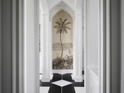
Narrow hallway ideas to help you make a grand entrance out of an awkward space
Narrow hallway ideas from the experts are essential to help you make the most of a long, tricky corridor


Narrow hallway ideas are an essential part of modern life. They mean you can take an urban apartment, with its windowless corridor beyond the front door, and turn it into something truly special.
There are, you see, some tricks of the trade that can help combat any feeling of being enclosed, some hallway ideas tailored specifically to tight spaces. Below are some designer-approved solutions to make the hallway a showstopper in its own right.
Embrace the tight space with the smartest narrow hallway ideas

Design by Betsy Wentz
As the saying goes, if you can’t beat them, join them. Rather than trying to make a long, narrow hallway something it’s not, play up its coziness with warm, deep colors and wall coverings. “Lean into the small space and have fun with pattern play,” suggests interior designer Marika Meyer. “Be strategic and try to create intimacy. Wallpaper may not make a hall feel larger, but it defines the space and creates an experience. This is especially important if the hall has no natural light.”
Designer Kevin Isbell concurs, saying that “wrapping a narrow hall in a pattern or saturated color turns a negative into a cool design feature.”
Not only does a graphic print create excitement where there isn’t any, says Betsy Wentz, these wallpaper ideas help the walls in a narrow space disappear. “The worst thing is the feeling of being smacked with walls on either side of you,” says Wentz. “Wallpaper distracts the eye and affects one’s spatial perception. I love to go for drama and high contrast, such as a black-and-white print or a graffiti-inspired paper.”
Turn your narrow hallway into a destination in its own right

Design by Marika Meyer
Sure, a hallway’s most basic function may be a thoroughfare, but it has the potential to be much more than that with a little imagination and some well placed narrow hallway ideas. “The goal is to make a hallway more than just a passthrough,” says Melissa Warner Rothblum of the firm Massucco Warner. “You want to incorporation things to hold people’s attention. Working in some furnishings, such a chest of drawers with artwork and a lamp, makes a small space feel purposeful.” A small “drop spot” for keys goes a long way, too, according to Wentz. “You can even use shelving to offset that feeling of claustrophobia.”
For a recent project, Meyer borrowed space from a row of closets to create a niche for a coffee bar - for which you of course need one of the best pour over coffee makers. “Pushing the wall back provides a sense of relief from an otherwise narrow, tall space,” explains Meyer. “The hall needed something fun to carry one through, and it also makes it functional.”
Look up, and employ a ceiling treatment

Design by Kati Curtis
Ceilings are often overlooked, but a petite space presents an opportunity to have fun and take risks—all while drawing the eye up and away from the long, skinny space. “Even if the ceiling is low, I would lacquer it and install a flush-mount light fixture that doesn’t take up much space,” says Wentz, who recently selected a high-gloss turquoise shade for a hall that reflects the light and attracts the eye. “It feels like a pretty little gem.”
Interior designer Melanie Roy is also a fan of that trick, often choosing either a white gloss finish or a metallic wallpaper on the ceiling “to give the appearance of a taller space,” she says. Sometimes Andrea Schumacher will carry the ceiling’s wallpaper down the sides of the wall about a third of the way and combine it with moldings and wainscotting to break up the wall. “It’s a way to fool the eye,” says Schumacher. If painting the ceiling an accent color, Meyer suggests trying a pale blue or green to make the ceiling feel taller.
Create an optical illusion

Design by Kevin Isbell
Sometimes when a hallway is very long it takes away from the space and makes it appear more even more narrow than it is. To counteract this, Isbell suggests painting the wall at the end of the hall an accent color. “This will draw the eye to the end of the hall immediately and help mitigate the length,” says the designer. “You want to keep the eye moving forward in a space like this, so it’s important to create a strong focal point at the end.” In a recent project, he also hung art along one wall to help direct one’s gaze down the length of the hall.
Don’t forget the rug
Rugs don’t just look pretty. In addition to providing a hallway with a sense of identity and polish, a rug serves a spatial purpose when used as part of narrow hallway ideas, too. “Using a large, light-colored rug can make the hall feel wider,” says Meyer. “I like a flatweave or a sisal.” On the other hand, says Wentz, “vintage runners are great, too. A runner accentuates a clear path, which prevents one from feeling trapped in a tight area.”
Experiment with small artworks
Artwork is the perfect way to lend interest and inject personality into any space, so why not the hallway? However, not all artwork is created equal when it comes to a narrow hall. “This isn’t the place for large-format works, since there wouldn’t be enough room to step back and see it,” says Warner Rothblum. “Instead, try a grouping of small pieces, such a collection of botanical prints.” Christina Nielsen finds a gallery wall to be effective in this instance, but instead of positioning it in the middle of the wall—which could actually accentuate the hall’s long length—she plays with scale and uses the entire height of the wall.
Let there be light

Design by Michelle Gerson
A space as highly used as a hall needs to be well lit, but the options are endless, from sconces to chandeliers to flush-mount fixtures. The type of fixture and its placement are critical elements of the design scheme. “Good lighting is the key to opening up a space,” says Nielsen. “Invest in recessed lighting that disappears into the ceiling and illuminates the walls. For an accent, select pendant lights that don’t extend too low.”
The designer Kati Curtis prefers wall sconces over down lighting. “Sconces are functional without creating shadows on one’s face,” says Curtis. “Plus, you can use them to highlight items on the wall, such as artwork.” In a recent project, Curtis used 20 matching sconces to break up a long hallway. “The sequence creates an interesting experience,” she notes.
What color makes a hallway look wider?
“Colors that recall the outdoors—such as blue and green—can have a positive psychological effect in small interior spaces,” says Meyer. Curtis also gravitates toward blue and green, as well as red. “It’s counterintuitive, but dark colors lend depth and make a space feel more expansive,” explains Curtis. “In fact, the darker the better.” Another bold choice is a vibrant mustard yellow. “It warm things up and it can actually act as a neutral,” says Nielsen. And when in doubt, paint it white. “A stark white, such as Benjamin Moore’s Super White, makes the ceiling feel taller and the hallway wider,” says Michelle Gerson. But whatever color you choose, Warner Rothblum suggests painting the walls, molding, and ceiling the same shade. “When the eye doesn’t sense any choppiness, it makes a space appear larger.”
How do you brighten a narrow hallway?
Electricity isn’t the only way to add some brightness to a long, dark hallway. According to Meyer, employing reflective surfaces that allow light to bounce around can make a huge difference. “I love doing a lacquer treatment or painting paneling in a semi-gloss finish,” she says. “A series of large mirrors is another good idea for the same reason.” Gerson agrees, saying that “lining a hall with a few large standing mirrors adds dimension as well as a feeling of extra width.” And what better way to add brightness than through a collection of items and artworks that are personal to the homeowner. “This could be anything from hanging plates to wall sculptures to a grouping of black-and-white family photos,” says Nielsen.
Be The First To Know
The Livingetc newsletter is your shortcut to the now and the next in home design. Subscribe today to receive a stunning free 200-page book of the best homes from around the world.
Alyssa Bird is a New York−based freelance writer and editor with experience covering architecture, interior design, travel, hospitality, and real estate. She has held editorial positions at Architectural Digest, Elle Decor, Hamptons Cottages & Gardens, and New York Cottages &Gardens. When she’s not writing about dreamy spaces, you can find her tweaking the decor in her own Brooklyn home, honing her green thumb, testing out a new recipe, or scouring for antiques.
-
 The 12 Best Table Lamps for Reading —I'm a Certified Bookworm (and Shopping Expert)
When it comes to table lamps for reading, I don't mess around. If you're the same, this edit is for YOU (and your books, or course — and good recommendations?)
By Brigid Kennedy Published
-
 "It's Scandi Meets Californian-Cool" — The New Anthro Collab With Katie Hodges Hits Just the Right Style Note
The LA-based interior designer merges coastal cool with Scandinavian simplicity for a delightfully lived-in collection of elevated home furnishings
By Julia Demer Published

