10 Ways Designers Decorate Modern Walls To Create Homes That Feel Warm and Inviting
These modern wall decor ideas will help you create spaces that feel like home, elevated spaces you can relax and unwind in but that look good, too

Walls, these (almost) flat surfaces are decorated with paint, paper, and artworks that speak to the stories of our lives and our style sensibilities. They can be molded into a plethora of possibilities but can also prove to be a challenge when designing your home. Sometimes it may just feel easier to pick up the closest shade of magnolia but to do so would be to rob your space of character, warmth, and color.
Interior designers across the globe continue to push the boundaries when it comes to living room wall décor, whether it is creating features with new materials like moss within living green walls or bridging the gap between myth and modernity with traditional woven tapestries. “Walls offer a great canvas for layering elements that reinforce an interior's overall concept. Whether it’s through abstract art, ornamental wallpaper, or customized painted walls, these choices are working with the rest of a space to define the narrative of the house. We are seeing a higher demand for eclectic, unique interiors that are visually stunning and have a strong sense of identity, and in order to achieve that for our clients, we designers have to push boundaries and make bold choices,” reveals Sydney-based interior designer, Greg Natale.
Each example blends innovation with a deep-rooted understanding for the architectural landscape of the room, allowing the wall to be the star of the show but also a part of the bigger picture. In this list, we explore some of our favorite wonder wall moments and how they can inspire you to make more of your interior.
1. ACCENTUATE ARCHITECTURAL FEATURES WITH WOODEN PANELLING

Wall paneling is not a new trend; in fact, some say it dates as far back as the ancient Greeks. This rhythmic pattern of wooden strips is an obvious choice for so many schemes as it adds warmth and a sense of movement to your walls. Seattle and New York-based interior designer, Allison Lind of Alllison Lind Interiors' thoughts on the paneling emphasizes the marriage between the room’s architectural features and its suitability for paneling.
“I laugh when I hear people say that wood paneling is “back in style.” Wood paneling has always been in style – in the right settings. This home is tucked in the trees but has a contemporary architecture that could feel a bit too sterile or cold without the right warmth layered in. For this bedroom, the asymmetrical wall felt like it needed to be accentuated vs hidden or ignored. Be careful with the “accent wall” concept, though. In most cases, a single stand-alone wall can feel too piecemeal or noncommittal. In most rooms, just take that bold color or wallpaper and cover all those walls. My exception, though, is when a wall has an interesting shape or differs from the rest of the space somehow, like a niche or in this case a dramatic ceiling pitch,” says Allison Lind, founder & principal of Allison Lind Interiors.
2. CREATE A FOCAL POINT WITH A BOOKSHELF FEATURE

Bookshelves are back but not in the way you might expect. Whilst traditional iterations are lined with rows of your favorite authors, modern bookshelves take on a more minimal approach as they present a curated selection of personal objects and artifacts.
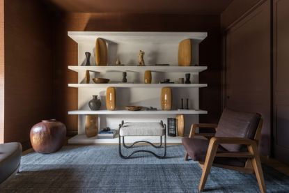
Contemporary designer, Heather Hilliard demonstrates this new school of bookshelves perfectly with her San Francisco project.
“A large-scale bookshelf to display objects and ceramics can serve as an art piece in and of itself. In this room we did dark rust-colored walls against the bookshelf for the pieces to really pop,” says interior designer Heather Hilliard. The crisp lines of the white bookshelf draw your eyes to the wall whilst adding some light and levity to the depth and drama of the surrounding elements.
3. BRING THE OUTSIDE IN WITH A GREEN LIVING WALL

There is no doubt that we have seen a reignited fascination with the outdoors in the wake of the Covid-19 pandemic. Designers have seen a growing demand for patio spaces that feel like an extension of your interior alongside more natural features being married into interior schemes.
This green living wall designed by Owl Design demonstrates how living walls can effortlessly temper more contemporary and structured spaces. “For our West London Terrace project, we wanted to bring the outside in and embrace nature within the open plan space. A living wall does this perfectly, by not only adding a vibrant pop of green, it helps with the acoustics and softens the feel of the harder architectural finishes, creating a harmonious sanctuary,” reveal Sophie van Winden and Simone Gordon from London-based Owl Design.
4. ADD DEPTH AND CHARACTER WITH A WALLPAPER CAVE

Walls work really well to frame internal elements like furniture and lighting, but this is taken to another level with this clever wallpaper cave feature. When referring to the guest bedroom of their Chimney Rock project, Brit Epperson, Founder and chief Creative Officer of Studio Plow says, “The walls are painted in Farrow & Ball's Inchyra Blue, which is a deep velvety blue-green with the inset the moody fairytale wallcovering Trematonia by House of Hackney.”
The detailed paper plays with the sense of depth with apparent ease and also creates an anchor for the bed and wall lights to sit within. Its excitement and color are given a soothing edge with the steel-like blue paint that surrounds it. This wall décor idea is perfect for those looking to introduce a strong statement wallpaper into a room but are concerned about applying it too liberally. You are able to enjoy the print and pattern in just the right amount. It also works incredibly well for those challenged by interesting architectural features, the paper turns those annoying crevices and corners into captivating moments.
5. FUSE TRADITION AND MODERNITY WITH A TAPESTRY

The schools of traditional and contemporary design can at times feel like polar opposites that are never meant to meet but in fact, when they do meet, the real fun begins. This clean and contemporary space designed by Heather Hilliard is given added depth and warmth through the addition of a traditional tapestry.
The contrast between the pared-back interior and the intricate detail of this wall feature highlights not just the individual strengths of these elements but also celebrates their complimenting natures. Sharing her take on this wall décor idea, San Francisco-based interior designer Heather Hilliard explains “Using antique or vintage tapestries can be a wonderful alternative to paintings or framed art. They add texture to a space, which can work well on both painted walls and plaster, as we used in this room. They give rooms a beautiful old-world quality.”
6. TAKE YOUR TILES FURTHER WITH A HEARTH WALL

From the floor to the wall, tiles are a staple when it comes to interior design, and it's easy to think that we’ve established every way to use a tile in a room, but you would be proven wrong. This ingenious hearth wall plays with the idea of a small fireplace in a tall and expansive space. The tiles feel almost like burnished steel climbing up the wall and give this open and airy room a dose of drama.
“For our cabin in the woods, we designed a quilt-inspired hearth wall we clad by hand with waterjet-cut porcelain tiles,” says Britt Eperson. Take inspiration from this project and utilize those extra tiles you may have in storage, creating a feature wall with them could add new life into your interior.
8. CREATE CONTRAST AND STORAGE WITH SHELVES

Shelves are definitely having a moment as we see more and more designers utilize them for decorative and storage functions. This example from French designers, Studio Castille for their Trocadero project showcases how shelves can be a mesmerizing wall feature too. The contrast of the asymmetric shelving with the inky blue walls not only frames the fireplace but also references the white of the ceiling and surrounding walls.
The result is an interior wall that feels fascinating but is also connected to the scheme as a whole. “Shelves can create storage space, add depth if painted, and create a decorative effect because you can place decorative objects on them, making the wall less monotonous,” explain Mathilde Abeel and France Lepoutre, founders of Parisian agency, Studio Castille.
9. GO MYTHICAL WITH AN ETCHED WALL MURAL

This elegant wall design makes the case for murals that are more-pared back in their color palettes but just as mesmerizing in their effects. The figures depicted evoke a laid-back luxury that speaks to the myths and legends of centuries past. Etched in black, this wall doesn’t fight the contemporary furniture and lighting that sits in front of it but instead acts as an refined backdrop for these striking pieces.
“This etched plaster mural by Holly Hunt brings subtle intrigue to the edges of this space. The antique pattern is etched onto a black background, making a classical image feel modern and bold,” says Wauwatosa based interior designer, Amy Carman. Follow Carman’s example and choose a wall mural for your space that feels both minimal and mythical.
10. BLEND YOUR ARTWORK WITH THE WALL

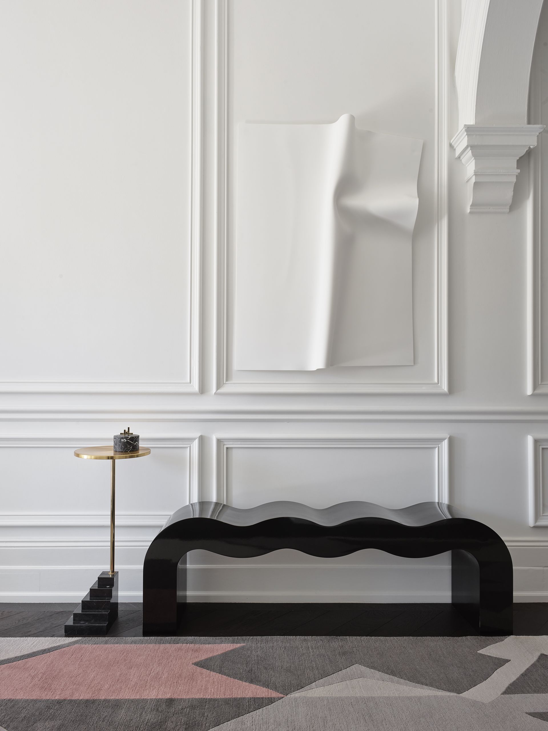
Subtle yet striking, this project by Australian designer, Greg Natale shows how optical illusions that blend the wall with unexpected artwork and lighting are growing in popularity too. The sharp lines of the traditional paneling are wonderfully complimented by the angular yet gentle form of the color-matched artwork. Natale shares his thoughts on this collaboration between the wall and its decorative elements.
“Abstract art gives an interior modernity. The white molded-plastic sculpture by Anya Pesce reveals itself against the white wall to bring a contemporary layer to this 1885 Victorian home. The result is a playful juxtaposition between old and new; a piece of modern art framed by over 100-year-old moldings,” says award-winning interior designer Greg Natale.
Be The First To Know
The Livingetc newsletter is your shortcut to the now and the next in home design. Subscribe today to receive a stunning free 200-page book of the best homes from around the world.
Writer and design expert Faaizah Shah is the founder of The Interiors Consultancy. She has worked with designers such as Staffan Tollgard and design houses such as Sanderson to help them understand and communicate their narratives. She is known for crafting engaging stories and imaginative content, and understanding great decor from her years alongside some of the best creatives in the industry. She is also a contributor to Livingetc.
-
 How to Thaw a Frozen Pipe — Learn Everything You Need to Know in 5 Minutes With This Guide
Winter storm caught you off guard? We asked an expert — just how do you thaw a frozen pipe?
By Hugh Metcalf Published
-
 The 12 Very Best Silk Bedding Pieces — As Our Style Editor Says: 'It's What Dreams Are Made Of!'
Slumber in lustrous luxury with the very best silk bedding sheets, duvets, pillowcases, and more — your sleep score will thank us later
By Julia Demer Published

