5 mistakes interior designers always notice in an entryway - and how to avoid them
These are the mistakes designers first notice when stepping into a home and their expert advice to rectify them and create a perfect first impression

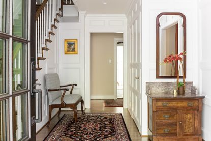
Entryways are likely to be the smallest designable space in your home. As a space often deemed less glamorous than a living room or master bedroom to design, entryways can become an afterthought and with this, comes design mistakes and they are mistakes designers notice. Getting the design right for the size and esthetic of your home isn’t necessarily easy.
After all, there is a lot riding on a well designed entryway, as Founder and Principal Designer of Arsight, Artem Kropovinsky, highlights: “An entryway isn't just a home's first impression; it's a taste, a teaser, of the narrative that unfolds within its walls.” Here designers let us in on the mistakes that catch their eye as they enter a home and tell us how you can avoid them.
1. MESSY SHOE STORAGE

There’s one mistake often made when decorating and subsequently using an entryway day-to-day which makes designers twitch and that’s messy shoe storage. Although practically-speaking, yes, you will want your shoes close to the door of your home, filling your entryway with open shelving full of muddy sneakers is going to quickly make the space look untidy, no matter how polished the rest of the space is. It’s a mistake Los Angeles-based designer Peter Dunham has seen in many homes. He says: “Any kind of storage for shoes seems like a good idea, but never looks tidy.”
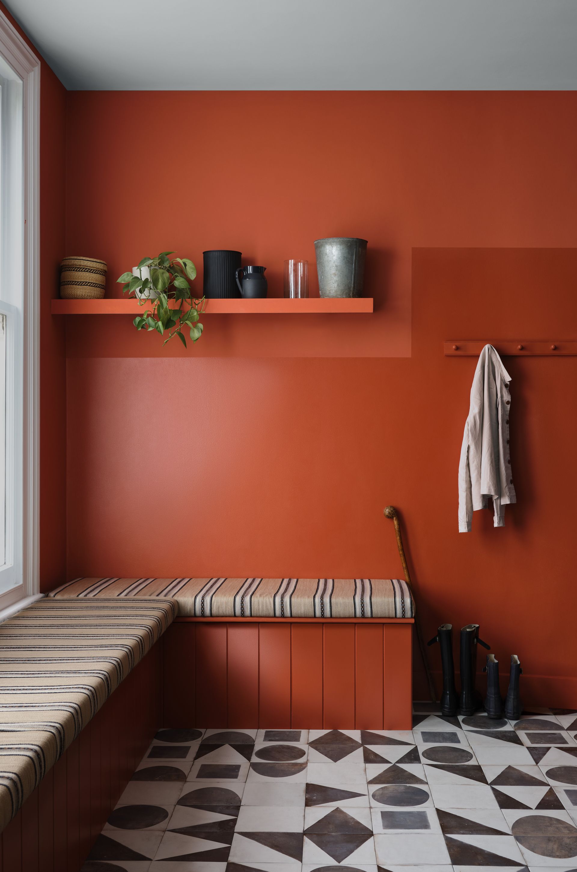
Instead, opt for a doored unit where a few of your most used pairs of shoes can be stored and keep the rest of your shoes in the base of your closet. Or better yet, hide a unit behind a piece of statement furniture like a bright velvet couch.
2. Using colors that don’t connect to the rest of the house

Although you can make a feature of your entryway, Atlanta-based designer Catherine Wilson of CCW Interiors warns against using colors that don’t connect to the rest of your house, or at least to the adjoining room. “When you don’t study your paint transitions before you paint, you could either end up with a choppy paint connection from one wall to the next, a deep color overextending its welcome in stairwells and hallways that often don’t have natural light, or light colors extending into stairwells and hallways creating a very sterile and uninviting look,” the designer explains. “Depending on the color you select for your foyer, you must plan on the fact that it needs to purposefully and smoothly connect to other rooms.”
Wilson’s advice on how to avoid this faux pas is easily followed: “The best way to avoid design mistakes like these is to design with the end in mind,” she says. “If you don’t know where you are going, you might be unable to tell if you have arrived. Specifically, you may not like the look of what you have created because you started buying for your foyer or any part of your home, for that matter, without fully knowing what you want throughout your entire home. So, you must create a comprehensive design plan before you hire your first sub-contractor or make a purchase.”
3. CARPETED FLOOR

A mistake catching Kathy Corbet of Kathy Corbet Interior’s eye is underfoot. That’s right, carpet in your entryway is a major no-no. Although carpet is known to make a space feel cozier and less clinical, in an entryway, it’s a material to steer clear of. “An entryway is a high-touch home area, so it is crucial to utilize durable elements such as tile floors that will withstand shoes, pets, and heavy traffic,” Corbet says. “I often see entry spaces that are designed for esthetics and no function.”
This is particularly true of homes with children where lots of wiping of shoes can’t be guaranteed before entering the space. Peter Dunham highlights this very issue for homes without a “mudroom”. It is wise to opt for laminate or tiled floors in this area and use a welcome mat to wipe feet and add some texture back into the floors.
4. WHITE RUNNERS

In a similar vein, Brooke Speckman of Californian brand Design Hutch says she notices white runners in entryways and not for the right reasons. Although you may have taken Corbet’s advice and moved away from carpeting your entryway, laying a white runner to add dimension back into the space isn’t necessarily the way to go. “Ideally, avoid colors like white in an entry runner, as that will show the most amount of wear and tear, and dirt immediately,” Spreckman explains.
You could look for a patterned runner that won’t show up dirt or even a tougher material like a jute rug which is easier to maintain and won’t go out of style. We also recommend the runners at Ruggable, which are all washable (ideal for coping with muddy shoes)

Price: $209
Size: 2.5' x 10'
5. UNNECESSARY CLUTTER

Like the shoe storage issue, Madison Popper thinks general clutter in other areas of an entryway can be a significant eyesore. “Everyone loves a showroom vibe but it still needs to feel like a home,” Popper says. “We are all stimulated by constant distractions every day. The last thing you want to feel is overwhelmed when you return to your space.”
He says to rectify this issue you could look for “an eye-catching console with storage can create a huge difference, and having a coat/storage closet in addition guarantees clutter free.” Or if working to a tighter budget, the designer says: “There are great versatile seating benches with storage under. It tends to be this or that, which is why utilizing the space and maximizing its perception is imperative.”
Clutter can range from the obvious - opened letters, old parcel boxes, to the more obscure forms of clutter that you may not be able to pin down but you know the space is looking chaotic. Isfira Jensen of Nufacet Interiors says the less obvious sinners could be furniture which may fit the esthetic of the space, but may be the wrong scale. “
Overcrowding with too many items makes this area feel too chaotic will less than optimal room for movement,” Jensen says. “Choosing furniture that is either too large or too small for the space will throw off the visual balance and flow of the area. It’s the first thing that gives off the vibe that the area is not well designed.”
If you are looking at your entryway and can’t put your finger on why it doesn’t look quite right, you may have made one of the mistakes these designers point out. All is not lost, simple swaps can be made to redress the visual order in the space and have it feeling serene in no time.
Be The First To Know
The Livingetc newsletter is your shortcut to the now and the next in home design. Subscribe today to receive a stunning free 200-page book of the best homes from around the world.
Katie is a freelance lifestyle writer who has recently finished an MA in Magazine Journalism at City, University of London. Before writing for Livingetc, Katie has gained bylines with The Caterer and The Telegraph and has interned at several lifestyle magazines including Grazia and Red. When not scrolling through Pinterest for interior design inspiration, Katie can be found writing about women's issues, trying out new beauty trends for her blog or seeing a West End show.
-
 These 12 Best Table Lamps for Your Desk — Perfect Glows for a Creative Home Office
The best table lamps for your desk is have a soft, targeted glow. Elevate your WFH set-up with these stylish picks endorsed by Style Editor Brigid Kennedy
By Brigid Kennedy Published
-
 The Nespresso VertuoPlus is 30% Off for President's Day, and it's Kim Kardashian's Coffee Maker of Choice
This sleek and stylish coffee maker was spotted in Kim's home bar, and you can currently save $60 if you buy yours from Amazon
By Lilith Hudson Published

