10 living rooms with limewash walls that prove that this textural wall finish is the perfect cozy-but-chic finishing touch
If you still weren't convinced about the power of limewash, these living room ideas will change your mind


We've been waxing lyrical about limewash paint for some time now – this cool, highly textural wall finish is an enduring trend that extends across styles, bringing layers to a minimalist scheme and helping to offer a subtle contemporary twist to a period property.
So when it comes to living rooms, it's natural that we'd look to limewash to help deliver a decent dose of texture. Its hand-painted look and range of colors makes it an ideal living room idea – you can go cozy with a darker shade, for example, or help bounce light around with an off-white for a brighter space.
With that in mind, we've rounded up some of our favourite living rooms with limewash walls that showcase the versatility of this wall finish – and will hopefully inspire your next decorating project.
1. Build up texture with a fluted application

The living room in this Tribeca apartment sees layers of texture built up through the use of limewash and the fluted plaster application on the alcove walls either side of the fireplace. ‘Our decision to incorporate limewash into the design was driven by a desire to introduce a sense of imperfectness and human touch, a quality difficult to capture with manufactured items,’ says Artem Kropovinsky, founder of interior design studio Arsight. ‘The hand-applied technique allowed us to create an environment that felt intimately crafted and bespoke.’
Artem chose a green-grey paint color for the limewash that complements the oak flooring and marble trim and fireplace. ‘This color not only complements the existing materials but also creates a cozy atmosphere, reminiscent of natural stone elements,’ he adds.
2. Add a playful twist with an unexpected color

The existing Saltillo floor tiles in this space helped define Los Angeles-based studio Taylor and Taylor’s scheme. ‘[The tile] had a thick glossy finish on it: we had that stripped down and wanted vibrant walls that played off the pinks in the warm floor tones,’ says co-founder Jonathan Taylor. ‘These clients were particularly creative and were game for an especially vibrant trim color that really helps the whole space pop.’
3. Use lighter limewash to brighten up a darker room

On first glance, you might not even spot the limewash texture that adds interest to the walls of this Brooklyn home – but look closer and you can see how this subtle limewash paint idea helps add lightness, layers and a subtle contemporary touch to this living room and its period features.
‘We love using limewash in our projects because it brings depth to the space by creating variation in the way light hits the subtle variations on the wall,’ says Sarah Zames, founder of New York Studio General Assembly, who designed this project. ‘Not only does limewash create a more textured feel, there are also many health benefits to using it over traditional paint.’

Color Atelier limewash paint, Amazon
Color Atelier's Lime Paint creates an authentic limewash finish, and is available is a rainbow of shades, from soft neutrals to bold and bright colors. Whatever you choose, you're guaranteed a soft, subtle texture and matt finish. You can get the primers and finishers you need, too.
4. Or embrace the darker side with a moody hue

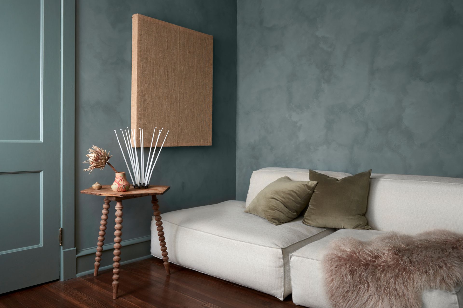
The myriad shades of limewash paint means that you can conjure up very different feelings with the same textural finish. Lighter hues will help light bounce around, greys will maximize a modern industrial aesthetic, and darker colors help to make this wall finish even more cocooning – as this cozy living room shows.
‘I was focused on creating the experience and feeling of a traditional den, but in an organic and fresh way,’ says Madeline Hause, founder of Madeline Interiors, who designed the space. ‘Painting the walls with Portola Paint’s darkside limewash brought the dark, cocooning feeling without the heaviness; the movement in the application of the limewash brings an airiness to the space.’
5. Use limewash to celebrate period properties

Thanks to its versatility, a limewash wall finish is a popular paint idea – but of course, limewash plaster itself dates back centuries. That makes limewash a strong choice for period properties – and it creates a beautiful contrast with features like coving and original fireplaces.
For Downshire Hill, a project by London architectural and interiors practice McLaren.Excell, the brief was tricky: the building was part listed, part 20th century. ‘It was a welcomed challenge by the studio,’ says co-founder Luke McLaren. ‘The listed nature of the building meant externally we needed to be mindful and sensitive in approach. Inside, however, it was an entirely different story. We were able to peel back decades of wallpaper and layers of successive paint schemes to reveal the original lime plastered walls. We found these to have a beautiful, natural texture of their own and so we decided to unapologetically celebrate the beauty of this most traditional material.’
A limewash coating helped seal the surface and homogenize the color palette through the house. ‘In revealing the building’s origins, the lime plaster speaks to the wider design narrative but in our true-to-studio approach we’ve worked towards a contemporary aesthetic without compromising on integrity,’ Luke adds.
6. Mix limewash with a palette of contrasting textures

This cinema room by London studio Run For The Hills is a masterclass in how to bring texture to walls, incorporating limewash in a way that feels homely, but also surprising. ‘We love finding ways to use gorgeous design elements in unexpected ways, so opted to design some glazed partition screens embedded in the wall of the entrance hall through to our cinema room,’ explains founding creative director Anna Burles. ‘We worked with Perla to fabricate them in a low sheen, to contrast against the interesting textured limewash paint.’
For the paints, Anna played with contrast, using harmonious shades with differing texture: ‘eco-gorgeous brand Earthborn’s solid Olive Green “lifestyle” block colour up to a crisp dado height paint line to create a rich, cozy setting, and then Bauwerk’s gorgeous textured limewash in deep green Hawthorn, applied with a brush to create a cloudy, vintage style dramatic effect,’ she explains. ‘The multiple layers add depth and creative character to the space - we love the two-tone effect of the paints, and the pop of wallpaper in the background. We designers love our layering!’
7. Use the textured finish to emphasize architectural curves

The sumptuous curves in this living room by New York's Studio Giancarlo Valle are emphasized by a limewash finish that envelops walls, cupboards and ceiling. Because of its texture and the way light plays off it, limewash paint can be a strong choice for highlighting architectural details in this way: the changeable matt texture draws attention to the three-dimensional elements of the space.
Coupled with boucle sofas, statement painting and a sculptural ceramic floor light, this space embodies the meaning of Minimaluxe.
8. Opt for cool grey tones for a strong contemporary scheme

Whereas warmer-toned limewash can soften spaces and work with traditional settings, cooler tones like grey have much more of an industrial interior design feel – and therefore fit in well with contemporary spaces.
But for anyone who’s put off by the idea of colder shades, let this living room by Los Angeles, CA-based Aesthetics Studio reassure you: the hand-painted effect of limewash ensures that this look still feels homely rather than commercial. ‘I love the use of limewash paint as it can add both subtle depth and texture to any space,’ says the studio’s founder, Victoria Adesanmi. ‘Personally, I gravitate towards things that have a slight patina and elements of wabi-sabi.’
9. Go tonal with the rest of the room’s surfaces

A surefire way to create a soothing living room scheme (because who doesn’t want one of those?) is to opt for a tonal approach to your palette. Limewash is a great wall finish choice for a scheme like this because its texture helps differentiate it from similar colors. Elsewhere, opt for stone flooring and upholstered furniture that can capture the same tones – and, again, add extra texture that’s always helpful in a scheme like this.
For Studio Andrew Trotter, this approach worked wonders in creating a restful space. ‘An earthy tone lime wash was chosen for the interior and exterior walls of the house,’ says Marcelo Martínez, studio manager and partner. ‘Based on this choice, the floor material and furniture were chosen, always seeking to achieve an air of lightness and calmness.’
10. Create a two-tone wall with texture

Two-tone walls are a commonly seen idea, but in this scheme by Montreal-based architectural firm AtelierCarle, a warm neutral limewash on the upper half of the wall is paired with a smooth grey-panelled statement fireplace on the lower half – a game of contrasts that pays off for this space thanks to its high ceilings. Note the use of concrete on the floor and wood on the roof, too – each material supporting its counterpart on the wall.
Be The First To Know
The Livingetc newsletter is your shortcut to the now and the next in home design. Subscribe today to receive a stunning free 200-page book of the best homes from around the world.

Ellen is deputy editor of Livingetc magazine. She cut her teeth working for sister publication Real Homes, starting as features editor before becoming deputy editor. There, she enjoyed taking a peek inside beautiful homes and discovered a love for design and architecture that eventually led her here. She has also written for other titles including Homes & Gardens and Gardeningetc. While she gets ready to buy a house of her own, she takes inspiration from the works of some of her favourite architects and tastemakers. She has a particular passion for green design and enjoys shopping small, local and second-hand where she can.
-
 The 12 Best Table Lamps for Reading —I'm a Certified Bookworm (and Shopping Expert)
When it comes to table lamps for reading, I don't mess around. If you're the same, this edit is for YOU (and your books, or course — and good recommendations?)
By Brigid Kennedy Published
-
 "It's Scandi Meets Californian-Cool" — The New Anthro Collab With Katie Hodges Hits Just the Right Style Note
The LA-based interior designer merges coastal cool with Scandinavian simplicity for a delightfully lived-in collection of elevated home furnishings
By Julia Demer Published

