Designers Have a New Clever Shortcut To Make Rooms Look More Rich — 5 Spaces That Nail the Look
Take your cue from these designers: a mixed wood palette is the height of luxury interior schemes right now


Gone are the days of matchy-matchy wooden furniture and one-note finishes. The most understated way to decorate in 2024 is with layered timber – the technique of pairing different tones of wood, through surfaces, furniture or accessories, for a look that feels rich, warm and sophisticated.
Before we dive further into this interior design trend, a note on the timbers to use together – and those to avoid. 'Timbers such as pine, oak, cherry and maple work wonderfully together,' say Alexy Kos and Che Huang, founders of London-based design practice Child Studio. 'Look into species indigenous to your area, because it’s sustainable and that’s what local craftspeople are used to working with. Absolutely avoid exotic woods and endangered species.'
So, let's get into it: here are five spaces that show how to use this trend to your advantage to create schemes that feel welcoming, cozy and elegant – everything we want from a room.
1. A dining room with rich wood joinery

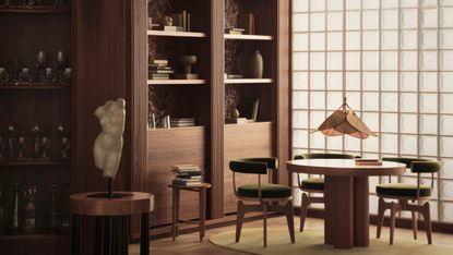
For this dining room idea, Child Studio opted for mahogany library walls, lined with red Rosso Levanto marble, and a round maple table – both slightly red in tone for a deep, rich feel.
'Layering various beautiful tones and textures of wood creates a timeless atmosphere, and wood immediately makes the home feel warm, cosy, and lived-in,' Alexy Kos and Che Huang explain. 'The beauty of layering two tones of timber in the home is that if it’s used in an understated way, it’s timeless. Overly elaborate designs don’t age well, so let the timber sit more in the background, and update the space with accessories or art.'

Price: $2,760
Material: Solid wood with maple top
2. A lighter and brighter approach to layering woods

The curved walls in this project by Child Studio furthers the organic feel of the space – and note how, despite having different tones, the walls, furniture, screen and wooden decor work together in a space dominated by the material.
That's all thanks to careful choice of grain. 'It’s important to pick specific pieces of timber to combine so you get that attractive natural pattern,' the designers explain. 'Wood has a very beautiful texture and wood grain – it’s all about letting it come through. Some timbers have very linear grains, which can look artificial, so we choose soft and natural grain patterns. There’s also the sheen – high gloss levels on wood can also feel plastic and artificial, so use oils and varnishes to preserve an organic appearance.'
3. A kitchen-diner with a wraparound tonal panelled look

For this project by Melbourne architects Kennedy Nolan, every material used was chosen for warmth, texture, durability and a capacity to improve with age – including the wooden slats for the walls and ceiling of this kitchen-diner. 'One of the aspirations of [the project] was to give the sense of a warm embrace,' says founding partner Patrick Kennedy. 'By eliminating white and lining all surfaces in timber, the warmth and softness of the material is amplified and the views are emphasized.
Layering woods in this way is something the studio is cautious about, so a lot of care was taken to create this scheme. 'We have always been reticent to mix timber species, [but] we are aware that there is a great tradition of it in vernacular architecture,' Patrick explains. 'We were careful to balance tones, we avoided high contrast and we used timbers specifically for their inherent qualities.'
4. A vignette of carefully paired tones

Designed by San Francisco firm NICOLEHOLLIS, the luxury Kona Village, A Rosewood Resort in Hawaii draws on the landscape for its interiors, including a liberal use of wood. In this scheme, cabin-like walls and ceilings clad in Douglas Fir are paired with a mix of wood furniture, from the deep red-brown of the sideboard to the pale frame of the armchair. These elements are drawn together by other natural materials, such as cane.
Alexy Kos and Che Huang advises pairing light and dark timbers to create contrast and interest, as in this space. 'We use different shades of oak for lighter tones and cherry and walnut for the darker,' they explain. 'Use one as a backdrop, then add in highlights with the opposing shade. When dark and light timbers are contrasted it creates a smart and sharp look, while a mixture of softer, more subtle tones, grains and sheens feels casual and relaxed.'

Price: $1,998
Material: Caned oak veneer
5. An architectural hallway with subtle highlights

At first glance, this architecturally beautiful entryway idea by Los Angeles interior designer Jake Arnold appears to use one type of timber throughout – but look closely and there's a subtle difference in tone between the staircase and the columns that serves to highlight the architectural beauty of each of these elements.
Adding to the scheme is the stone table that stands out in contrast against the deep woods. 'Materials that look great with mixed woods are other natural elements,' say Alexy Kos and Che Huang. 'We always come back to a small selection that we know work beautifully – stones such as marble or limestone, metals such as brass, and textiles like wool.'

Price: $1,199
Material: Solid marble and iron
Be The First To Know
The Livingetc newsletter is your shortcut to the now and the next in home design. Subscribe today to receive a stunning free 200-page book of the best homes from around the world.
Amy Moorea Wong is a freelance interior design journalist with a decade of experience in contemporary print and digital editorial, previously News Editor at Livingetc. She writes on a broad range of modern design topics from news and interior zeitgeist to houses, architecture, travel and wider culture. She has a penchant for natural materials, surprising pops of colour and pattern and design with an eco edge.
-
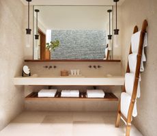
 How to Organize your Bathroom for a Better Morning Routine — 6 Steps for a Seamless Start to the Day
The ease of your morning routine can have a huge influence over the rest of the day, so make sure you optimize you space for a stress-free start to the day
By Lilith Hudson Published
-
 5 Trees You Should Prune in Your Backyard in February — 'It Makes Much Sense to Cut These Ones Back Now'
If you think pruning trees is best left to spring, think again. These trees all could use some cutting back now for several very important reasons
By Hugh Metcalf Published

