9 ways architects use interior windows between rooms to boost natural light, even in our home's smallest spaces
These 10 creative schemes from architects all use interior windows between rooms to borrow light. Here's how
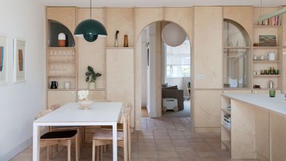

An interior window between rooms is a useful trick to have up your sleeve. Not only can it help make rooms that don't have external windows brighter by borrowing light from neighboring spaces, it can also make your home feel bigger, increasing your sightlines and hinting to the spaces beyond.
For the world's most creative architects, it's a tool that they can use to problem solve awkward and small properties in particular, and with that in mind, we've curated 10 of our favorite examples of internal windows, both glazed and not glazed, in interior design, to showcase what a well-placed gap in a wall can achieve.

Hugh is Livingetc.com's deputy editor, and an experienced homes and property journalist with a passion for creative architecture. Delving into his little black book, he's pulled together 10 examples of internal windows and gaps in walls that really enhance the architecture of a home.
10 ways designer use interior windows between rooms
1. Add a porthole to staircases
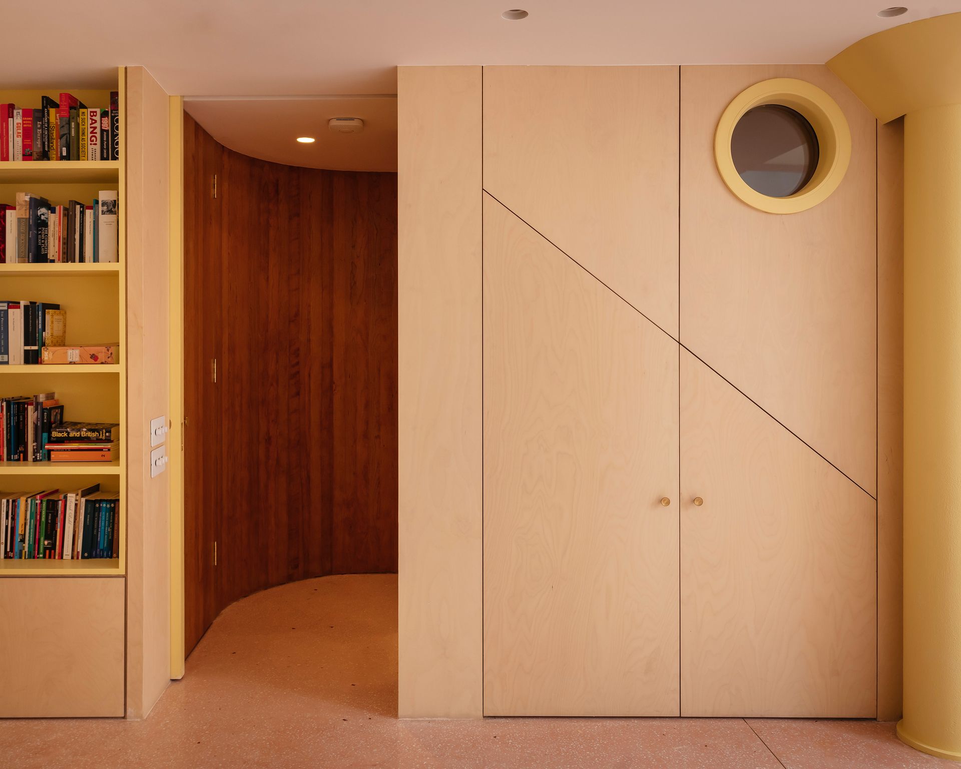
A yellow porthole was incorporated into the stairwell joinery of a project by Gundry + Ducker to create a connection between the spaces, as well as a charming design detail.
'The main reason for the window was to bring some light into the stairwell, while also enabling a glimpse of the space beyond when descending the staircase,' says Christian Ducker, co-founder of Gundry + Ducker of this staircase idea. 'The clients had two young children and so the porthole was located at child height so as to include them, too.'
2. Borrow light while retaining privacy
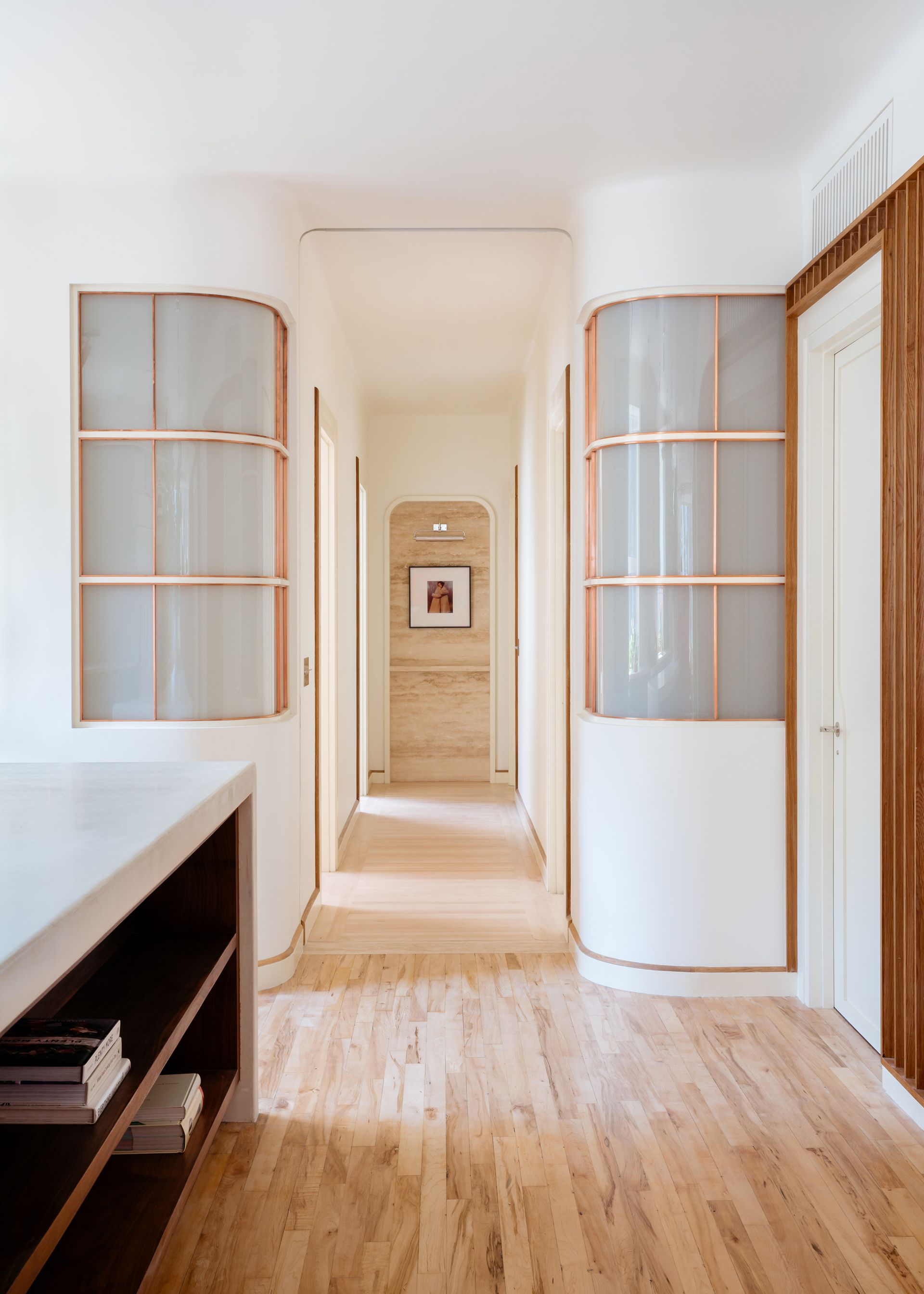
In a New York apartment, Home Studios used curved windows with an opaque finish to borrow light from the main living areas and hallway for the smaller rooms, such as the guest bathroom, where privacy is key.
‘The curved geometries of Alvar Aalto’s work were one of the project’s many design inspirations, which can be seen in the bowed glass windows with copper details,' Oliver Haslegrave, founder of Homes Studios, explains.
3. Make an opening flexible for your needs
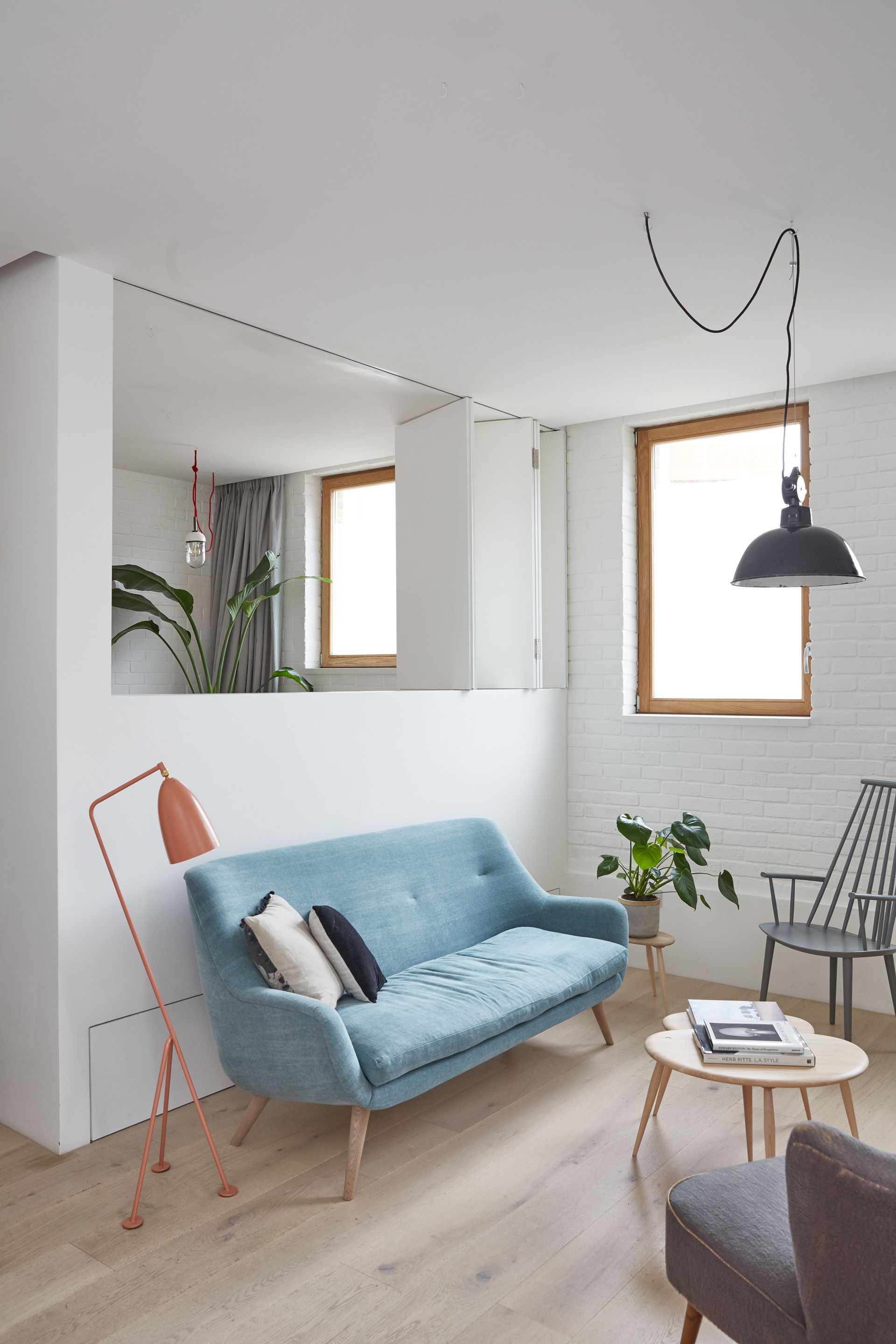
In creating an extra bedroom in a small side addition to this home, Craig Hutchinson, founder of Hutch Design, realised they could make the space feel larger with a bi-folding wall opening that can be left open when the room is not in use.
'It creates a flexible space that can be used as both a home office or a third bedroom,' says Craig. 'By itself it provided little additional area to the property, but by opening this up to the living space, with a folding wall, the spaces feel much bigger.'
4. Reinvent the serving hatch
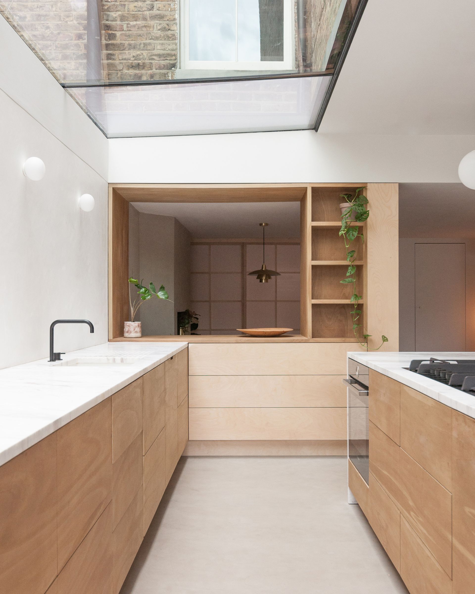
In the kitchen of a London home, Yellow Cloud Studio reimagined the 70s classic of a serving hatch with a timber volume inserted between the cabinetry and the adjacent dining room.
'It achieves a level of privacy and separation between each space,' Eleni Soussoni and Romanos Tsomos, directors of Yellow Cloud Studio, tell us. 'Walls tend to be hard austere surfaces that would deter the user from moving around freely so a joinery volume was designed instead, acting as a multifunctional kitchen storage and display unit while also hiding the structural and mechanical elements of the building.'
5. Consider sliding doors
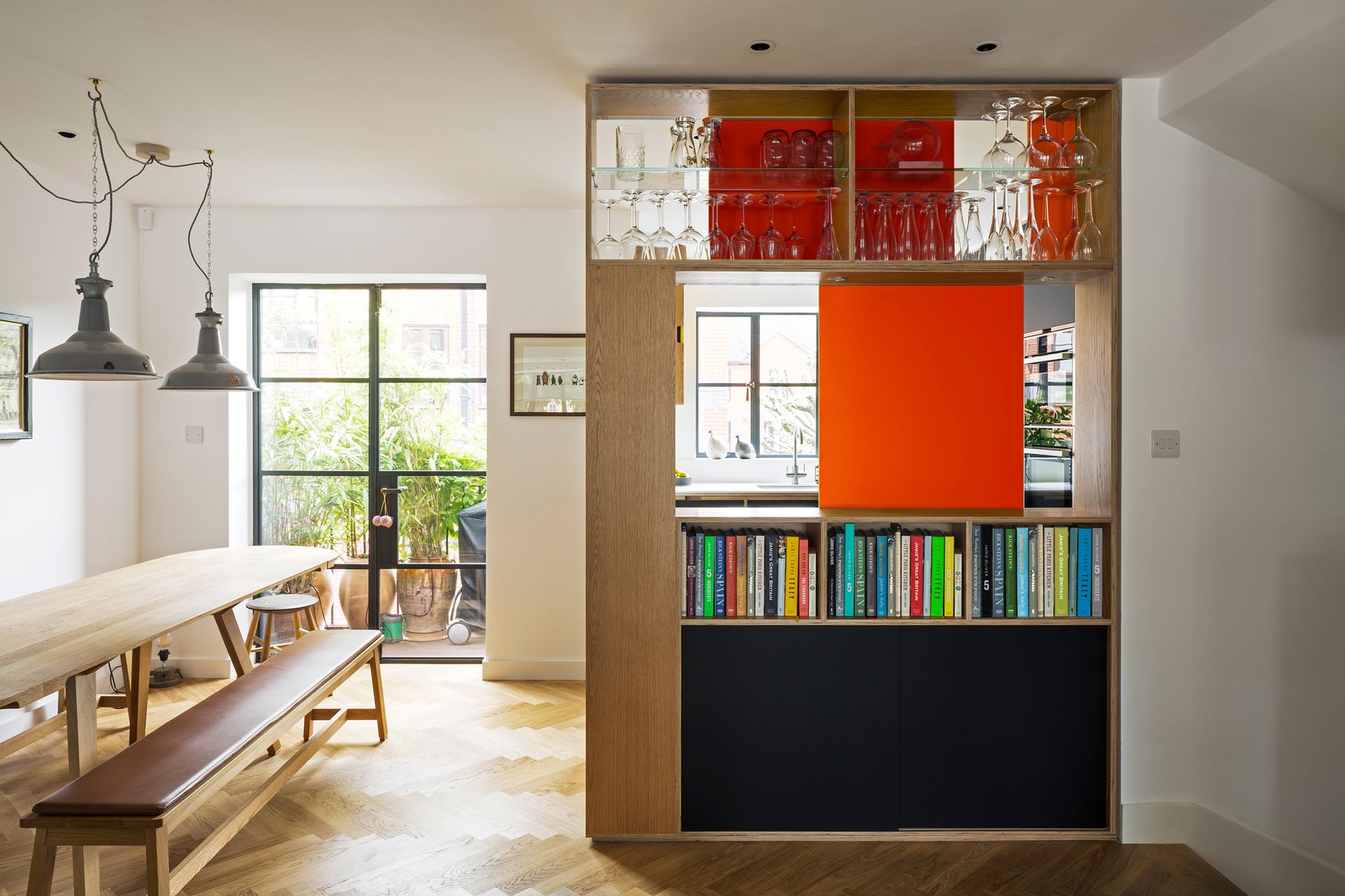
Kitchen makers Uncommon Projects came up with a clever way to create a flexible connection between a kitchen and the wider open plan space. ;When the client approached us, they thought they would have to keep the kitchen enclosed with the existing wall, separating it from the stairs,' says Alan Drumm, co-founder of Uncommon Projects.
'We came up with the idea of the kitchen cabinet idea of double sliding doors to get over this unusual functional requirement. They loved the fact they can slide completely out of sight from the living room side when open, and inject some colour to the space when closed.'
6. Add an internal window to a mezzanine
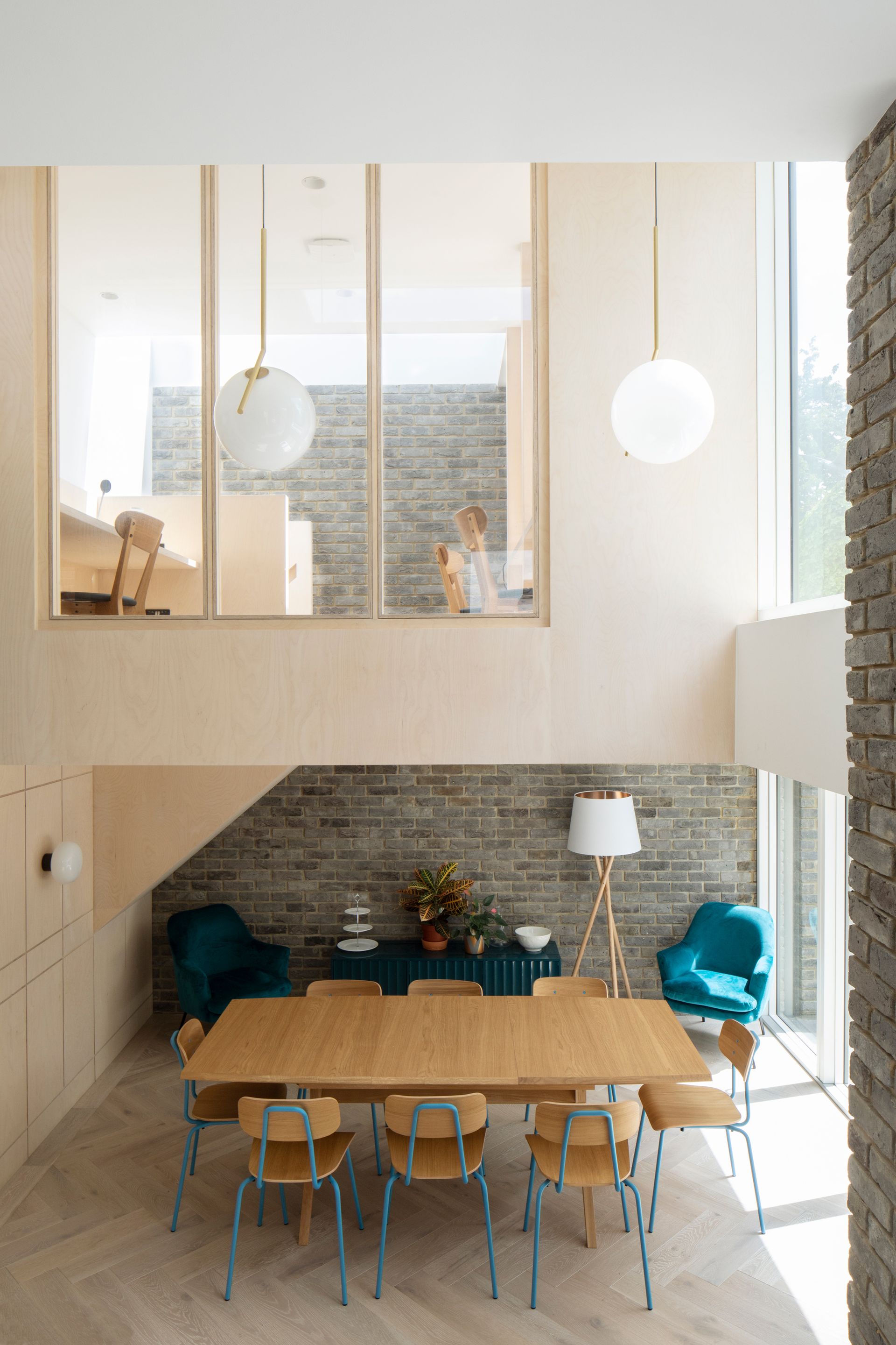
In turning a house into a community living project, architects Selencky Parsons looked to create connected spaces, which included an internal window looking down from a mezzanine level on the open plan kitchen.
'The thinking behind the design of the mezzanine window was to enliven the shared areas of this community living project by providing strong visual connections between the different spaces of the scheme,' says David Parson, director and founder of Selencky Parsons. 'The window serves the purpose of allowing additional natural light to flood into the kitchen and dining spaces ensuring good natural light from a variety of directions.’
7. Increase the sense of space
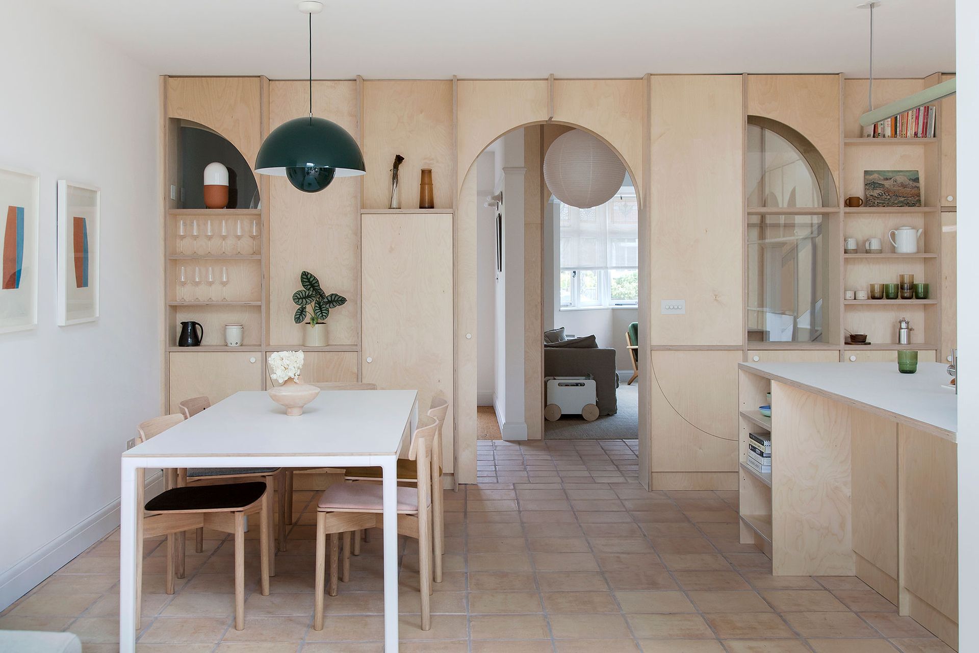
In this home, an internal volume of ply creates a backdrop for the kitchen diner, with arched cut outs which expand the sense of space.
'A curved motif repeats throughout defining internal windows, doors and alcoves that display valued family objects,' Nimi Attanayake, cofounder of NimTim Architects, tells us. 'The internal glazing allows light to transfer between the spaces as well as allowing connection throughout the ground floor layout. The glazed elements are constructed using fire safety glass,' Nimi adds.
8. Re-consider your layout
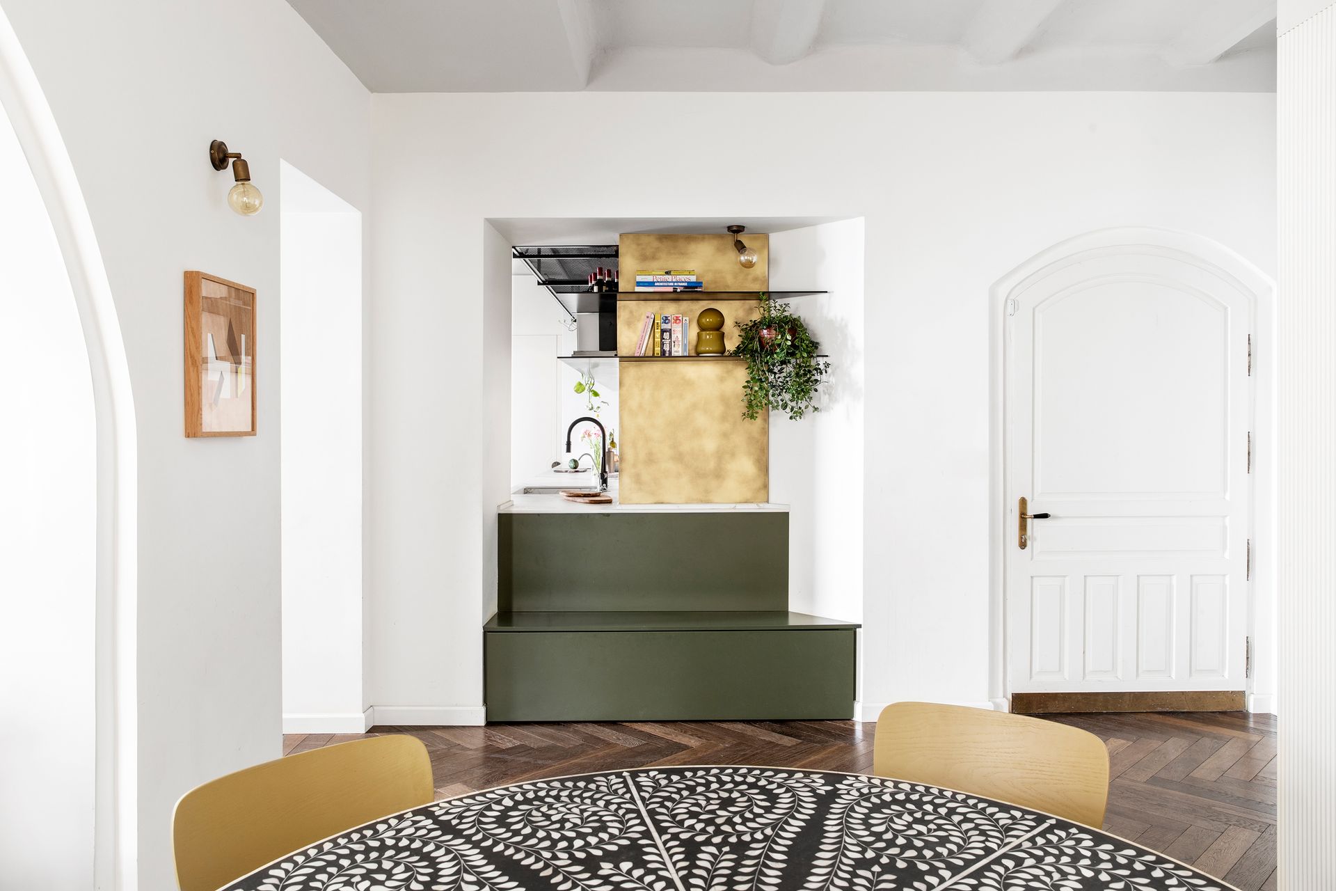
Working around the existing bones of this Tel-Aviv apartment meant an awkward gap between the kitchen and dining space. Instead of leaving it as a walkway, its designers extended the kitchen out, but kept the reveal.
‘Now, when someone is cooking and someone else enters the entrance or eats in the dining area, they can see each other and communicate,' say Orit Singer and Rachel Graff-Rachim, co-founders of Ma/Deux Architects. 'The brass wall cladding leaks into the entryway connecting the space, while the green kitchen cabinets also double up as an entrance bench.’
9. Connect adjoining rooms
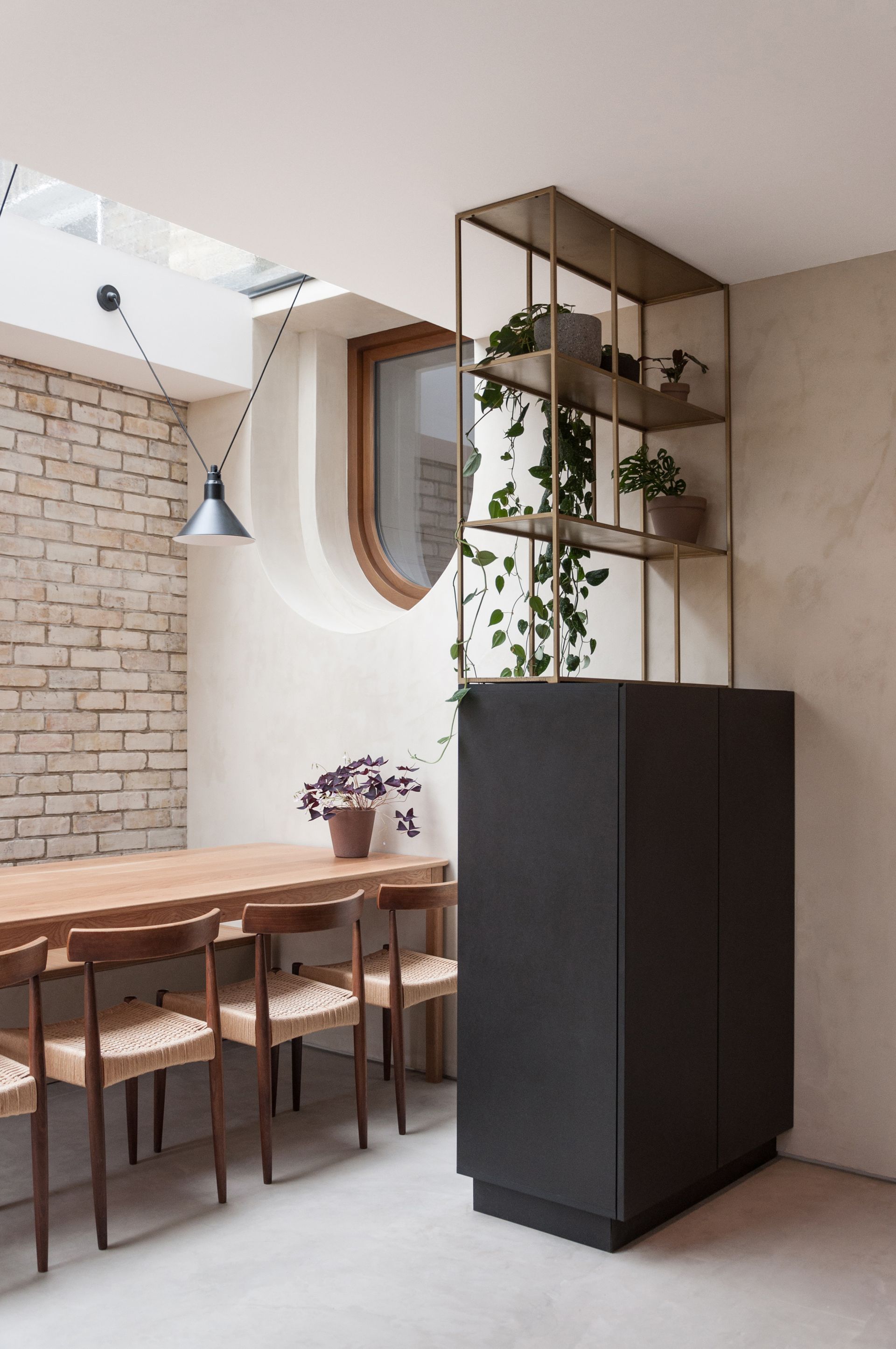
With a seven step drop between the front and rear of a Victorian property, creating a connection between the two spaces, while concealing a maze of plumbing pipes, was the biggest challenge.
'The solution took the form of an internal elongated capsule window with a stepped sill outlining its shape and hiding the building’s functional elements in its void,' Eleni Soussoni and Romanos Tsomos, directors of Yellow Cloud Studio, explain. 'A large skylight cuts the capsule window in half and establishes a connection to the living area through the bottom half and cross ventilation of the space through the top, essentially becoming a half external/half internal window.'
Be The First To Know
The Livingetc newsletter is your shortcut to the now and the next in home design. Subscribe today to receive a stunning free 200-page book of the best homes from around the world.

Hugh is the Editor of Livingetc.com. From working on a number of home, design and property publications and websites, including Grand Designs, ICON and specialist kitchen and bathroom magazines, Hugh has developed a passion for modern architecture, impactful interiors and green homes. Whether moonlighting as an interior decorator for private clients or renovating the Victorian terrace in Essex where he lives (DIYing as much of the work as possible), you’ll find that Hugh has an overarching fondness for luxurious minimalism, abstract shapes and all things beige. He’s just finished a kitchen and garden renovation, and has eyes set on a bathroom makeover for 2024.
-
 How to Thaw a Frozen Pipe — Learn Everything You Need to Know in 5 Minutes With This Guide
Winter storm caught you off guard? We asked an expert — just how do you thaw a frozen pipe?
By Hugh Metcalf Published
-
 The 12 Very Best Silk Bedding Pieces — As Our Style Editor Says: 'It's What Dreams Are Made Of!'
Slumber in lustrous luxury with the very best silk bedding sheets, duvets, pillowcases, and more — your sleep score will thank us later
By Julia Demer Published

