How to make a small home office feel bigger – 11 easy ways to maximize your space
The simplest (and most stylish) ways to make a small home office feel bigger are revealed by our favorite designers
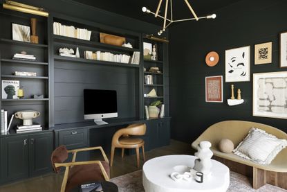

Looking for easy tips on making a small home office feel bigger? We have you covered. Let's face it, for most of us, the home office is the smallest room in the house. It's a space you probably had to cobble together back in 2020, when you decided it was time working from the sofa/kitchen island/bed on very lazy days had to come to an end.
And we ask a lot of these small rooms, they have to be efficient, inspiring, and (if you are anything like us) stylish spaces to work. Of course, the key to all those things is really to maximize your space, and create the allusion that the room is in fact larger than it is. It's simpler than it sounds and doesn't even have to mean an entire reno.
It's about choosing your colors carefully, trying clever layouts, and experimenting with pattern in ways that can help 'expand' your small home office. We asked some of our favorite designers for their top tips too, and they came through, demonstrating with some of their ingenious work what can be achieved with even the tiniest of offices.
1. Make bold choices with pattern
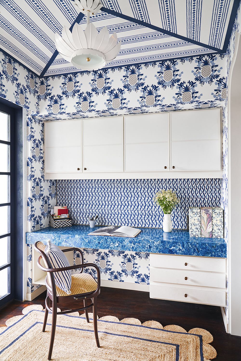
With any small room, we'll often advise the less is more approach, and there are plenty of examples of that coming up don't worry. But neutral colors, minimal decor, and simple decor aren't the only way to make a home office feel bigger. Take note of this wonderful home office designed by Elizabeth Hay.
The electric mix of pattern on the walls and ceiling not only create an inspiring place to work, but they blur the boundaries of the room so you can't quite clearly make out the edges. A smart interpretation of home office wall decor. It's maximalist yes, but the fact there's the simple color palette of just blues and whites prevents it was being too visually overwhelming.
2. Keep it simple
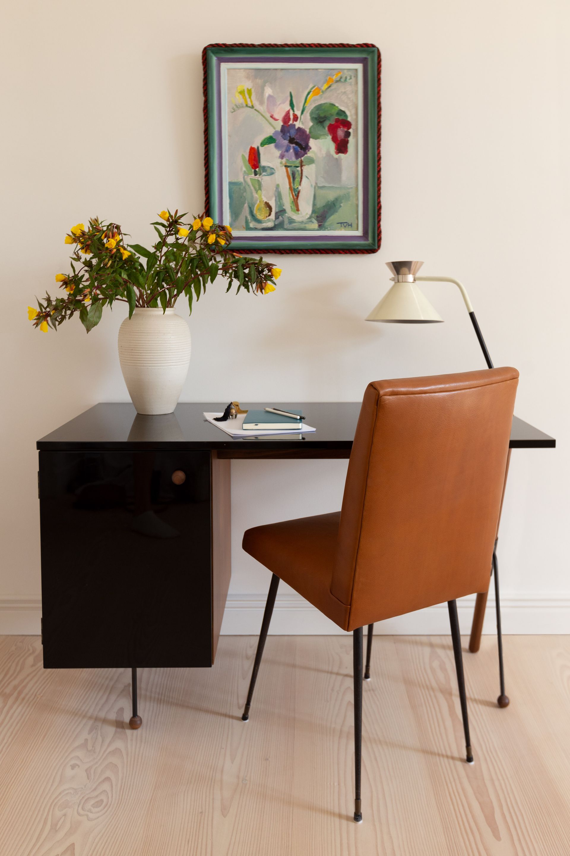
When making a small home office feel bigger, often the less is more approach can apply too. Too much visual bulk shrinks a room, so consider the bare necessities of what you need – that could be as little as a desk, a chair, and some storage (which could just be added with one of the best desks). Case in point; this beautiful, but functional, minimalist home office.
'In this Berlin apartment, the home office consisted of a desk in the living room — our goal was to make sure the Greta Grossman desk worked stylistically with the rest of the room's mid-century modern Italian and French furniture. The ball feet and finishes of the selected piece are lovely, and it conceals a bit of the tech needed for working, but it's more of an aesthetic decision rather than a "workhorse,' explain Keren and Thomas Richter, co-founders of White Arrow.
'Often to make a home office look bigger, we'll run cabinetry to the ceiling and use open furniture on thinner legs so your eye can travel to the edges of a room. Mirrors, crown molding, or anything to allow the eye to travel also helps increase the sense of scale and openness. Mitigating clutter, having a room that feels calming, and natural light go far.'
3. Float your built in storage
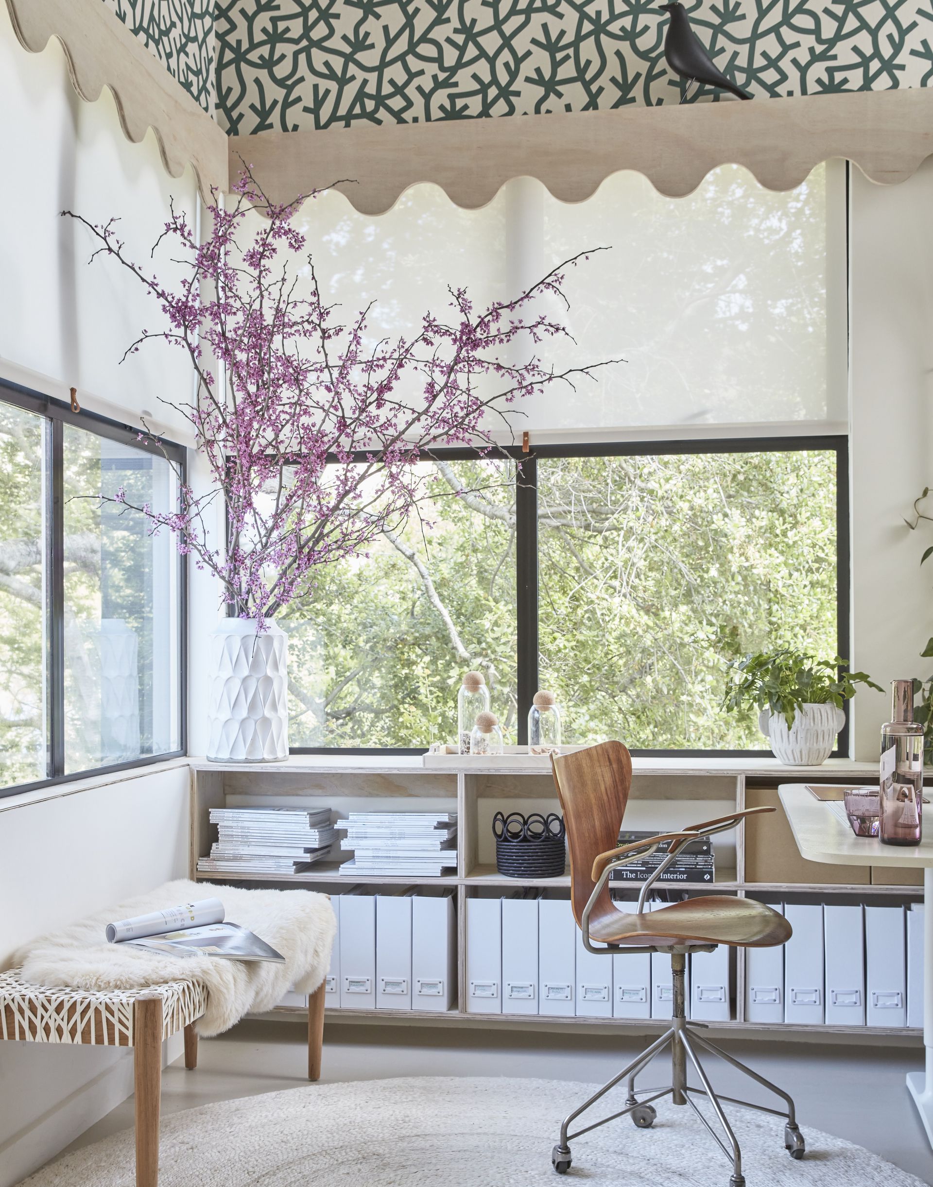
This is always one of our top tips in small rooms, if you can go for the built-in storage (and even better bespoke built-in storage) then do. It's a sure-fire way to make the most of every inch of your space no matter how tiny or awkward. And built-ins aren't always bulky and imposing, as this gorgeous modern home office designed by Lisa Le Duc proves, they can be super simple and subtle.
'In order to maximize storage and floor space, and house all the client's different needs, we designed bespoke cabinetry. This meant we could house everything that needed storing and build everything into the walls around the room.' explains Lisa.
'We made all the cabinetry float off the floor, to give the impression of more floor space and make the room feel lighter. Often built-in furniture that touches the floor can feel heavy and very solid/stuck. Hanging cabinetry on the walls can make it feel lighter and airier.'
'The room had a very high apex ceiling. This can, on the one hand, make a room feel very large, but because it's mainly vertical space, it also makes a room feel disproportionate. So we wallpapered the ceiling in order to add some interest, drama and give the illusion it wasn’t such a high void of space.' (We are getting more and more convinced that wallpapered ceilings are a must in every room...).
4. For a budget friendly option go modular
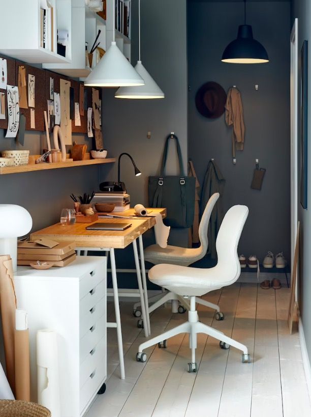
IKEA and small spaces are synonymous, so if you are designing a small home office on a tighter budget or renting so bespoke built-ins aren't an option, be inspired by IKEA office ideas and its ever-popular storage solutions.
As Samuel Pye Creative Manager of Echlin says, 'Built-in joinery is the number one way to maximize the feeling of space in a home office as it will provide areas to hide the clutter. If built-in joinery isn’t an option as you need some flexibility for the future or other purposes in the room, then IKEA or other modular storage solutions will be the best route as they allow all available space to be maximized and have the largest selection of units in different dimensions.'
'Remember, every centimeter counts so if you’re buying “off-the-shelf pieces” definitely mark out on the floor with a tape measure and masking tape. A lot of modern storage bookcases are about 40cm deep but traditional bookcases are more like a maximum 30cm, which is plenty for storing most books and files.'
5. Choose slimline furniture
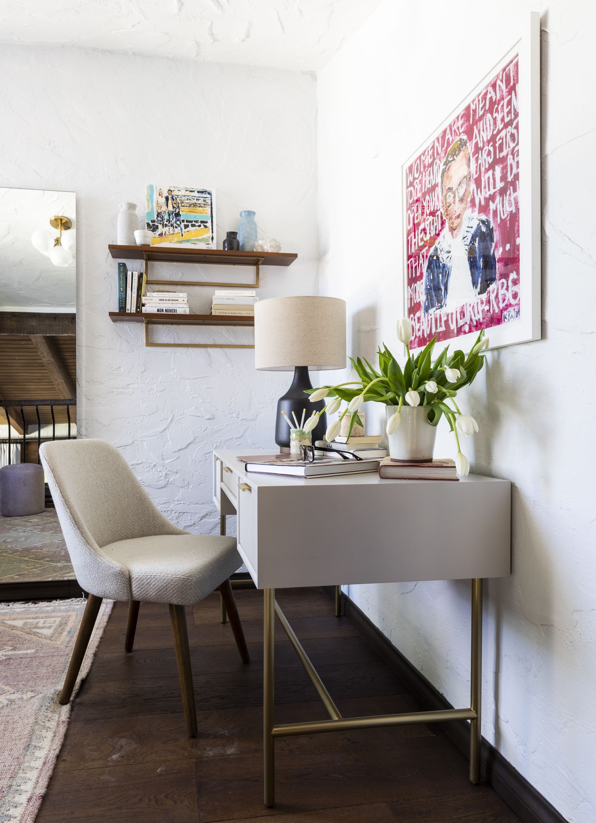
Often the key to making a space feel bigger is to not fill the room with too much visual bulk – by that we mean make sure no piece of furniture breaks up the eye line or prevents light from flowing around the room. If you can see plenty of floor the room is always going to look larger.
Easy to do, just pick furniture that's slimline and sits high enough off the ground. Think dainty pieces with narrow tapered legs and minimalistic frames, and get any storage up off the floor – shelving always works as the best storage in a small office. Avoid office chairs that have bulky arms and heavy dark desks that will sap light from the room.
Consider layout too. Open up the space by ensuring you keep any walkways clear and avoid having furniture bang in the middle of your eye line as you walk in the room.
6. Pick the right window treatments
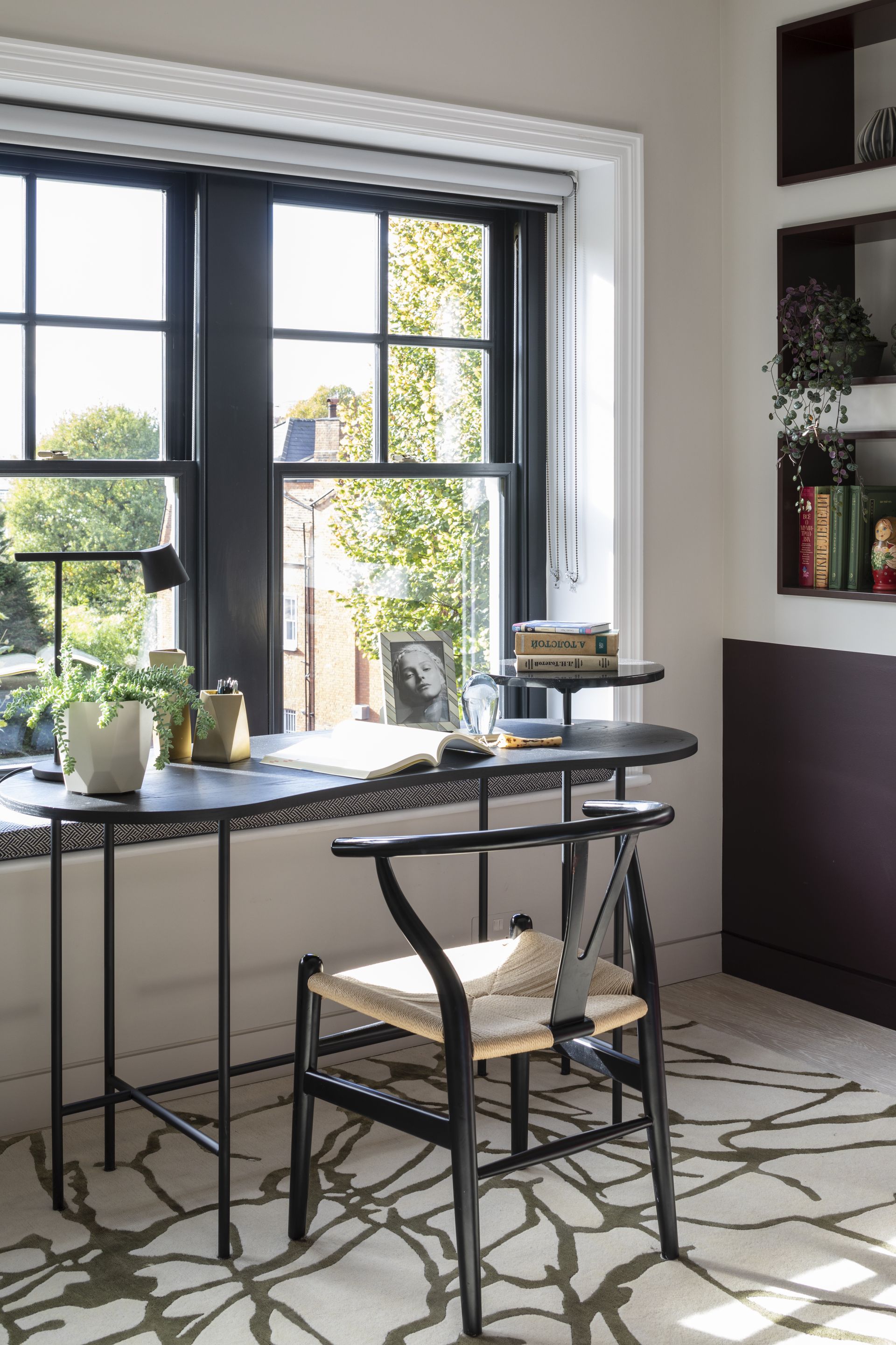
'Flooding your small home office with natural light will help to make it feel bigger. So keep your windows clean and cut back any trailing plants blocking your view. Also, clear your windowsills of any clutter and consider your window dressing carefully.' explains founder of Gunter & Co, Irene Gunter.
'If you like curtains, make sure you can pull them back during the day to maximize light. I often recommend Roman blinds as an alternative to curtains: they make the window look ‘dressed’ and are attractive even when not in use, creating a neat stack at the top of the window when raised.'
'Some clients are concerned about blocking the top portion of their window with Roman blinds so ask for a roller blind instead. If this is the case, I always try to hide the cartridge (the cylinder around which the fabric is rolled) – it’s very ugly! One option is to hide the roll behind a pelmet, or a neat designer’s trick is reverse roll the blind so when it’s hung, the cartridge is hidden as shown in this project.'
7. Consider the basics and get sizing right
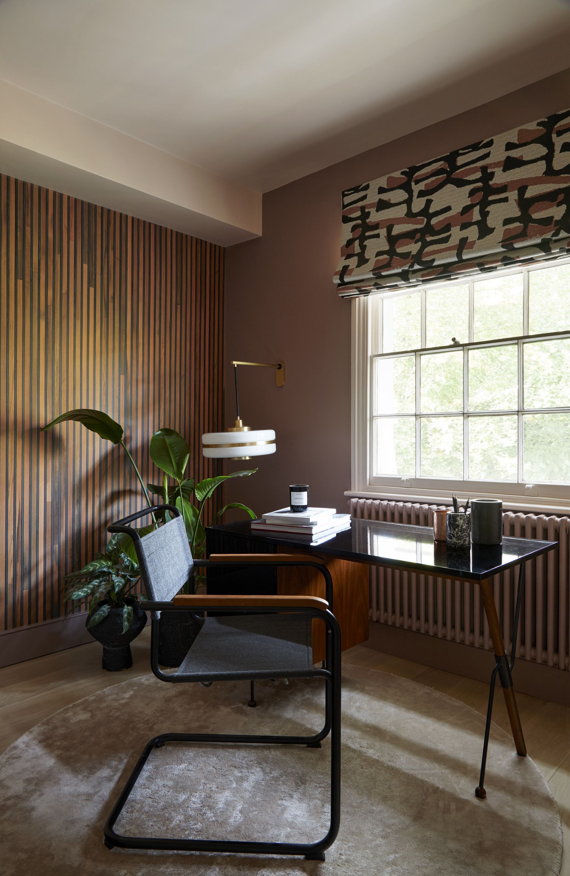
'A home office or workspace has to work quite hard to tick the right boxes – it should be clean and uncluttered, comfortable enough to spend plenty of time in, but also inspiring and (ideally) a pleasing part of your home’s overall look and feel. So make sure you get the basics right – the right sized desk, a good chair, good lighting, and some storage.' explains Andrew Griffiths founder of A New Day .
'With this home workspace, we set out to create something that felt feminine but strong. The walls are in a muted rose tone, while on the ceiling is a very soft pink that has a big dose of grey in it. The softness and warmth of the palette is paired with the beautiful mid-century form of the desk, with its rich walnut tone and crisp black lines which are then echoed in the window dressing. The marriage of strong lines, bold forms, and soft powdery pink tones looks to strike a balance.'
8. Make use of alcoves
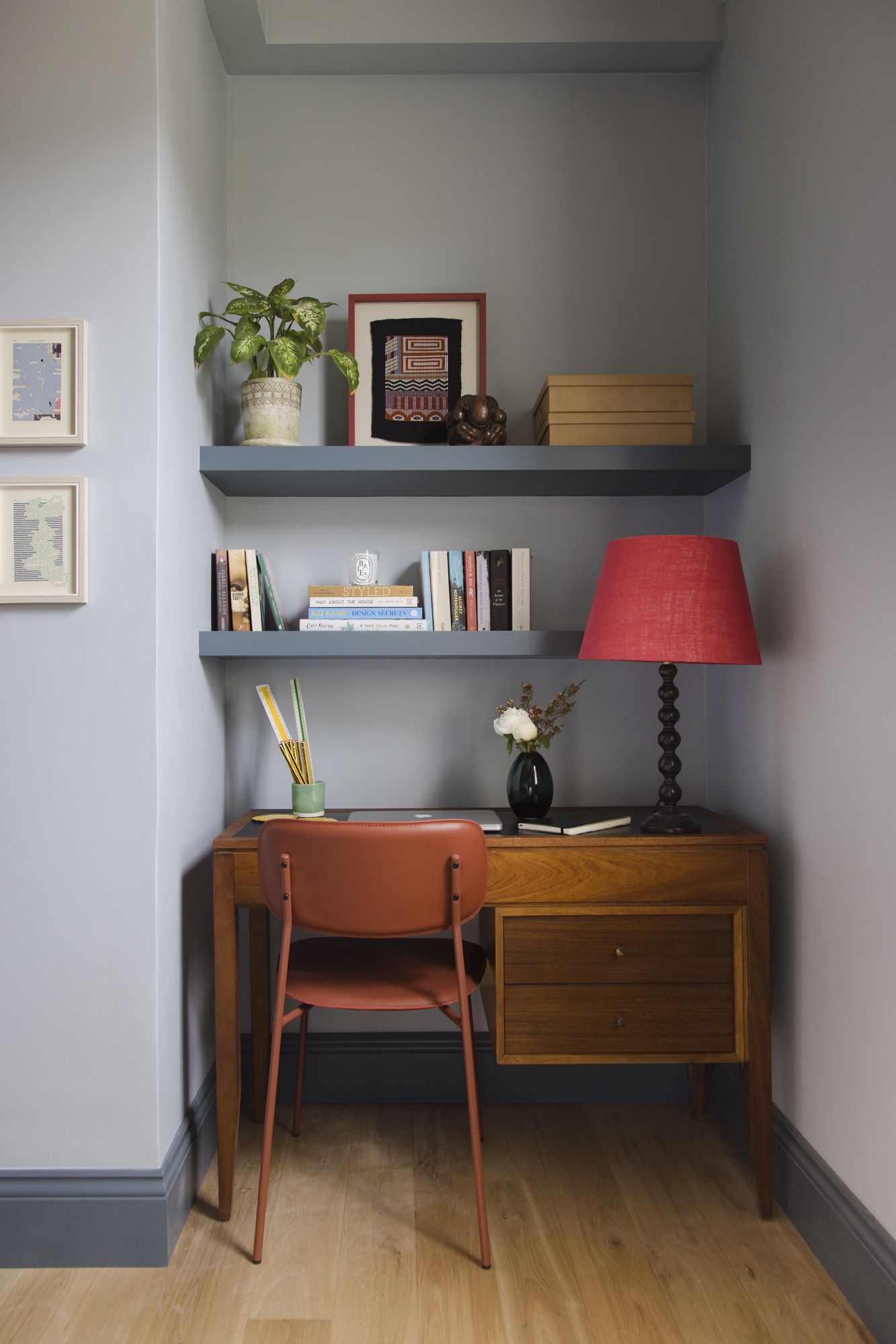
Alcoves are such an underused part of our homes. They have so much to offer and yet often they are just dead space. If you have been blessed with alcoves in your small home office, or even want to create a workspace in another room, use them to their full potential and house your bulky pieces of office furniture within them.
Be inspired by this home office designed by Brooke Copp-Barton and tuck in your desk and add alcove shelving above to create a mini workspace that doesn't encroach on the rest of the room.
'We are finding most briefs these days are asking for home office solutions and this project was a flatshare for three young professionals who may on occasion work from home – so we needed to incorporate them into their bedrooms. So here we dedicated an alcove to wfh space – matching a vintage desk with colorful lamp – and painting the bookshelf joinery to match the rest of the scheme.' explains Brooke.
'In a small home office, I would definitely avoid furniture that is too office looking. And always think about where your wires go! We often incorporate wire tidy’s behind desks and cut holes in the back of desks for cables to feed into. And add of course storage – draws, boxes, shelves. Lots of them!'
9. Opt for light shades and pale woods
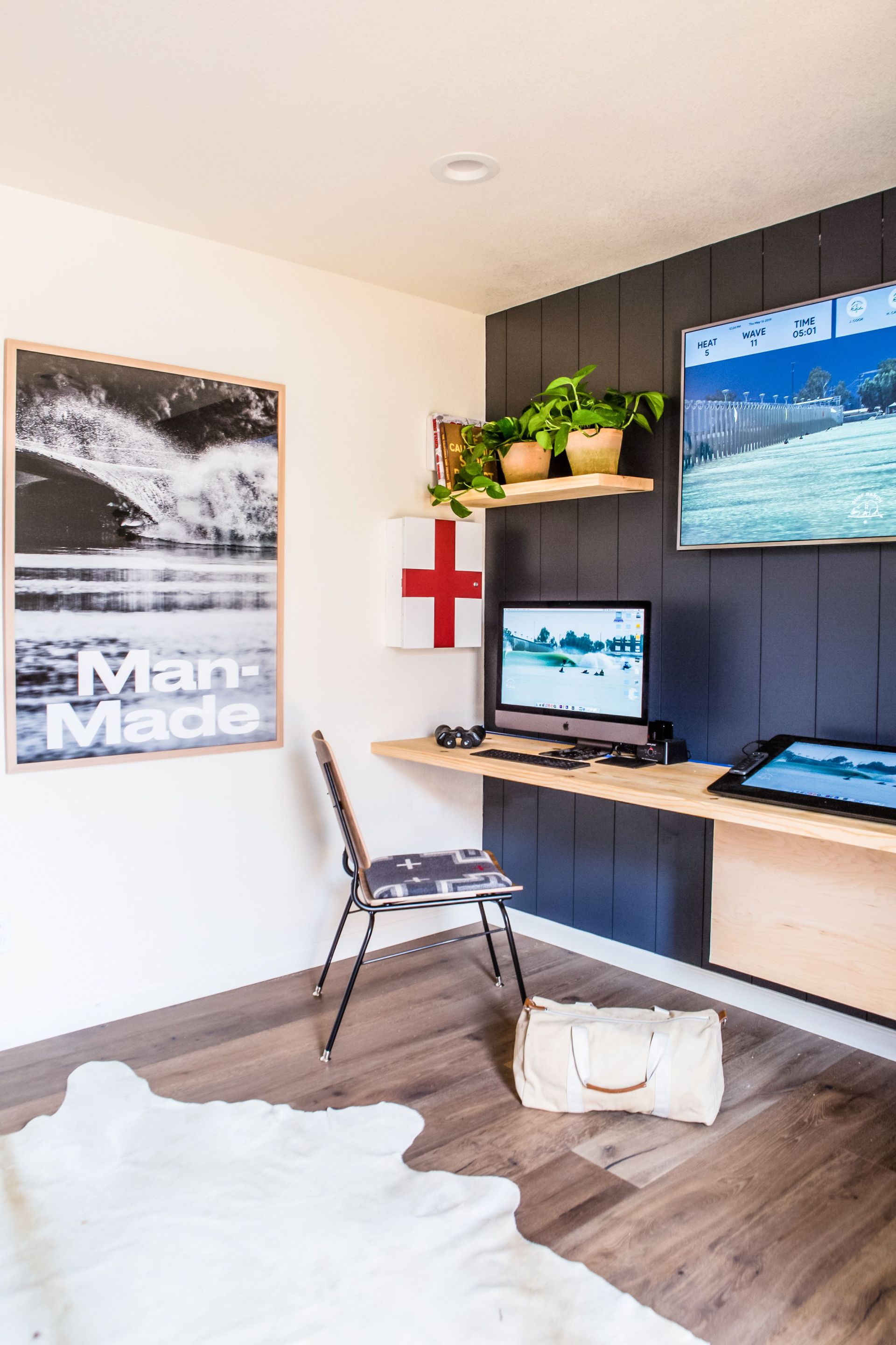
It's interior design 101 that light colors 'expand' a space, so if you're thinking of how to use paint in a home office, it's an obvious call to stick with lighter hues. However, that being said, all white rooms don't make for the most inspiring workspaces, so adapt the rule of light = larger and go with mostly lighter = larger.
You want the room to feel bright but not void of personality, so take some tips from this home office by RailiCA and stick with a simple color scheme of clean neutrals, pale woods and introduce one or two accent shades to ground the room and give it (and you) some focus.
'Natural woods and light tones make small spaces look larger, while built-in desks and storage units make functional use of the space.' explains founder Raili Clasen. 'Keeping the clutter to a minimum and styling with vintage art and some greenery make the space feel personal.' Raili.
10. Distract from smaller dimensions with bold color
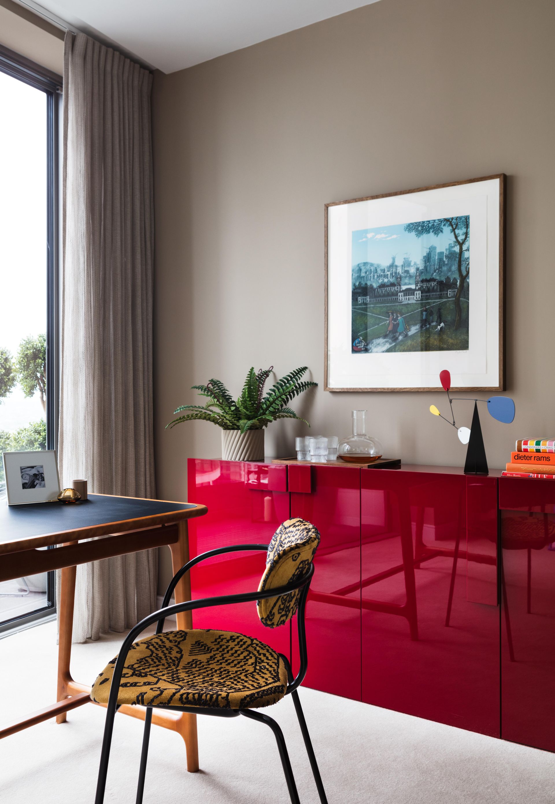
So we've covered the classic light and bright look, but if that very clean and simple look isn't your vibe and you like warmth and color fear not. Really there are so many color 'rules' when it comes to smaller spaces, but what matters most (particularly in a home office where you will be spending lots of time) is that you like the shades and they comfort and inspire you.
This small home office design by Echlin feels fun and warm and welcoming, and while the color scheme isn't super light and bright the space doesn't feel cramped. Samuel's advice is to 'Opt for mid tones for the walls and add bright colors, with artwork, books, and styling, to create other areas of interest that will detract from any mess. There’s no point in our view creating an overly constrained aesthetic palette as life is colorful and sometimes chaotic.' Amen.
Also, note the curtains. This is such a nifty trick in any small room and a great one to allude to more height. Rather than start and end your window treatments just around the window, take them slightly above the top of the window (or go all the way to the ceiling) and go right down to the floor. It's far more elegant and an easy way to make a room feel larger.
11. Color drench a small home office with dark shades
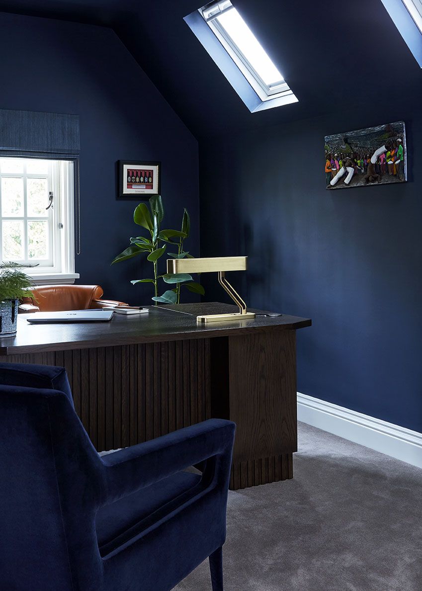
Color drenching is a huge interior design trend right now and can work to make a small home office look bigger. Color drenching is exactly what it sounds like, taking one shade across all the surfaces of a room, walls, ceilings, work wood, and even floors, furniture, and decor if you really commit to the trend.
It's a great look in small spaces because no matter what color you use, whether it's something dark and dramatic like the deep navy used here, or a pale muted hue, it blurs the dimensions of the room and creates the allusion of more space.
'We decided to paint the sloped ceilings the same color as the walls to give the sense of openness and space and then opt for built-in storage to niches either side to maximize storage in the room.' explains Nicky Mudie founder of Violet & George. 'This home office was a great opportunity to go bold with the color as we wanted this room to feel different to the rest of the house and the dark color creates a cozy, relaxing space.'
How do I make my small office brighter?
To make a small home office brighter you of course want to ensure you have your home office lighting nailed. Bring plenty of different sources into the space – task lighting is, of course, a must in the home office so make sure to have a strong light over your workspace. In a small room, you might find wall mounting is the best option so you can keep your desk as clear as possible.
Consider your ambient lighting too. Spotlights work well in a home office for an overall glow and you don't then need to worry about a pendant light being too much for the small proportions of the room.
Of course, maximizing natural light is key to upping the brightness too, so keep windows free from clutter and don't block the flow of light with any bulky furniture. Choose window treatments that are going to allow as much light in as possible – we'd recommend subtle blinds that can be almost totally hidden away when not in use.
How do I maximize space in a small home office?
To maximize space in a small home office the key is using all the space available for storage and incorporating clever home office organization so the room is really easy to use, it's clutter-free, and works efficiently for you.
'Make sure all storage is working at 100% capacity. Do you have any areas that require more shelving? Don’t allow any wasted spaces.' advises Nicky Mudie of Violet & George. 'Use floors and walls for cabinets and shelving. Think about your specific needs. What do you need to house? Books? Files? Drop down files? Paperwork? Stationary? What can you do without? What can you throw out? Be brutal.'
Be The First To Know
The Livingetc newsletter is your shortcut to the now and the next in home design. Subscribe today to receive a stunning free 200-page book of the best homes from around the world.
Hebe is the Digital Editor of Livingetc; she has a background in lifestyle and interior journalism and a passion for renovating small spaces. You'll usually find her attempting DIY, whether it's spray painting her whole kitchen, don't try that at home, or ever changing the wallpaper in her hallway. Livingetc has been such a huge inspiration and has influenced Hebe's style since she moved into her first rental and finally had a small amount of control over the decor and now loves being able to help others make decisions when decorating their own homes. Last year she moved from renting to owning her first teeny tiny Edwardian flat in London with her whippet Willow (who yes she chose to match her interiors...) and is already on the lookout for her next project.
-
 How to Make a White Bathroom Feel Warm — 5 Tricks Designers Use For a Cozier and More Restful Spaces
Give your all-white bathroom a glow-up with these tips for bringing warmth to the space
By Oonagh Turner Published
-
 5 Habits to Adopt That Will Make Your Home Smell Good All the Time — 'Add Them to Your Routine Today!'
Incorporating these tricks into your maintenance routine will keep every corner of your home smelling fresh and welcoming
By Katie Baxter Published

