5 fresh ways to use pattern in a living room - 'all of which spark so much joy'
Pattern in the living room is tricky to get right, but when done well it can feel fresh and fun


If you're afraid of incorporating pattern into your living room's design, you're not alone. If scale and color are even slightly off-balance, you run the risk of patterns clashing and overwhelming the space, leaving a room feeling chaotic. 'Pattern play is one of those things that people shy away from,' says Kristen Pena of K Interiors. 'But don’t! It’s so fun when you get it right.'
But all of these well-executed uses of pattern can spark so much joy and feel friendly, fun, and even relaxing, the perfect atmosphere for a living room. If you're considering incorporating pattern into your living room's design, take inspiration from the designers with these five different ways to use and incorporate pattern.
1. Try patterned upholstery on a statement sofa

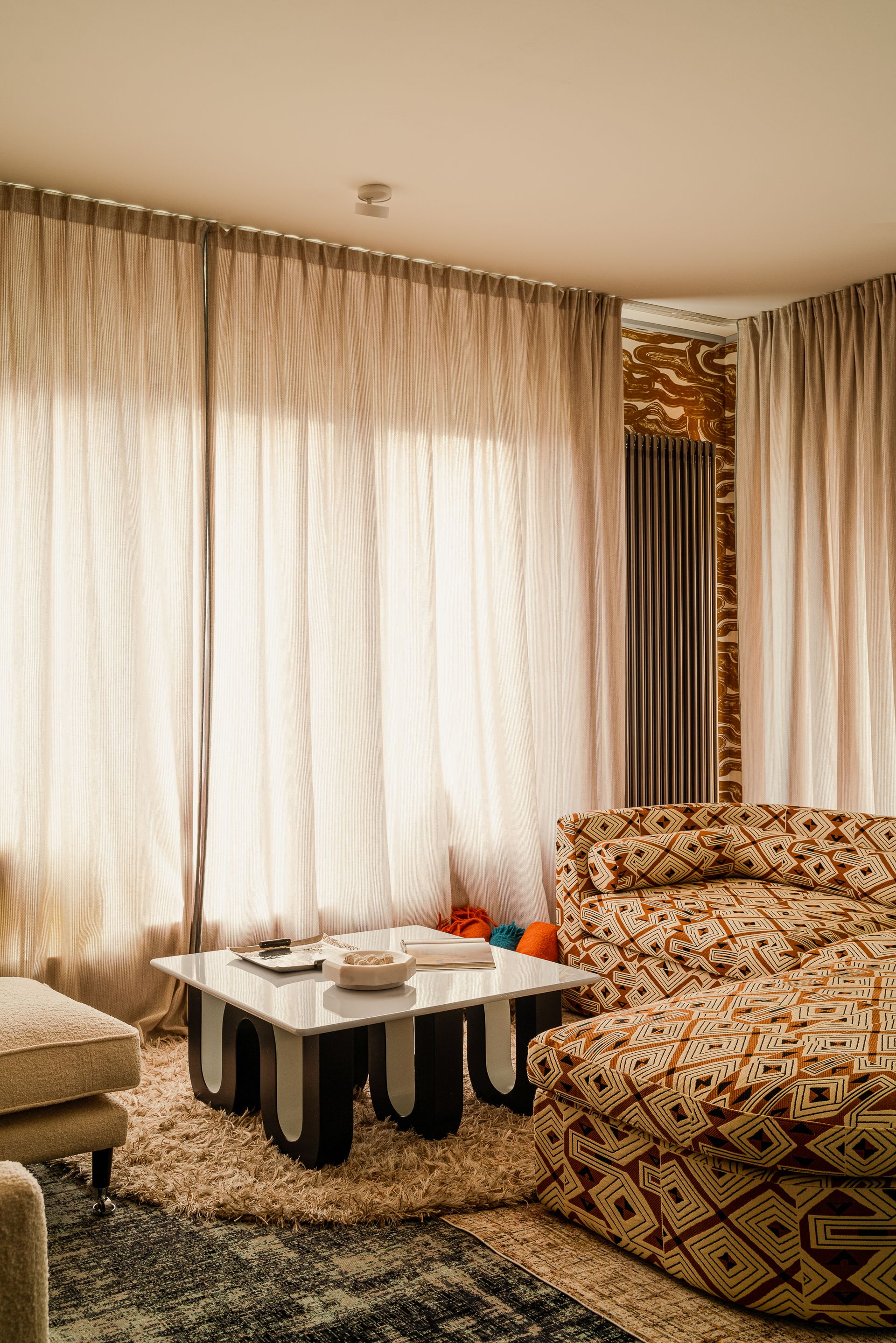
If you want to create a living room focal point, a statement living room sofa upholstered in a loud, patterned material is a great way to draw attention to the center of the room.
In the living room of this Gdansk apartment, designer Karolina Rochman has kept the room feeling relaxed and understated, meaning that the sofa really commands attention and acts as an unexpected centerpiece.
'The Greek philosopher Heraclitus said that everything in the world flows because opposites constantly clash and dissolve - darkness and light, heat and cold, chaos and order,' says Karolina. 'Out of difference comes understanding. Here, a patterned sofa provokes artistic chaos. But out of this chaos emerges the most beautiful order. It's a bold interior that gives aesthetic pleasure.'
For upholstery inspiration, look to House of Hackney's recent collaboration with 1stDibs which upholsters unloved midcentury furniture in modern patterns and eccentric floral illustrations.
2. Use pattern to soothe

Pattern has a reputation as being loud and carrying a lot of energy, but it can also be used to soothe, like this cozy den living room design by San Francisco interior design studio, Chroma.
Here, the cool color scheme of the moody blue combined with browns and reds make this space a temple of relaxation. The pattern on the ceiling combined with the upholstery on the living room sofa makes it feel fun yet relaxing.
'The Sunset Lounge is meant to be a regenerative space,' says Leann Conquer and Alexis Tompkins of Chroma. 'It's a room that both soothes, eases stress and tension and enlivens. It's a place of sanctuary.
'We were informed by the home's almost 100-year Spanish style architecture, the rich textures and patterns from a favorite Attico fashion collection, and the bold contemporary color palette of Billi Eilish's 'Bad Guy' music video, waving together a space that is comfortably vintage and vanguard.
'Moody teal, sanguine red, patinated bronze and blue velvet trip a tantalizing experience.'
3. Strike the right balance by playing with scale

Scale is crucially important when dealing with pattern. If you're going for the pattern-on-pattern look, like stripes with polka dots, or the classic pattern clash of geometrics with a floral motif for example, the trick is to use different scales. Think large, medium and small used together.
'Patterns are essentially just flat texture, so they need to be balanced in scale, says Los Angeles interior designer, Sally Breer, who designed this room in Firehouse, a boutique hotel intended to be a 'dreamy mix of the elegant and bizarre'.
'For example, if you want to mix a floral and a stripe, for example, generally I like the floral repeat to be small and the stripe to be looser. Take this space, we added a rainbow raw silk plaid to give the leopard print a different context. The room becomes something you didn’t expect and just so much more dynamic.'
Sometimes, a great way to add scale is through smaller, subtle elements, says Bradley Taylor of design studio Bradley Taylor Design. 'Bring warmth and pattern to a room with a patterned lampshade, cushions or artwork. This will allow you to play with scale. For example, you could have a really beautiful big print wallpaper as the hero, teamed with some smaller lamp shades in a delicate print.'
4. Pick similar colors to avoid overdoing it

Another trick to help you become a master of pattern is all about color. If you're looking to create a harmonious, calming color scheme, look to the color wheel for inspiration.
‘Picking patterns in a similar color palette is one way to not overdo it,' says Kristen Pena, founder of K Interiors. 'You want to create visual interest, but you want to be careful to not overdo it so that it still feels inviting and like a cozy living room.'
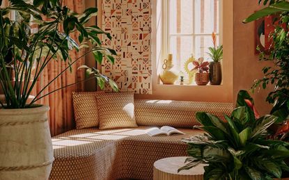
'In this porch at the London hotel, Ember Locke, it was important to pair a graphic pattern on the sofa with a tone-matching wall-hung tapestry: both patterns vary in scale but color creates a common language,' says co-founder of Atelier Ochre and designer of this room, Pauline Dellemotte.
'I would usually look at the hero pattern and pick out some complementary colors within the design,' says Bradley. 'This could then help choose a clashing print, but in a complementary colorway. Don’t ever be scared to clash together different prints and patterns, just try to keep them complementary in terms of color.'
5. Use patterns that run in different directions

Finally, to help your patterns work alongside each other in harmony, try patterns that lead the eye in different directions. 'Another tip is to make sure patterns that are next to each other don’t run in the same direction,' says Kristen. 'Switching direction allows for some relief to the eye when looking at them together.'
This example from Bryan O'Sullivan does exactly that. Bryan has used pattern drenching throughout the space, with a ceiling covered in wallpaper, but on a micro level, pillows have patterns that mix vertically as well as horizontally to keep the space interesting.
3 patterned buys to snap up now

Material: 100 percent cotton
Price: $5.99

Material: Merino wool
Price: $465

Colors: Pink and green
Price: $85 per roll
Be The First To Know
The Livingetc newsletter is your shortcut to the now and the next in home design. Subscribe today to receive a stunning free 200-page book of the best homes from around the world.

Oonagh is a content editor at Livingetc.com and an expert at spotting the interior trends that are making waves in the design world. Writing a mix of everything and everything from home tours to news, long-form features to design idea pieces on the website, as well as frequently featured in the monthly print magazine, she's the go-to for design advice in the home. Previously, she worked on a London property title, producing long-read interiors features, style pages and conducting interviews with a range of famous faces from the UK interiors scene, from Kit Kemp to Robert Kime. In doing so, she has developed a keen interest in London's historical architecture and the city's distinct tastemakers paving the way in the world of interiors.
-
 The 12 Best Table Lamps for Reading —I'm a Certified Bookworm (and Shopping Expert)
When it comes to table lamps for reading, I don't mess around. If you're the same, this edit is for YOU (and your books, or course — and good recommendations?)
By Brigid Kennedy Published
-
 "It's Scandi Meets Californian-Cool" — The New Anthro Collab With Katie Hodges Hits Just the Right Style Note
The LA-based interior designer merges coastal cool with Scandinavian simplicity for a delightfully lived-in collection of elevated home furnishings
By Julia Demer Published

