Hold everything - these 11 flooring transitions are reinventing decor, zoning spaces and looking incredibly luxe
Color outside the lines with these amazing flooring transition ideas for a fresh take on threshold styling that zones spaces and has perfect designer decor appeal
When choosing what type of materials you want running through your home, design-led flooring transition ideas may not have been top of the list of things to consider.
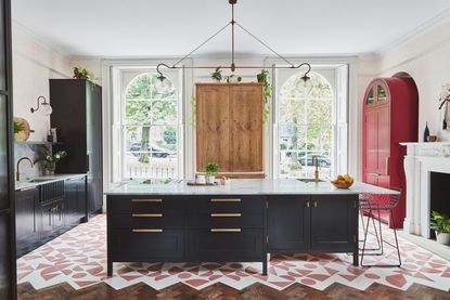
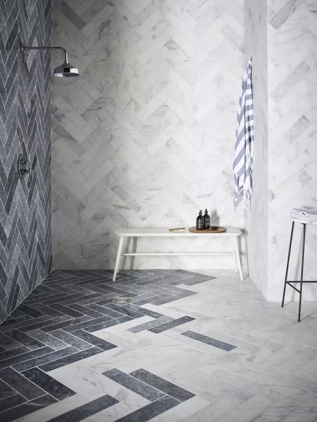
But unique transitions between different floor types, for example wood to tile, can be a way to show off a design statement. While seamless transitions are always elegant and timeless, there's also been a trend - inspired by design-forward hotels and bars - to make a display of the transition with inlays, patterns, and different materials. This can be seen in open spaces, for example from a living room to a kitchen, or in doorways.
Alice Arterberry, Principal at Arterberry Cooke Architecture, says: 'When transitioning between materials in a doorway, a good go-by is: choose the material that is harder of the two and install a single, monolithic strip of that material. For example, wood to stone would be a piece of solid slab stone as the threshold.
'When transitioning between materials in a wide pass through (greater than 10”) or just in an open change in material within a room, you can have a little more fun with pattern and material inlays - just make sure they are all flush.'
She continues: 'If you have wood plank or stone flooring you can spend a little time having a more delicate pattern of that material span the threshold. Even if you aren’t changing materials in a pass through, it's nice to have a visual pattern change to help delineate the space.'
Flooring transition ideas for a unique design statement
Cool flooring transition ideas can come in all shapes and sizes, allowing you to stray away from the traditional chrome transition strip and create an extra design element in the space.
Ellen Hatton, of BVA BarnesVanze Architects, says: 'We have lately used a thin brass pinstripe as a border between a walnut plank floor in the middle of a room and a stone edge perimeter, which was exquisite.
'Another cool flooring transition idea is that, for places where there is an extra-wide threshold, we’ll lay the floorboards in a pattern like a bullseye rather than just straight planks.'
Feeling inspired? See more designer-approved flooring transition ideas below...
1. Use the shape of the flooring layout
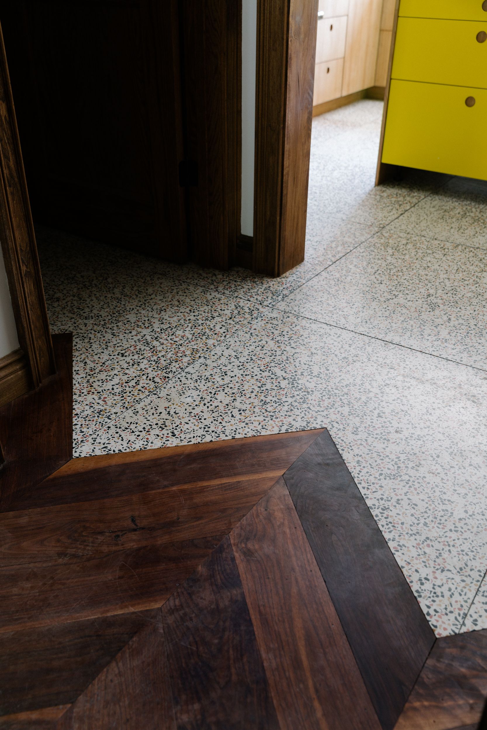
Instead of using a plank border to frame the parquet wood flooring, the design team at Brownstone Boys decided to make the transition a design feature - and continue the layout pattern into the tiled kitchen.
'We try to avoid too many flooring transitions in a space, but sometimes it’s inevitable,' say Brownstone Boys Jordan and Barry. 'We really wanted to make this one a feature, something that was special to the space.
'So, instead of just having a straight line as a flooring transition, we decided that we would continue the chevron pattern from the wood floor and cut that into the terrazzo tile.'
The design duo continued: 'What you can’t see is that that transition continues into the powder room next door on one side, and in the closet on the other.
'It’s a really fun detail and, now as you pass through these two rooms, it’s something that can really be enjoyed rather than something that is overlooked.'
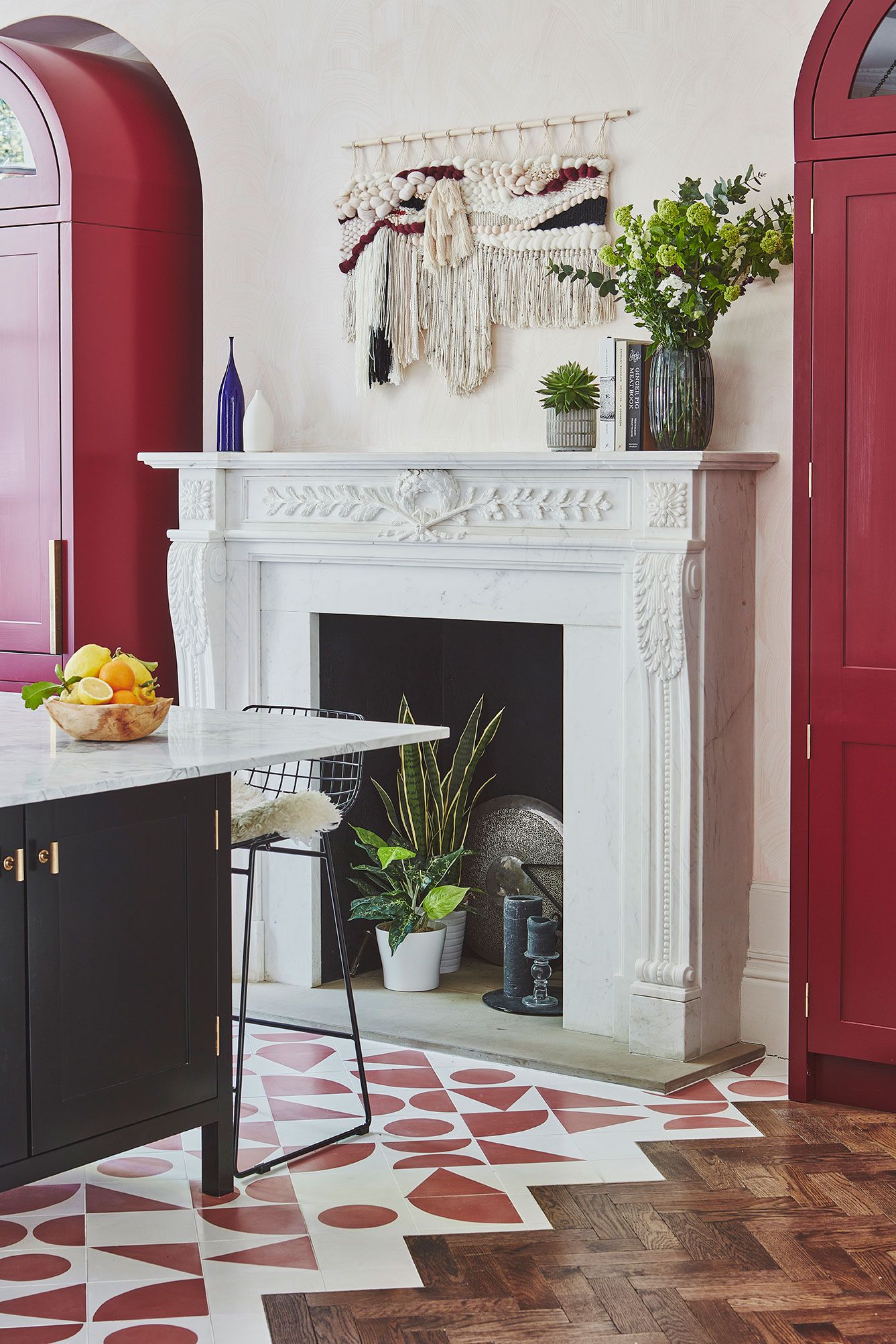
The cool flooring transition below is a clever small kitchen idea as it works to zone the space, while also picking out the red hue of the cupboards for an interesting yet curated look.
2. Let two colors overlap
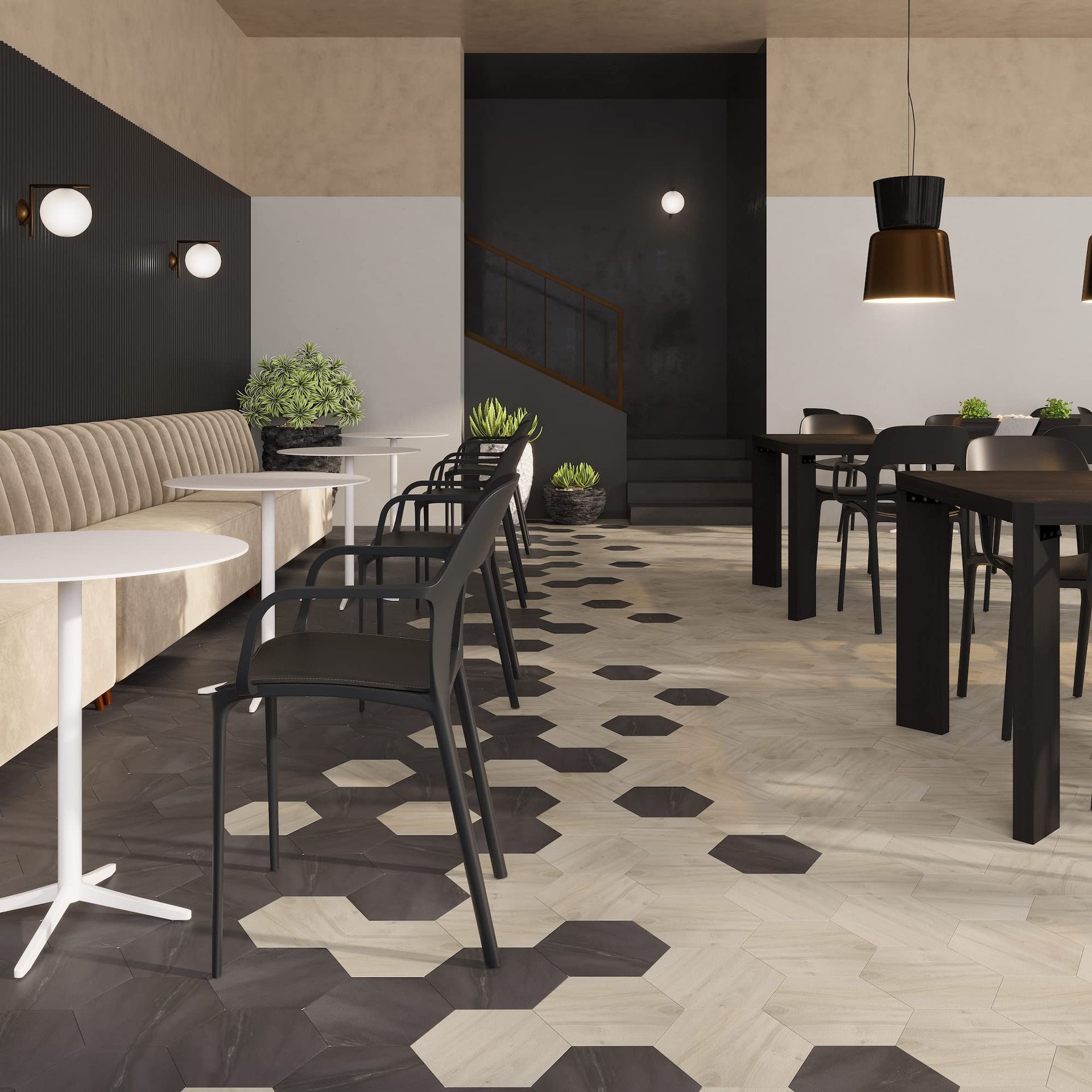
A flooring transition doesn't have to be a change of material - it can also be a change of color, too.
A color change can work to zone a space, with the darker area (below) framing the lounge seating and the lighter hue highlighting the table and bench seats.
In your home, this is is a tile idea you can use to divide an open-plan kitchen diner, or kitchen and living space.
It's also effective in a large modern bathroom where defining spaces can make it feel cozier.
3. Utilize different materials in the same dimensions
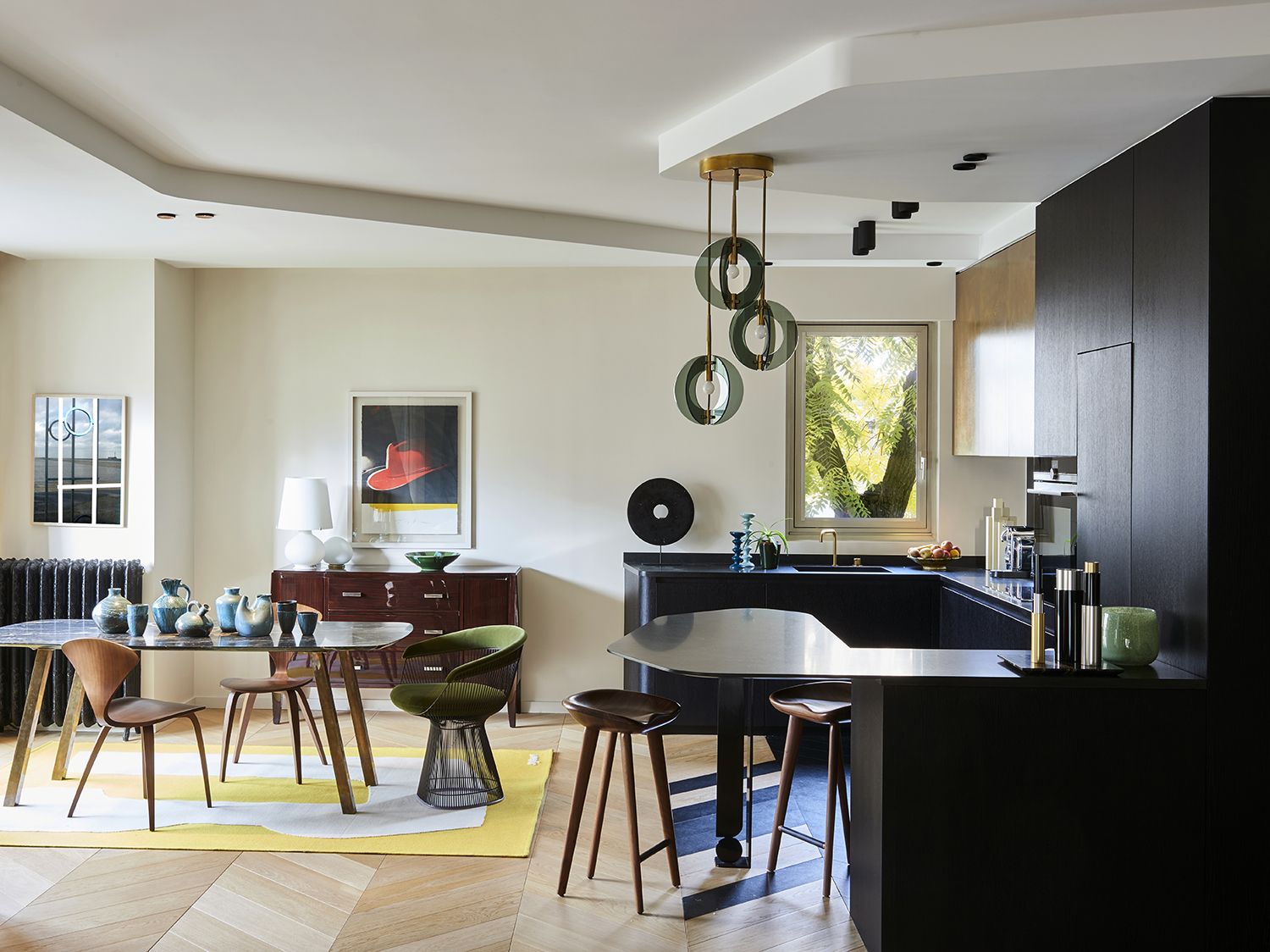
By transitioning from wood parquet flooring to a darker granite tile of the same dimensions, this beautiful space by Le Berre Vevaud gets an injection of a dynamic relationship between the two that serves as a cool design feature while also working to define space.
Co-founders Raphaël Le Berre and Thomas Vevaud say of the design feature: 'Where the kitchen and dining space meet, we gradually replaced the beech wood panels in the traditional herringbone parquet flooring with tiles made of black granite that were exactly the same dimensions.
'The effect distinguishes the difference between the spaces, while also offering practicality and a sophisticated look.'
4. Think outside the box
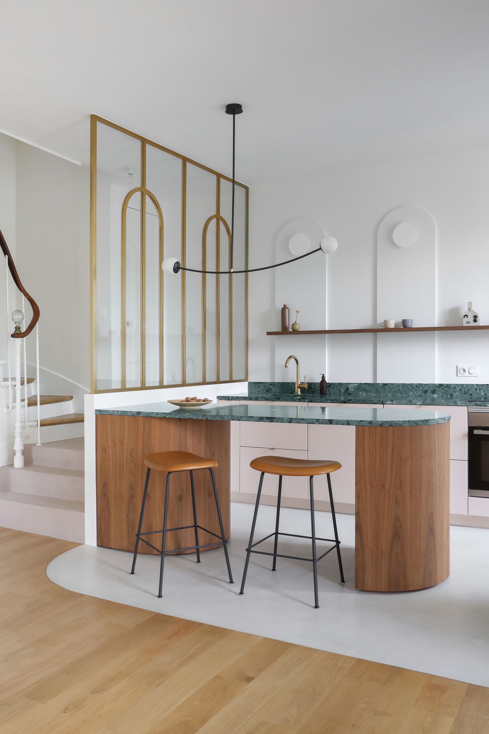
Curved flooring transitions are certainly not as common as straight lines or a rectangular inlay. So think outside the box and add in a curve for a transition that's interesting and adds subtle drama and definition to the space.
With curved sofas being one of the biggest inteiror design trends of last year, it's a shape that works to create a relaxed atmosphere, and one that is championed by many top designers.
The curved floor in the kitchen above by Hejo echoes the arches on the back wall and the unique shape of the kitchen island.
5. Create an irregular pattern to highlight a focal point
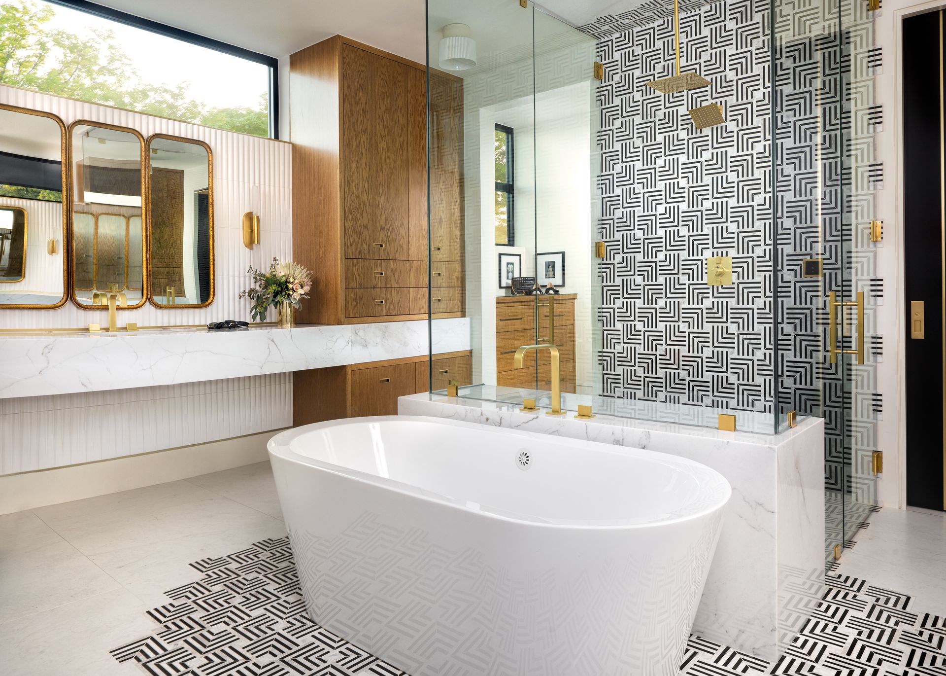
'Tile rugs' are a design feature that's more commonly seen in the kitchen, perhaps under a table to define it as a dining space.
But they can also be used to great effect to lend definition to a focal point in the bathroom. And, when combined with an irregular-shaped flooring transition, it becomes even more of a personality-packed design feature.
Eddie Maestri, principal architect and owner of Maestri Studio, says: 'By continuing the shower accent wall as a live pattern on the floor, the vessel tub is visually grounded and warmth is injected into this modern bathroom.
'I love how the patterns, details, and textures came together to make this space modern, yet warm and inviting.'
6. Highlight architectural features with flooring transitions
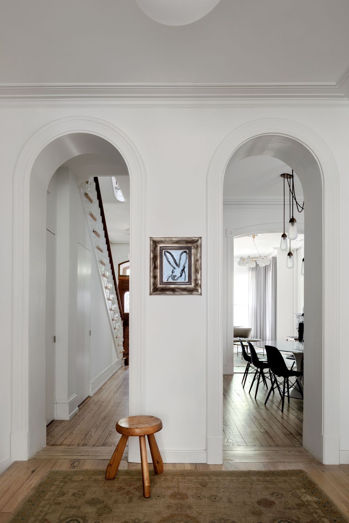
You can use your flooring transitions to highlight architectural features, like arches, which is what Kate Ballou, of Hendrick Interiors, did in the space above.
She says: 'Changing the direction of floorboards can help to accentuate architectural details and transitions between spaces.
'Doing so also gives a visual break from the floors running all in the same length and becoming a 'bowling alley', especially in row homes. Architect Lauren Wegel ensured that the depth of the archways were accentuated by changing the direction of the floor boards in this detail.'
And it so much more successful than a traditional-sized wooden threshold strip or a chrome transition strip.
7. Play with pattern and inlays
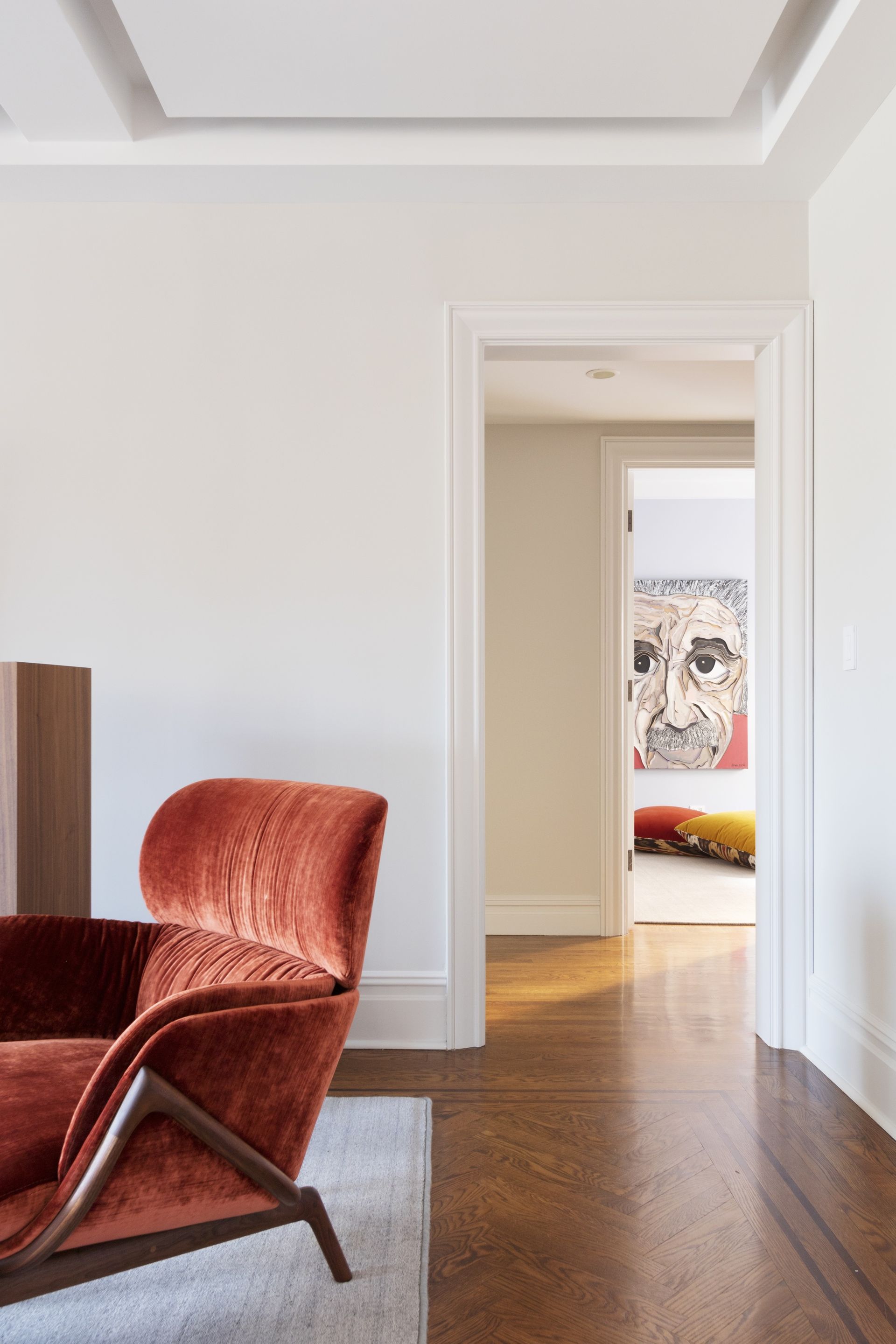
This sleek apartment in New York, by AMMOR Architecture, shows how you can add inlays and different patterns within the same flooring material to create definition and cool transitions.
The parquet area above defines the living space, while the plank layout creates flow through to the hallway and the rest of the apartment.
'You can use the same floor shade, but change the pattern in transition spaces,' says Anthony Scott, Global Product Director, Havwoods.
'Some people choose to use planks as a border, and frame out a herringbone or chevron pattern, which provide visual direction as the pattern' 'points' in one direction.'
He adds: 'You can also create transition and separation of space with beautiful brass inlays, to create a visual change with a luxurious accent.'
Sophie-Zacha Lameret, Chief Development Officer at Lucida Surfaces, agrees that brass is a stylish option for a metal transition strip, adding: 'Brass is a great way to create transition within spaces. The metal is very versatile and works with many tones and textures, creating a bridge between two flooring types.'
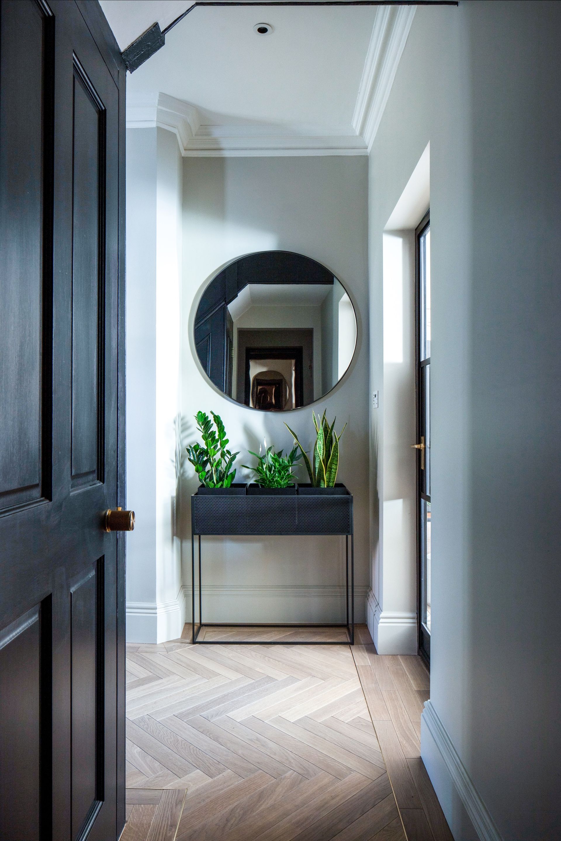
8. Make a feature with a stone or marble strip
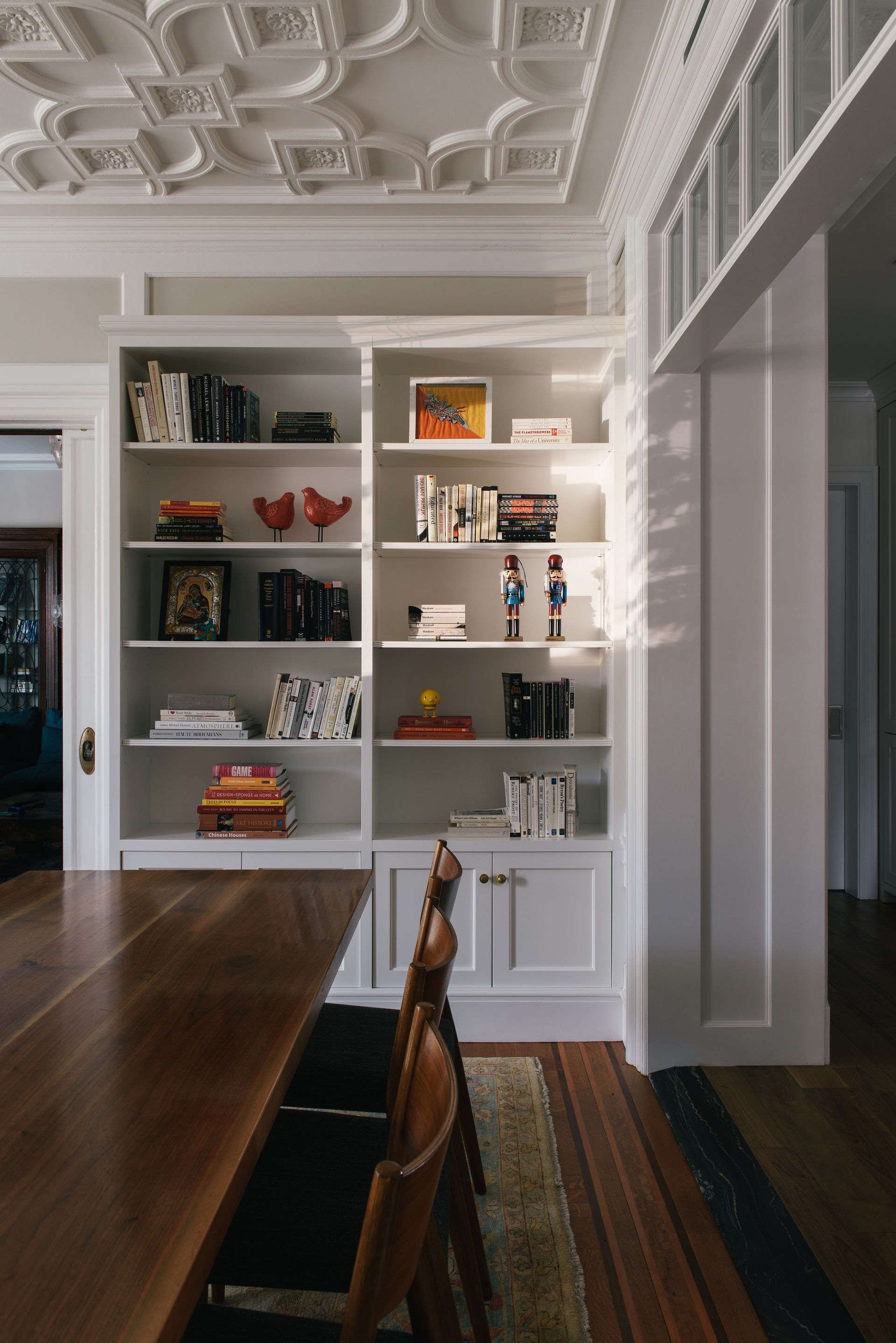
Using a beautiful piece of natural stone, like marble, as a flooring transition creates a cool design detail in itself.
Thomas Morbitzer, of AMMOR Architecture, says of the idea in the NY apartment above: 'The new floor to the right is wood-look porcelain - the client has kids and really wanted a wood floor but knew it would not hold up as well as porcelain. We selected a really well-done wood look (not all are created equal) and had the tiler put in minimal grout joints of a color that blends the seams together.
'The natural stone slab saddle is pretty subtle, but also a beautiful item in its own right. The width provides enough space between the materials for them to coexist without competing.'
9. Paint the transition strip the same color as the wall
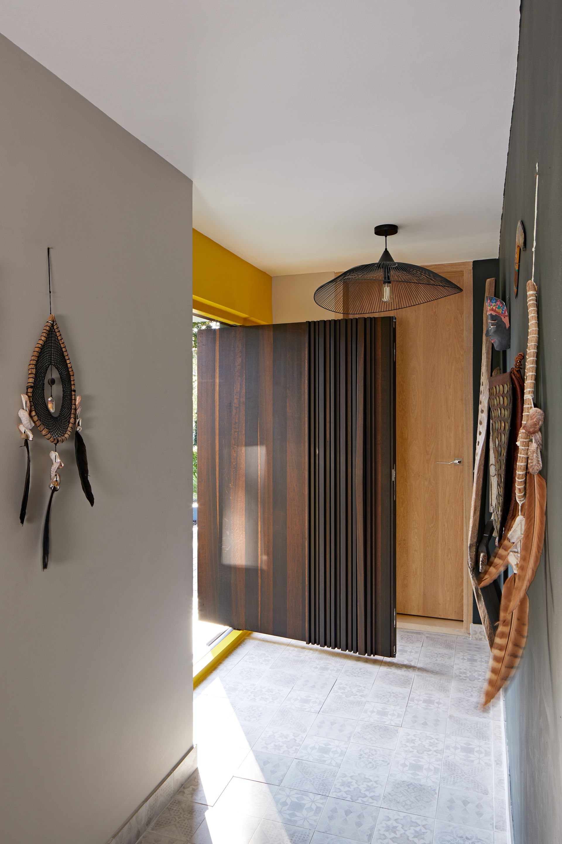
Rather than trying to hide a raised transition strip at the front door, try painting it the same color as the walls for a curated look that's also creatively a little bit different.
The pop of yellow in the entryway above injects color into the space for a fresh update, and also practically works to make guests aware of the trip hazard below.
10. Lay a tile border
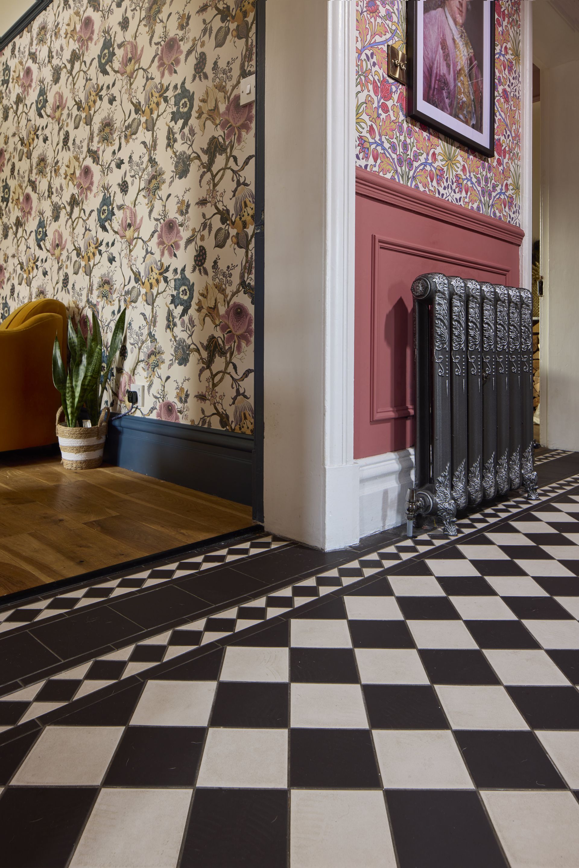
Going from tile to wood in a doorway? Make an inventive transition with a patterned tile border.
The hallway floor above shows how a smaller version of the geometric tiles, feature in color reverse, creates an interesting border between the entryway and the living room.
Lucida Surfaces' Sophie-Zacha Lameret says: 'We’re seeing a lot of transition strips being made using geometric and mosaic tiles. It's a beautiful way to bring in a design aesthetic or bold pop when done correctly.'
11. Choose a subtle change of direction
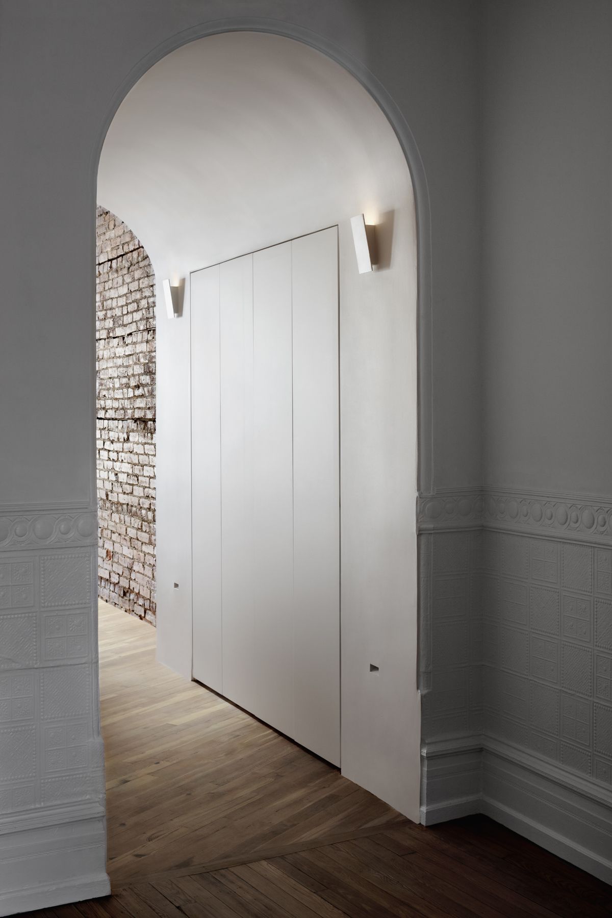
Cool flooring transition ideas don't necessarily need to be big statements - a subtle twist can be just as effective.
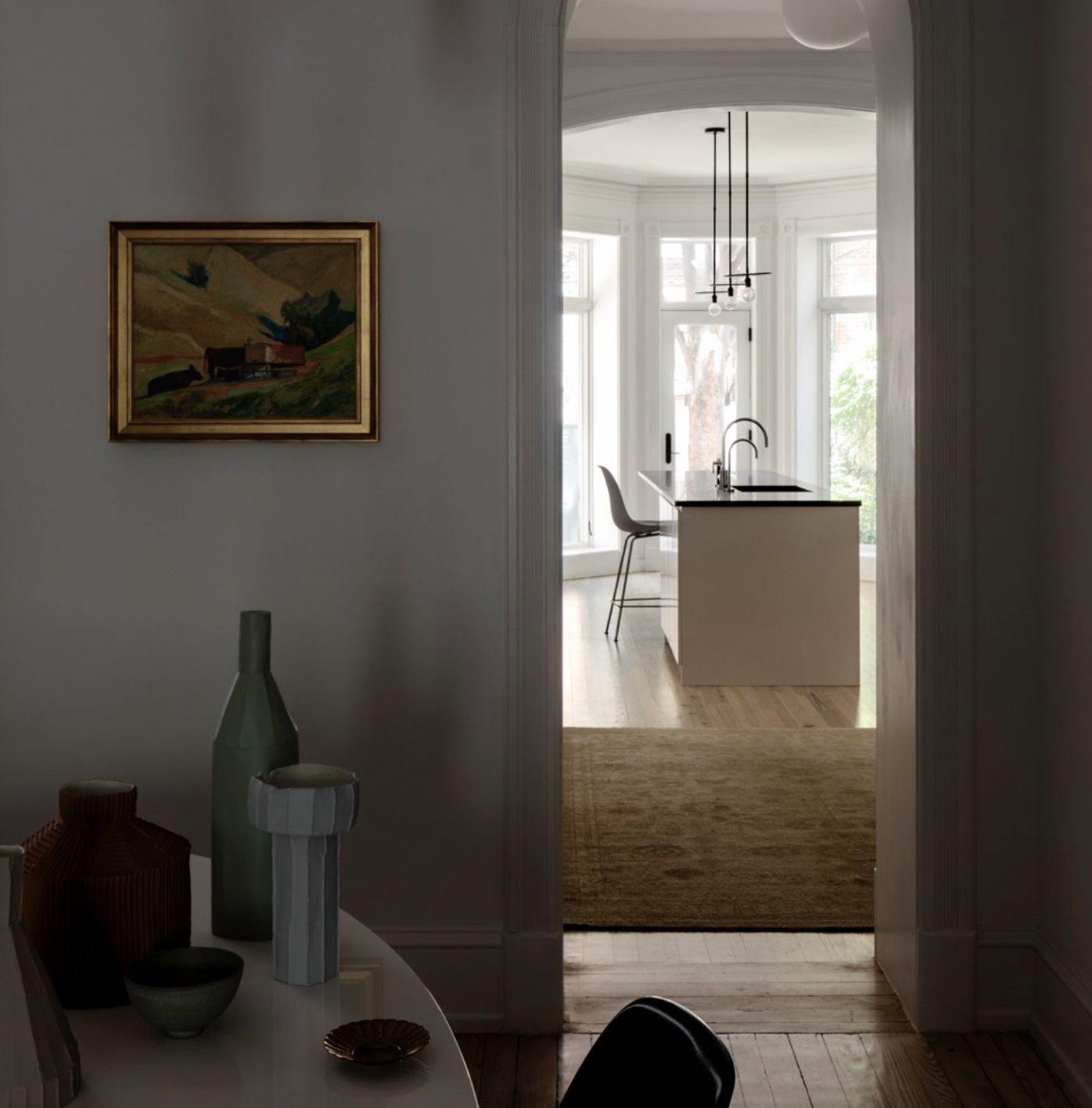
Colleen Healey, of Colleen Healey Architecture, says of the tranquil space above: 'The exterior walls of this house on Logan Circle follow the large radius of the urban circle at the city scale outside of this home. The lot and house on it are therefore a subtle pie shape. A condition that as you open up the floor plan creates an issue in flooring pattern alignment.
'To avoid pronouncing the walls not in parallel as you move to the rear of the house, we decided to turn the flooring on a 45 degree angle at the start of the new space.
'The compressed curved ceiling also helps to signal a subtle transition to a more modern part of the home and serves to provide a private area to enter the powder room hidden across from the flush pantry doors on the right hand side of the elongated archway.'
Be The First To Know
The Livingetc newsletter is your shortcut to the now and the next in home design. Subscribe today to receive a stunning free 200-page book of the best homes from around the world.
Ruth Doherty is a lifestyle journalist based in London. An experienced freelance digital writer and editor, she is known for covering everything from travel and interiors to fashion and beauty. She regularly contributes to Livingetc, Ideal Home and Homes & Gardens, as well as titles like Prima and Red. Outside of work, her biggest loves are endless cups of tea, almond croissants, shopping for clothes she doesn’t need, and booking holidays she does.
-
 The Nespresso VertuoPlus is 30% Off for President's Day, and it's Kim Kardashian's Coffee Maker of Choice
This sleek and stylish coffee maker was spotted in Kim's home bar, and you can currently save $60 if you buy yours from Amazon
By Lilith Hudson Published
-
 10 Rules For Decorating Small Spaces - How Designers Create A Cozy Room That Also Boosts The Square Footage
Experts reveal their tips and tricks on how to combine a welcoming vibe with space-stretching interior design techniques...
By Ruth Doherty Published

