6 tricks people with brightly-colored homes use to make bold schemes work - 'these rooms give you color courage!'
These mood-brightening schemes prove the effectiveness of decorating with color – they’re seriously uplifting


Lovers of neutral design schemes, look away now: highly saturated color is back in a big way. We're seeing more and more designers using vibrant, intense hues in their work, celebrating everything from primary palettes through to neon – and we have to say, it's a joyful approach to design that we kind of love.
Of course, it's understandable that decorating with color – especially highly saturated color – can make some a little nervous. But once you get started, you'll find that injecting these little pockets of vibrancy into your home can brighten your mood and even energise you.
Not sure how to get started? We've rounded up six ideas for decorating with the most intense and vibrant colorful hues – we bet you'll find something compelling in all of them.
1. Opt for ombre

Situated on the Venice Beach Canals, this home is as colorful as its surroundings. Of all the different shapes and sizes of bright tones featured in the space, the ombre walls of the kitchen stand out as a playful idea for anyone looking to experiment with new ways of introducing color.
‘The house was a blank canvas, so we had fun with colors, shapes, and textiles to make it exciting and personal to the clients,’ explains Jessica Ayromloo, principal of Los Angeles' Ayromloo Design. ‘My advice for decorating with color is to create a few variations of the palette or color combinations you are gravitating towards and see which ones complement the lighting and overall mood of the room.’
2. Follow the thread

In a more neutral color scheme, a single bright thread woven through the home is an effective way to introduce a bolder, highly-saturated hue to a scheme without the whole thing feeling jarring. Even better, choose that bright hue based on the tones in the rest of your scheme. Here, a living room by Sydney studio Atelier Alwill features a bold blue artwork by Stephen Ormandy that picks out the blue undertones of the sofa and the rug; a sculpture in the adjoining room by the same artist carries the vibrant hue through for a cohesive look.
3. Match bold with bold

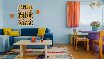
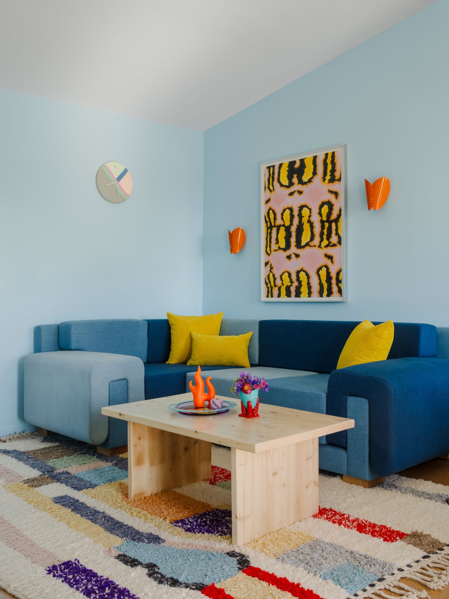
As counterintuitive as it seems, the safest way to approach bold color if you’re less than confident in decorating with it is to pair it with other bold colors. ‘If you're introducing bright, highly-saturated colors into the space they need to be balanced,’ says Leah Ring, founder of Los Angeles interior design firm Another Human. ‘Rather than a "pop of color" I generally aim to drench spaces in various colors of similar brightness and saturation, which leads to a space feeling balanced, rather than overwhelming or distracting.’
For this blue living room, she began by designing the custom three-toned denim sofa, then punched up the color with the lighting and artwork. ‘I love the combination of orange and blue together, so I sourced the vintage butterfly sconces online and then had a studio visit with artist Sarah Ippolito and loved how vibrant this artwork is – it felt like it was meant for this space.’
4. Deviate from paint

A painted wall isn’t the only way to bring in bright color. We’ve seen colorful decorative veneers being used across furniture and interior design more and more – they’re popular amongst designers for the way they help bring out the natural pattern and texture of wood. Alternatively, opt for bright lacquered furniture as an easy, less permanent way to add a pop of color to a scheme. This bedroom design is part of The House by M.A.H, interior stylist Laura Fulmine’s new concept store: the glossy texture of the red bed frame, paired with Tubes Radiatori's Bench radiator also in red, enhances the brightness of the pieces.
5. Focus the vibrancy on a single standout piece

The blink-and-you’ll-miss-it flash of bright color in this scheme is delivered via an eye-catching Tobia floor lamp by Foscarini. It’s almost neon in its intensity, but the accent is supported by the blue Camaleonda sofa by B&B Italia – and these pieces are softened by the room’s dominant tone. ‘The elegant blue of the panelings wraps around the whole parlor level, holding together the colorful accents and toning down the light to guarantee a feeling of calmness,’ says Giorgia Cedro, founder of New York architectural practice Olbos Studio.
6. Make vibrant hues pop with a dark backdrop

A blank canvas in a dramatically dark hue can help make colorful artwork or furniture pop even more than usual. Part of American fashion designer Christopher John Rogers' Carte Blanche collection for Farrow & Ball, this scheme features rainbow-colored paintings, an intense green velvet sofa and a sky-blue cabinet all against the backdrop of a rich, inky blue wall.
Be The First To Know
The Livingetc newsletter is your shortcut to the now and the next in home design. Subscribe today to receive a stunning free 200-page book of the best homes from around the world.

Ellen is deputy editor of Livingetc magazine. She cut her teeth working for sister publication Real Homes, starting as features editor before becoming deputy editor. There, she enjoyed taking a peek inside beautiful homes and discovered a love for design and architecture that eventually led her here. She has also written for other titles including Homes & Gardens and Gardeningetc. While she gets ready to buy a house of her own, she takes inspiration from the works of some of her favourite architects and tastemakers. She has a particular passion for green design and enjoys shopping small, local and second-hand where she can.
-
 The 4 Things People With Really Organized Kitchen Drawers Always Have
Level up your ‘drawer decor’ and keep things tidy and organized with these 4 essential ideas for uncluttered storage
By Becca Cullum-Green Published
-
 Experts say These 6 Paint Ideas are Devaluing Your Home — 'Be Sure to Redecorate if you Plan to Sell!'
Thinking of selling up? Avoid these paint colors to maximize the potential of your space and appeal to prospective buyers
By Ottilie Blackhall Published

