Are gallery walls going out of style? These interior designers all came to the same verdict
Carefully curating a selection of prints and artwork to create a gallery wall was once the perfect way to decorate a home, but are these days over? Experts share their thoughts
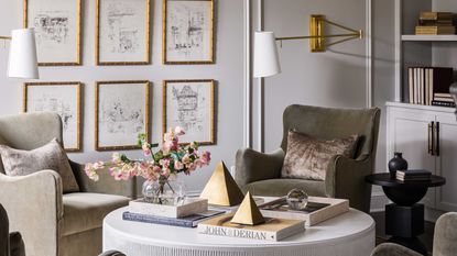

Making considered choices when displaying art in our homes is something that’ll never go out of style or fashion but gallery walls have recently come under scrutiny, being branded as ‘too put together’ or feeling a little outdated. So are gallery walls relevant for today's interiors?
‘It depends on what you are trying to achieve with the design intent of the space,' says interior designer Elizabeth Bennett, partner at Kobel + Co. 'If you are striving for a collected, artistic space with some eclectic elements, a traditional gallery wall of mixed media and frame styles will instantly hit the mark’.
So perhaps gallery walls aren’t an interior design trend that should be left in the past after all? The days of displaying sets of artwork on the walls are over but there are new and innovative ways to embrace the gallery wall that feel modern and contemporary.
1. Mix it up

A gallery wall should be personal and express your own personal style. If you’re going to implement one in your home, be sure that there is a mix of artwork that you’ve collected over the years that represents your eclectic style, weaved in with pieces that you truly love and that are personal to you.
Just be sure to mix mediums that will add interest and different textures to your space. Hayley English from Hayley English Interiors suggests ‘if it's overwhelming to curate or match several pieces together, consider a scenic hand painted or wallpaper panel instead’.
2. Go oversized
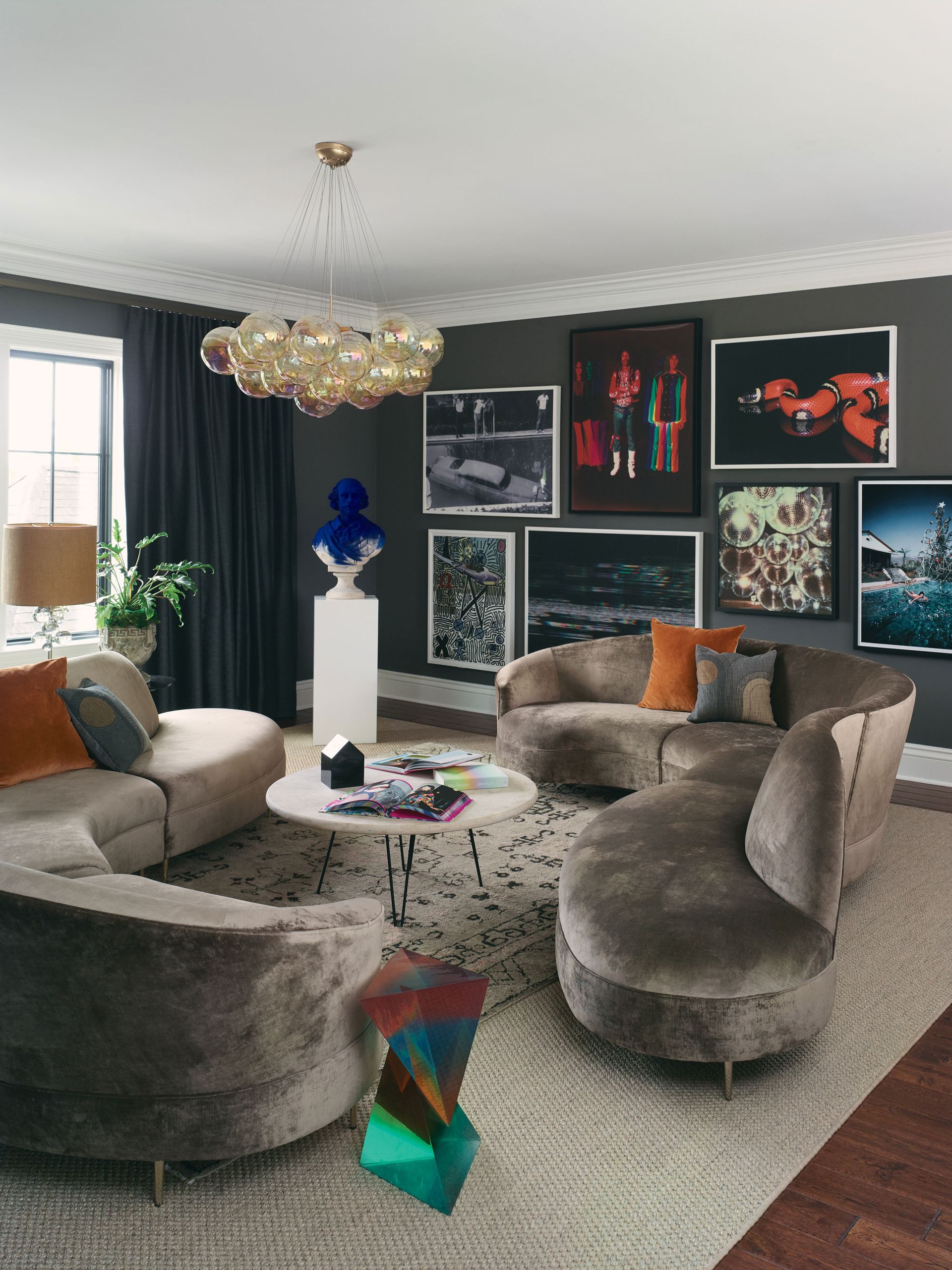
A gallery wall made up of lots of small framed artwork can look chaotic and muddled. Your eye won’t be drawn to one particular area and it can make a space feel cluttered.
Playing with the proportions of a wall can bring the room to life. Hanging two or three oversized pieces of art can make a statement and feels like a bold design choice. Mounting artwork is a clever trick for taking up more wall space and it also allows the artwork to truly stand out.
3. Include original artwork

Original pieces of art have an air of authenticity about them that cannot be replicated. But don’t be fooled, these don’t have to be heritage investment pieces, they can be original drawings or photographs that provoke a certain feeling that you’d like to convey in your home.
Elizabeth says including genuine artwork in a gallery wall is a must! ‘Make sure you include original artwork - vintage oil paintings, drawings and photography mixed together will always read more expensive than a pre-curated set of digital art’.
Avoid falling into the trap of buying pre-curated sets of artwork that feel forced or inauthentic. This will make your gallery wall feel uninspired and old-fashioned.

Price: $428
Size: 23" x 17"
4. Right place, right time

Living room gallery walls, specifically displayed behind a sofa, naturally feel quite dated as we’ve seen this set up time and time again. Choosing the right place for your gallery wall is key for making it feel modern and perfectly styled.
Consider displaying a gallery wall as staircase wall decor. This can be quite an uninspiring area of a home, but showcasing your favourite artwork or prints up the stairs is a lovely way of discovering something new every time you take a step.
Try something new and curate a gallery wall in your bathroom. If your tiles only go up the wall half way, the painted part of your bathroom is the ideal place to display some of your most beloved artwork. Using a selection of vintage and thrifted frames will suit a traditional bathroom design.
5. Choose similar scales
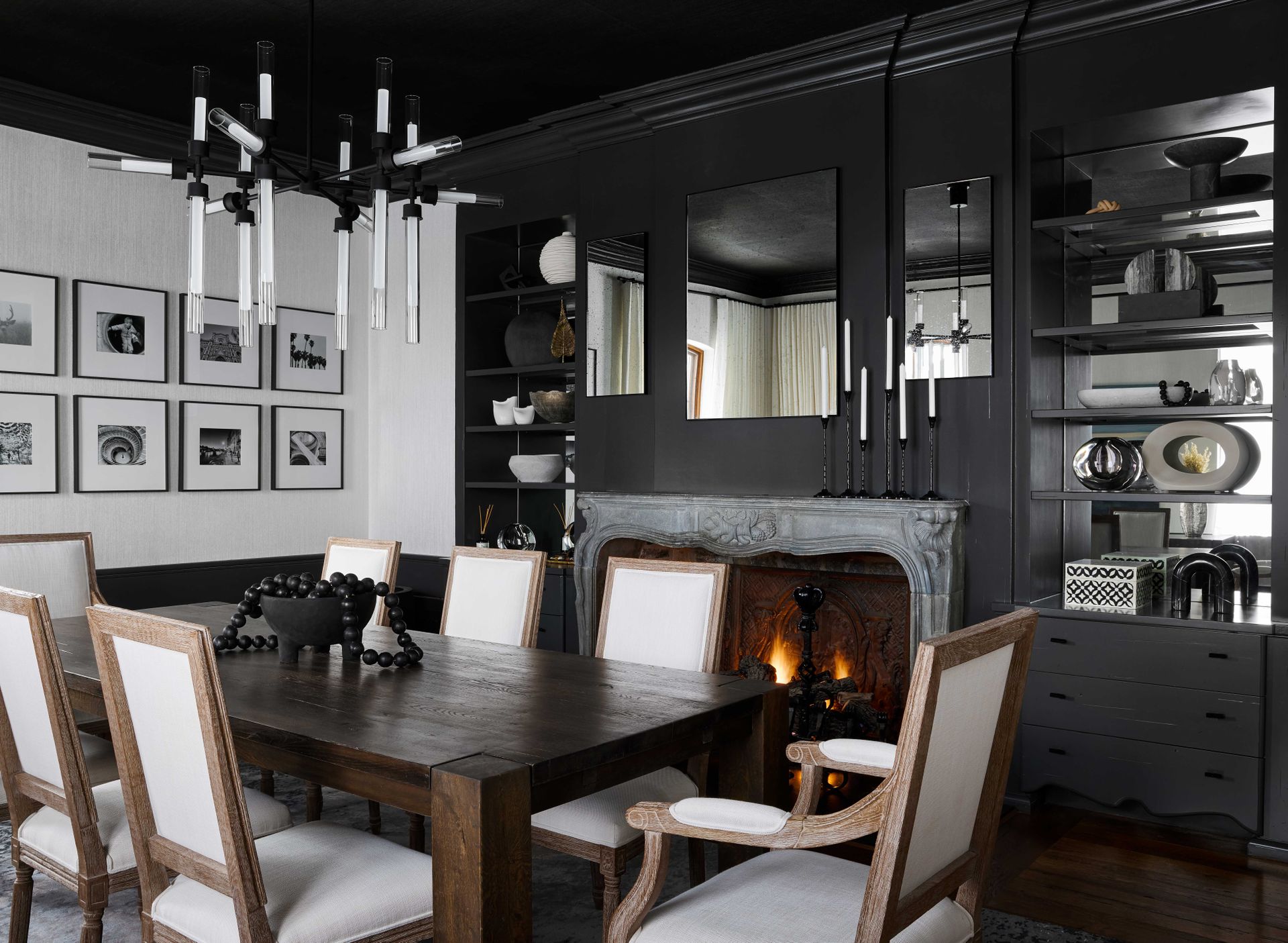
Minimalists rejoice! If your home boasts a modern minimal aesthetic, grids of artwork that follow clean lines and where all the pictures are of the same scale is one way designers are reinventing the gallery wall.
‘If you are looking for a slightly more modern, streamlined result, try a wall of repeated imagery in the same scale and format,’ says Elizabeth. Following this linear design will read as clean and tailored and suits all art mediums.
Be The First To Know
The Livingetc newsletter is your shortcut to the now and the next in home design. Subscribe today to receive a stunning free 200-page book of the best homes from around the world.

Becca Cullum-Green is a freelance interiors content creator and stylist. She fell in love with interiors when she landed her first job as an editorial assistant at a leading UK homes magazine fresh out of university. You can find her renovating her 19th-century cottage in the Suffolk countryside, consciously trying not to paint every wall with Farrow and Ball’s ‘Pitch Black’. Her signature style is a mix of modern design with traditional characteristics. She has previously worked for House Beautiful, Grand Designs, Good Housekeeping, Red, Good Homes and more.
-
 What are the Most Comfortable Pillowcases? From Temperature Regulating to the Best for Your Skin
When you're looking for comfort in your pillowcases, material matters. These are the best you can buy
By Faaizah Shah Published
-
 5 Simple, but Genius Bathroom Layout Tricks That Will Make Your Space Work so Much Harder
Small switches to how you lay out your bathroom that help make the most of a small space
By Luke Arthur Wells Published
