How do you decorate using different shades of the same color? Top tips on tonal looks
Learn how to create a cool and calming space by decorating using different shades of the same color...

How do you decorate using different shades of the same color? A tonal look can create a chic and stylish aesthetic, but you'll need to employ some interior design tricks to ensure it doesn't fall a little flat.
Clara Ewart, Head of Design at Kitesgrove, explains: 'When working with varying shades of the same color, textures and pattern help to add depth and visual interest.
'We recommend introducing pattern through wallpaper, soft furnishings and upholstery and introducing varied textures and finishes to create a scheme that feels layered and inviting.'
How do you decorate using different shades of the same color?
'Using shades of the same color within a room creates a sophisticated look,' says Amanda Telford, CTD Tiles Marketing Manager.
'It’s important to begin with one base color initially, it needs to be a hue that will have the most impact on the space. From there, you can then build out the scheme with different shades of the same hue.'
Want to give the look a go? We've rounded up expert tips on how to make it work below.
1. Create depth and contrast with light and dark

Light and dark and tonal values are key factors in successful artwork, and the principle is the same for interior design: it creates depth.
Depth is important to ensure the room comes to life and has visual impact.
Amanda says: 'To create depth, opt for very deep shades and very light shades, the contrast between the colors will prevent the room looking flat.'
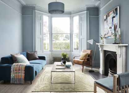
The use of light and dark tones is seen above, where a light blue Mylands paint is used to color drench the walls and woodwork and the deep blue lampshade creates contrast. Similarly in the top image, a blue room is given depth with a rich blue sofa, which also adds texture with its inviting velvet material.
2. Try a two-tone wall

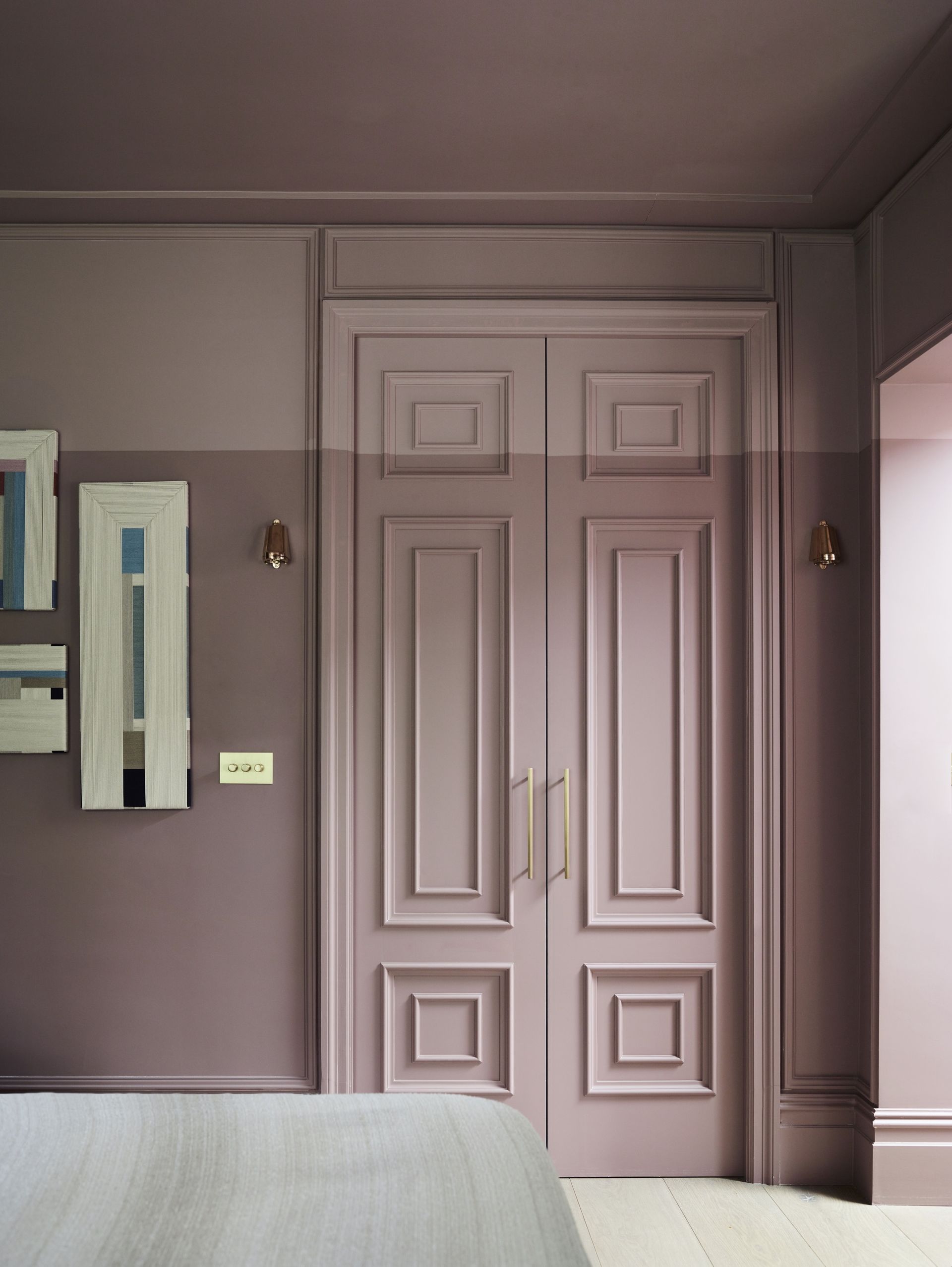
A two-tone approach is an easy and stylish way to embrace decorating with the same color. Gunter & Co harnessed the look for the master bedroom idea of a project in Notting Hill, London (above).
Irene says: 'Here, we drew a line three quarters of the way up the wall. Below the line we used Paint & Paper Library’s Rouge II, and above the line and across the ceiling we used the same colour with 50 per cent white mixed in to create a lighter shade.
'This effect also helps seemingly to raise the ceiling height and adds interest to the space.'
Emma Bestley, Creative Director & Co-Founder, YesColours, advises: 'Opting for a darker color on the lower half of the walls can create a grounding atmosphere, complement with a lighter color on the upper area and ceiling, this will add height and create a feeling of space.
'If you have a picture rail, consider painting from the ceiling all the way down for an impactful look.'
Dominic Myland, CEO at Mylands, suggests that you can use different shades of the same color for your trims and woodwork if you don't want to use the look on the whole wall
He says: 'Play with the saturation of color, for example using a much darker shade on skirting and woodwork, while keeping the walls paler and less overwhelming.'
3. Choose paint brands that offer varying tones of one color

It may seem obvious, but it's a good idea to make things easier by choosing a paint brand that actually offers a range of shades within the same color, for example Little Greene (seen above) and Paint & Paper Library; both often have five shades of one color, which begins light, and darkens each tone.
Cat Dal, founder of Cat Dal Interiors, explains: 'This way, you can have a scheme that connects all they way through the home, for example the skirting/architraves, and then can choose moments to go darker or lighter.
'For example, with Lead from Paint and Paper Library, you could use Lead II on the walls, Lead IV on the woodwork (skirting/architrave/doors) and then the ceiling in a Lead I. Then perhaps a piece of joinery in a Lead V to offer some contrast.'
4. Use wallpaper to add pattern for visual variety

Using wallpaper in the same color as the walls means you can inject pattern and dimension to the space but also keep it calming and tonal.
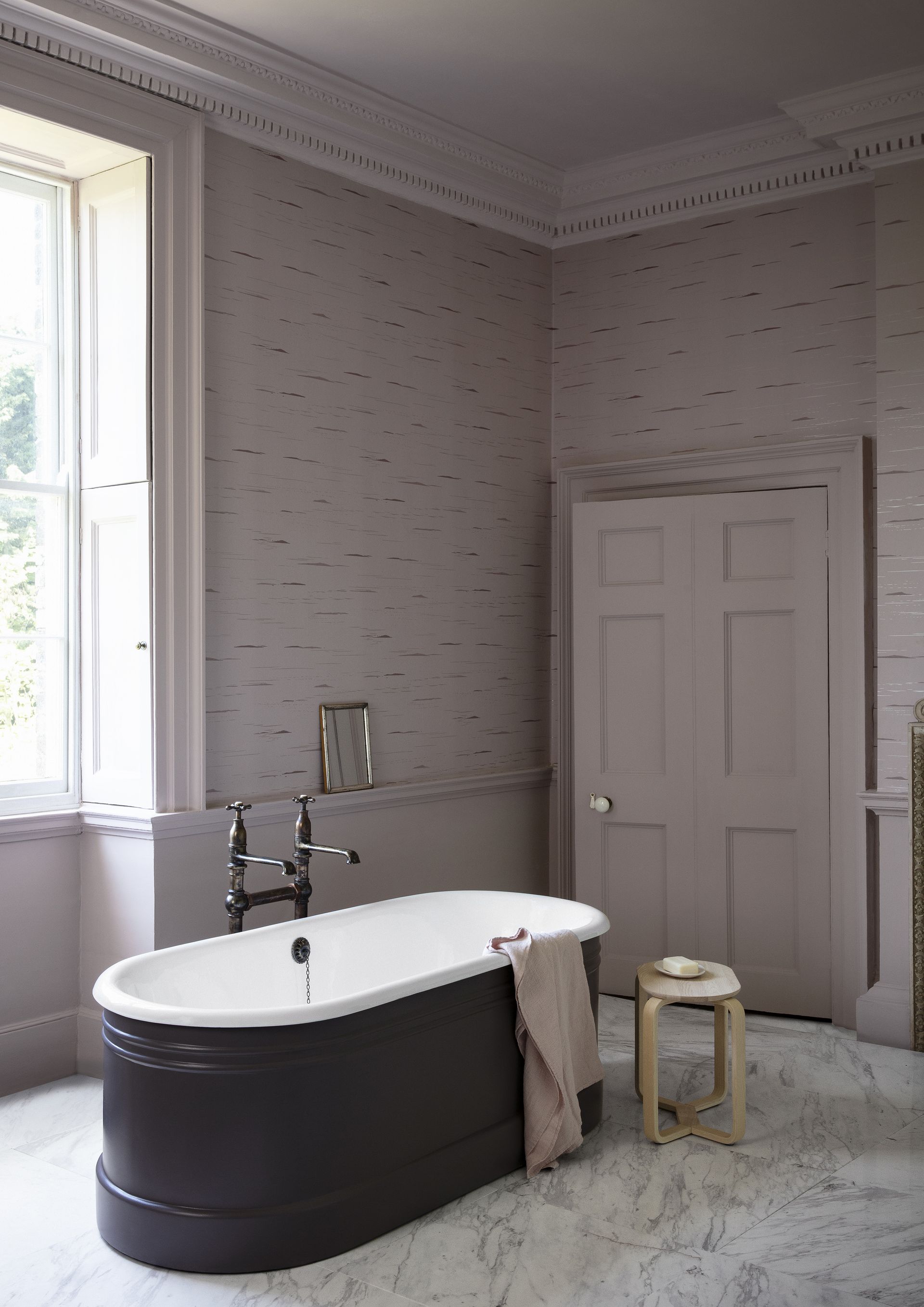
The room above shows a soft purple pink, which is given depth by a wallpaper pattern as well as a darker-toned violet-based bath. This dramatic shade is within the same color family but serves to anchor the space and add depth.
5. Mix up materials for tone and texture

Even a monochromatic space can be given life with a varied use of materials.
The room by Lindye Gallow Studio + Shop above uses three shades of grey (mid-tone on the walls, a dark shade on the sofa and lamp, and a light grey in the top half of the artwork).
This is brought together by mixing all the shades into the artwork, as well as pattern and softness in the linen cushions and the different textures of the grey steel frame and side table. An added neutral (beige) throughout the room wraps it all up nicely.
'Different patterns and textures in a shade range can help keep a room visually interesting even when it's monochrome,' says Lindye Galloway, Founder and Chief Creative Officer.
'The pops of beige in the painting are carried through the room on the pillows and the curtains, helping to add more dimension to the room against the dark background without drawing from the bold impact.'
6. Choose the right color for the space

'Studies, home offices, and libraries work particularly well when decorated in different shades of the same color,' says Kitesgrove's Clara Ewart.
'Whether this is a dark, moody and cocooning color or something softer and lighter, this can help to create a calming and cerebral identity within the space.'
For a harmonious setting, think about different tones but from the same color family.
Emma Bestley, Creative Director & Co-Founder, YesColours explains: 'Two tones of pink will feel intimate and nurturing, while two tones of purple will give a luxurious and dramatic feeling to the space. Or, for a more relaxed feeling that brings the outdoors in, try combining various tones of green.'
She adds: 'Consider how you would like to feel in your chosen room. For example, for bedroom ideas, you may want to be uplifted when you wake up in the morning so choose a color that evokes a sense of calm. When deciding on shades, go lighter on the ceiling or from the picture rail to open up the room creating a sense of space.
'A living room is the perfect spot to opt for a darker ceiling or consider painting from the picture rail upwards to create a comforting cosy feel.'
The office by Mylands above also shows how you can add interest to the space with a patterned rug in varying shades of the same color.
7. Use natural materials within the scheme

'When decorating using different shades of the same color, the use of natural materials such as timber or marble can help to introduce variety without the need for a contrasting color,' explains Clara Ewart.
'Similarly, the addition of a striking colorful sofa or artwork within a color scheme that is otherwise uniform and pared back can bridge the gap between monochromatic and a more colorful scheme.'
A neutral hue like grey is a calming choice for decorating with different shades of the same color. The grey dining room above shows are the texture of a wooden sideboard and the beauty of a marble table can add interest and dimension to the space without the need for introducing a another color.
8. Add in an accent color

If you do want to throw in another color, do so sparingly so the effect is still predominantly the tonal shade you have chosen.
Even when you are decorating using different shades of the same color, you can add at least one other shade to break up the scheme a little and ensure the room is not left feeling flat.
In the pink bedroom above, Gunter & Co used different shades of pink on the walls and ceiling, as well as a darker shade of pink on the bedding.
The introduction of teal into the scheme adds depth and allows the other shades of pink to stand out even further.
Irene Gunter says: 'You can add subtle depth by playing with shades of the same color to create visual variety.
'But, even a scheme with two colors can look a little too coordinated. My advice is to relax it with small touches of a third, fourth or even fifth color.'
9. Use the 60/30/10 rule

If in doubt, turn to age-old design practices, like the 60/30/10 rule, for guidance.
'The 60/30/10 is a perfect way to apply balance to a room and can be applied to help create a cohesive monochromatic color scheme,' Emma Bestley, Creative Director & Co-Founder, YesColours.
'Start with determining the '60' part and decide which tone of color you would like as the dominant shade.
'If it's darker, it should help you narrow down the '30' part, which will then be a lighter version of the dominant colour.
'The '10' percent can be accented with your home accessories or your trim color.'
How do you paint walls with different shades?
How to paint walls with different shades of the same color depends on a number of factors, including personal taste, the architecture of the room, and the effect you’re trying to achieve.
Dominic Myland says: 'For a more contemporary look, try painting trim darker than your walls to create a sense of depth and contrast. Alternatively, using the same paint color on the walls and trim, but using a gloss paint finish for the trim, creates a more subtle contrast.
'A lighter shade on the ceiling will also help to create a sense of height, which can be especially beneficial in smaller rooms that you want to open up.'
Can you decorate with different shades of grey?

Decorating with different shades of grey will create a calming yet cool space that won't date.
Livingetc.com content editor Oonagh Turner says: 'For a timeless look that's always going to be in style, choose a monochrome grey scheme - an idea that works really well for a living room.
'Layer up a few different grey shades to create a soft and inviting neutral living room. A grey sofa is always a good base - you'll find some great options in our shopping guide to the best sofas - then add in plenty of different textures to bring interest to the minimal color palette – cushions and throws in grey shades, natural materials like wood and rattan, and prints and artwork with a grey color palette too.'
She adds: 'Just be sure when layering shades to make sure they have similar undertones and won't clash when sat together.'
Layering different tones and textures is key to decorating with different shades of grey, says designer Kathy Kuo, adding: 'There is something so timeless and elevated about designing a living room with shades of grey - I especially love layering different tones and textures to create contrast in the room.
'Basing your design off a key piece of furniture is a great place to start when determining how other elements can best complement the space.
'Having a grey sofa or patterned area rug can quickly create a focal point in the room and adding in accent pieces with the same kind of material - such as a natural wood or metal - can help ground the design, making it cohesive throughout.'
Be The First To Know
The Livingetc newsletter is your shortcut to the now and the next in home design. Subscribe today to receive a stunning free 200-page book of the best homes from around the world.
Ruth Doherty is a lifestyle journalist based in London. An experienced freelance digital writer and editor, she is known for covering everything from travel and interiors to fashion and beauty. She regularly contributes to Livingetc, Ideal Home and Homes & Gardens, as well as titles like Prima and Red. Outside of work, her biggest loves are endless cups of tea, almond croissants, shopping for clothes she doesn’t need, and booking holidays she does.
-
 These 12 Best Table Lamps for Your Desk — Perfect Glows for a Creative Home Office
The best table lamps for your desk is have a soft, targeted glow. Elevate your WFH set-up with these stylish picks endorsed by Style Editor Brigid Kennedy
By Brigid Kennedy Published
-
 The Nespresso VertuoPlus is 30% Off for President's Day, and it's Kim Kardashian's Coffee Maker of Choice
This sleek and stylish coffee maker was spotted in Kim's home bar, and you can currently save $60 if you buy yours from Amazon
By Lilith Hudson Published

