This tiny apartment uses clever tricks to look bigger - that any small space can be enhanced by
A tiny apartment was transformed into a modern living space that still keeps its historic feel, mixing stainless steel, a wood box bedroom, and a rich color palette


In the face of good design, a small space doesn’t pose an issue. Innovative solutions can be found in even the tiniest spaces through clever use of materials and layout. This Greenwich apartment project is a perfect example. After having been neglected for decades it was falling apart, but through careful renovation, it refound its Parisian attic-space vibe that reminds one of an artist’s loft.
The most stunning feature of the apartment was its 22-foot tall skylight but with a long and narrow shape the design needed to make the best use of the natural light. Light colors that would keep the feeling of space were mixed with pops of yellow, rust, and natural wood tones, while reflective materials such as stainless steel enhance the light in the loft.
In spite of the small footprint, the apartment feels very spacious due to its main open area, while the separate cozy bedroom allows for privacy. The creative team behind the operation talk to me about how it was all achieved so successfully in this modern home.
The surprising materials and colors palette

When small space decorating it’s important to make the best use of the natural light. An overall white and neutral tone palette was used for the walls, but there was another benefit to it. BoND, the architecture and interior design firm that completely transformed this space managed to achieve an artist's loft feel with walls like a canvas next to which an interesting mix of materials stand out. The yellow and rust tones of the living furniture add a joyful pop of color.
‘We tried to inject a rich and surprising material palette into this project, to emphasize the feeling of sculptural objects that have a clear identity and presence in the space - like in an artist's studio,’ says Daniel Rauchwerger, co-founder of the practice.

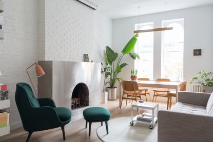
The original floors and moldings were sanded and stained, while newer, more contemporary materials were introduced alongside. What stood out to me, in particular, was the use of stainless steel. The coffee table, console, and kitchen cabinet fronts, are all stainless steel, creating a very modern look contrasting with the warm wood of the floors and that of the box bedroom walls. This is not the only project of the design duo where the material was used.
‘The use of stainless steel here - and in other works of ours - is related to it being a very "New York" material - like the subway cars, gates, restaurant kitchens, and so many other things... we wanted to bring this industrial edge into an otherwise very light, pristine home,’ explains Daniel.

For their Chelsea apartment project, the original brick fireplace was wrapped by a cut-and-folded sheet made of stainless steel, commissioned at a local workshop in Chinatown, giving the room a contemporary edge. The added benefit is the reflective quality of the material, bouncing light off into the rooms.
Making the best use of the limited space

The small footprint of the flat meant that the design team needed to make the best use of every inch of the floor. In a bold move, the walls between the main living area and the rest of the apartment were taken down completely to open up the space. The result is a contemplative room where one can lie down and look up at the skylight pouring light in.
You might be wondering what happened to the bedroom. Even though the walls were taken down, a beautiful bedroom was created within a wooden box. It’s a great small bedroom idea - incredibly cozy, and the wood walls of the box bring great warmth to the space. Planned in collaboration with and executed by Lesser Miracle, the bedroom is a warm cocoon that contains a bed and storage elements.
The overall feeling I get from looking at this project is one of joy. It’s showing the possibilities of how good design can transform a space, no matter its size, or previous state of neglect. From a run-down, tiny apartment, a beautifully bright, light, and inviting space was created by taking down walls, using light tones mixed with pops of color and cool reflective surfaces, while still keeping that feeling of warmth and coziness through the ingenious build of the wooden box bedroom. Plenty to get inspired by here that's for sure!
Get the look of this Greenwich apartment with these buys

Price: $889.99
This super comfy sofa in a light color will lift up your space. You can style it with throws and blankets in warm, natural colors.

Price: $2,274
This is an investment, but what a statement it makes! Use just one table or multiple dotted around your living space. The stainless steel is a great light reflective surface too.

Price: $798
This accent chair will be a joyful pop of color in a light scheme and brings a more traditional twist to a modern room.
Be The First To Know
The Livingetc newsletter is your shortcut to the now and the next in home design. Subscribe today to receive a stunning free 200-page book of the best homes from around the world.

Raluca is Digital News Writer for Livingetc.com and passionate about all things interior and living beautifully. Coming from a background writing and styling shoots for fashion magazines such as Marie Claire Raluca’s love for design started at a very young age when her family’s favourite weekend activity was moving the furniture around the house ‘for fun’. Always happiest in creative environments in her spare time she loves designing mindful spaces and doing colour consultations. She finds the best inspiration in art, nature, and the way we live, and thinks that a home should serve our mental and emotional wellbeing as well as our lifestyle.
-
 What are the Most Comfortable Pillowcases? From Temperature Regulating to the Best for Your Skin
When you're looking for comfort in your pillowcases, material matters. These are the best you can buy
By Faaizah Shah Published
-
 5 Simple, but Genius Bathroom Layout Tricks That Will Make Your Space Work so Much Harder
Small switches to how you lay out your bathroom that help make the most of a small space
By Luke Arthur Wells Published

