There's a subtle new color trend that makes neutral schemes feel like a vacation – this house nails it
Design studio Hendrick Interiors uses the best understanding of color and styling there is to create an uplifting and calming modern home in Washington D.C.
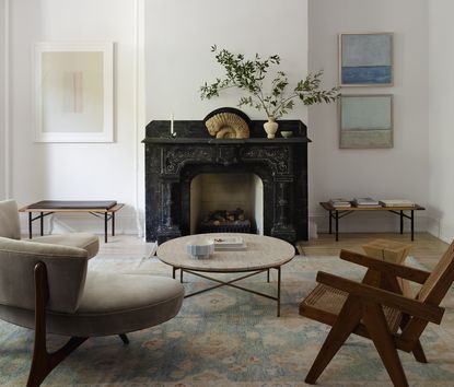

Avid readers of Livingetc might already know what the big color trends are in interior design. We've been touting honeyed tones - used by the likes of designers Noa Santos and design studio Post Company to create warming schemes that are only a notch or two up from netural. We've been highlighting pistachio, seen in projects by YSG Studio and, yes, Noa Santos again, which delivers a very restful take on the ever-calming green. But bubbling under, as a trend for accent tones, is a differnt color entirely. Powder - or baby - blue.
We've seen it featured quite often recently. Pierre Yovanovitch added it into an otherwise pale bathroom in Paris, and the designers behind rug brand A Rum Fellow have used it as a grounding neutral on the walls of an otherwise pop-bright living room. And now, proof that this is a mini interior design trend comes from how Kate Ballou of Hendrick Interiors has added it into the otherwise pared-back palette of this home in Washington, D.C. 'I love using blue as a more dynamic neutral,' she says. 'It gives color to the space without being loud or garish. When a client is drawn mostly to subdued colors, or there is a more neutral vision for the overall design, I will use blue to introduce warmth and interest. This not only keeps the space calm, but also creates a sophisticated mood.'
So how does sky blue go from being a cool shade to one that adds heat?
Family living room

Let's start with the most nuanced use of powder blue. So subtle it's almost not there, the objets on the bookshelf of the informal living room are tinged a blue so pale it's almost grey. They connects to the peachy couch - they're both the same level of pastel as each other.
'The sofa’s peach tones play so well with the blue in the accessories,' Kate says. 'Blue and orange are complimentary colors, so they create visual energy when they are paired together.' This is how color theory can be used to create arresting schemes, putting shades together that sit opposite each other on the color wheel. 'The fact that they're both pastel — rather than more dynamic jumps in color — adds to the calmness of the room,' Kate continues. 'We wanted to keep the room light and airy while letting the forms speak for themselves.'
3 perfect powder blue accessories

Even the candlestick itself is made of wax, begging the question: is this poweder blue scented candle actually too pretty to burn?!

In the same powder blue as a morning sky comes this dreamy cloud-shaped vase, from the master of decorative objets Jonathan Adler.

Add to an equally pastel or just as soft grey couch for an all-over tonal look.
Living room

For this transitional-style living room Kate kept the furniture quite monochrome. But again, powder blue appears on the area rug and in the art - very intentionally on both the wall and the floor.
'The patterned rug activates the room by providing contrast with the neutral furniture,' Kate says. 'The blue keeps your eye moving around the room from the walls to the floors — and everything in between. It's a great transition color between the very light walls and darker elements in the furniture and upholstery.'
Traditionally, blue is seen as a cooler color, but clearly that's not the case here as this reads like a fairly cosy living room. Kate says likes to blend blues in a space like this, and while powder blue is used a fair amount, so is the stronger cerulean. 'It has a bit more pigment [than baby blue] and a touch of gray,' Kate says. 'These elements keep it grounded as a neutral while still being light and cheerful. I am consistently drawn to this color because it catches the eye without being distracting. With it, the eye also moves around the room in a soft and comfortable way.'
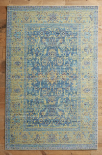
Albufera rug, Anthropologie
This Persian-style area rug has all the right notes of blue in it, tempered with a soft mustard. It'll not clash with or overpower neutral shades - in fact, it'll make them seem softer.

When seen from a different angle, without the blue art on the wall, the rug takes on a much more neutral apperance. The two need each other to draw out the color from each other.
But Kate's sparing, edited use of blue is very clever. By not filling every corner with it, and reserving who sightlines to be as grey and white as this one, when you do come across the shade you really feel like you're having a visual vacation, a little moment of a treat or respite in an already calming space.
Blue details

Between the two arched doors looking out to the entryway, the only color in this space, really, is a touch of blue in the oil painting by Hunt Slonem. Again, it's a tiny detail that really serves to lift the whole area.
'The minimal figure of the bunny adds an element of playfulness,' Kate says. 'The bright blue also pops in a way that is unexpected. The blue reads as a neutral, but still catches your eye at the same time. That’s why it's such a successful color in this space. The luminosity of the painting really shines here!'
Bedroom

Even in the neutral, calming modern bedroom Kate has found a way to add a sliver of blue - and isn't it uplifting?!
'Indeed! I find this Cerulean blue color incredibly relaxing for a bedroom,' Kate says. 'It has a bright and cheerful tone but it is soft and calming at the same time. It isn’t a color that is overpowering. It’s hard to get tired of it quickly. I also love how the blue of the blanket speaks to the neutral browns in the carpet. Selecting the right color bedding for this space was challenging because we needed a color that would work with charcoal, brown, and beige. This warm blue was the perfect color to tie them all together.'
See more work from Hendrick Interiors.
Be The First To Know
The Livingetc newsletter is your shortcut to the now and the next in home design. Subscribe today to receive a stunning free 200-page book of the best homes from around the world.

The editor of Livingetc, Pip Rich (formerly Pip McCormac) is a lifestyle journalist of almost 20 years experience working for some of the UK's biggest titles. As well as holding staff positions at Sunday Times Style, Red and Grazia he has written for the Guardian, The Telegraph, The Times and ES Magazine. The host of Livingetc's podcast Home Truths, Pip has also published three books - his most recent, A New Leaf, was released in December 2021 and is about the homes of architects who have filled their spaces with houseplants. He has recently moved out of London - and a home that ELLE Decoration called one of the ten best small spaces in the world - to start a new renovation project in Somerset.
-
 What are the Most Comfortable Pillowcases? From Temperature Regulating to the Best for Your Skin
When you're looking for comfort in your pillowcases, material matters. These are the best you can buy
By Faaizah Shah Published
-
 5 Simple, but Genius Bathroom Layout Tricks That Will Make Your Space Work so Much Harder
Small switches to how you lay out your bathroom that help make the most of a small space
By Luke Arthur Wells Published
