Before and after: one tiny tweak to this kitchen's cabinetry made so much difference to its storage space
This clever kitchen redesign increases storage space and brightness without changing the footprint


Kitchens aren't easy spaces to remodel. The list of needs for a functional and stylish cooking space can grow pretty long to the point where meeting them all feels impossible, but sometimes the simplest of design ideas can offer the best solution. In this Mid-Century style home, the lack of light, dated cabinetry, and insufficient storage space made for a lackluster kitchen, but a team of designers have since added subtle ideas that invite more light in and help to cut the cluttered look, and we'll be taking a leaf straight out of their book.
Preserving the inherent vintage charm of the three-bed Californian home remained the primary objective throughout the renovation. Briefed with the task of 'embracing the Mid-Century style while infusing a more current aesthetic and optimizing functionality', the design team really hit the mark. ‘Given that we were tasked with renovating a relatively small kitchen we relied on innovative storage solutions to optimize the functionality of the room,’ explains Jennifer Verruto, founder and CEO of Blythe Interiors. We caught up with Jennifer to learn more about how she turned this once-dated space into a fresh and inviting modern kitchen.

Before the renovation, the kitchen lacked natural light. Dated dark wood cabinets, hardware, and worktops meant the space wasn't uplifting, and the lack of storage meant it wasn't maximized in terms of functionality either. While brightening up a design can be relatively easy to do through clever use of color and materials, adding more storage without increasing the footprint of a room can prove to be quite tricky. The space had to be transformed both in look and functionality without any major renovating works, but Jennifer's team at Blythe Interiors mastered the task.

‘Given the small size of the kitchen and the need to maintain the same layout, we maximized storage with custom inserts, better cabinet ideas, and understanding how the homeowners used the space and what they needed to store,’ explains Jennifer Verruto of Blythe Interiors. As with any renovation project, understanding your individual needs for the space is crucial before you start planning.

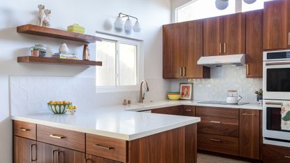
To optimize the space, there's one particular trick to increase the kitchen storage that's so simple and effective, yet so subtle. On first look at the space it appears that the cabinets have remained the same size, however, look twice and you’ll notice a small change that makes a big difference.
‘We were able to take the cabinets 10” higher to meet the window line, giving the clients lots of vertical storage for their wonderful mid-century collections,' says Jennifer. 'Every inch has intentional use making the kitchen layout work more efficiently and almost double the cabinetry storage.'

Good kitchen storage doesn’t stop at maximizing all available space, though. It’s also how the space is optimized within that makes a big difference. You can add (and save) so much space in a small kitchen by simply keeping your storage super organized, and the Blythe Interiors team aimed to facilitate this through their redesign.

‘Not all cabinets are created equal,' says Jennifer. 'If you’re using existing cabinetry, make sure to utilize inserts. Roll out trays, storage systems for lids, pots and pans, trash pullouts, spice racks, and lazy susans for spices, all go a long way.'
When it comes to choosing the best type of kitchen storage, think drawers. They are more functional than shelves as you can utilize the whole space within, and they also allow for all items to be reached more easily without having to shuffle anything about to see or access behind it. If you’re updating cabinetry, Jennifer also recommends installing double drawers for pots, pans, and triple drawers for the likes of spices, baking needs, and Tupperware containers. 'A drawer can handle double the contents of low cabinets,’ she adds.

While there's nothing that can beat good storage and physical square footage, don’t forget that you can make a space appear bigger and brighter with simple design tricks, too. In a small space, everything counts, so use every asset available to your advantage. We’re all familiar with the power of painting walls in a fresh white to impact how a space feels, but, as Jennifer goes on to explain, you can’t achieve that with just any old white.
'If you use a white that pulls yellow or gray, it can make a space feel dingy and dark,' she says. 'We love to use Sherwin Williams Snowbound, with no undertones, to make a room shine and let the other colors do the talking.' A case in point is the beautiful home bar area shown above and below, with its mint green paneling that feels so fresh against the white walls.

'To finish off the look, we also topped the walnut cabinets with solid white quartz and a playful all-white backsplash to help brighten up the space,’ adds Jennifer. To play into the Mid-Century Modern style, she also finished off the room by adding a statement pendant and an additional sconce to illuminate the space.
This kitchen renovation is a prime example of how subtle but impactful design hacks can make such a stark difference to the overall look and usability of a space. Let this be a lesson in beautifully balancing Mid-Century nostalgia with contemporary efficiency.
Get the look

Price: $898
When keeping the design of your kitchen on the minimalist side, add a statement ceiling light for that extra layer of interest that draws the eye up.

Price: $1,798
This beautiful teak table will look great in a mid-century stile open plan kitchen and dining space. Its smooth surface and darker color will add an elevated feel to the room.

Price: $300
Add joyful touches to your kitchen like this beautiful ceramic fruit bowl that you can display on your worktop, whether in use or not.
Be The First To Know
The Livingetc newsletter is your shortcut to the now and the next in home design. Subscribe today to receive a stunning free 200-page book of the best homes from around the world.

Raluca is Digital News Writer for Livingetc.com and passionate about all things interior and living beautifully. Coming from a background writing and styling shoots for fashion magazines such as Marie Claire Raluca’s love for design started at a very young age when her family’s favourite weekend activity was moving the furniture around the house ‘for fun’. Always happiest in creative environments in her spare time she loves designing mindful spaces and doing colour consultations. She finds the best inspiration in art, nature, and the way we live, and thinks that a home should serve our mental and emotional wellbeing as well as our lifestyle.
-
 The 12 Best Table Lamps for Reading —I'm a Certified Bookworm (and Shopping Expert)
When it comes to table lamps for reading, I don't mess around. If you're the same, this edit is for YOU (and your books, or course — and good recommendations?)
By Brigid Kennedy Published
-
 "It's Scandi Meets Californian-Cool" — The New Anthro Collab With Katie Hodges Hits Just the Right Style Note
The LA-based interior designer merges coastal cool with Scandinavian simplicity for a delightfully lived-in collection of elevated home furnishings
By Julia Demer Published

