Explore this semi-detached house in south London with a pared-back palette
This semi-detached house in south London boasts minimal design and neutral tones for a family home that's serene yet stylish.

The property
A semi-detached house in south London, built in the mid 19th century. The modern home is a living room, snug, open-plan kitchen and dining room, and a WC on the ground floor. Upstairs, there is a master bedroom, shower room, family bathroom, the children’s shared bedroom, two guest bedrooms and a small office. The basement contains a laundry room.
Kitchen
With help from architect Jonathan Douglas, the house’s awkward layout, narrow hall and galley kitchen have been rationalised to create a flowing mix of intimate rooms and bright, open-plan space.
Once the owners decided to stay and renovate, gaining planning permission in this conservation area took several years. Finally, the family moved out and the builders moved in, completing a total reconstruction in a speedy nine months. At one point, all that remained was the front wall and the side return wall, the rest was demolished.
Despite the scale of the renovation, the finished design references the house’s original shape and structure. Instead of a grand new statement, there are Georgian-style low windows, exposed rafters, cabin-like wall panelling and a layout which includes a cosy living room at the front and a good mix of family areas.

The house was extended by about four metres at the back, creating additional space for the kitchen. A slim section of glass in the flat roof boosts the room’s light feel. Emma and Dan’s love of timeless, slightly country-ish style is visible in the kitchen. Marble worktops and a butler’s sink are teamed with classic metro tiles and handsome cabinets. Copper pendant lights add a warm, metallic glow to the serene kitchen.
The large butler sink is used for washing up while a second sink, recessed into the marble worktop, is used for filling drinks.Neat, deeply recessed lights boost the light supplied by pendants and wall lights.

SNUG and living room
The couple decided against opening the house out completely in favour of creating some smaller, more intimate spaces. The living room has a wood burner and no TV.
Settling on a palette of soft whites and greys, the owners' idea was to add colour at a later date. But they've ended up loving the calmness. The colours create a softness that suits the house’s cottagey vibe.

Located in the centre of the ground floor, shelving wraps around the ‘man’s snug’ providing space for books. The shelving is painted oak. Sliding doors transform it from an extension of the living area into a cosy, intimate library.
Desk area
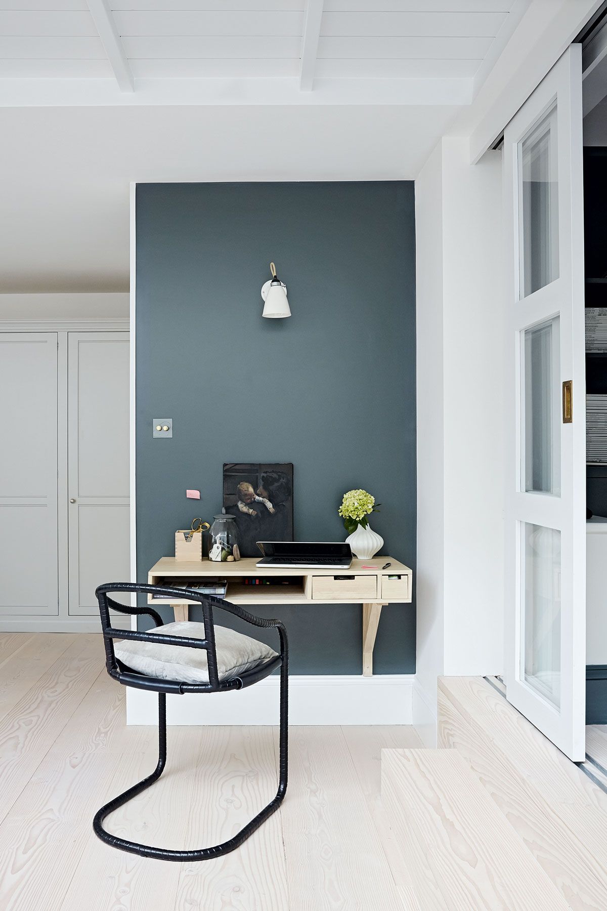
A wall-mounted desk creates a neat area for admin in the corner of the large, open-plan kitchen and living area. The wall paint echoes the look of the snug, which lies just beyond the sliding doors.


HALLWAY
The newly expanded hallway is a favourite part of the house. The genius of Jonathan Douglas, the architect, was to reconfigure and extend this space so it feels wide.

MASTER BEDROOM
Formerly a bathroom and the kids’ room, the master bedroom lacked height. The ground floor was lowered to level the kitchen-living area with the garden and gain more ceiling height here. Part of the ceiling has been removed to reveal the soaring roof rafters and bring the cabin-chic look the couple loves.

FAMILY BATHROOM
The modern bathroom is a new space, created by squaring off the dog-legging, single storey ground floor below and building over it. A wet room finish makes the most of the space, and no-nonsense fittings kept costs down.

See Also: Black and white bathroom ideas for a modern, monochrome look
Children's bedROOM
The design of the cabin-style bunks were inspired by some the owner had slept in on holidays in Cornwall as a child. The ceiling has been removed above the bunks, to create a lofty play space, accessed by a ladder.

DINING AREA
The panelling on the walls of the dining area looks slightly cabiny, slightly cottagey.

Contact Jonathan Douglas at jonathandouglasarchitects.com.
Photography / Paul Massey
Styling / Mary Weaver
See Also: Laid-back Luxe Dining Room Ideas
Be The First To Know
The Livingetc newsletter is your shortcut to the now and the next in home design. Subscribe today to receive a stunning free 200-page book of the best homes from around the world.
The homes media brand for early adopters, Livingetc shines a spotlight on the now and the next in design, obsessively covering interior trends, color advice, stylish homeware and modern homes. Celebrating the intersection between fashion and interiors. it's the brand that makes and breaks trends and it draws on its network on leading international luminaries to bring you the very best insight and ideas.
-
 The 12 Best Table Lamps for Reading —I'm a Certified Bookworm (and Shopping Expert)
When it comes to table lamps for reading, I don't mess around. If you're the same, this edit is for YOU (and your books, or course — and good recommendations?)
By Brigid Kennedy Published
-
 "It's Scandi Meets Californian-Cool" — The New Anthro Collab With Katie Hodges Hits Just the Right Style Note
The LA-based interior designer merges coastal cool with Scandinavian simplicity for a delightfully lived-in collection of elevated home furnishings
By Julia Demer Published

