An incredible use of color and space-saving ideas turns this pocket apartment into a luxurious home
Designer Enass Mahmoud of Studio Enass has created a rich palette to maximize every inch of this pocket city apartment

While getting on the property ladder is becoming harder and harder, and by financial necessity first time buyers are often owning smaller and smaller apartments, interior designers are having to come up with genius ways to add character while utilizing every inch.
Which is what Enass Mahmoud, director of Studio Enass, has done skilfully in this 'pocket home' in central south London. Pocket homes were invented by Marc Vlessing of the company Pocket Living, a way to help Generation Rent buy homes by making these small - but perfectly formed - apartments. This one is just 130 square foot, but that hasn't prevented Enass from adding plenty of style and decor flair.
'The brief was to create a space that feels eccentric and luxurious but also inviting and warm,' Enass says. 'To include the color blue and avoid using white, grey and beige as the client was a fan of bold and bright shades.' The result is a masterclass in making a modern home, richly pigmented, out of modest footprint, and proof that some of the best interiors can truly come in small packages.
Living room
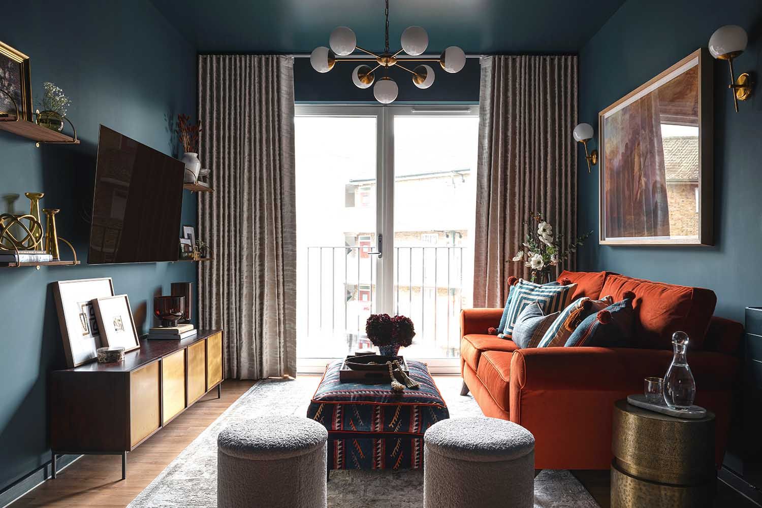
Dark blue is a theme that carries through this bijou apartment, lifted with pops of bright hues. Enass has used Farrow and Ball's Hague Blue for the living room. Orange is one of the best colors to go with blue as it both contrasts yet matches its richness. This sofa is from Lounge Co.
'I have always been a fan of color and believe you can use strong colors in any space no matter the size of the room,' says Enass. 'However, there are a few things to consider. For this property, we had the luxury of having tall windows which bought in a lot of natural light this meant that we could get away with using dark colors on the wall and ceiling. We also included wall lights and a 7-arm ceiling pendant which allowed the light to bounce around the room.'

And the art placement is a clever way to get charm into a modern build. 'I find using different sizes of art really helps add a bit of character to your space,' Enass says. 'We had a large art piece behind the sofa however there was still that little gap between the wall light and door which felt a bit empty. So we included two small pieces which fit perfectly and helped to create some balance on the walls.'

'Dark tones of blue tend to work well with orange,' Enass says of her vibrant living room palette. 'It instantly gives a sense of luxury especially if the item of furniture is in a velvet fabric. However it has to be the right shade of orange, I usually find bright oranges with a yellow undertone can make the space look cheap but using a deep burnt orange tone that has undertones of red works better with dark blue.'
Smartly, for a small space where wall square footage is a premium the radiator seems almost entirely concealed. 'This was an old radiator which we actually painted using the same color that we used on the walls but with a different finish,' Enass says. 'Plus a few layers of undercoat that was suitable for radiators.'
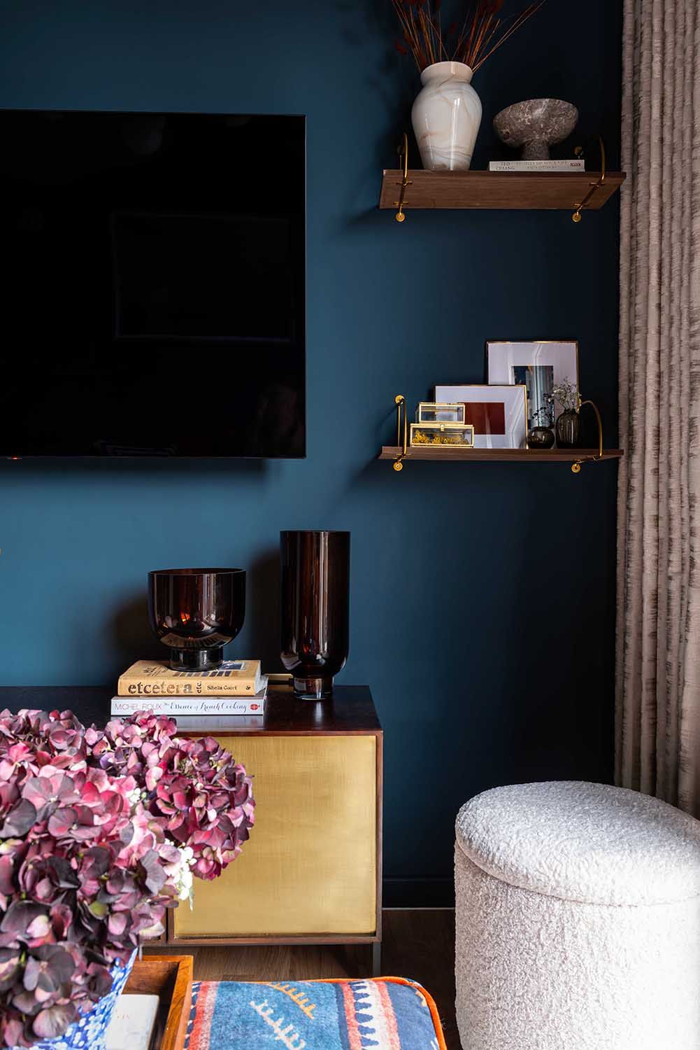
'Living room TVs can be quite difficult to design around as it's a large piece of furniture that you won't necessarily be able to move,' Enass says. 'As there was not a lot of space in here we were not able to build a TV unit so we mounted the set on the wall and added narrow shelves beside the TV, styling them with small accessories.'
The narrowness of the shelves is proof that anyone can embrace the eclectic style trend, even in a small space. Just keep the edit tight.
'We also included this beautiful mango wood and brass sideboard underneath the TV which we dressed up,' Enass says, of the other focal point of this area. 'This made the TV work within the space rather than stand out.'
Kitchen

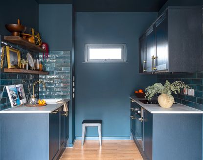
The open plan kitchen is the same blue as the living room, helping to create a seamless transition between the two.
'As the kitchen is part of the living space, we wanted it to flow with the living room but at the same time have its own identity,' Enass says. 'So we used navy cabinets which worked well with the Hague blue wall color and by adding a marble style countertop and wooden shelves it created some distinction between the living room and kitchen. Not to mention that the tiles used in the space had elements of greens, browns and blues, with each tile being different from the next, this added some dimension to the kitchen rather than being flat.

Storage was at a premium in this small kitchen, but that didn't stop Enass from finding a way to inject a bit of the owner's personality via display of their objets.
'The kitchen space is very limited so we could only add a few cupboards,' Enass says. 'But we included some walnut shelves over the sink which is a great way to display kitchenware and accessories.'

'This is my favourite space in the property,' Enass says. 'These inky blue ceramic tiles are from Metro Tiles and we used a budget friendly laminate marble effect for the countertop.'
Bedroom
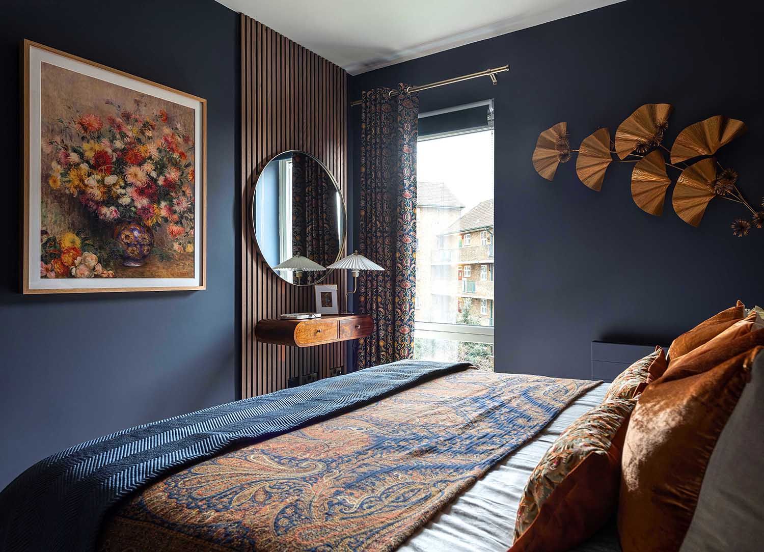
In this one bedroom apartment, the bedroom itself is really only just big enough for a large double bed. 'We had to work with the bed my client currently had, and this did not allow us to have much space left in the room,' Enass says.
Again, Enass worked hard to maximize every inch of this modern bedroom, adding in storage and character without making it seem cluttered. The tricks she employed are masterful.
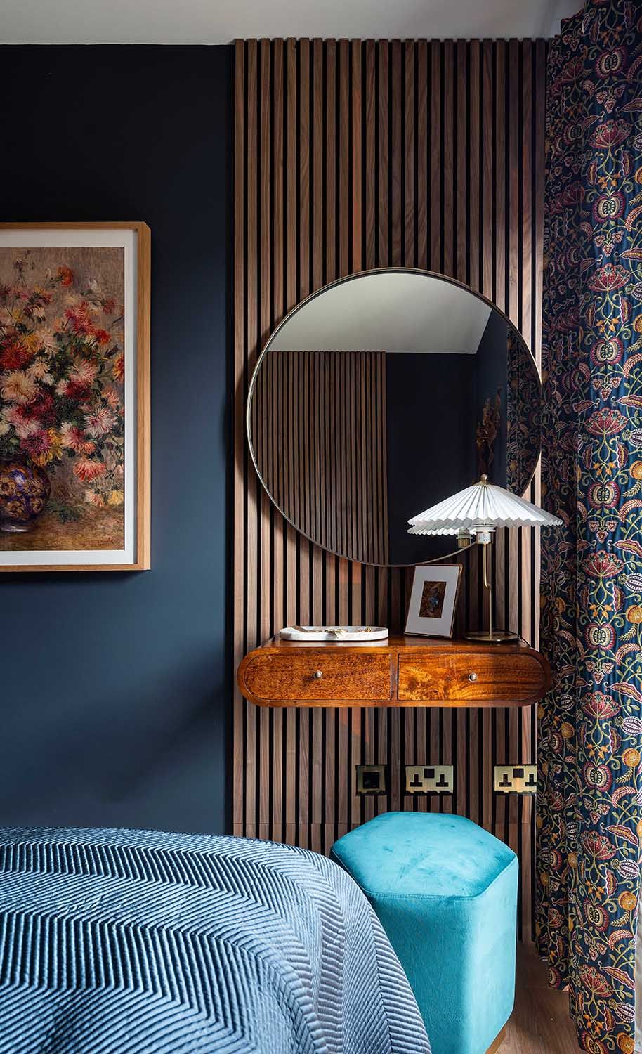
With no space for full dresser, that didn't stop Enass coming up with a genius plan to at least have something that acted as one. 'We added this lovely wall mounted console table and used a pouffe to create a dresser corner,' she says.
The slatted wood accent wall behind the vanity is a smart addition, bringing texture into the otherwise very contemporary architecture.
We wanted to add some warmth to this space and I usually find that including mixtures of materials such as wood helps, especially in a bedroom,' Enass says.
The drawers are from House of Isabella.

Those slats are mirrored by the headboard on the wall opposite. 'As the room is fairly small we wanted to create a statement for the headboard but at the same time, make the space feel taller,' Enass says. 'So we introduced these walnut slabs and placed them behind the bed which gives an illusion of a higher ceiling.'
The bedside table is from Atkin and Thyme and bedside light is from Wayfair.
Bathroom

Being a small windowless space, at only 11.5 square foot was an opprtunity to embrace its cozy dimensions with the same dark blue tones seen elsewhere. 'We decided to use small rectangular tiles and placed them vertically which instantly made you feel that the room was taller,' Enass says of this modern bathroom. 'A tip for using dark colors in a small space like this is to use a gloss tile which will help reflect the light around the room and avoid using large shapes. I find that how you place your tiles will either make your space feel smaller or bigger.'
These porcelain tiles are from Porcelain Superstore, while the walls are painted in Farrow and Ball's Inchyra Blue.
'We wanted to make this room feel glamorous so we included brass elements for the bathroom accessories,' Enass says. 'This always work well with dark tones such as blues and greens.'
See more work from Studio Enass.
Be The First To Know
The Livingetc newsletter is your shortcut to the now and the next in home design. Subscribe today to receive a stunning free 200-page book of the best homes from around the world.

The editor of Livingetc, Pip Rich (formerly Pip McCormac) is a lifestyle journalist of almost 20 years experience working for some of the UK's biggest titles. As well as holding staff positions at Sunday Times Style, Red and Grazia he has written for the Guardian, The Telegraph, The Times and ES Magazine. The host of Livingetc's podcast Home Truths, Pip has also published three books - his most recent, A New Leaf, was released in December 2021 and is about the homes of architects who have filled their spaces with houseplants. He has recently moved out of London - and a home that ELLE Decoration called one of the ten best small spaces in the world - to start a new renovation project in Somerset.
-
 The 12 Best Table Lamps for Reading —I'm a Certified Bookworm (and Shopping Expert)
When it comes to table lamps for reading, I don't mess around. If you're the same, this edit is for YOU (and your books, or course — and good recommendations?)
By Brigid Kennedy Published
-
 "It's Scandi Meets Californian-Cool" — The New Anthro Collab With Katie Hodges Hits Just the Right Style Note
The LA-based interior designer merges coastal cool with Scandinavian simplicity for a delightfully lived-in collection of elevated home furnishings
By Julia Demer Published
