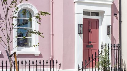
This bright pink London mews house hides an unexpectedly calming interior
From the outside, this might look like a bold colorful home but step inside and you'll see it's actually a neutral lovers dream


The property
When you see a boldly painted house, whether it be sunny yellow, bright turquoise or, in this modern home's case, baby pink, you do tend to assume that the interior within would be equally as colorful and eclectic. However, step inside this elegant Chelsea mews house and you'll instantly notice a change in tone. No crazy wallpapers, quirky furniture or mad color clashes in sight. Instead, you are met with a soothing, calming, neutral home that's filled with light shades and earthy tones. Let's take a tour...

Tucked away in West London's Chelsea, the property is a traditional mews building – it has a relatively small footprint, going upwards rather than outwards and it set over three stories. The property was completely refurbished by architecture and interior design practice TR Studio, who were given the brief of turning this pied-à-terre in the city into a relaxing, stylish family home away from home.
Kitchen

The kitchen and main informal family living space is on the lower level. It has been totally transformed from a dark, basement-like space made up of lots of small rooms into a light-filled open plan kitchen/dining/living room. There's even a guest bedroom and bathroom tucked away at the opposite end of the space.
- See also: the 15 best modern kitchen ideas - stylish, smart and chic

The kitchen itself was designed by Sebastian Cox for deVOL and is made up of black stained beech cabinetry and a chic marble splashback. The gorgeous copper worktop on the island creates the perfect focal point to the space and adds some rustic warmth to the dark cabinetry.
- See more black kitchen ideas

At the opposite end of the lower level there is a relaxed, informal living area. This is a family home at heart, a place for the homeowners to stay when they come into the city so having a laid-back space to spend time as a family and entertain was a key part of the renovation.
There are touches of muted colors here, with the sage green sideboard and terracotta paneling, but the overall feel is still very neutral and tranquil.
Formal living room

The formal living room is on the upper ground floor. It has been designed sympathetically to match the 19th century home with light wooden floors and elegant paneled walls. They work as the perfect backdrop for the more modern aesthetic going on with the furniture. Again, there is color going on here, but the tones and still muted and rich which add just the right amount of vibrancy to the room.
Entertaining nook

Just off the living room is a space dedicated to entertaining, complete with a bespoke drinks cabinets, sophisticated upholstered chairs and a statement orange pouf to add just a touch of bold color. There also speakers built into the ceiling to create the perfect laid-back space to host.
- Find more: 21 wine room Ideas – these chic ideas are the ultimate in wine storage
Hallway

Connecting each level is a bespoke staircase. The sweeping handrail and mirrors the curves of the walls and the shape of the skylight that it leads up to. It was designed to create an effortless flow between each floor. It leads up to the first floor where the master bedroom, two more guest bedrooms and the family bathroom can be found.
- See also: 75 modern staircase ideas to transform your staircase into something extraordinary
Master bedroom

The master bedroom is a wash of gorgeous muted green tones and despite its modest size, the vaulted ceiling makes it feel both elegant and cozy. The bespoke velvet headboard adds extra comfort as well as depth with that lovely deep forest green.

- See more master bedroom ideas
Guest bedroom

The guest bedroom again has a small footprint but a lighter color scheme prevents the room from feeling cramped. In fact, it's the smaller size of this room that makes it so inviting and all the soft textures only enhance the coziness.
- Find more: 15 small bedroom ideas that max out on style
Ensuite bathroom

In the ensuite bathroom, the soft neutral theme continues. White marble bounces even more light around this bright space and the black accents and striking lines are the perfect contrast.
- Love this look? Find more Crittall style shower screens and marble bathroom ideas.
Guest bathroom

On the lower ground floor, disguised behind the terracotta paneling lies the guest bathroom. Quite the opposite to the light, bright bathroom that lies upstairs, rich dark marble cover the floors and walls, with bronze and brass finishes adding even more opulence to the space.
Be The First To Know
The Livingetc newsletter is your shortcut to the now and the next in home design. Subscribe today to receive a stunning free 200-page book of the best homes from around the world.
Hebe is the Digital Editor of Livingetc; she has a background in lifestyle and interior journalism and a passion for renovating small spaces. You'll usually find her attempting DIY, whether it's spray painting her whole kitchen, don't try that at home, or ever changing the wallpaper in her hallway. Livingetc has been such a huge inspiration and has influenced Hebe's style since she moved into her first rental and finally had a small amount of control over the decor and now loves being able to help others make decisions when decorating their own homes. Last year she moved from renting to owning her first teeny tiny Edwardian flat in London with her whippet Willow (who yes she chose to match her interiors...) and is already on the lookout for her next project.
-
 The 12 Best Table Lamps for Reading —I'm a Certified Bookworm (and Shopping Expert)
When it comes to table lamps for reading, I don't mess around. If you're the same, this edit is for YOU (and your books, or course — and good recommendations?)
By Brigid Kennedy Published
-
 "It's Scandi Meets Californian-Cool" — The New Anthro Collab With Katie Hodges Hits Just the Right Style Note
The LA-based interior designer merges coastal cool with Scandinavian simplicity for a delightfully lived-in collection of elevated home furnishings
By Julia Demer Published

