This narrow home is a perfect example of how to get a sense of luxury into a small space
Designer Fiona Barratt-Campbell has turned a dentist's studio with a slim footprint into an opulent yet welcoming home


How do you convert a dentist's studio with a few apartments above into a luxe home? Especially when it has a tired facade and slim footprint and your aesthetic points the needle very firmly towards sumptuous?
For designer Fiona Barratt-Campbell, undertaking her first ever redevelopment, her aim was to 'use luxurious artisan finishes to create a sumptuous and welcoming home,' she says. 'We wanted to create a liveable feel throughout the house and very much designed every aspect - from the interior layouts, the colour palette, to the furniture and artwork - with potential future owners front of mind.'
Under her new business arm Fiona Barratt Projects, and with her husband Sol looking after the finances, the modern home in Chelsea, London, took a year to redevelop.
'The main challenges were the structural works - we had to restore the facade and rebuild and reconfigure many of the internal structures to maximize the space,' Fiona says. 'For example, we widened the entrance hallway so that you really get a sense of arrival - it was formerly very narrow - and we also added an incredible sky light in the guest bedroom as throughout the house we wanted to maximise natural light.'
Kitchen

The modern kitchen sits on the ground level, and is open plan, leading into a dining area and TV lounge. It may be a relatively small space, but that didn't stop Fiona dialling up its opulence through a use of dramatic veining and contemporary furniture, handcrafted by her own brand FBC London.
'The island, worktop surfaces and backsplash feature an exquisite rare Italian Calacatta Viola marble,' Fiona says. 'The striking marble offers a variety of subtle tones and colors that complement the cabinetry palette and materiality. With practicality in mind, this specific marble makes a durable and long lasting surface due to its polish, which ensures it is more resistant to marking and stains while achieving a timeless modern feel.'

Use of such a dramatic stone in an open plan kitchen could overpower the space, but here it feels soft enough to almost blend into its enviroment.
'Despite its striking appearance, the marble’s variety of warm brown tones are actually very subtle and not overbearing,' Fiona says. 'And they also complement the tones of the cabinetry. The pattern of the marble really lifts and adds character to the matt lacquer and veneer cabinetry frontage, instantly creating a focal point for the space. We intentionally chose simplicity in the smaller details, including handleless cupboards and drawers for a cleaner look.'

Despite how modern the kitchen is, it doesn't feel jarring with the more traditional vibe of the furnishings, thanks to how pale the floor is that unites it with the rest of the room.
'We definitely wanted to create a contemporary-feeling home but with a softness and liveable quality,' Fiona says. 'Keeping the materials light but warm helps achieve this balance. The floor is a light timber in a chevron pattern.'
Dining and TV areas

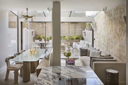
The dining room area, just off the kitchen, is relatively narrow - 12 foot by 7 foot. The bench one side of the table, pushed up against the wall, makes the best use of space.
'We wanted to incorporate a bench on one side but then rather than have a fixed bench on the other side of the table, the individual dining chairs offer flexibility as they can be easily moved if more space is needed,' Fiona says.
Because there is a glass wall in this space, pouring in lots of wonderful light, Fiona had to use other tricks to the make the dining area feel intimate. 'Separating the dining area from the living area was an intentional decision, to create a cozy environment within the open plan space,' Fiona says. 'A lot of our clients are preferring this ‘broken plan’ style of living area. The natural light provided from the extended glass exterior and roof gives a bright and airy feel, maintaining a sense of continuity between the individual spaces.'
The sofa is ideal for a narrow living room - looking comfortable but not taking over. 'It’s all about scale and the style of the sofa,' Fiona says. 'We chose one of our more traditional sofas, the FBC London PAX sofa, as its clean lines allows it to almost blend into the space, it’s not an overbearing or overly wide piece.'
Living room

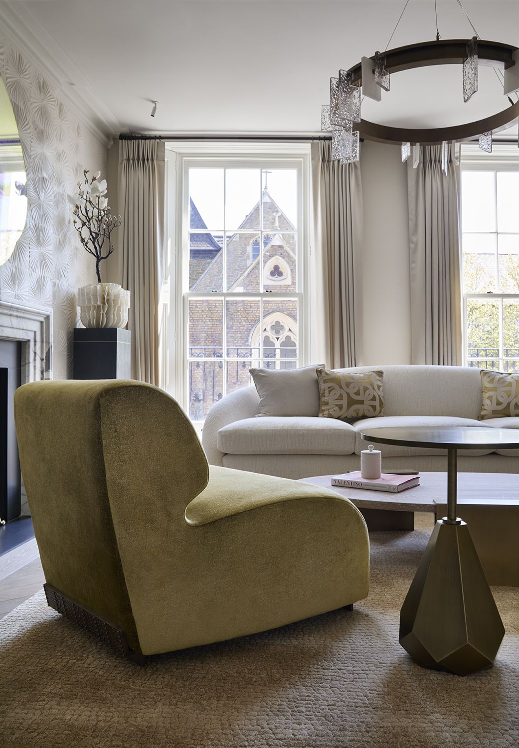
The living room may seem quite grand on a first look - its high ceilings and vast statement light give it a wonderful sense of sophistication - but there is a conviviality here. It's mostly due to the rounded shapes Fiona has used.
'The curved edges of the FBC London pieces are designed to embrace smooth and fluid lines and evoke an understated elegance,' Fiona says. 'This creates the perfect mix between a luxurious aesthetic design and comfortable living space.'
The walls are covered in textured plaster, a trick that any small living room can take for adding a sense of refinement.
The piece above the fireplace is the Aspectu Mirror from FBC London. 'Created through layers of a semi-reflective transparent mirror with a gold leaf dispersion evoking elegance, the delicate nature of the mirror is purposefully brutalised using a bronze planished rod, which fixes the different layers into place.' Fiona says. 'A mirror designed to force a pause in reflection, to play with the muscles in the eye and for you to look further than yourself.'

'The accent chairs in the sitting room are the FBC London Angelina armchairs – one of my favourite pieces in the entire collection,' Fiona says. 'I chose the fabric, which in person has a beautiful luminescent, almost golden appearance, as it sits so well against the more neutral tones of the other pieces in the room. We needed a moment of color and the two chairs really do ‘pop’ and provide a focal point as soon as you enter the room.'
Entryway

The entryway was widened to create a truly grand first impression, helped by the gleam of the hallway wallpaper. 'It’s a suede textured wallpaper that adds a lot of warmth to the entryway,' Fiona says.'It's something we were keen to add so that the owners feel enveloped and at home as soon as they enter.'

Above the bench in the entryway hangs a very modern piece of art. 'This is a beautiful tapestry piece by a Lebanese artist – it’s one of my favorites as I love the 3D and highly textural impact it has,' Fiona says.
Main bedroom

Fiona utilized every inch of the modern bedroom, creating a cozy and almost-enclosed area for the bed, hidden by a wall of storage. 'The built-in storage is a bespoke FBC London design, part of the Byethorne collection,' Fiona says. 'The material is a natural timber, Silky Oak. We added a whitewash over the top in order to emphasize the smooth rippling waves in the wood and create warming tones and soft textures.'

The wallpaper helps to increase the sense of light in the room, bouncing it around the space. 'I love the dappled shimmer effect,' Fiona says.
The bedroom color scheme is a little more creamy than the rest of the house, which leans more towards white elsewhere. 'We used a slightly warmer neutral base in the master bedroom to draw people in,' says Fiona. 'The soft, natural colours create an elegant and calming space for comfort and relaxation.'
Ensuite bathroom

The modern bathroom just off the main bedroom is just as luxe and well designed as seen in the rest of the redevelopment. By introducing a fluted element of texture to the cabinets, Fiona has created something that instead of feeling too sleek, actually feels inviting and warm.
'I love marble with bold, dramatic veining but I do then recommend to keep the hardware and bathroom units and furniture quite minimal in design, so as not to create too heavy an atmosphere.' Fiona says. 'A bathroom should ultimately be a calming environment.'
Guest room

Up in the eaves on the top floor of the four storey house is this charming guest bedroom. It's super sophisticated palette makes the twin beds - ordinarily for kids - unexpected. However, there was a reason behind having two.
'I love this room as it’s located at the top of the house and the eaves add such a sense of cosiness to the space,' Fiona says. 'It’s a guest room and the twin beds were to add flexibility so the room could be used by different guests as needed.'
Double guest room

The other spare bedroom comes with a double bed and lamps that have beautiful ceramic bases. 'The lamps were one of the more budget-friendly pieces we chose but I love them!' Fiona says 'The pattern evokes the uneven and varied layers of crystal.'
Media room

The house comes complete with its own cinema, located in the basement. Unlike the rest of the home, the media room is dark and cozy.
'The darker hues throughout the walls and flooring in the cinema room create a cocooning effect,' Fiona says. 'While also lending the perfect backdrop for statement furniture and art pieces that, against the darker setting, can’t help but grab your attention.'
Courtyard

Of course, the narrow courtyard garden is just as refined as the rest of the decor. 'All pieces within the FBC London outdoor furniture collection were designed to blend the boundaries between indoor and outdoor furniture,' Fiona says. 'So most pieces started life as indoor pieces, which we then tailored with different finishes and upholstery to make them fit for outdoor environments.'
Painting the garden wall white, in stark contrast to the brick of the neighboring house, is an equally luxe design choice. 'It gives the courtyard a fresh and summery ambience even when the sun isn’t shining directly on the space.' Fiona says. 'In terms of the furniture, most of our FBC London outdoor pieces are upholstered in whites and neutral colours as again this lends a freshness to the outdoor space. I never want our furniture to overwhelm or feel too heavy or dark.'
See more of Fiona's work at Fiona Barratt Interiors.
Be The First To Know
The Livingetc newsletter is your shortcut to the now and the next in home design. Subscribe today to receive a stunning free 200-page book of the best homes from around the world.

The editor of Livingetc, Pip Rich (formerly Pip McCormac) is a lifestyle journalist of almost 20 years experience working for some of the UK's biggest titles. As well as holding staff positions at Sunday Times Style, Red and Grazia he has written for the Guardian, The Telegraph, The Times and ES Magazine. The host of Livingetc's podcast Home Truths, Pip has also published three books - his most recent, A New Leaf, was released in December 2021 and is about the homes of architects who have filled their spaces with houseplants. He has recently moved out of London - and a home that ELLE Decoration called one of the ten best small spaces in the world - to start a new renovation project in Somerset.
-
 How to Thaw a Frozen Pipe — Learn Everything You Need to Know in 5 Minutes With This Guide
Winter storm caught you off guard? We asked an expert — just how do you thaw a frozen pipe?
By Hugh Metcalf Published
-
 The 12 Very Best Silk Bedding Pieces — As Our Style Editor Says: 'It's What Dreams Are Made Of!'
Slumber in lustrous luxury with the very best silk bedding sheets, duvets, pillowcases, and more — your sleep score will thank us later
By Julia Demer Published

