A modern apartment in Moscow where ornate antiques sit with minimalist designs
Mid-century modern + 18th-century antiques + a minimalist aesthetic = a stunning space filled with inspiration


We are often drawn to homes that expertly mix styles. A Georgian townhouse where modern pieces sit against ornate fireplaces and detailed architraves, a new-build that embraces eclectic country-style. We like the unexpected. So when we saw this apartment, situated in a 19th-century building in Moscow, where elegant wooden antiques are mixed into a very minimalist aesthetic we had to find out more about this modern home.
The apartment was overhauled by Moscow based architect and interior design studio, Block Studio. Despite being built in the 1800s the building was totally stripped of all its original interiors and layout in the 20th century so when it came to remodeling the space, adding that history and character back into the space was a key part of new design.
Living spaces

The majority of the downstairs space of the apartment is open plan, with a wall sat in the center to break up the space. All the walls are kept a very crisp off-white, the perfect backdrop for all the ornate, heavy wooden antiques that can be found in every room.
The whole project revolved around this antique collection. Both the homeowners and the designers wanted to blend these quirky, vintage finds into the very modern setting, nodding to the building's heritage and adding a warmth to the minimalist aesthetic.
The founders of Blockstudio, Natalia and Ivan Trofimov, noted that it was actually quite an unusual project to work on. Despite being a popular such a popular approach elsewhere, blending such opposing styles is not something they see very often in Russian interiors making this a unique space to design.

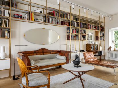
A sleek contemporary fireplace sits in the center of the part open plan room. A living room stretches the length of one side. And it's in this space that the blending of styles can be seen most clearly, with Mid-century shapes and more contemporary designs mixing with traditional silhouettes and shinning walnuts woods.


The wall-to-wall bookshelves were made bespoke for the room, adding a touch of modern glamour with the gold accents. The very clean lines again juxtapose all those sift curves of the antiques making the clashing of styles clean throughout the length of the space. They also create a nice continuity too between the living room and the dining room that sits adjacent.

An extra seating area provides a more formal space away from the main living area. The antique circular table sits comfortably in the midst of the modern seating and lighting, perfectly demonstrating the effortless blending of styles.

- Find more living room ideas and inspiration.
Kitchen

The striking kitchen is kept relatively simple in comparison to the ornateness of the adjoining rooms. But even in this minimalist space, you can find a touch of antiquity with the vintage chandelier hanging low over the kitchen island.
Everything is integrated, there's nothing to interrupt the seamless cabinetry meaning that the lighting really is the focus and the clashing of styles is more of a statement in here than any of the rooms despite the lack of furnishings and decor.
- See all our modern kitchen ideas in our full gallery.
Dining room

And the center of the dining room is a simple modern white table. You almost don't notice it, but it's perfect for the space as it prevents the heavy wooden carved dining chairs from overwhelming the room. Instead of bulky they look elegant and chic when paired with such a simplistic piece.
Hallway

An elegant white hallway leads up to a narrow landing where an antique floral wall hanging covers the main wall. Even in this small space, the mix of styles can be found with the contemporary bench and lighting.

Master bedroom

The minimalist white scheme is continued in the master bedroom with the antique headboard and matching dressing table being the focal point. The furniture in here is all relativity low, emphasizing the towering ceilings and adding to the minimalist aesthetic with all the negative wall space.

The opposite of the room is more contemporary, with Scandi shapes, contemporary prints, and simple decor. The simple fireplace mirrors the one downstairs with the section of stone wall adding a lovely subtle texture.

Guest bedroom

The guest bedroom is like the master bedroom on a smaller scale. The same neutral scheme and the mix of wooden antique pieces and there are touches of contemporary design in here too in the form of the bedside table and the wall light.

Bathroom

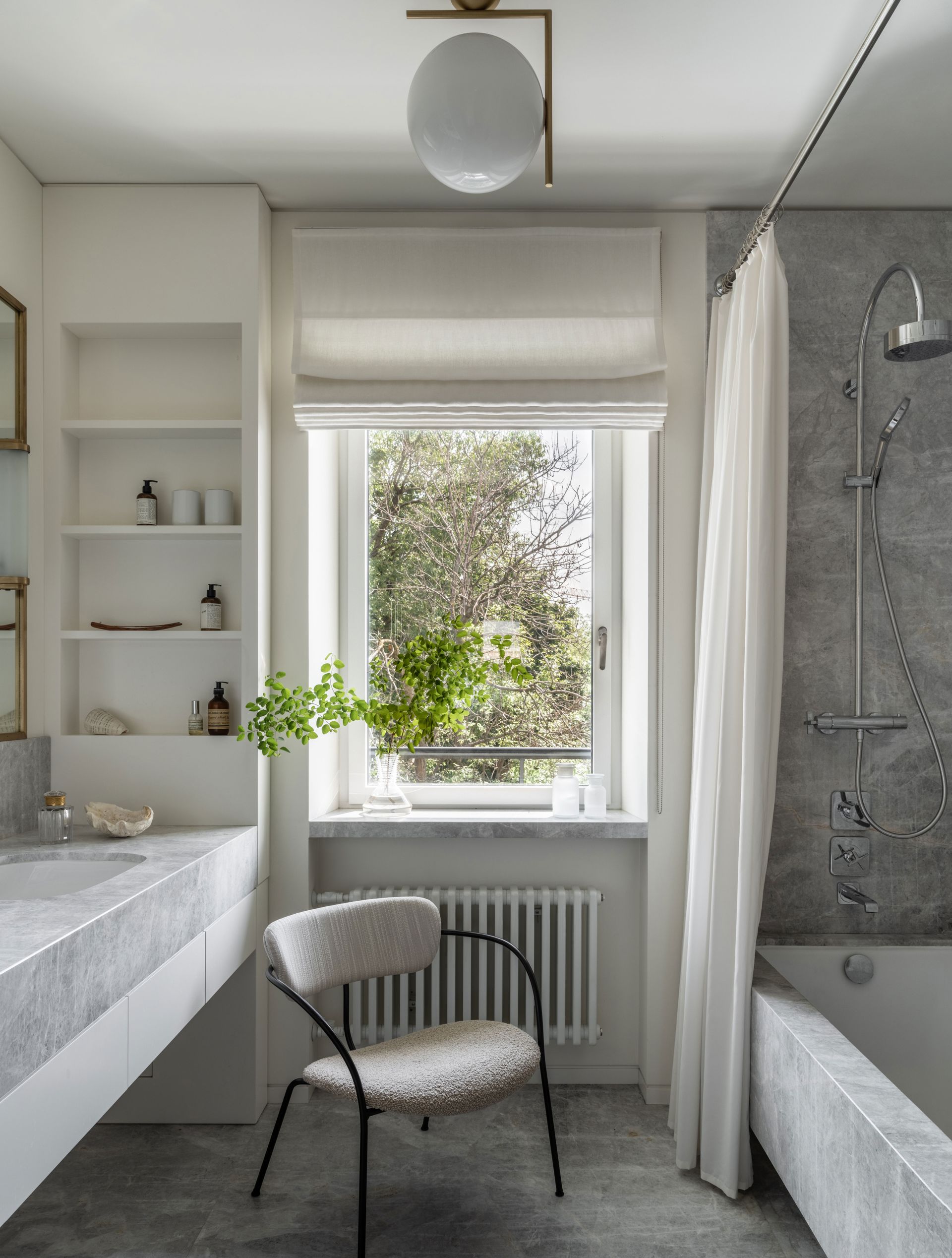
The bathroom is the only space where modernity rules. Grey marble covers the walls and floors with the shower curtain and Roman blind adding a softness to all the cool tones and clean lines. The touches of brass found in the mirror and globe lighting add a needed warmth too.

Be The First To Know
The Livingetc newsletter is your shortcut to the now and the next in home design. Subscribe today to receive a stunning free 200-page book of the best homes from around the world.
Hebe is the Digital Editor of Livingetc; she has a background in lifestyle and interior journalism and a passion for renovating small spaces. You'll usually find her attempting DIY, whether it's spray painting her whole kitchen, don't try that at home, or ever changing the wallpaper in her hallway. Livingetc has been such a huge inspiration and has influenced Hebe's style since she moved into her first rental and finally had a small amount of control over the decor and now loves being able to help others make decisions when decorating their own homes. Last year she moved from renting to owning her first teeny tiny Edwardian flat in London with her whippet Willow (who yes she chose to match her interiors...) and is already on the lookout for her next project.
-
 The 12 Best Table Lamps for Reading —I'm a Certified Bookworm (and Shopping Expert)
When it comes to table lamps for reading, I don't mess around. If you're the same, this edit is for YOU (and your books, or course — and good recommendations?)
By Brigid Kennedy Published
-
 "It's Scandi Meets Californian-Cool" — The New Anthro Collab With Katie Hodges Hits Just the Right Style Note
The LA-based interior designer merges coastal cool with Scandinavian simplicity for a delightfully lived-in collection of elevated home furnishings
By Julia Demer Published

