This designer's house is a masterclass in minimaluxe decor - 'designed to be a place to chill'
Designer Katie Harbison’s Brooklyn home exudes a serene stillness thanks to its perfect balance of contemporary pieces, traditional materials and vintage pieces

Nestled in a renovated townhouse in Cobble Hill, Brooklyn, New York, interior designer Katie Harbison's apartment has perfected the minimaluxe design trend.
The pared-back modern home is the antithesis of bland; rather it is packed with personality with layers of textures - velvet, carved wood, ribbed matting, linen and bouclé - teamed with vintage pieces, such as the brass pendant, a travertine table and ancient earthenware. The bedroom, for example, is intentionally without color and exudes a serene stillness - the essence of what minimaluxe is all about. ‘We live such busy lives, it’s designed to be a place where we can go to relax and chill,’ explains Katie.
In contrast, areas that don’t get much natural light, such as the cloakroom and entry hall, are embraced with a moody palette. There is also a dedicated office space for the couple who both work from home. ‘We have had to be creative with managing our storage as I have so many samples and I love having them on display,’ says Katie, ‘but it’s a small office, so has to be very organised!’
Living room

‘As this is our main relaxing space, as well as entertaining space, I wanted it to be comforting as well as exciting,' Katie says of her endlessly relaxing minimaluxe living room. I spent time filling the shelves with objects I gathered from our travels, so there is a little bit of everything on display here – from Paris, Germany, LA, London, New York. As the backdrop is clean and neutral, I wanted the decorative objects to pop and fill this space.’
The living room walls painted in White Dove, Benjamin Moore, the perfect soft white which feels clean buy not stark. And, in keeping with current design trends, she has one of the best white boucle sofas to recline on.

‘Styling a space is as important as designing it for me and is something that can be changed and refreshed without the need for a total redecoration,' Katie says.
Her approach to her living room shelving is to pick her favourite items and let them breathe, with space between each one. Very minimaluxe.
Kitchen

‘The prime requirement was somewhere practical, with lots of storage and open shelves for easy access to items as James cooks a lot,' Katie says of her pared back modern kitchen. 'But it needed to look not overly cluttered as it’s part of the main area and friends gather here for drinks.’
Just as in the living room - and so as to create a seamless blend between the two, the walls here are painted in White Dove by Benjamin Moore.

As in the living room, Katie's curation of what is on display is really well edited. If you're feeling inspired, our guide to the best marble serving boards will help you with this look.
Dining room

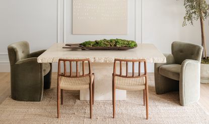
‘The dining table was the main source of inspiration,' Katie says of her peaceful dining room. 'It was the first thing we bought and originally intended to be our desk, but I thought it was such a dramatic piece, it needed to be on display rather than hidden in the office.’
An indoor tree helps to contrast with the intriguing jagged edges of the stone table. Though not everything here is as expensive as it looks - the rug is actually from Ikea.
Bedroom

‘The aim was to create a calm and tranquil space that we can go to at the end of the day to completely switch off and unwind,' Katie says of her minimalist bedroom. Comfort was the key here, so that was the priority when designing this room.’
Again, not everything here is as expensive as it seems. The rug is from Zara Home and the night stand is by Athena Calderone for Crate & Barrel.
Bathroom

'It’s a small space but manages to feel both practical and luxurious,' says Katie of this minimalist bathroom. 'And the materials were reasonably priced, which is a bonus. Fitting tiles like this and creating a niche in the wall is quite an art, so it pays to have an expert tiler!’
Shop Katie's look

Price: $999
Dimensions: 75.2"l x 35.4"w x 30.7"h

Price: $101.73
Dimensions: 30" SH x 22"SD x 18"SW

Price: from $199
Size: from 2' x 3'

Price: $20.99
Height: 3.5"

Price: $109.95
Size: 1 - 2'

Price: $29.95
Dimensions: 8.5" dia. x 7.75"H
Be The First To Know
The Livingetc newsletter is your shortcut to the now and the next in home design. Subscribe today to receive a stunning free 200-page book of the best homes from around the world.
A legendary houses editor, Mary Weaver held the job of Homes Editor on Livingetc for over a decade. She set the aesthetic for which the brand has become known. She is now a freelance stylist, art director and writer, regularly contributing to Livingetc and overseeing the brand's successful House Tours franchises of live and webinar events.
-
 The 12 Best Table Lamps for Reading —I'm a Certified Bookworm (and Shopping Expert)
When it comes to table lamps for reading, I don't mess around. If you're the same, this edit is for YOU (and your books, or course — and good recommendations?)
By Brigid Kennedy Published
-
 "It's Scandi Meets Californian-Cool" — The New Anthro Collab With Katie Hodges Hits Just the Right Style Note
The LA-based interior designer merges coastal cool with Scandinavian simplicity for a delightfully lived-in collection of elevated home furnishings
By Julia Demer Published

