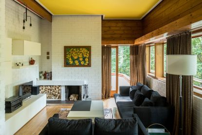
Inside a mid-century modern home in the Scottish Borders inspired by Peter Womersley and Frank Lloyd Wright
With a simple, single storey layout, flat roof, and mix of brickwork and glazed panels this retro gem really nods towards the iconic Usonian houses


Nestled in the rolling Eildon Hills in Melrose, a town in the Scottish Borders, this Mid-century home is an ode to modernist design. Set over a single storey, three half levels dividing the space, it really feels reminiscent of Frank Lloyd Wright’s Usonian houses – the simple, grid-like layout, the flat roof with protruding overhangs, the mix of exposed brick and glass panels. The house was actually designed by the late architect Hamish Bremner, but was extended in 1977 by Ron Russell, a Principal Architect to the celebrated Mid-century architect Peter Womersley.
The interiors have been renovated in recent years to modernize the space, but really you'd never know, it's all be done so sympathetically. The exposed white-painted brick walls and pine board paneling, with the colorful kitchen and orange tiled bathroom, look like they have belonged in the house for decades. Let's take a tour...

- Explore all our modern house tours for more inspiration
Living room

Through a warm and welcoming, wood-paneled hallway, you enter the sunken sitting room. Whitewashed brick walls meet with that warm stained pine, the two materials that cover the walls in every room. A quirky open fire that's off centered by the log storage, is the focal point making the room feel cocooning and cozy despite the large expanses of glass that fill the room with sunlight.

The room is actually shaded by a flat roof canopy so you don't get that harsh direct sunlight streaming straight into the room. The timber strip flooring that runs underfoot adds even more warmth to the space, counteracting the crisp white of the walls.
The decor in here is kept fairly minimal, really it's the architecture of the house and that mix of wood and brick that provides all the decoration needed. And that goes for every room – quirky finds from the homeowner's collection add touches of color and texture without distracting from the unique design of the space.

- Be inspired by more of our modern living room ideas
Kitchen

The kitchen is semi-open plan with the living room, they sit together in an L-shaped space that feels both open and airy and yet like that could be separate spaces when needed. The bold color palette of pistachio green, vibrant coral, and pale yellow, has a slight 60s vibe, like a pastel Mondrian.
The combination of brick and wood continues through to this space too, adding plenty of natural textures to the clean and simple cabinetry. Note the mirror splashback too, a really clever way to open up the relatively small space and make it feel much larger. Forgoing the wall cabinetry on one side prevents the narrow kitchen from being too cluttered too and that run of the brick wall makes it feel more connected with the living room.

- Find more kitchen ideas and inspiration in our full gallery
Dining room

On the mid-level, up a short staircase from the kitchen, is the dining room. The soft light blue color scheme really pops against the darker, warm wood paneling. The shapes in here too seem to contrast the natural backdrop, the retro shapes of the dining chairs and the light fixture, even the geometric print of the wallpaper, stand out as being decidely modern and striking in comparison with the grains of the wood. Despite this mixing of materials, the overall look suits the house and its surroundings perfectly.

Bedroom

The main bedroom (there are two more on the uppermost level) has a similar soft blue scheme and echoes the mid-century atmosphere of the rest of the house. The ceiling has been painted to match the ceiling in the dining room which perfectly counteracts all the warmth with the wood paneling, the room feels cozy and inviting and yet fresh and calming too.

Bathroom

The family bathroom zings with bright color, vivid orange tiling, and glossy cabinets, set against muted timber wall and ceiling boarding. It feels fun and retro, just like the rest of the property, but it's simple and sleek too so the design doesn't feel too gimmicky. No carpet in here as there would have been when the house was first built!
Like what you see? This property is currently listed with The Modern House.
Be The First To Know
The Livingetc newsletter is your shortcut to the now and the next in home design. Subscribe today to receive a stunning free 200-page book of the best homes from around the world.
Hebe is the Digital Editor of Livingetc; she has a background in lifestyle and interior journalism and a passion for renovating small spaces. You'll usually find her attempting DIY, whether it's spray painting her whole kitchen, don't try that at home, or ever changing the wallpaper in her hallway. Livingetc has been such a huge inspiration and has influenced Hebe's style since she moved into her first rental and finally had a small amount of control over the decor and now loves being able to help others make decisions when decorating their own homes. Last year she moved from renting to owning her first teeny tiny Edwardian flat in London with her whippet Willow (who yes she chose to match her interiors...) and is already on the lookout for her next project.
-
 How to Thaw a Frozen Pipe — Learn Everything You Need to Know in 5 Minutes With This Guide
Winter storm caught you off guard? We asked an expert — just how do you thaw a frozen pipe?
By Hugh Metcalf Published
-
 The 12 Very Best Silk Bedding Pieces — As Our Style Editor Says: 'It's What Dreams Are Made Of!'
Slumber in lustrous luxury with the very best silk bedding sheets, duvets, pillowcases, and more — your sleep score will thank us later
By Julia Demer Published

