See how architects Michaelis Boyd have transformed this disused mews house into a colorful creative refuge for work and play
Playful, creative and full of inspiring ideas, it's hard to imagine this stylish home was transformed from an abandoned building

Without stating the obvious, this last year has been pretty limiting. Who hasn't grown tired of working from the same desk (or the same kitchen table, or the same sofa, or on the occasion, the same bed...)? We have personally been desperate for a new place to work, a fresh view, a new setup that feels separate from home life and can be a place to be productive and be inspired. So when the owners of this dilapidated mews house decided it was time to make more of the beautiful but disheveled building that sat in their garden, it made sense for it to become a 'creative refuge' – a place to work and play away from the main house.
They brought on architects Michaelis Boyd for the project. The brief was to bring the house back to life, inject vibrancy and energy into the rooms, that would become a creative workspace, as well as a place to host parties and double as a guest house when needed.
The modern home, now aptly named Little Mews Refuge, comprises a library and office space, gym area, guest room, WC, and bathroom, plus a party lounge and bar area for entertaining.
Hallway
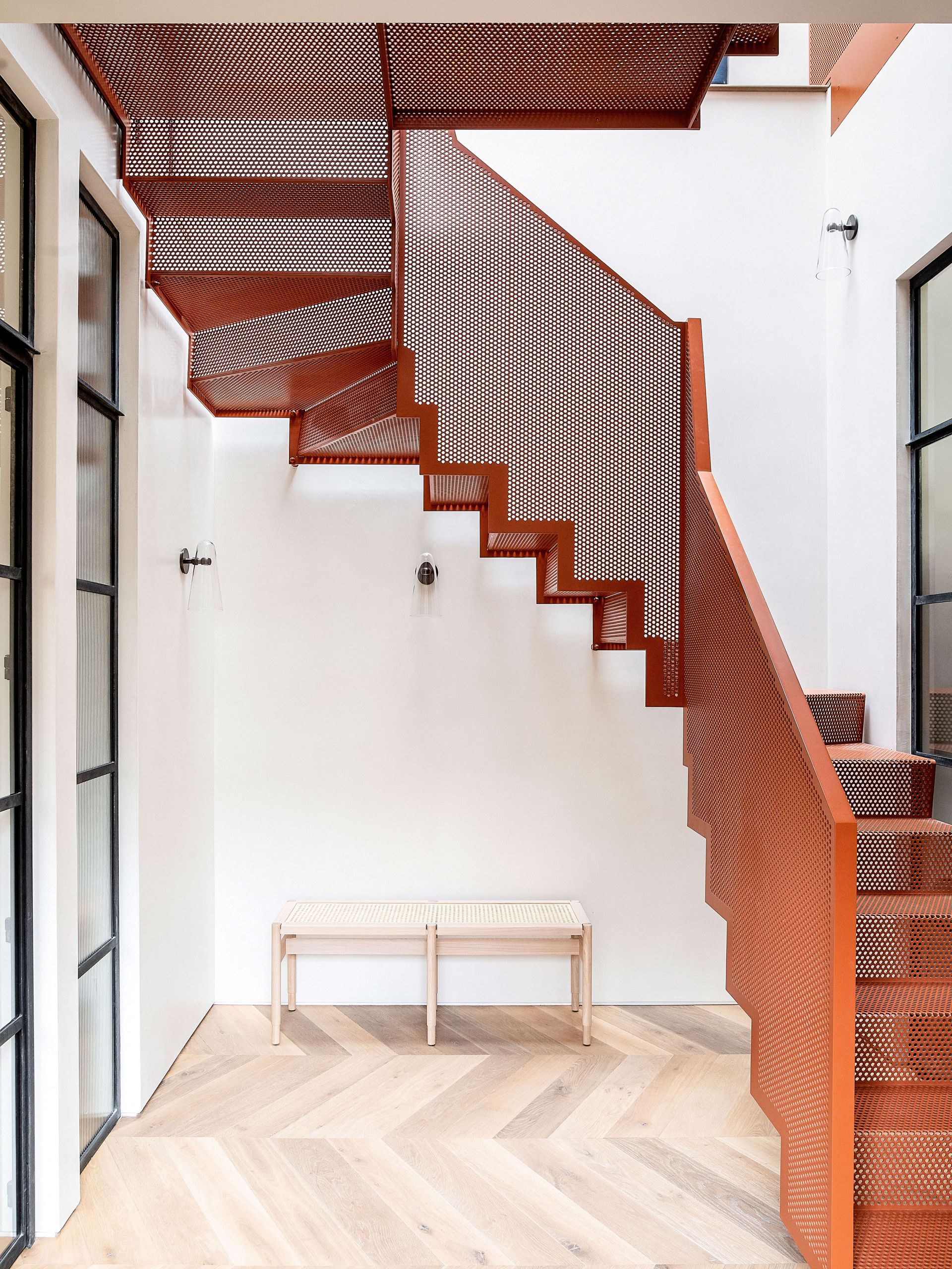
The hallway saw the biggest transformation. Once a small, dark, and dingy entrance hall that didn't really feel like its own room at all, has been turned into a light-filled, statement space that really sets the fun and creative scene for the rest of the home.

Set against the neutral backdrop of crisp white walls and pale wood herringbone flooring, The perforated steel staircase designed with Diapo, is the focal point. However, despite its imposing size, light still flows through from the newly install skylights above and the Crittall doors that frame the room make it feel even more open and airy.
Library

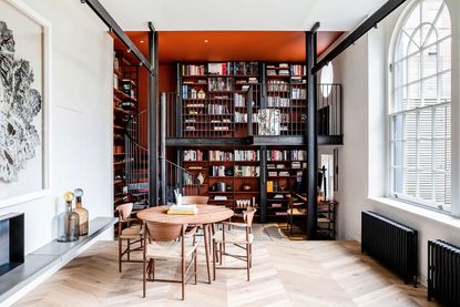
Off to the right of the hallway is the gym/library. Designed to feel like the space was part of the original building, there's a slight industrial edge to the room, with the striking steel mezzanine, spiral staircase, and bespoke floor to ceiling shelving.

The shelves are actually totally customizable so can be moved as the homeowners curate the display. Lights have been installed into the unit to create a cozy and intimate vibe of an evening.
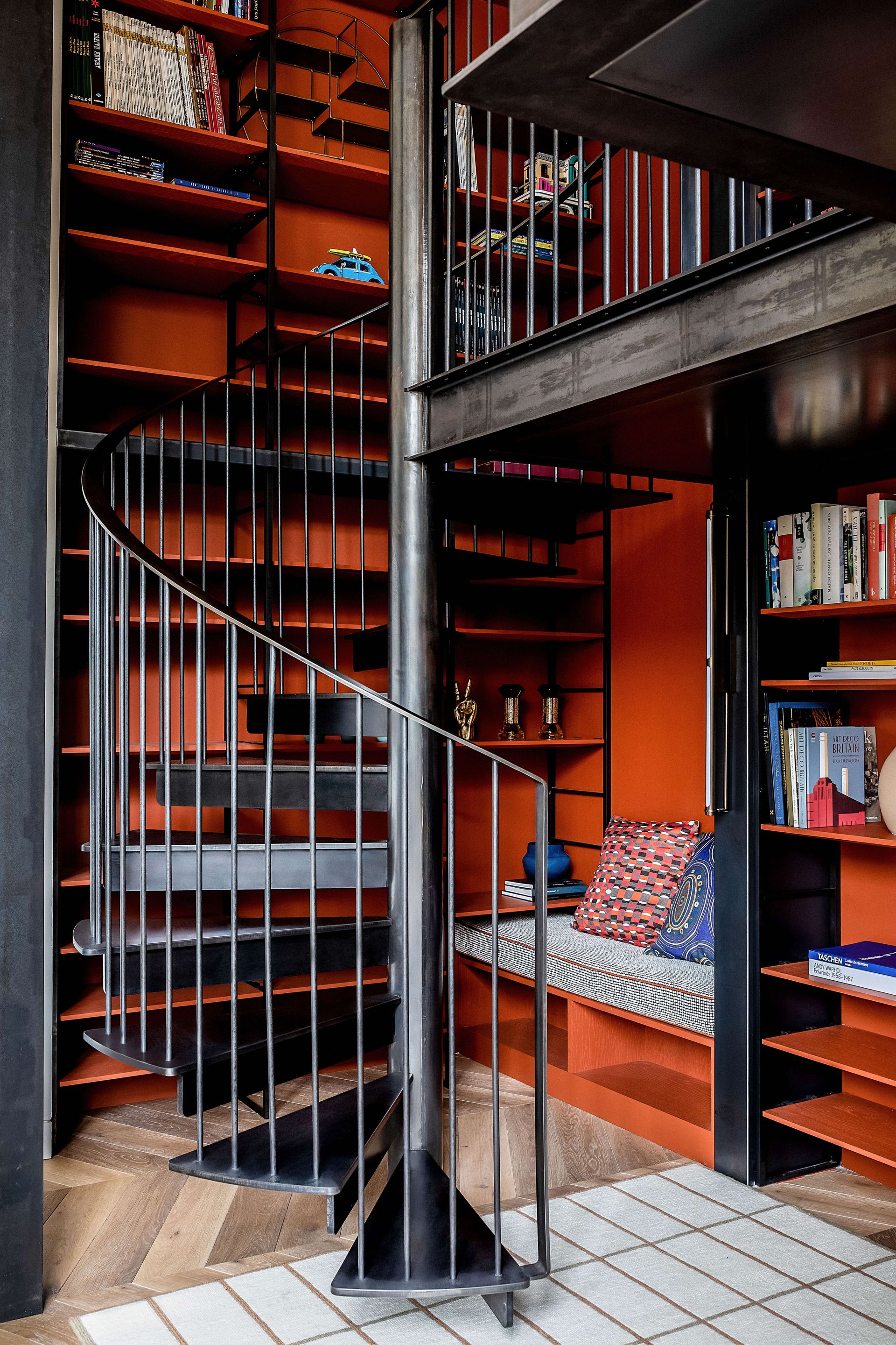
- See more beautiful library ideas.
Kitchen
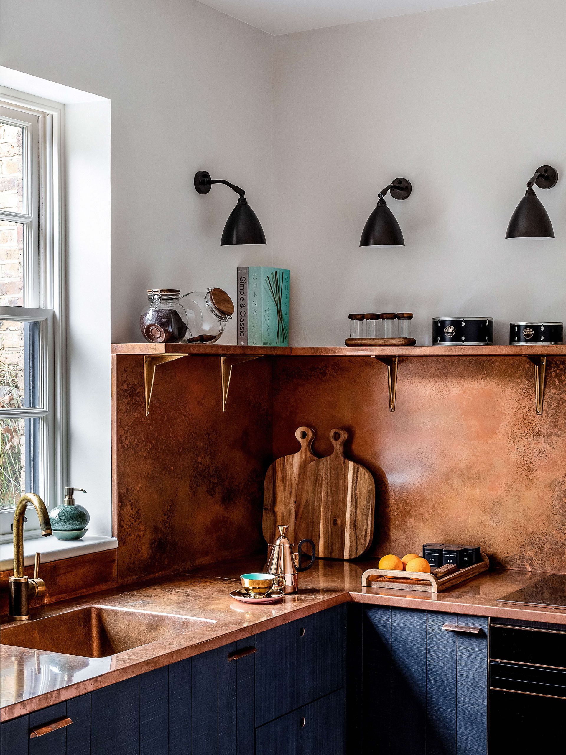
Back across the hall and through the opposite Crittall door is a small but practical kitchen. Designed by DeVol, the deep orange of the copper surface and splashback were chosen to mirror the same warm color scheme in the hallway.
The copper is a clever choice for the small space as it bounces light around, making the space appear lighter and larger.

- See more small kitchen ideas in our inspiring gallery.
Bedroom
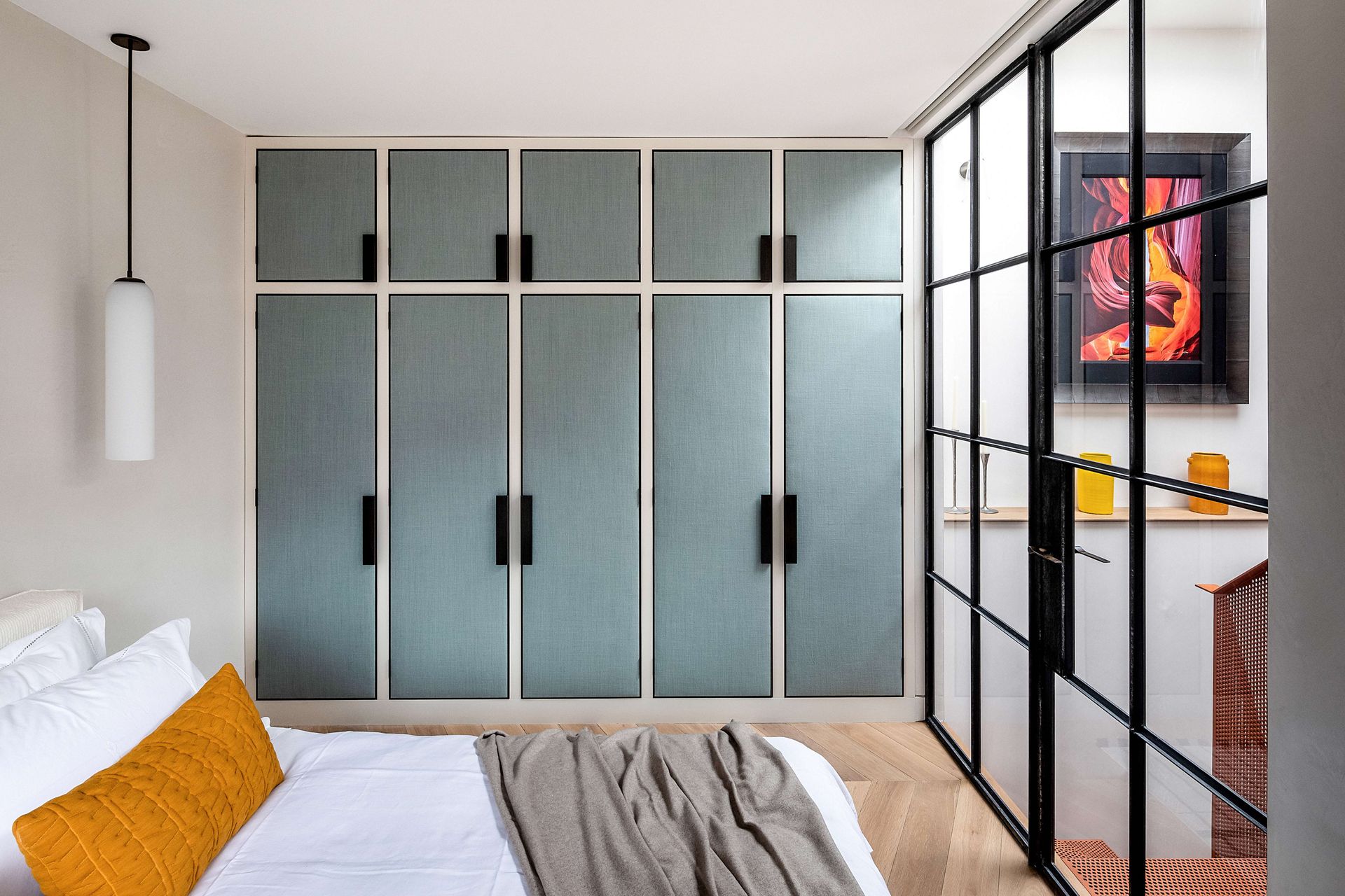
Up the steel staircase and through another Crittall door is the bedroom. Michaelis Boyd designed bespoke joinery to add a pop of muted color to the room, plus cleverly the padding acts as a noise dampener too, creating a quite serene space that's the perfect retreat.
- Be inspired by more modern bedroom ideas.
Living room

Originally made up of four separate rooms, the lounge space is now a large open plan room that's perfect for relaxing and entertaining.
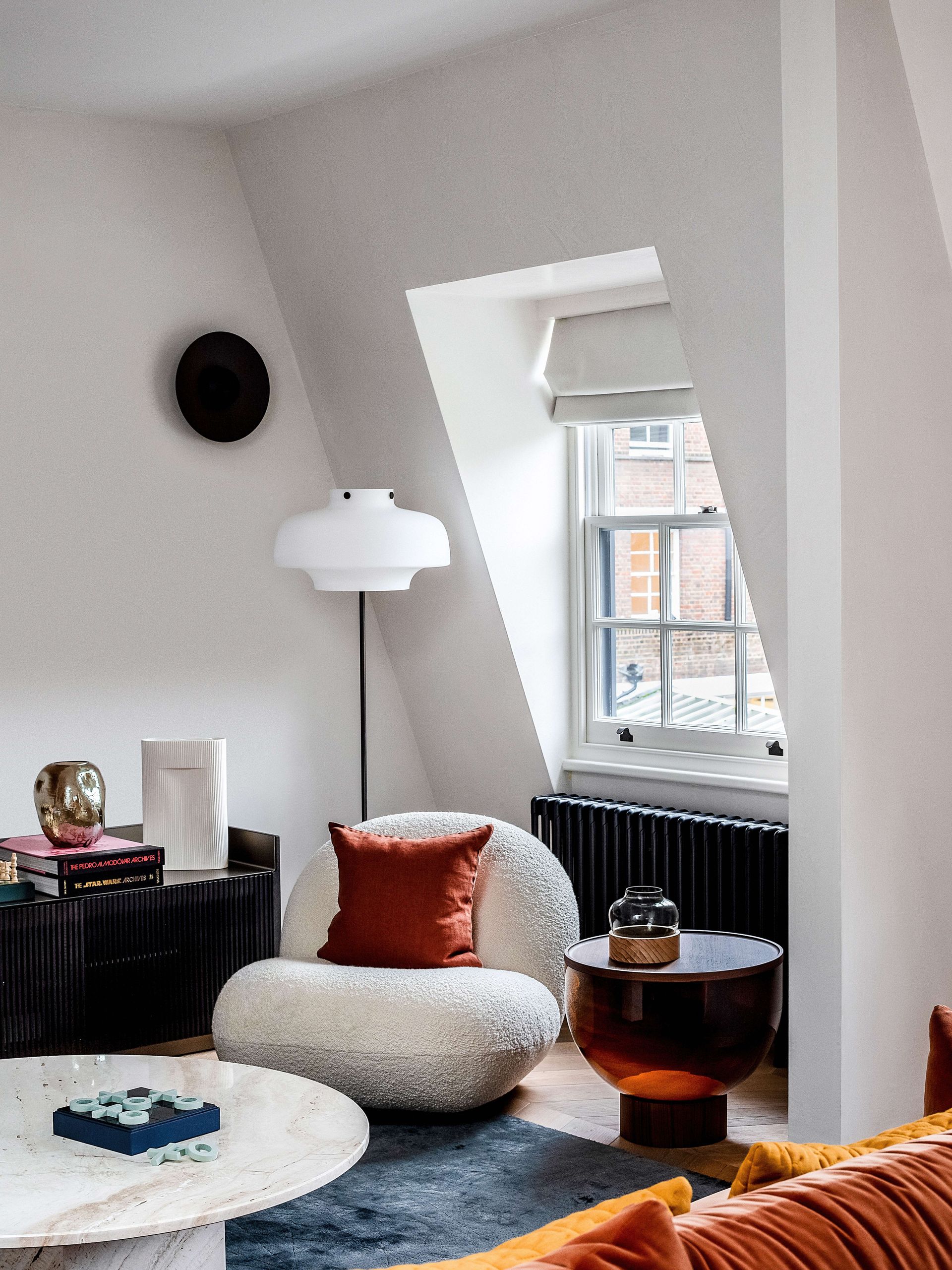
There's a football table (glass-topped and as stylish as they come), a blackened steel cocktail bar, and a and softly furnished sofa and chill-out area that's perfect for movie nights.
- Find more stylish living room ideas in our gallery.
Bathroom

The upstairs modern bathroom (there's a WC too on the ground floor) it's the teal marble floor that first catches the eye.
The bold turquoise hues are the perfect pop of color for the otherwise soft, neutral space and it was of course the starting point for the rest of the room's design. The simple pink tiles were picked to perfectly match the slight accents on pink that also run through the marble and the striking black sanitaryware was chosen to contrast all the soft shades.
Be The First To Know
The Livingetc newsletter is your shortcut to the now and the next in home design. Subscribe today to receive a stunning free 200-page book of the best homes from around the world.
Hebe is the Digital Editor of Livingetc; she has a background in lifestyle and interior journalism and a passion for renovating small spaces. You'll usually find her attempting DIY, whether it's spray painting her whole kitchen, don't try that at home, or ever changing the wallpaper in her hallway. Livingetc has been such a huge inspiration and has influenced Hebe's style since she moved into her first rental and finally had a small amount of control over the decor and now loves being able to help others make decisions when decorating their own homes. Last year she moved from renting to owning her first teeny tiny Edwardian flat in London with her whippet Willow (who yes she chose to match her interiors...) and is already on the lookout for her next project.
-
 The 12 Best Table Lamps for Reading —I'm a Certified Bookworm (and Shopping Expert)
When it comes to table lamps for reading, I don't mess around. If you're the same, this edit is for YOU (and your books, or course — and good recommendations?)
By Brigid Kennedy Published
-
 "It's Scandi Meets Californian-Cool" — The New Anthro Collab With Katie Hodges Hits Just the Right Style Note
The LA-based interior designer merges coastal cool with Scandinavian simplicity for a delightfully lived-in collection of elevated home furnishings
By Julia Demer Published
