This luxe cabin shows how to do the new warm minimalism trend, full of soothing and uplifting decor ideas
Soft woods and soothing shades, this Canadian forest home designed by Studio Paolo Ferrari embodies the warm minimalism trend


One of the main decor trends at the moment is a feeling rather than an aesthetic. A desire for our homes to make us feel both soothed and uplifted at the same time - recharged and restored by how welcomingly calm they seem.
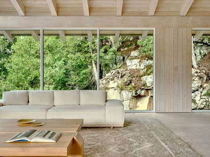
And embodying this desire is this 'warmly minimalist' cabin in the Canadian Muskoka woods, designed by Toronto-based architect Paolo Ferrari of Studio Paolo Ferrari. The soft color of Douglas Fir blends with views out of the picture window, bolstered by the many shades of cream and beige from the artfully curated pieces of furniture. The result is a space that feels both of its surroundings, and cosseted gently away from the outside world.
'For us, the idea of warm minimalism is all about creating a space that feels restorative and connected to nature,' Paolo says of this wonderful modern home.
'Our client was looking for a retreat from the city. Richard did not want this to feel ubiquitous Muskoka and instead wanted this property to feel more akin to a beach house,' Paolo continues. 'For us the idea of locality was important and we naturally leaned into a restrained palette made up of whitewashed Douglas Fir and Muskoka Granite, both of which are local to this part of Canada. There is an enveloping quality to a restrained palette and it allowed us to heighten the quality of the site. The trees feel more vibrant and the blue of the lake more evocative.'
Kitchen

The kitchen borrows many tenets from the modern farmhouse movement - a blend of natural materials such as wood and rock - and uses them to create a sophisticated yet soothing space.
But despite being a pared back palette, this isn't strictly a minimalist kitchen - there are whorls and textures that create a sense of intrigue. This - of course - was intentional, and a way to take a modern kitchen and imbue it with a sense of personality.
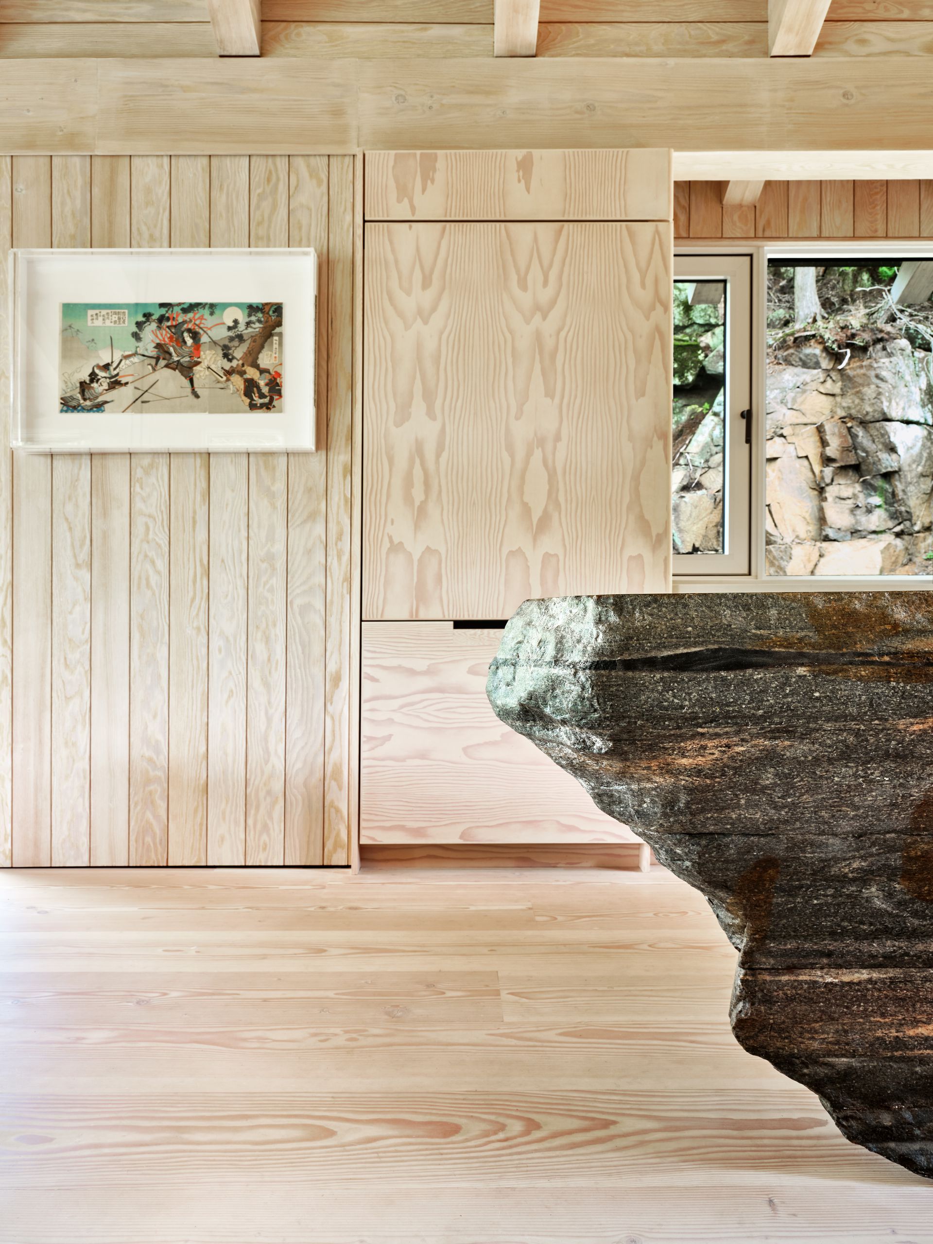
'We wanted the cabinetry to express the natural quality of the wood,' Paolo says. 'We didn’t want this to feel engineered and we opted for flat cut Douglas Fir, which is the single wood species used in the interior architecture and local to this part of Canada.'

Contrasting the gentle fronts of the cabinet doors is the large kitchen island, made of Muskoska Granite. It's a solid piece, irregular, and looks like it was just hewn from the mountains around the cabin. Because it essentially was.
'This was an extremely complicated piece,' Paolo says of the island that measures 11’-0” x 4’-0” wide. 'We had the vision of wanting to create a kitchen that both blended into the interior architecture with a monumental island that connected the interior to the site’s terrain. The site is essentially a cliff made up primarily of Muskoka granite visible from the kitchen. In essence, the kitchen recedes and it’s all about the interior architecture and the island connecting back to the site and escarpment (exterior rock face, which is made of Muskoka granite).'

The closer you look, the more you notice the different textures at work in this modern farmhouse kitchen. The designer John Pawson, known as being the master of modern minimalism, was known to complain that the brushstrokes of a rough plaster finish were too busy for his aesthetic, which highlights how different Paolo's approach truly is.
The warmth in Paolo's warm minimalism comes from the mix of wood panels and fronts, from the rough edges of the stone, and from the blend which stops the space feeling one note.
DINING AREA

The open plan kitchen dining area sits under a vaulting peak of 13'-2”, helping to draw the eye along the cavernous space and out the vast picture window. The ceiling is also made from Douglas Fir, and keeping to such a minimal palette of materials helps to create a seamless space.

Minimalism is often (wrongly) asscoiated with a lack of softness, and instead with a Spartan sense of hardness and discomfort. But these dining chairs, part of Studio Paolo Ferrari's Editions collection, disprove this theory. They at once manage to be sparing (in color) but soft.
'They wrap around the user creating a very comfortable seat and the wrap around back doubles as an armrest,' Paolo says.

The dining table is solid Saur wood from Indonesia. 'It was a piece my client Richard purchased while travelling,' Paolo adds. 'It’s been brushed and blackened.'
LIVING AREA

Despite the windows being the hero of this beautifully beige living room, Paolo purposefully centered the decor around comfort.
'The rug is pure wool and was custom made for the project,' he says. 'It adds a layer of softness, while blending into the neutral palette. The rug was designed to incorporate Berber symbols for man, dog and forest, a cheeky nod to our client, his dog and the site.'

Many designers have come up with ingenious uses for hiding living room TVs, but the beauty of warm minimalism is a curation of beautiful and functional pieces, chosen for how you actually live. While the TV errs more towards functional than beautiful, choosing not to hide it away was an acknowledgement of how the owner likes to genuinely use the space.
'Hiding televisions can get tricky and cumbersome and often are designed to prioritize a photoshoot vs how our clients actually live,' Paolo says, giving permission for us all to keep our sets out in the open.
Bedroom

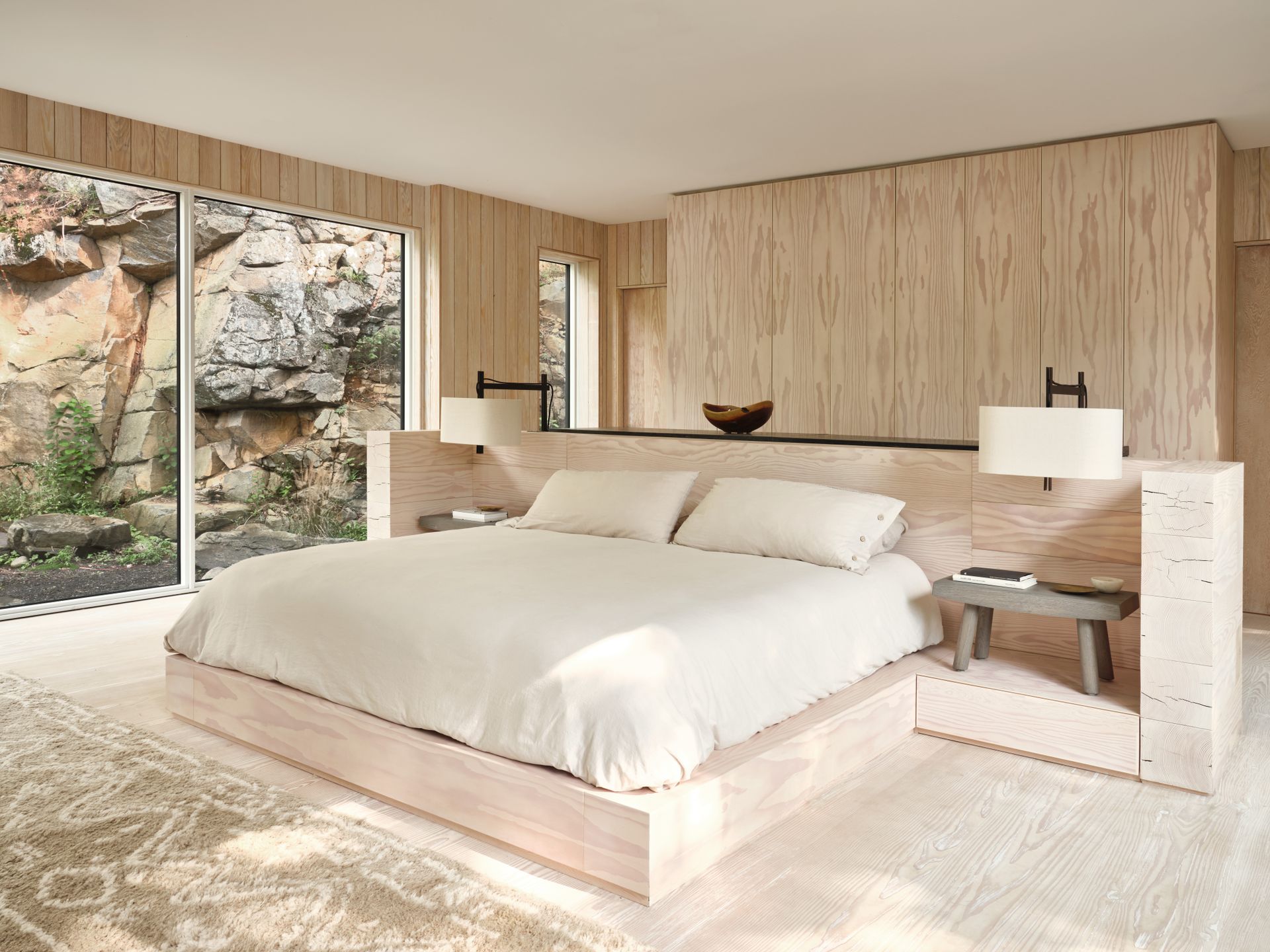
With its raised platform and enclosed headboard, the bed feels cosy despite being in a large, almost empty space. 'The bed platform has a monumental quality, made up of stacked timbers of Douglas Fir,' Paolo says. 'We wanted the bed to be completely immersed in the view and create a cocooning quality.'

Waking up in this bedroom, Paolo says, is a dream. 'On rainy days the view to the exterior has a quality of a Japanese Onsen, it’s pure magic.'
It's a reminder to embrace the best of what you need for a space like this - a bed, a light, a table, a rug for comfort - and do away with the rest.
Bathroom

Just like the kitchen island, the modern bathroom is made from Muskoka granite, the same local stone used throughout the project.
'We wanted to the primary ensuite to have an enveloping, cave-like quality,' Paolo says. 'We wanted the ensuite to feel as though you were entering the rock. We wrapped all the walls in Muskoka granite and the sink was carved from a single block. As well, for the ensuite, it’s all about the connection to nature. Because the site is sloping, the exterior ground cover is just below the height of the vanity, creating this wonderful sunken quality when you’re standing in the ensuite. As well, the mirrors were intentionally side mounted allowing the view out and connection to the escarpment take precedence.'
See more work from Studio Paolo Ferrari.
Be The First To Know
The Livingetc newsletter is your shortcut to the now and the next in home design. Subscribe today to receive a stunning free 200-page book of the best homes from around the world.

The editor of Livingetc, Pip Rich (formerly Pip McCormac) is a lifestyle journalist of almost 20 years experience working for some of the UK's biggest titles. As well as holding staff positions at Sunday Times Style, Red and Grazia he has written for the Guardian, The Telegraph, The Times and ES Magazine. The host of Livingetc's podcast Home Truths, Pip has also published three books - his most recent, A New Leaf, was released in December 2021 and is about the homes of architects who have filled their spaces with houseplants. He has recently moved out of London - and a home that ELLE Decoration called one of the ten best small spaces in the world - to start a new renovation project in Somerset.
-
 These 12 Best Table Lamps for Your Desk — Perfect Glows for a Creative Home Office
The best table lamps for your desk is have a soft, targeted glow. Elevate your WFH set-up with these stylish picks endorsed by Style Editor Brigid Kennedy
By Brigid Kennedy Published
-
 The Nespresso VertuoPlus is 30% Off for President's Day, and it's Kim Kardashian's Coffee Maker of Choice
This sleek and stylish coffee maker was spotted in Kim's home bar, and you can currently save $60 if you buy yours from Amazon
By Lilith Hudson Published

