Inside a luxurious London apartment that's inspired by the iconic Covent Garden Piazza
This gorgeous London home pays homage to the beautiful square it overlooks in the most subtly stylish ways


The property
A room with a view indeed. It's easy to see how the architects of this modern home were inspired by the beautiful Covent Garden piazza. Steeped in history and with a strong cultural heritage in the capital, this square has always been known as a hub of activity, alive with the hustle and bustle of the city. So when London-based interior design and architecture studio Ward & Co, were given a project of an apartment located within a Grade II listed building on the edge of the market square, the inspiration for the project was obvious.

'Our brief for this project was to create a space that reflects the listed status of the building, the cultural heritage of the location and yet in-keeping with the archetypal Covent Garden resident.' explains Rosie Ward, Creative Director at Ward & Co.
'Every element of the design, from the choice of materials and furnishings to textures and colors, have been selected to reflect and celebrate these elements whilst considering the fabulous aspect and views over the historic Piazza. We have worked together with local artisans to capture the elegance and essence of the location with a vibrant twist and contemporary touches.;

Living room

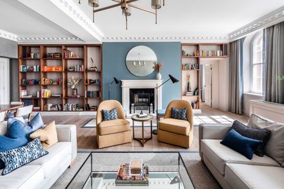
The color palette used throughout the apartment is made up of strong blues, soft greys, warmer brown tones, wooden accents, and mustard yellows. The scheme was chosen for its classic 'British' feel that was current and fresh but had a longevity too.

In the spacious reception room, which works as both a living room and a dining space, is a gorgeous bespoke, built-in bookcase. But this bookcase isn't just for show, or storage, it's a subtle nod to the Piazza from which this home takes its inspiration.

Housed in the hand-crafted library are 400 books. Each book was chosen to honor a year in Covent Garden’s history, since its inception as London’s first modern square in 1630.
Dining area

The dining area feels like its own 'room' positioned behind the sofa, to create a separate zone within the open-plan space. Again, deep blues meet warm dark woods to give a very traditional, stately feel and yet the shape of the furniture, with its clean lines and Mid-century look give the space a modern edge.
Sitting room

A smaller sitting room provides a more intimate space to relax away from the main living space. In here the decor feels fresher, more modern and less formal. Above the sofa hangs this room's nod to Covent Garden, a pair of oil paintings, commissioned for the project that reflects the views of the adjacent Piazza and constant movement of the market square.

Kitchen

The same deep blues and wooden tones can be found in the kitchen. The white stone worktops and soft off white walls lift those moodier hues so the space still feels bright and inviting.
Guest bedroom

A bold blue four-poster bed fills the guest bedroom, but it's simple slimline design means it doesn't overwhelm the room. The blues are warmed by the gold accents of the wall lamps, mirrors and the small touches found in the white marble console table and matching bedside tables.

Guest bathroom

The warm tones and textures continue into the main bathroom, which has been clad in natural stone. It provides the perfect backdrop for the unique Picasso resin freestanding bath, which has been elegantly illuminated by discrete uplights and all those honey tones have been offset by gunmetal brassware.
Master bedroom

The master bedroom has a lovely, luxurious hotel feel with the symmetrical design, plush headboard and sumptuous colors.

All the textures and warm colors make it feel cozy and inviting so the smaller proportions create a cocooning space.
Ensuite master bathroom

The large ensuite master bathroom feels modern and fresh with large marble wall tiles and a spacious walk-in shower. Again, a hint of warmth is added with the wooden cabinetry and the blue comes into this room too with the throw pillows used on the window seat, so the space still feels cohesive with the other rooms.
Be The First To Know
The Livingetc newsletter is your shortcut to the now and the next in home design. Subscribe today to receive a stunning free 200-page book of the best homes from around the world.
Hebe is the Digital Editor of Livingetc; she has a background in lifestyle and interior journalism and a passion for renovating small spaces. You'll usually find her attempting DIY, whether it's spray painting her whole kitchen, don't try that at home, or ever changing the wallpaper in her hallway. Livingetc has been such a huge inspiration and has influenced Hebe's style since she moved into her first rental and finally had a small amount of control over the decor and now loves being able to help others make decisions when decorating their own homes. Last year she moved from renting to owning her first teeny tiny Edwardian flat in London with her whippet Willow (who yes she chose to match her interiors...) and is already on the lookout for her next project.
-
 The 12 Best Table Lamps for Reading —I'm a Certified Bookworm (and Shopping Expert)
When it comes to table lamps for reading, I don't mess around. If you're the same, this edit is for YOU (and your books, or course — and good recommendations?)
By Brigid Kennedy Published
-
 "It's Scandi Meets Californian-Cool" — The New Anthro Collab With Katie Hodges Hits Just the Right Style Note
The LA-based interior designer merges coastal cool with Scandinavian simplicity for a delightfully lived-in collection of elevated home furnishings
By Julia Demer Published

