This uber-modern beach house is a lesson in loft-style living
Because why have lots of small rooms when you can have one huge one? Step inside this stunning seaside home and learn a thing or two about open-plan design


The property
When you are blessed with a plot in as gorgeous as a location as this modern home, with the Suffolk countryside stretching out around you, the beautiful coast, literally a stone's throw away and skies so big they almost don't seem real, it an obvious call that the home you build is going to be at one with all that nature that surrounds it. So when the designers at Studio Pond decided to build this home, it was very much influenced by the landscape, drawing inspiration from the vertical reedbeds and fishermen’s huts that can be found along the nearby coast.

Inside the property feels so connected with the outdoors, the spans of glass walls opening out onto the terrace create a very seamless flow between indoors and out. The beautiful light that floods the space, totally uninterrupted because of the mainly open plan, loft-style living spaces.

Like the sound of it? Well, it's actually currently on the market with The Modern House...
Open plan kitchen

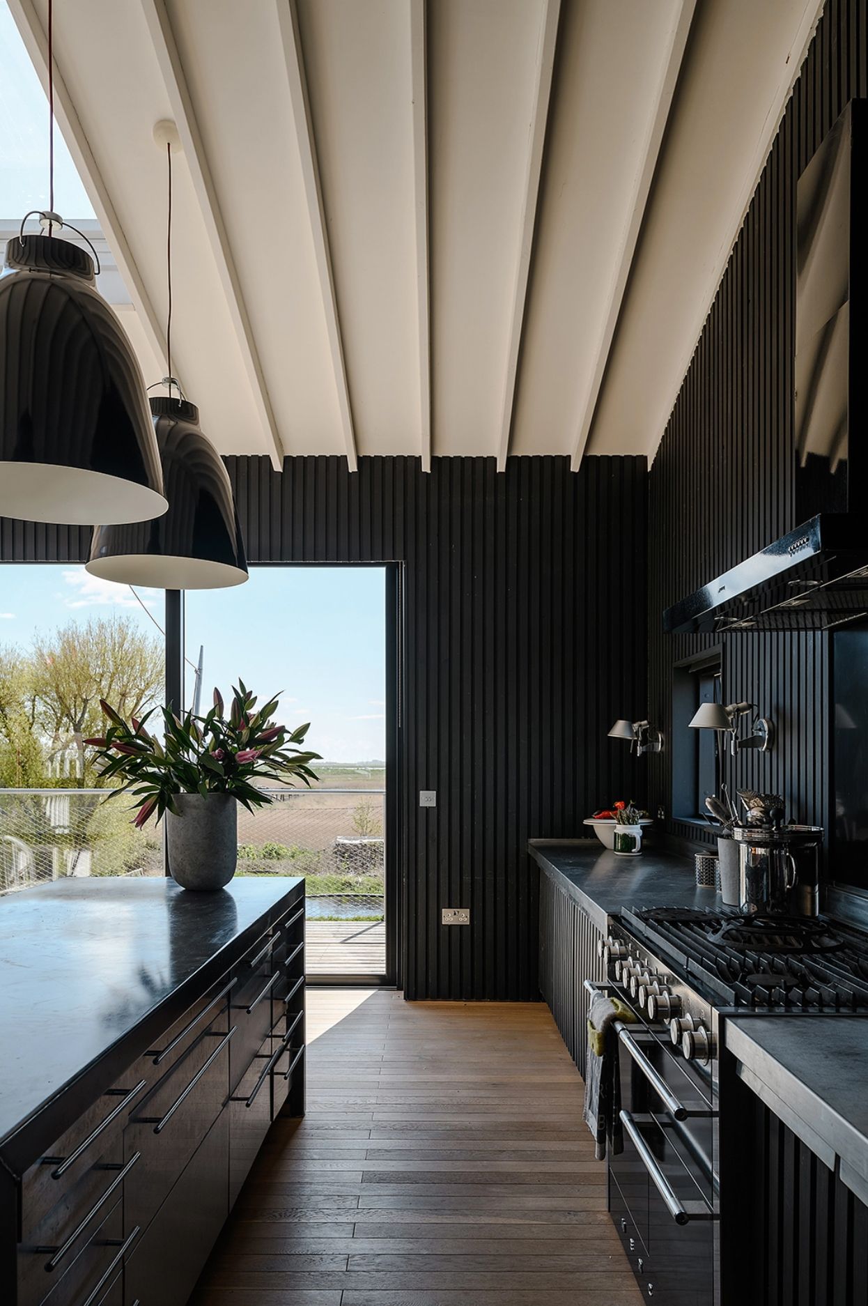
The first floor is where the main living spaces are, and apart from a guest bedroom that's tucked away at the back, it's a completely open-plan space up here. The large sliding glass doors fill the room with natural light, and can be completed opened up in the warmer months, expanding the space to include the spacious terrace that runs along the back of the house.

The stylish black kitchen doesn't feel dark or enclosed, despite the moody hues it feels fresh and light and blends perfectly with the black wooden paneled walls. The steel worktops and kitchen island give the space a slight industrial edge which works perfectly with the loft-like space.

The dining area runs between the kitchen and living room, perfectly positioned to look out over the gorgeous scenery that surrounds the property. Again the monochrome scheme of black and white links the space with the kitchen and the simplicity allows for little distraction from the view.
That statement lights that hang above the dining table again add that raw, industrial feel as well as a pop of color. The ceiling fixture mirrors the one above the stairwell that hangs pendant lights down into the hallway.

At the opposite end of the kitchen is a snug living room. Separated from the rest of the space with a vivid orange corner sofa, this area feels cozy and intimate, despite being part of a large open plan space. There's a log burner to up the coziness too.

Hallway

On the ground floor, you enter the house through this beautifully light hallway. It borrows light from the open-plan space above, and the timber-clad walls down here are painted white, rather than black, so feels just as light and bright as the first floor.
Polished concrete floors run through the whole of the downstairs, and a contrasting warm oak staircase takes you up to the main living space.
Master bedroom

The white paneled walls continue into the master bedroom, in fact, they are used in all the rooms downstairs (apart from the bathroom) so even though this floor is not as open plan as the one above you still get that seamless flow between rooms, which does give that sense of openness.

A dressing room is separated by a half wall, and an optional sliding door, so the room feels very open and airy. Plus, the doors blend into the walls so there's no visual bulk in the room either.
Guest bedroom

The guest bedroom is decorated in a similarly simple but chic style, with minimal furniture and a limited color palette. It feels very restful and calm. The floor-to-ceiling French doors flood the space with light, but there are steel shutters that can be pulled over the windows from privacy and darkness.
Bathroom

In the bathroom, the polished concrete from the floors is taken up onto the walls. The dark wooden-clad bathtub and matching floating sink almost mirror the space upstairs, creating a subtle connection between the two. That's something unique about this house, all the rooms feel very connected and cohesive – it's been designed as a whole space rather than individual rooms.

Studio

Sitting at the end of the beautiful, very natural-looking garden is the studio. An aluminum-clad building that reflects the light from the wildlife pond.

The interior of this garden office is just as striking as the exterior. Lined in birch plywood is feels most softer and warmer in contrast to the metal used outside.

Light flows in through both the huge windows and the wall of translucent polycarbonate which provides the perfect backdrop for the curated shelving.

Be The First To Know
The Livingetc newsletter is your shortcut to the now and the next in home design. Subscribe today to receive a stunning free 200-page book of the best homes from around the world.
Hebe is the Digital Editor of Livingetc; she has a background in lifestyle and interior journalism and a passion for renovating small spaces. You'll usually find her attempting DIY, whether it's spray painting her whole kitchen, don't try that at home, or ever changing the wallpaper in her hallway. Livingetc has been such a huge inspiration and has influenced Hebe's style since she moved into her first rental and finally had a small amount of control over the decor and now loves being able to help others make decisions when decorating their own homes. Last year she moved from renting to owning her first teeny tiny Edwardian flat in London with her whippet Willow (who yes she chose to match her interiors...) and is already on the lookout for her next project.
-
 How to Thaw a Frozen Pipe — Learn Everything You Need to Know in 5 Minutes With This Guide
Winter storm caught you off guard? We asked an expert — just how do you thaw a frozen pipe?
By Hugh Metcalf Published
-
 The 12 Very Best Silk Bedding Pieces — As Our Style Editor Says: 'It's What Dreams Are Made Of!'
Slumber in lustrous luxury with the very best silk bedding sheets, duvets, pillowcases, and more — your sleep score will thank us later
By Julia Demer Published

