This mad lake house in Poland breaks tradition with imaginative spaces and daring design
With an imaginative kids room that's divided over three levels, a master suite with upholstered walls, a sunshine yellow bathroom, plus a home cinema and disco-garage, this lake house in Poland favours the bold...


The Property
This lakeside home in Poland is modern and playful, with a wonderfully imaginative kids bedroom and a decadent master bedroom upstairs, and more subtly playful spaces down at ground level. There's also a show-stopping illuminated garage, and a tiered home cinema with perforated zig-zag walls.
The lakefront property spans 2562 square feet (238m²), is surrounded by woodland and has direct lake access.
Designed by Zarysy Jan Sekuła, the country home brings in the surrounding nature with an earthy colour palette – but in more unexpected ways like a green ceiling.
Entrance
The hallway sets the tone for the rest of the house, with a woodland mural and the same colour palette that continues in the rest of the home.

A floating wooden staircase makes a dramatic impact, and features striking design with slatted sides all hanging from the ceiling.

The burgundy seat adds warmth and contrasts with the green ceiling. A glass door offers a glimpse of the illuminated garage – see more on this space later.

The walls' edges are curved, and the woodland mural is a nod to the home's setting.


Landing
As for the upstairs - the designer was given free reign to create something whimsical and imaginative...

Girl's bedroom
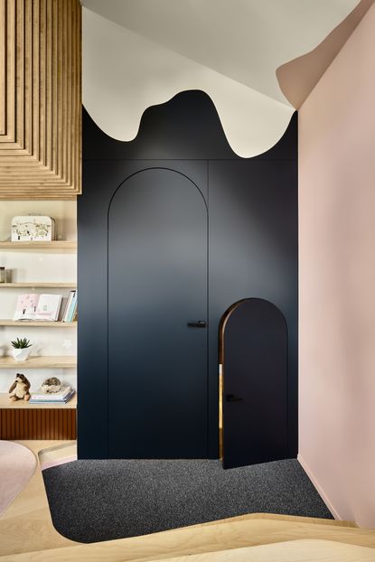
Two arched doors – one big, one miniature – signal the entrance to the kids bedroom. Clearly, this is no ordinary space.

The designer creates a girl's bedroom that's whimsical and imaginative – a little world for the daughter to play and grow up in.

The designer wanted to create a bedroom built to last, one that the little girl wouldn't grow out of too quickly. She is only three, but it made sense to create a scheme that would also work during school age and into her teens.
To achieve this, walls were kept relatively neutral, leaving room for updating at a later stage. Colours, themes and wallpapers are easier to swap / replace than the joinery. The change in levels within the room will help it keep its playfulness and wow-factor throughout her childhood.

The height of the girl's bedroom opened a door of possibilities. The only obstacle was the positioning of the main window, which is relatively high in the room – too high for the child to see out of the window.
The objective was to utilise this height of the room while also being able to enjoy the views from the window, and utilise the deep window sill.
The solution was to build a three level composition – 1st for study, 2nd for play and 3rd for sleep.

The large pouf pads on the middle level conceal clever toy storage hidden under the floor. A swing is also going to be installed.

The middle level (used for playing) doubles as a desk.

Wide stairs lead up to the middle level where the deep window sill can now be enjoyed as a window seat for reading.

Childrens' bathroom
The designer wanted to create an ensuite bathroom that felt playful but without being childish. The bathroom needed to be a space that wouldn't date too quickly, and could be enjoyed throughout childhood.
A yellow painted wall and ceiling creates a sunny shower area, with a spotty tiled feature wall.

The yellow hue wraps around the shower enclosure, cocooning it in a cheerful sunny glow.

Master bedroom
The master bedroom features sumptuous upholstered walls, and hanging bedside pendant lights.

The designer's intention was to create a master bedroom which feels like a retreat – somewhere peaceful, quiet and calming to retreat to at the end of the day.
disguised within the walls are two upholstered doors that lead to separate spaces; one to a dressing room, and one to an ensuite loo.

Cold raw stone on the floor beautifully contrast with warm claret textiles behind the bed. A blush pink rug under the bed softens the look in the sleeping zone.

Bathroom area
Interestingly, the bathroom is part of the bedroom – there is no door between the two spaces. The designer went for this more open-plan layout to create a larger, hotel-inspired space.
The only wall is the one separating the bathtub and the bed. This wall is finished in soft grey felt which adds texture and softness.

Deep green bathroom cabinets add a pop of colour and tie in with the rest of the home's colour scheme.

Open-plan living area
The green ceiling from the hallway flows through to an open-plan living room, dining room and kitchen. The designer chose a dark, earthy colour palette to reflect the natural surroundings.
Floor to ceiling windows prevent the scheme from feeling too dark.

Kitchen counter tops are made from beautiful tiny terrazzo Corian slabs, complementing the dark stone tiles.

The kitchen continues the green scheme with green kitchen cabinetry.

A tall handless cupboard slides open to reveal a narrow place that's perfect fr storing herbs, spices, oils and vinegars.


The kitchen is separated from the rest of the space with a 'zig zag wall' created with rotating felt louvers, allowing the kitchen to be opened up or hidden away. The soft louvers are also used to disguise the concrete construction pillar in the middle.

The dining table was custom made for this space, and features modern steel legs.
Seven concrete lamps painted in the same sunshine yellow as the above bedroom add a needed pop of colour to this dark space. The lamps are actually painted in ombre effect – ranging from deep yellow to a softer beige shade on the far right.

The living room is zoned by a wooden ceiling and a change in flooring. Sliding doors open up to a pool area, and offer views out over the lake.

Behind the sofa is a terrazzo tile wall with welded, super-thin steel shelves.

Home cinema
Light, minimalist plywood and deep dark anthracite contrast in this striking home cinema.
Inspired by classic cinema, the room is spread over tiers to allows all the veiwers equal view of the screen.

Perforated plywood panels zig-zag around the room, aiding acoustics.

Garage
Last but not least, when it came to the garage, the owner asked for something special – something with wow-factor.
Thirty six round led lamps were created specially for this project, illuminating the space, the reflections bouncing off a mirrored wall.

The mirrored wall and dark glass multiply the effect of these halo-shaped lights.

The mirrored wall hides built-in storage, while the surrounding led lights are motion sensored and activated when a car takes position.

Be The First To Know
The Livingetc newsletter is your shortcut to the now and the next in home design. Subscribe today to receive a stunning free 200-page book of the best homes from around the world.
Lotte is the Digital Editor for Livingetc, and has been with the website since its launch. She has a background in online journalism and writing for SEO, with previous editor roles at Good Living, Good Housekeeping, Country & Townhouse, and BBC Good Food among others, as well as her own successful interiors blog. When she's not busy writing or tracking analytics, she's doing up houses, two of which have features in interior design magazines. She's just finished doing up her house in Wimbledon, and is eyeing up Bath for her next project.
-
 The 12 Best Table Lamps for Reading —I'm a Certified Bookworm (and Shopping Expert)
When it comes to table lamps for reading, I don't mess around. If you're the same, this edit is for YOU (and your books, or course — and good recommendations?)
By Brigid Kennedy Published
-
 "It's Scandi Meets Californian-Cool" — The New Anthro Collab With Katie Hodges Hits Just the Right Style Note
The LA-based interior designer merges coastal cool with Scandinavian simplicity for a delightfully lived-in collection of elevated home furnishings
By Julia Demer Published

