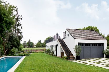
See how a 'historic' garage in Los Angeles has been transformed into a modern guest house with English country charm
Built in 1924, this three-car garage was considered a historic home by L.A standards so the facade and the structure had to stay, but what it's morphed into is almost unrecognizable...


1924 doesn't sound that old right? But by Los Angeles standards anything built before the 90s is basically considered ancient and so when it comes to updating these 'historic homes' what you can do to them is pretty limited. The homeowners of this property quickly found this out when deciding to convert their three-car garage into a guest house. The structure and even the garage facade all had to stay.
So how do you turn a dilapidated old (sorry 'historic') garage into a chic modern guest house? The homeowners brought on Cali-based Dmar Interiors to show them what could be done. Now all that's recognizable is the garage doors, and what lies behind is a two-bedroom, three-bathroom modern home, complete with a cozy home office and a huge roof terrace. Let's take a tour...
Living space

The brief for Dmar Interiors was European Countryside charm. The guest house was to be an escape from L.A life, and since the homeowners had only recently returned from a decade of living in London, they wanted to bring some of that classic English style back to their California home. But as you'll quickly see, 'countryside charm' doesn't always have to mean rustic, the designers took a totally different, refreshing route creating a more boldly colored, high-end version of country interiors that still feels warm, welcoming, and classic but just slightly more polished.

This isn't a huge space, it's 880 square footage in total so going open plan with the living spaces made sense. The living room and the kitchen share the same light-filled space, and both take up the perfect amount. Initially, the living room was meant to creep more into the kitchen, but it was decided a smaller living space and larger kitchen would make more sense. A living room can get away with being smaller and cozier whereas size is more important in a kitchen.
The deep blues of the built-in storage in the living room add to the cocooning feel of the space, plus the wood-paneled wall and the fireplace with its statement custom surround contribute to that too.
The rug acts kind of like walls, the thing in which all the living room furniture is ground by and what makes this space feel separated from the kitchen.

The kitchen has that really classic English country charm. The pale sage green cabinetry, the exposed beams, the butcher's block but like the rest of the house there's still a clear feeling of modernity.
The deep blueish grey zellige tiles and marble worktop gives the pale hues and wooden textures add more of an elegant glamorous edge. In this modern kitchen, the hanging globe pendants slightly shift the balance from country to contemporary.

Hallway

Since space was so tight, the hallway is only 38 inches wide, fine for moving through but how can you make a space that small feel like its own stylish room rather than just a buffer state? The answer was picture frame moldings which take up zero square footage but add plenty of interest, especially when they surround such chic lighting fixtures. And there's the small detail of the color blocking near the ceiling too, which again adds something to the space without the need to fill in with clutter.
The ceiling was given rightful attention too. The same tongue-in-groove oak paneling that can be found on the kitchen ceiling continues through the hallway.
Guest bathroom

Off the hallway is the guest bathroom. Again the challenge here was space. This modern bathroom needed to function as a bathroom for the guest bedroom but also for the whole house. There needed to be plenty of storage, plus a bath so it could accommodate all ages.
A custom vanity provides most of the storage needed and yet because of the light wood and cane frontage it doesn't feel bulky in the space. The matching wall unit provides open storage and even the huge niche in the shower was added for keeping products.

And this space isn't all form over function. The decorative wall tiles nod to the country-style the homeowners were after but mixed with the marble and pencil tiles of the shower it doesn't appear too fussy or twee. The striking black hardware in the shower also provides contrast with the more traditional gold accents used throughout the room.

Master bedroom

Getting natural light into this space was always going to be a challenge as there was only one wall where windows could be added. The solution was to add two tall windows to frame the bed and then just run with the fact it was a darker space. The deep green paneled walls totally distract from the lack of light and instead create this delicious cocooning space that in fact benefits from the darkness.
Warm dark woods and the rust tones of the bedlinen balance out the green and nod to that English country vibe. The touches of gold and notably the two globe pendant lights that hang over the bedside tables work beautifully with the wall color and add classic elegance as gold always does.

Home office

This space was originally going to be a second bedroom, but as this construction was happing both pre and during the pandemic and working from home was looking like the new way of life, it was decided it would be better used as a home office. However, the layout was planned so that should it ever need to be switched, a bed could easily fit in between the two windows even in this relatively small space.
The nook and its built-in features were there from the beginning, even when the space was going to be a bedroom, so handy that the cozy reading spot and extra storage lends itself so well to being in a home office. In the tiny nook, the deep green wall paneling goes floor to ceiling, but throughout the rest of the room it's just partial height so you get that drama and coziness of a darker shade but the room still feels light, open, and airy.

Be The First To Know
The Livingetc newsletter is your shortcut to the now and the next in home design. Subscribe today to receive a stunning free 200-page book of the best homes from around the world.
Hebe is the Digital Editor of Livingetc; she has a background in lifestyle and interior journalism and a passion for renovating small spaces. You'll usually find her attempting DIY, whether it's spray painting her whole kitchen, don't try that at home, or ever changing the wallpaper in her hallway. Livingetc has been such a huge inspiration and has influenced Hebe's style since she moved into her first rental and finally had a small amount of control over the decor and now loves being able to help others make decisions when decorating their own homes. Last year she moved from renting to owning her first teeny tiny Edwardian flat in London with her whippet Willow (who yes she chose to match her interiors...) and is already on the lookout for her next project.
-
 The 12 Best Table Lamps for Reading —I'm a Certified Bookworm (and Shopping Expert)
When it comes to table lamps for reading, I don't mess around. If you're the same, this edit is for YOU (and your books, or course — and good recommendations?)
By Brigid Kennedy Published
-
 "It's Scandi Meets Californian-Cool" — The New Anthro Collab With Katie Hodges Hits Just the Right Style Note
The LA-based interior designer merges coastal cool with Scandinavian simplicity for a delightfully lived-in collection of elevated home furnishings
By Julia Demer Published

