This minimalist white home is *also* kid and pet-friendly - the designer explains the 'impossible' secret
You wouldn’t expect to see such light colors and luxurious fabrics in a family home. But this interior designer has both looks and durability ticked off the list
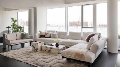

A family home needs to solve many practical issues in terms of functionality and durability, and often, looks come second. Making sure surfaces are spill and stain-proof in a home with small kids, and that the floors are easy to clean, especially where pets are involved too, while also ensuring comfort and room for all family members to spend time together at any given moment are not easy tasks to tick off a designer’s list.
It surprised me to learn that this pristine home in mostly white and light colors was designed for a family of four as a space where practicality and durability are just as much considered as style. Immaculately white walls, textiles, and materials are not what I imagined a family home would feature. But the interior designer has used clever, yet simple tricks to ensure all items last and are easily maintained while giving the home a feel of very elegant minimalism.
I had a detailed look at this contemporary yet timeless apartment in Brooklyn’s Prospect Heights and got the designer’s tips on mixing form and function so successfully.
The brief
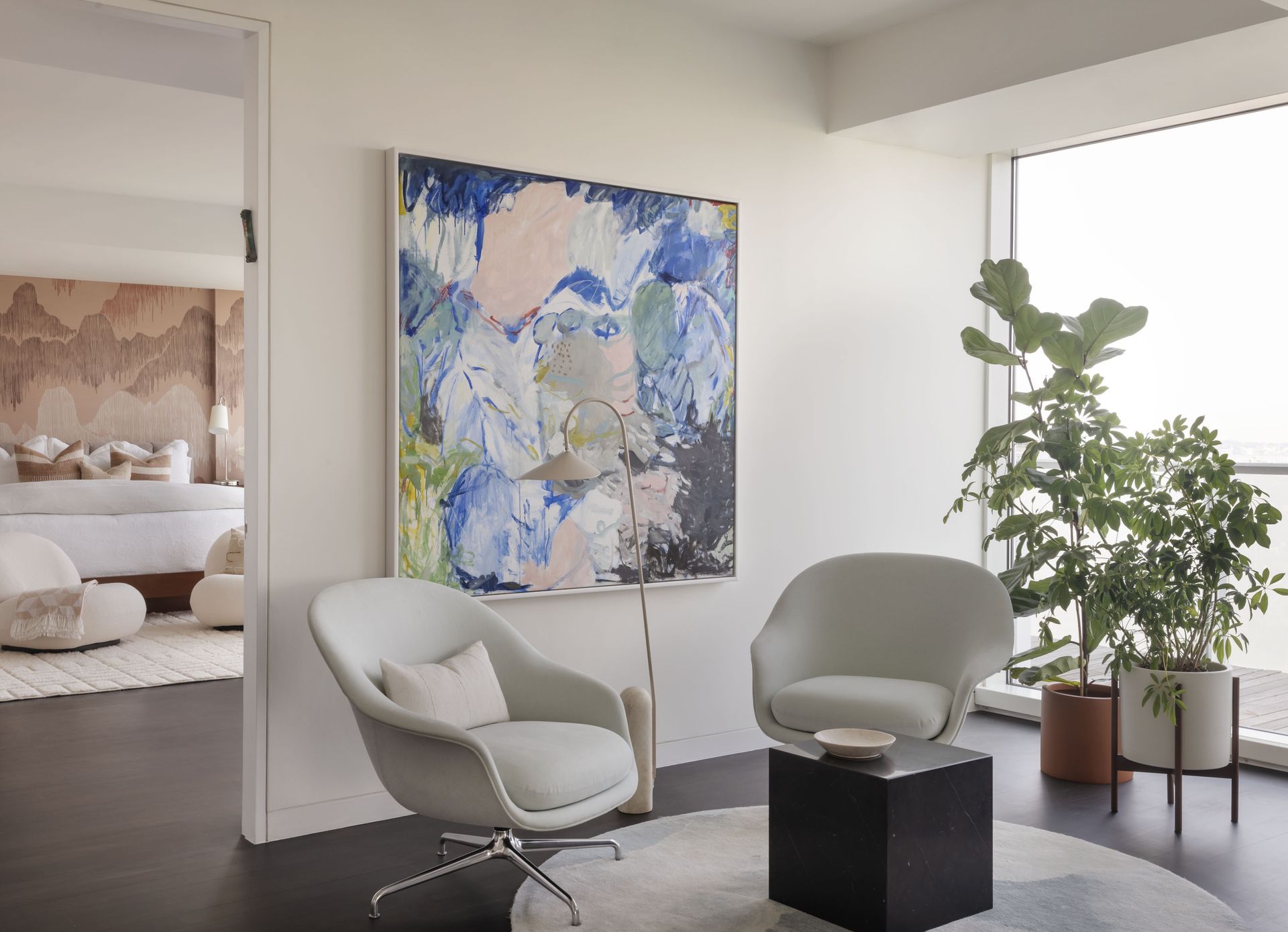
The condo is part of a modernist glass condominium designed by Pritzker Prize-winning architect Richard Meier. While it had been previously decorated by a designer, when the family moved in, it featured bold colors and strong patterns that needed a refresh. The clients wanted the home to feel timeless, yet maintain a modern interior design aesthetic. The look and mood couldn’t be more different to make the home feel like new.
With two sons and a dog, there was a definite need for more functionality and storage space, both a rarity and necessity for families living in the city. Eva Dornstreich, The Brooklyn Home Company’s principal architectural designer, worked closely with the homeowners to make these wishes a reality.
Every surface of this home, from walls to floors to furniture and accessories underwent a change. The kitchen island was enlarged, and worktops were replaced, while further utility space was incorporated to ensure there was not one nook or cranny that wouldn’t either serve a functional or aesthetic purpose. The result is a light, bright space filled with discreet kitchen storage and practical designs to cater to the needs of a city-dwelling family.
The secrets to how this is kid and pet-friendly
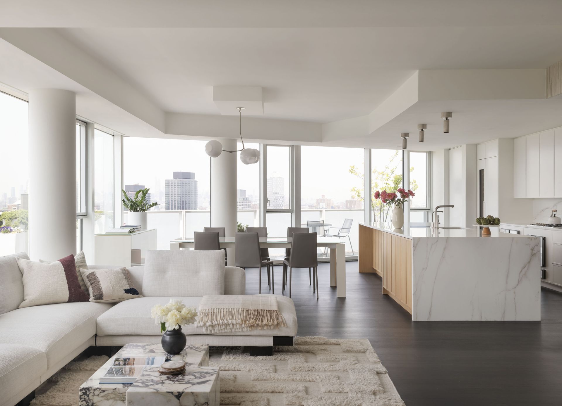
Previously the home featured bold patterns and strong colors, however, Dornstreich went in the complete opposite direction working with a restrained color palette of whites and light accents, adding subtle contrast through the use of texture and natural materials. The natural white oak wood floors were refinished and stained dark to ground the light-filled space, while subtle blues appear throughout the home as an extension of the sky just beyond the glass walls. The living room, bright and light decorated with white walls features a large, comfortable white linen sofa, and a soft, textured cream rug while in the background one notices the discreet and immaculately white kitchen cabinets and equally sparkling marble island worktop.
‘In addition to the apartment being home to two children and a dog, the homeowners were/are extremely intent on the interiors looking pristine for many years to come,’ Eva tells me, and you can see how this would, in theory, pose a challenge in terms of practicality. But she goes on to explain: ‘The refinished floors received special treatment to prevent damage from sunlight, while the marble counters received an invisible treatment to prevent staining and scratches. Naturally durable materials like plaster, wood, and tile were implemented throughout.’
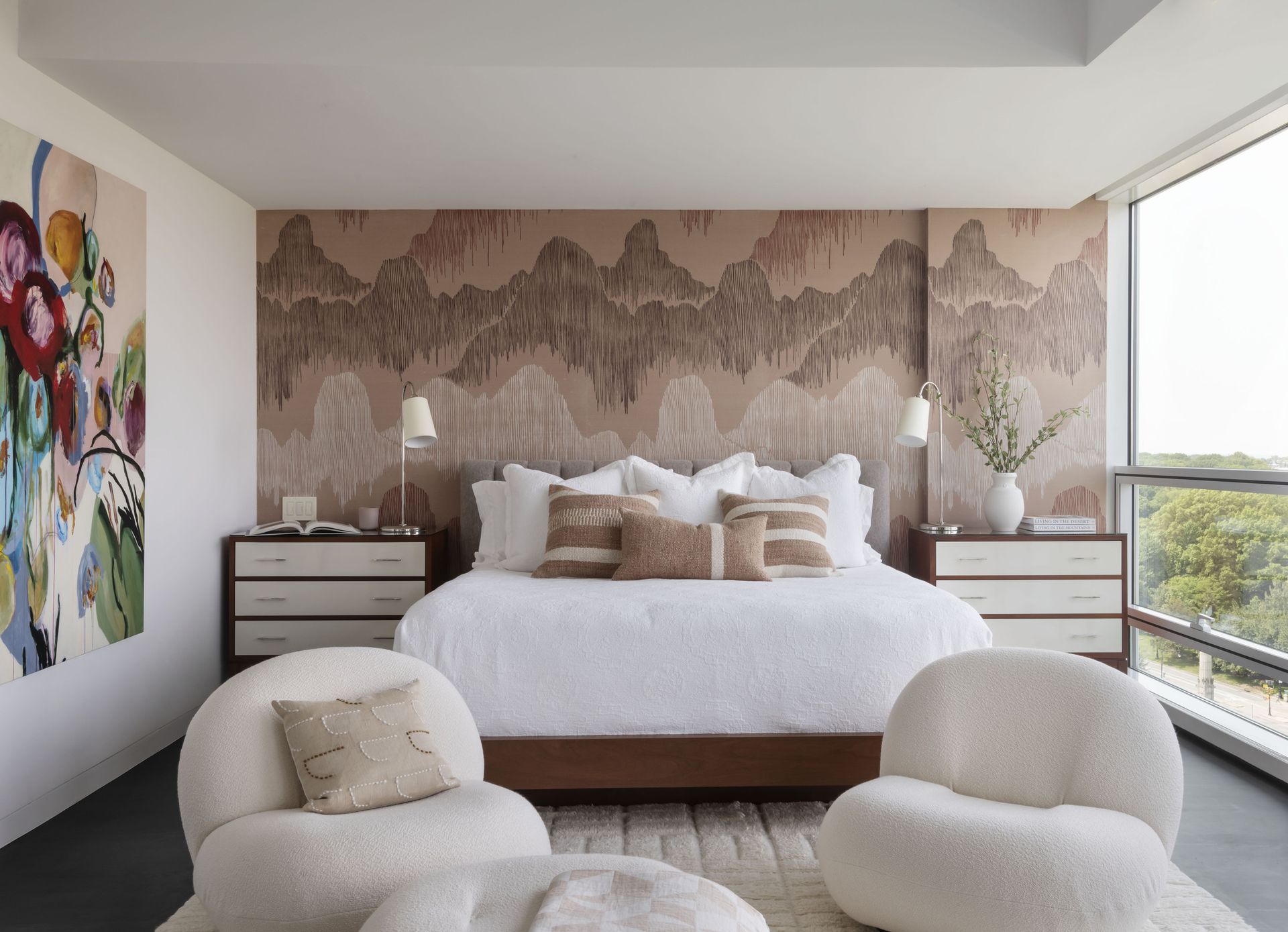
So while it might all be easy on the eye, it’s definitely not easy on your usual daily aggressions from family use and high traffic. The designer made sure all areas were covered. ‘The white sofa was upholstered in a performance fabric, and many samples were tested with ketchup and wine, I kid you not! And white paint can always be easily touched up.’ I love the apartment’s look of minimalism and simplicity knowing that behind its pristine surface, true design was at work to ensure it’s a look that will last, look good, and most importantly be lived in, in a relaxed way for many years to come.
Create a pristine home look with these buys
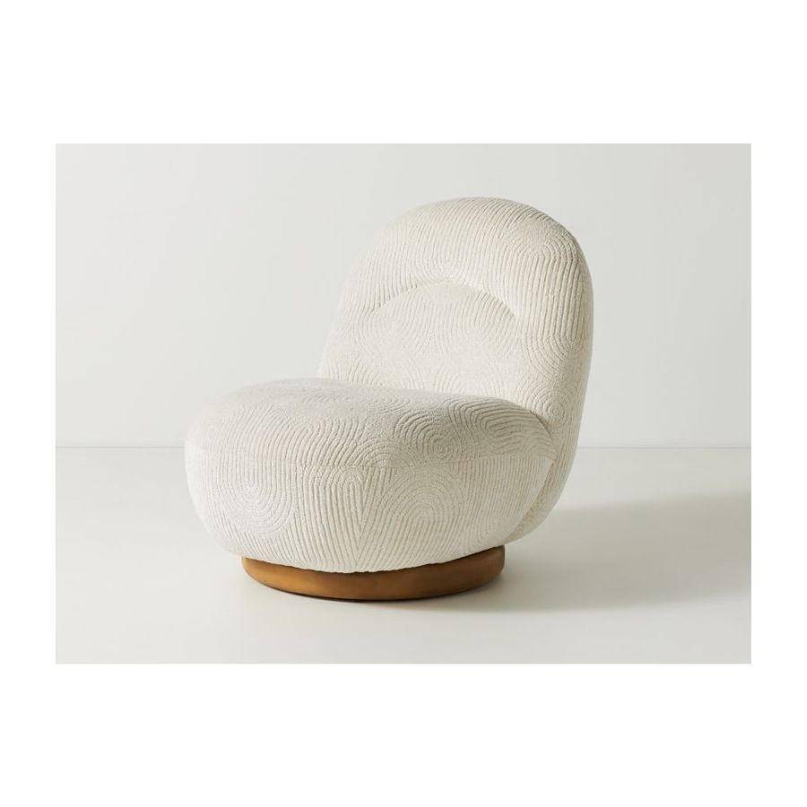
Price: $898
This accent chair is perfect for a minimalist interior in discreet white, while the velour texture keeps it interesting and adds depth to your design scheme.
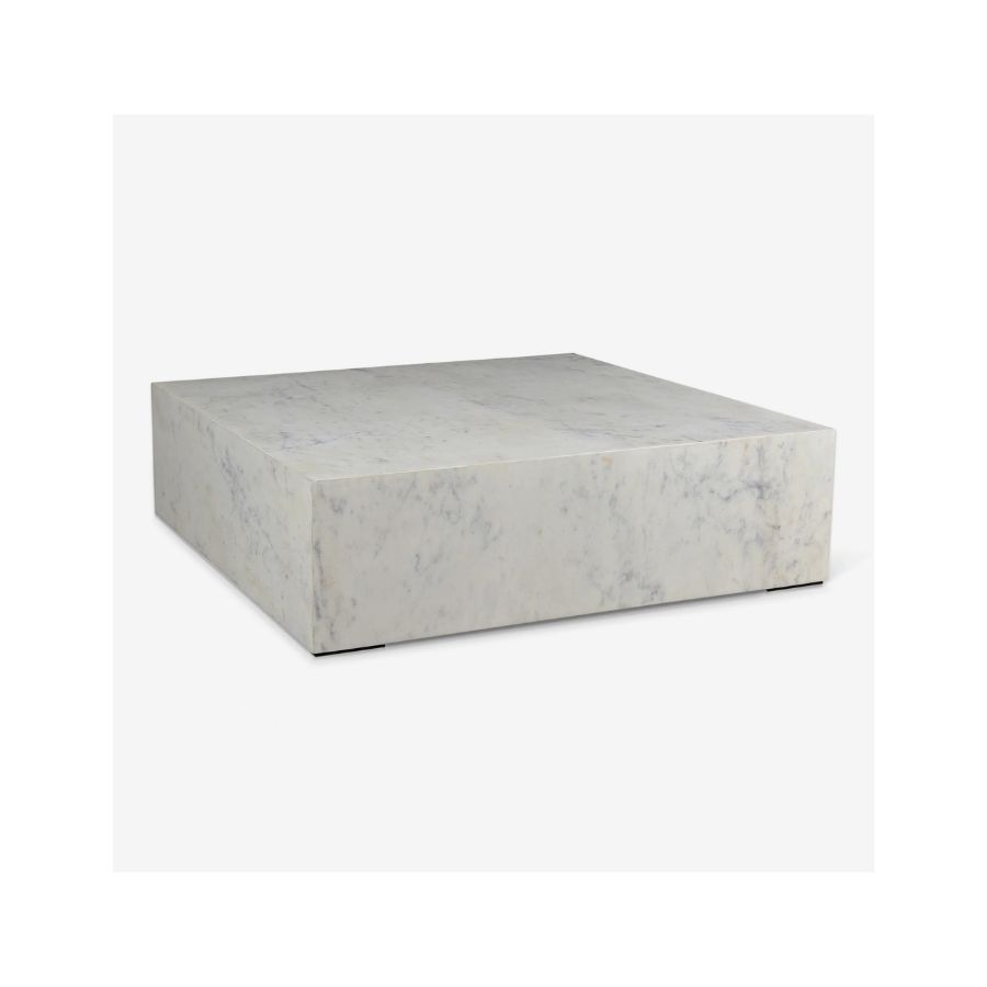
Price: $2,598
This is an investment piece but the effect it will create in a minimalist living room will be worth it. Shaped as a block of marble this coffee table will ground your design and create a focal point in your living space.

Price: $1,865
A pristine, white, minimalist space is THE perfect backdrop for modern art. Follow the example of this apartment design and curate bold art on your walls.
Be The First To Know
The Livingetc newsletter is your shortcut to the now and the next in home design. Subscribe today to receive a stunning free 200-page book of the best homes from around the world.

Raluca is Digital News Writer for Livingetc.com and passionate about all things interior and living beautifully. Coming from a background writing and styling shoots for fashion magazines such as Marie Claire Raluca’s love for design started at a very young age when her family’s favourite weekend activity was moving the furniture around the house ‘for fun’. Always happiest in creative environments in her spare time she loves designing mindful spaces and doing colour consultations. She finds the best inspiration in art, nature, and the way we live, and thinks that a home should serve our mental and emotional wellbeing as well as our lifestyle.
-
 These 12 Best Table Lamps for Your Desk — Perfect Glows for a Creative Home Office
The best table lamps for your desk is have a soft, targeted glow. Elevate your WFH set-up with these stylish picks endorsed by Style Editor Brigid Kennedy
By Brigid Kennedy Published
-
 The Nespresso VertuoPlus is 30% Off for President's Day, and it's Kim Kardashian's Coffee Maker of Choice
This sleek and stylish coffee maker was spotted in Kim's home bar, and you can currently save $60 if you buy yours from Amazon
By Lilith Hudson Published
