Explore a Georgian semi in East London with a minimalist Scandi-style aesthetic
How do you transform a standard Georgian semi in East London into your dream home? Extend it every which way, then add wow architectural features and huge windows to bring the outside in.

THE PROPERTY
A late Georgian semi in East London. The modern homes' lower ground floor has a kitchen/dining/living area and WC. Upstairs there’s a library, home office and guest bedroom, plus a bathroom and laundry. On the top floor is the master bedroom suite.
See more inspiring modern homes
DINING AREA
The owner brought on Martyn Clarke, who has built a reputation for thoughtfully designed contemporary residential projects. The existing floor plan didn’t work, the bathrooms to the rear of the upper and lower ground floors blocked off the garden and the place was cramped, with boxy rooms and narrow staircases.
The house was also the only one left in the street without a side extension–giving it a ‘missing tooth’ frontage. This lack proved to be an advantage, making the planning application a breeze.

It took the team a year to complete the project. The two-storey side extension created a new kitchen and WC on the lower ground floor with an extended bedroom (now the home office) and bathroom plus study area on the floor above and boosted the house from 1,400 to 2,100 square feet. Then the lower ground floor was opened up to create open-plan living, dining and kitchen areas.

A bold decision was taken to excavate the floor down eight inches to give the dining area a more imposing height. This was a big drain on the budget, not least because it led to the discovery of water-logged foundations.
It was the low point in the project but it was better to get it sorted sooner rather than later. In the end, the added hassle was worth it to get the extra height. The garden, now made up of contrasting blocks of formal box hedging and free-form meadow bordered by bleached limes and copper beeches is now the focal point of the house.

A raised area wraps around the room, serving as display area and extra seating for parties. The floor was excavated by a further eight inches to get more height in this room.

See Also: Laid-back Luxe Dining Room Ideas
KITCHEN
Designer Martyn Clarke had the confidence to go for a contemporary look with a very simple palette of materials including grey flamed granite across floors and worktops and white oak woodwork throughout.

Here, as elsewhere, a simple palette of materials set the tone, using mostly black, white and grey, granite and oak.

LIVING ROOM
Steps divide the living room from the dining area, zoning the open plan space and making each area feel bigger.

LIBRARY
This room, which had retained its original features, was planned to be a contrast with the rest of the house with dark grey walls and rich tones in the furniture.

The circular picture is a night scene of small towns in South Africa by South African artist Henk Serfontin.

STAIRCASE
Another of Martyn Clarke’s master strokes was to replace the narrow and rickety old staircase with slatted oak that lets light pour right into the centre of the house.

STUDY AREA
This study area in the entrance hall on the upper ground floor is the perfect nook for concentrating.

OFFICE
This room was designed to maximise views over the garden and the sedum roof so you can appreciate them while working.

GUEST BEDROOM
The existing features in this room were preserved. The African figures were picked up in Cape Town.

MASTER BEDROOM
This space feels completely neutral with the palette of grey, black, white that's used throughout the house. Calming textiles add interest.

BATHROOM
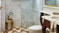
The main bathroom is in the upper ground floor extension, lit from above via a large rectangular skylight that provides drama and privacy. This modern bathroom is also where the laundry is done, in hidden built-in cabinets.

See the full range of Material Life furniture at material-life.co.uk, view Martyn Clarke’s portfolio at martynclarkearchiture.com.
Photography–Rachael Smith
See Also: Master bathroom ideas - 19 stunning design ideas for a dreamy master bathroom
Be The First To Know
The Livingetc newsletter is your shortcut to the now and the next in home design. Subscribe today to receive a stunning free 200-page book of the best homes from around the world.
The homes media brand for early adopters, Livingetc shines a spotlight on the now and the next in design, obsessively covering interior trends, color advice, stylish homeware and modern homes. Celebrating the intersection between fashion and interiors. it's the brand that makes and breaks trends and it draws on its network on leading international luminaries to bring you the very best insight and ideas.
-
 What are the Most Comfortable Pillowcases? From Temperature Regulating to the Best for Your Skin
When you're looking for comfort in your pillowcases, material matters. These are the best you can buy
By Faaizah Shah Published
-
 5 Simple, but Genius Bathroom Layout Tricks That Will Make Your Space Work so Much Harder
Small switches to how you lay out your bathroom that help make the most of a small space
By Luke Arthur Wells Published

