This elegant apartment shows how to use neutral colors in the most beautiful of ways
Maddux Creative have designed this city apartment to be glamorous yet homely, refined yet relaxed

Elegance. Style. Comfort? These are not three words that normally go together. Yet UK-based design studio Maddux Creative has managed to blend them all in this elevated, layered and soothing London apartment.
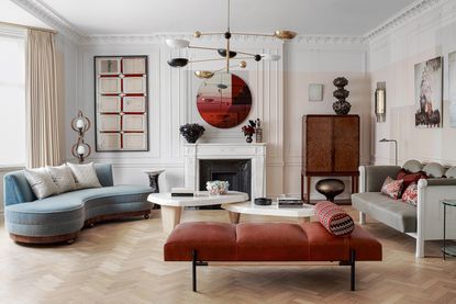
Soft, muted shades, from pale aqua to chalky off-white, flow through the main living areas of this sensual modern home, punctuated with hits of red and gold for a sprinkle of glamor. ‘The idea was to create a home that was relaxing yet fresh, with nothing too overpowering, yet nothing too bland,’ says Jo leGleud, Maddux Creative's co-founder alongside Scott Maddux.
The result is a space that achieves balance in its interior design, where unlikely shapes and shades come together to create one cohesive whole.
Entryway

Immediately as you enter the apartment you're met with a sense of refined opulence. In the entryway, the original mirrored doors help bounce light around - a good idea to copy in a dark space.
A second-floor Art Deco apartment built in the 1920s, this large entryway then leads onto a compact kitchen, a living room with dining area leading to a library room, two bedrooms, each with ensuite shower rooms, plus a powder room.
'The apartment] had original features and a bit of history, but the homeowners could make it their own without too much upheaval,' Jo says.

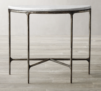
Thaddeus marble console, Restoration Hardware
An entryway console table can truly set the tone for your entire home. This elegant, marble-topped art deco-inspired one would become as much of a treasure as whichever carefully curated objets you place on top of it.
Dining area

‘Look closely at the muted colors used in the dining space and you'll notice that the whole wall isn't uniform. That there is a subtle grid-like pattern using neutral paints on the wall. 'We used a color-block paint effect on the walls to add a contemporary twist to the original period features,’ Jo says.
It's an unusual but striking effect, and proof that historic details can still be treated in contemporary ways.

Set between the main living room area and snug, the open plan dining room is zoned by the one-arm wall light.
‘The project is all about using fewer pieces with meaning and pulling them together in an interesting way,’ Scott says.

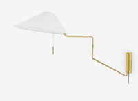
Rex wall sconce, Lulu and Georgia
A simple way to zone a dining space, this one-arm wall light can be angled above the table for, say, a game of cards, or moved to the side for a softer dinner glow.
Snug

A calm and comfortable space, the snug is just off the dining area, partitioned by sliding glass doors. It doubles as a gallery for the homeowners' growing art collection.
‘Finding a harmonious balance is when the magic happens,’ Jo says, and it's true that there is an alchemy here. ‘The idea was to create a home that was relaxing yet fresh, with nothing too overpowering, yet nothing too bland,’ she adds.
Living room

Original details from the 1920s, including the cornicing and flooring, were the inspiration for the mood of this room. ‘Woven patterns in the pillows add color, while warmth comes from the textured curtains, giving a sense of cohesiveness to the space,’ says Jo.
As ever, it's the curved sofa, and the elegant silhouette it creates, that truly makes this space.
Kitchen

The apartment kitchen is tiny, but it’s big on drama with its burnished bronze units beneath a magnificent slab of Calacatta Verde marble.
‘Statement materials were used so this small space matches the impact of the rest of the apartment,’ Scott says.
The aged brass-clad cabinetry is stunning contrast to the richness of all that Calacatta Verde marble. Folding the marble into a shelf allows for the addition of yet more objets, a way to decorate a room with simple things that gives real personality.
Powder room

The walls of the powder room are decorated with a playful sketch-like mural which echoes the panelling seen elsewhere in the home. It's child-like lines contrast with the more grown-up materials of the countertop and basin.
Bedroom

The existing wardrobes in the modern bedroom were given a fresh look with painted detailing on the joinery. The use of symmetry here is more pronounced than in other areas of the apartment, with pillows, lamps, mirrors and bedside tables all matched.
This results in a room that feels ordered, calm and inviting.
Bathroom

Maddux Creative is renowned for its painterly use of color and areas of detailing, and the mosaic bathroom flooring is a key case in point. It was inspired by the artist Jean Cocteau and makes this space spectacular yet serene.

As work progressed, the owners were receptive to pushing the boundaries through the use of more opulent materials in the bathrooms, which would be out of place in a swanky member’s club.
‘It was a joy to get away from white, with bathroom supplies now available in colors,’ says Jo of the sumptuous pink and green spaces.
See more from Maddux Creative.
Be The First To Know
The Livingetc newsletter is your shortcut to the now and the next in home design. Subscribe today to receive a stunning free 200-page book of the best homes from around the world.
A legendary houses editor, Mary Weaver held the job of Homes Editor on Livingetc for over a decade. She set the aesthetic for which the brand has become known. She is now a freelance stylist, art director and writer, regularly contributing to Livingetc and overseeing the brand's successful House Tours franchises of live and webinar events.
-
 These 12 Best Table Lamps for Your Desk — Perfect Glows for a Creative Home Office
The best table lamps for your desk is have a soft, targeted glow. Elevate your WFH set-up with these stylish picks endorsed by Style Editor Brigid Kennedy
By Brigid Kennedy Published
-
 The Nespresso VertuoPlus is 30% Off for President's Day, and it's Kim Kardashian's Coffee Maker of Choice
This sleek and stylish coffee maker was spotted in Kim's home bar, and you can currently save $60 if you buy yours from Amazon
By Lilith Hudson Published

