This Designer's Home Is a Masterclass in Using Neutral Colors, But Making Them Feel Cozy
This vintage home in Canada, renovated by Henrietta Southam for her family, is a testament to her roots, refined taste, and love for all things natural


Old homes can be a dream to live in if you know how to make just the perfect tweaks, and layer in the right modern elements for a comfortable living. Such is the story of this 1920s red brick house in New Edinburgh, Ottawa, Canada. Interior designer Henrietta Southam, her partner Peter Boole, and their two children live in this earthy, tactical home filled with whimsical elements and beautiful, handmade objects.
'Five years after dating, Peter and I set off to buy a property together,' says Henrietta Southam, founder of Henrietta Southam Design. 'After a few discussions between Peter and his children who did not want to leave the home they were born in, we decided that I would adopt their existing house.'
The home's layout was reconfigured to open up the communal areas for the children to interact more, while certain spaces were made more private. Several bespoke elements and sculptural pieces add softness to the home, and the curves of the house with the arches add to the warmth that is inherent here.
Take a tour of this modern home.
Foyer

The foyer sets the tone of the home instantly with its floor tiles, lighting piece, entryway seating, and mural. All elements represent the independent and well-traveled sprit of the designer.
'As a woman who is fiercely independent and has lived most of her life in homes separate from her partners, I wanted to put a stamp that said 'a woman lives here' when Peter and I moved in together just in case he mistook me for a coat hanger and forgot I was there! The mural is 'Famke in Earth' by the all-female company Drop It Modern. The jute-wrapped pendant compliments the oversized black rattan mirror and keeps the space youthful and the spirit modern.'
Living room

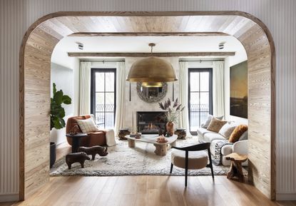
The earth tone living room designed with natural elements, cozy fabrics, and even a fireplace is the perfect place for the family to congregate. 'Not only do all roads lead to this room, but an arch was also specially built (there are no structural beams or vents in this) to set the stage of the living room,' says Henrietta.
'Televisions have never made an appearance in my home’s living rooms; people have,' she says. 'The level of comfort I wanted was tribal. The space features plush Beni Ouarain Carpet as soft as sheep’s fur, cushions made of Mongolian sheep pelts, deep sofas and chairs, and a roaring fireplace to keep the winter blues at bay. I coined the word 'post-apocalyptic chic' 10 years ago after a trip from my motherland, Norway. I have found this design vision to be helpful. When there is nothing left of the world we live in there will be wood and animals, metal and clay.'

All living room furniture pieces are designed or specially picked up for this space as they add to the overall natural, organic theme of the home.
'I made the coffee table from an awkwardly shaped piece of leftover marble and a log I found in my lake in the spring which I cut in three even stumps,' says Henrietta. 'Re-using and repurposing brings me joy. My parent’s Abercrombie Leather menagerie found pride of place alongside my Norwegian Mormor’s (mother’s mother) brass candlesticks and the painted antique Wood Foo Dog Statues that Alanis Morissette had used as Stereo bases. I was gifted these by a client.'
As for the oversized living room lighting piece, Henrietta confesses she has an interest in putting large things in small spaces. 'It has even become a recognized stylistic trick of mine,' she says. 'It was difficult finding an affordable grand chandelier that would complement the industrial, tribal vibe. This upside-down brass singing bowl is 52”. It diffuses a warm light and looks like an inverses sun rising or setting depending on the time of day. Not only does the circular shape soften the rigidity of the perfectly symmetrical room, but it captures and reverberates sounds as faint echoes. As it comes down quite low, and lends itself to intimacy. The height of the ceiling would otherwise make the room too slim and tall, boxy and trite as opposed to cozy and lush.'
Dining room

Situated next to the living room is the cozy dining room, with a round table, a unique white plaster Pesaro chandelier, and cane chairs. The vibe is intimate and personal.
'This was another place to bring in curves to offset the rectangular shape of the home,' says Henrietta. 'And, I often bring my love of architecture to my work. It doesn’t matter what budget or size you are working with; you too can have a bit of Bernini’s magical colonnade arms in your home. I wanted the small dining room to feel like a hug, so not only did I round the corners, but I also nailed half-round dowels to the wall.'
In terms of the furniture, a neutral palette was chosen. 'A caramel cowhide, teak and rattan chairs with yak pelts, a black cerused oak table, a white plaster chandelier à la Giacometti, vintage barn beams, and some of my favorite Canadian artists like Whitney Lewis Smith, all play a role here, where there is not one iota of color. The brutishness of it brings me back to one of my favorite eras — the 70s.'
Kitchen

The heart of any home, the kitchen is not just a functional room anymore but one where design too takes centre stage. The kitchen island lighting along with the counters grab attention.
'These lobster basket lights serve both as a screen to hide the kitchen but also to create the feeling of going back to the bare essentials,' says the designer. 'Another language I wanted to incorporate as a means to find homogeneity in the design throughout was the use of lines...imperfect lines. These are everywhere in these lights, the counter slab, the entry tiles, and the veins of the ash-clad arches.'

When it comes to the large kitchen island, the material, its tone, and pronounced veining add to the elegance of the room.
'I am very lucky to have access to a very important distributor of marble here in Ottawa,' says Henrietta. 'On any single day, they hold at least 40 different varieties of quartzite (onyx) and marble from around the world. It was love at first sight when I saw this leathered sequoia slab: the veins reminded me of ink rivulets dipped in cream. It completely altered my color concept for the room, and I instantly veered towards keeping all tones muted and in the organic realm: wood in all species and shades (walnut, oak, pine, poplar, ash) mixed with whites (plaster, wool, ceramic). There are copper mineral markings in the slab that made me choose rust as the one leading color throughout.'
'Given the gigantic size of the island which is 10 feet long, I book matched the slab in the middle where the sink is, forming an arrow that points outwards towards the guests,' she says. 'I also decided to pare down the massive scale without taking away from its hefty presence by adding sculptural edges on each side.'
Home Office

This modern home office is a treasure trove of interesting things. The walls showcase artworks, the shelves are stacked with books and as you look above and below, charming decor elements speak the story of the designer's heritage and personal taste.
'The room contains encouraging notes from teachers, first pages of autobiographies from the greatest performing artists of our time signed by the authors for my dad (he was the Founder and director of our National Arts Centre), first editions of books that started the French Revolution and hidden letters explaining who the anonymous characters were in the book,' says the designer. 'I wrapped the shelves in copper velvet as a nod to my mother’s French heritage and her love for using fabrics. The granite of the fireplace was picked to mimic the painterly strokes of the entry wallpaper, tiles, and the island ink rivulets. The cork wall is where I pin what was supposed to be my inspiration boards but has ended up being more of my children’s art. The rug is created by Denmark’s Nina Flagstad Kvorning.'
'All the lights in this home have a sculptural presence and are made of organic earthy materials: paper, plaster, straw, jute, and rattan,' says Henrietta. 'The rattan light by Trouva was added in. Like the other chandeliers, it is oversized as compared to the room, and yet lets through the light.'
Main bathroom

The master bathroom or rather the spa bathroom is a picture of luxury, serenity and understated glamor. Every element — from the bathtub and fixtures to furniture speaks of taste. Also, how often do you see rugs in a bathroom?
'I wanted a glorious bathroom to open into the bedroom in a hotel-style way, and yet be disguised as a living room,' explains Henrietta. 'This bathroom had to be spectacular, theatrical, make my senses sing and happiness glide. If you think about it, when one is in bed what do you look out towards? That was the focal point I needed in this space. We changed the layout so the bathroom is where the bedroom would normally be, with a window view. I added a swivel chair in heavy Bakuba linen and complemented it with Uzbekistan’s Ikat velvets in the cushions and my father’s antique Khal Mohammadi rug from Persia that has faded from deep red to burnt orange. I added driftwood and stone sinks giving this woman's cave an idiosyncratic language: primal luxury. Add in my Imperial Japanese Meiji Dragon Throne chairs and ceremonial tea table.'
Principle bedroom

Inside the bedroom, a feeling of calmness resides, thanks to colors, prints, and materials chosen to evoke the feeling of tranquility.
'My side of the bed is the only one with a table to keep the mess at bay, as I am a voracious reader, and read about a fifteen books at any given time,' avers Henrietta. 'The mid-modern side table was a flea market find. The Lostine swivel light with its pierced leather shade brings more organic materials into the mix. More Canadian designs can be found in the upholstered Cello bed, duvet cover, quilt, and rug all by Eq3.'
Staircase

The entire home's reconfiguration hinged on relocating and redefining the open staircase at the heart of the home. The staircase opens to a glass roof, which floods the long but narrow home with light.
As part of the staircase decorating idea, a lovely long light is suspended from above. 'The Isamu Noguchi Akari E paper pendant was a bucket list collectible I managed to snag during the pandemic as I was perusing museum shops in order to support them during the lockdown,' says Henrietta. 'I wanted to find a significant sculptural light that would hold its own in the stairwell that goes up three flights. The skylight was necessary to inundate the whole home with natural light as the walls along stairwell have been designated for the art.'
More projects by Henrietta Southam Design
Get the look

Material: Wool
Price: $1,400

Material: Wood, Rattan
Price: $349

Material: Iron
Price: $124
Be The First To Know
The Livingetc newsletter is your shortcut to the now and the next in home design. Subscribe today to receive a stunning free 200-page book of the best homes from around the world.
Aditi Sharma Maheshwari is an architecture and design journalist with over 10 years of experience. She's worked at some of the leading media houses in India such as Elle Decor, Houzz and Architectural Digest (Condé Nast). Till recently, she was a freelance writer for publications such as Architectural Digest US, House Beautiful, Stir World, Beautiful Homes India among others. In her spare time, she volunteers at animal shelters and other rescue organizations.
-
 'Subtle Gray' Is The New Color Trend Designers Are Using to Replace White — It's So Much Warmer and More Luxe
It’s the new shade grabbing designers’ attention and you should know about it. But what is ‘subtle gray’, and how can you use it?
By Raluca Racasan Published
-
 Exactly When to Fertilize a Lawn After Winter — Experts Guarantee You a Beautiful Backyard All Year
if you know when to fertilize a lawn after winter then you can set yourself up for a well manicured and healthy backyard all year long
By Jacky Parker Published

