A classic Craftsman House that's been transformed into a warm welcoming family home filled with modern rustic style
Filled with original charm and vintage features you'd never suspect this project was a gut renovation


Warm, classic, and rooted in history was the brief. And with a shell that dates back to the early 1900s going with anything but a sympathetic renovation would have been frankly unethical. But what designer Lisa Staton has created with this home is a place that's yes rooted in history, it's warm and classic to boot, but it's also distinctly contemporary, a perfect blend of old a new. Large antiques sit effortlessly with modern finishes, and despite the fact the ground floor was essentially a gut reno with a new layout, new windows, new floors, the lot, this modern home still feels filled with original charm. Let's take a tour...
'Our clients are busy working professionals with three children. We were brought on board to do a full gut kitchen and powder room renovation. As well as both upstairs bathrooms.' says interior designer Lisa Staton. 'This included fully changing the main level footprint in order to create a larger kitchen and more open floor plan. Additionally, they really wanted to bring the "original house soul" back to the renovated areas with enough historical accuracy and mindfulness to make it look as if it could have been that way all along! The house had been through many renovations over the years...especially the kitchen! '

'The vision for the space was Classic Craftsman with a more "English slant". From an architectural standpoint moving the powder room to the opposite side of the house was a game-changer to grow the kitchen and connect it to the dining room (and doubling the opening size between dining and kitchen).'
'To remain true to the original craftsman aesthetic, some rooms were kept the original stained woodwork. But then others are painted inky gray or deep gray-green to stay "moody" but not as "busy" with the stained grain of wood.'
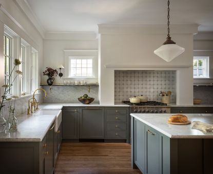
It's this mix of texture, the deep-hued, grained wood, and the flat matte grays that the whole house the balance of rustic, historic style and a more modern, clean aesthetic. You can see it most clearly in the kitchen where the two finishes come together in the same space. You have that lovely vintage cabinet adding that old-world, country touch and then the simple mid-toned grey cabinets to add the edge of modernity.

'It was very important to keep an old-world feel that we put some vintage soul into the kitchen. We contemplated building the large storage case piece on that side of the island. But then realized it really needed to be vintage. And it needs to be stained wood to have a relationship to the original parts of the house. An antique dealer we work with found the old large French cabinet, which was perfect! And it really works as an everyday workhorse for storage not just occasionally used items.'

'All the kitchen windows are new in size and location but we carefully re-created the exact proportions and style of the new kitchen windows to existing old parts of the house to make them historically accurate and proportional.'
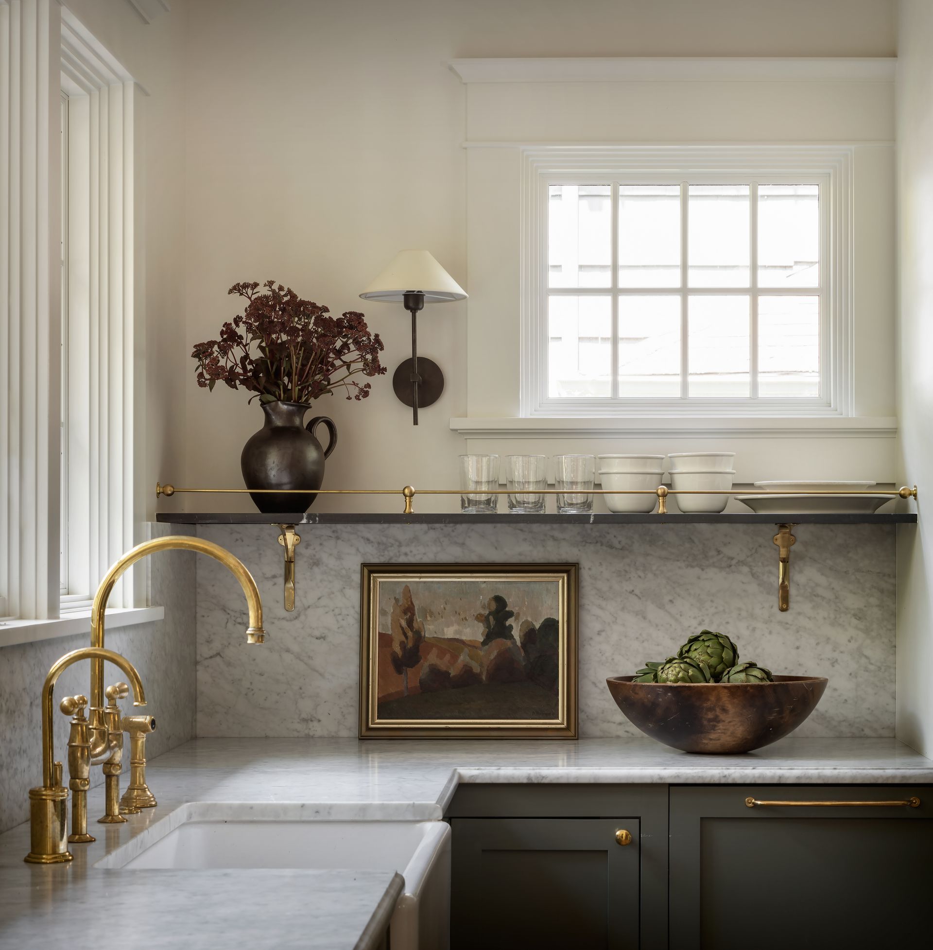
The marble splashback, combined with that deep gray and the gold hardware are timeless, a classic look that might be more contemporary than the house itself but the simplicity and the elegance give the impression it could have stood in the property for decades.
'We are very mindful of paying attention to what is "busier" in a home, and what are "quieter and more poetic" moments. The simple range with plaster and then open shelves and windows is both elegant but visually interesting. ' explains Lisa.
- Find more kitchen ideas and inspiration in our gallery.

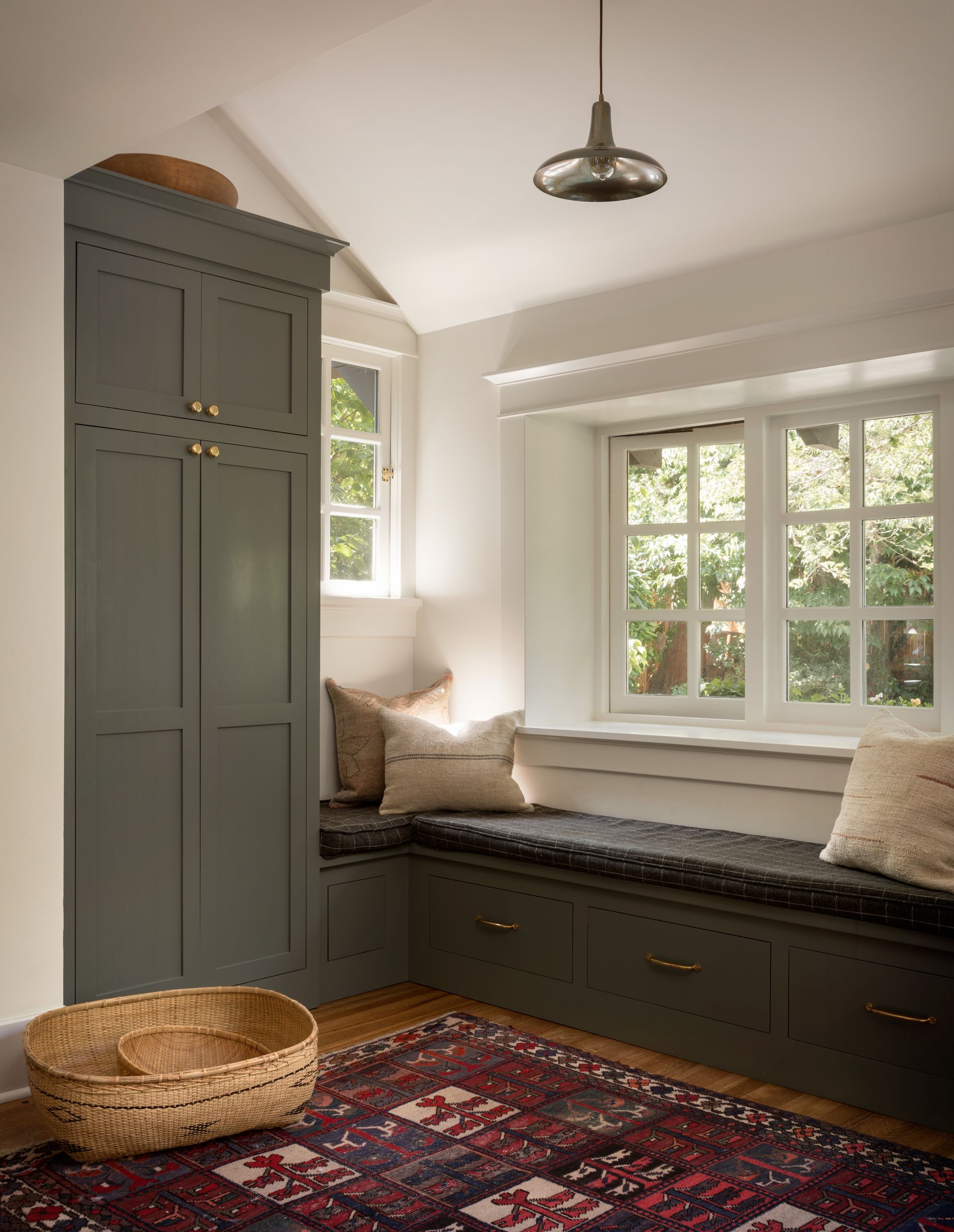
Adjoining the kitchen is a newly built mudroom. That same green-toned grey is used on the cabinets in here, which match those in the kitchen. Even in this much smaller space, Lisa has considered what she calls the 'appropriate soul' of the house. The rug is an antique, adding texture and character to the space. The linen pillows add to that rustic vibe and the modern light tips the balance from country into something slightly more contemporary.

A home bar was added as part of the renovation too. In here a gorgeous pale blue-grey bounces light around the space, giving it a fresher feel than the moody hued cabinetry of the kitchen. Plus, there are nods to the original house in here too, the glimpse of the brick in the splashback is original to the house, it's been given a modern update with the crisp blue paint but it still adds a rustic texture. And again, Lisa has chosen a vintage rug to add some warmer colors to the room.

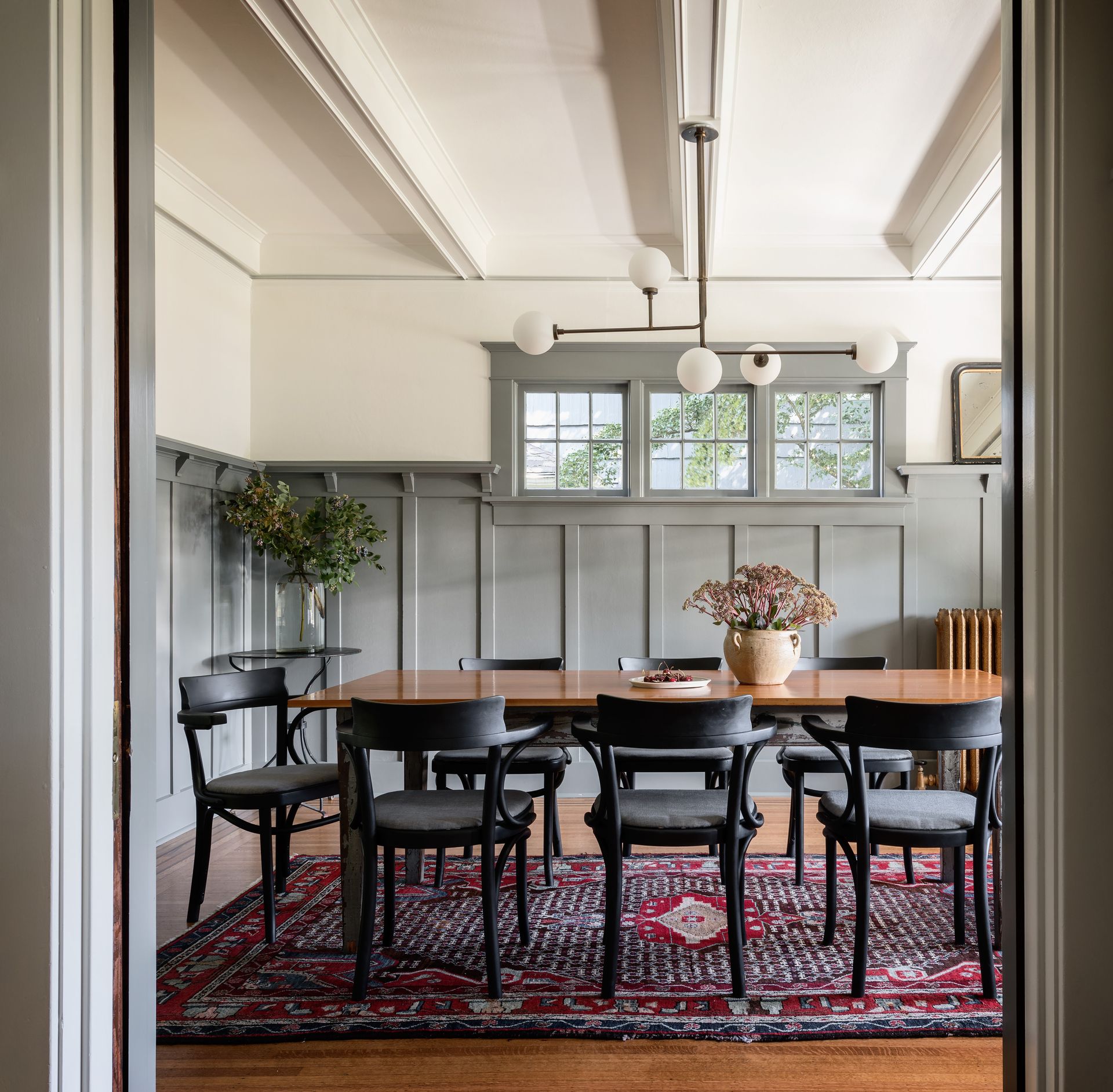
The dining room also gets that balance between old and new. The grey walls mirror the same tones of the other rooms so there's a nice cohesive feel in the downstairs space, plus is a very modern grey so keeps the room feeling fresh and contemporary.
An antique wooden table sits at the center, again much like in the kitchen, bringing in those natural tones and textures. The rug adds even more texture and a pop of bolder color amongst all those neutrals. The globe light fixture gives the room an overall fresh and modern feel.

For the powder room 'we wanted to go bold with a really interesting and more unusual marble custom sink,' explains Lisa. In here those soft light greys have gone, replaced with a dark and moody charcoal that's perfect for smaller spaces like powder rooms. The brass of the mirror and sconces add a nice warmth and the sculptural curves, as well as the gorgeous veining on the marble sink, bring in enough shape and texture to lift those steely grey walls.

Be The First To Know
The Livingetc newsletter is your shortcut to the now and the next in home design. Subscribe today to receive a stunning free 200-page book of the best homes from around the world.
Hebe is the Digital Editor of Livingetc; she has a background in lifestyle and interior journalism and a passion for renovating small spaces. You'll usually find her attempting DIY, whether it's spray painting her whole kitchen, don't try that at home, or ever changing the wallpaper in her hallway. Livingetc has been such a huge inspiration and has influenced Hebe's style since she moved into her first rental and finally had a small amount of control over the decor and now loves being able to help others make decisions when decorating their own homes. Last year she moved from renting to owning her first teeny tiny Edwardian flat in London with her whippet Willow (who yes she chose to match her interiors...) and is already on the lookout for her next project.
-
 The 12 Best Table Lamps for Reading —I'm a Certified Bookworm (and Shopping Expert)
When it comes to table lamps for reading, I don't mess around. If you're the same, this edit is for YOU (and your books, or course — and good recommendations?)
By Brigid Kennedy Published
-
 "It's Scandi Meets Californian-Cool" — The New Anthro Collab With Katie Hodges Hits Just the Right Style Note
The LA-based interior designer merges coastal cool with Scandinavian simplicity for a delightfully lived-in collection of elevated home furnishings
By Julia Demer Published

