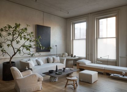
See inside super-stylist Colin King's apartment, a minimalist masterclass in creating a space full of personality
Colin King's New York apartment is the perfect place to showcase his clever way with curation, using minimalist techniques to celebrate the very best of things

There is an understated cool to New York interior stylist Colin King that pervades everything he touches. Maybe it’s because he gets it all just right while looking like he’s not trying too hard. Everything he styles - and now designs - appears as if it was organically meant to be that way, including his own home.
Sought after as a creative director by leading brands such as Zara Home, Anthropologie and West Elm and with his own lines at Beni Rugs and MENU, he, and his work, come across as authentic and natural. He is a leading light of the new minimalism in interior design movement, which celebrates the best of things, rather than hides them away.
Self-taught, with creative genes that were always there - he was a ballet dancer as a teenager - he believes in ideas evolving as they progress. 'I approached the decorating of the apartment by trial and error, similarly to how I approach most of my styling and creative work,’ he says. ‘I experimented over and over again with paint colors and furniture layouts until it clicked and the space felt like a home I was excited to come back to.’

The windows are deliberately left unadorned so the space doesn’t look too finished or ‘decorated.’
Walls and ceiling plastered in a custom color by Kamp Studio.
Existing mouldings and panelling painted in a custom matt color (to match the plaster), by Empire Painting.
Flooring, original pine boards
Colin found the rental, an historic loft-style apartment built in the 1890s as a dry goods store in Tribeca, the heart of downtown Manhattan, nearly two years ago. ‘I fell in love with the open layout, high ceilings, and gorgeous windows,’ he says of the sixth floor space. ‘Given that I travel frequently for work, I was searching for a place where I could reset and re-center myself when back in the city.’

‘Rather than make holes in the walls I used hanging gallery rods that can easily be moved around to hang pictures,’ Colin says.
Walls plastered in a custom color by Kamp Studio.
Existing mouldings and panelling painted in a custom matt color (to match the plaster), by Empire Painting.
Antique Swedish gate-leg table, Anton & K.
Lamp, Michael Verheyden.
19th-century painting, Dienst + Dotter Antikviteter
Custom brass gallery rod, made by J. Pickens.
Vintage urn, Michael Trapp.
Japanese vessels, Gallery Dobrinka Salzman.

Hanging gallery rods, $41.49 for five, Amazon
Colin's genius trick for hanging art without having to hammer holes into the wall becomes part of the installation itself.
Revamp-wise, it was more about peeling back the layers to restore the apartment to its original spirit, than a massive overhaul. Floors were stripped of their dark staining to reveal beautiful original pine floors; new doors were installed; living room walls and ceilings re-plastered in a deep bespoke beige, and mouldings and panelling painted to match.

‘The more I pared back the apartment, the more the beautiful original features like the windows, mouldings and flooring came back to life,’ Colin says.
Bespoke daybed designed by Colin, with woodwork by Oliver Westermeier and upholstery by Luccio Massa.
Urn, (on plinth) by Casey Zablocki, Woodfired Stoneware.
PK 62 side table by Poul Kjærholm
Lampadina Table Lamp (on side table) by Achille Castiglioni.

Vintage Japanese bowl, and vintage vessels, all Casa Patina.
Vintage fibreglass rock lamps, Andre Cazenave.
Toio floor lamp by Achille & Pier Giacomo Castiglioni, Flos.
His belief in the power of objects means it was important to surround himself at home with purposeful items. ’I’ve included several pieces from past projects, plus reminders of my childhood - such as rocks (referencing his childhood hobby of collecting stones), which add a natural element to an otherwise urban environment,’ he says.

A beautiful indoor ‘tree’ is placed like an art installation, catching the light and creating shadows as the sun moves around.
Painting by Milton Resnick, Cheim & Read.
Custom couch, Grant Trick.
Armchair, Axel Vervoordt.
Bespoke coffee table made using rocks from The Compleat Sculptor and wood from The Hudson Company.

‘I invested in a large table so I can host plenty of friends and family for food and drinks,’ Colin says.
Walls and ceiling plastered by Kamp Studio.
Flooring, original pine boards
Ash bespoke table designed by Colin, made by J. Pickens.
Finnish T-back chairs, Galerie Half.
Etching, by Amedeo Modigliani.
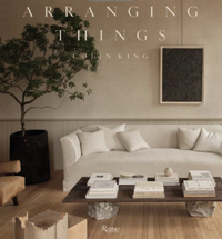
The apartment is a moving feast, intended never to look too decorated or finished - even the tree in a pot has changed since this shoot, the leaves having dropped and it has become a twig installation. ‘I am constantly tinkering and forging new relationships with objects in a space as part of my work,’ says Colin, ‘and I wanted the freedom to be able to do that in my own home.’ In keeping with this career of ‘tinkering', he has just published his first book, written with Sam Cochran, called ‘Arranging Things’, which takes the reader through his very personal process of combining items and cultivating beauty in everyday life.

The kitchen space is enclosed in panelling so all the paraphernalia is kept contained, yet it also means it fits with the open plan theme of the apartment.
Cabinet on wheels designed by Colin, made by Rift Cabinetry.

‘Rather than trying to make this windowless room light, I embraced the darkness with a warm, encompassing color,’ Colin says of his somewhat rustic bedroom.
Wall and panelling painted in Deep Reddish Brown, Farrow & Ball.
Painting by Malcolm T. Liepke, Gallery Dobrinka Salzman.
Shipping crate (used as bedside table), Dobrinka Salzman Gallery.
Akari table lamp (on top of crate) by Isamu Noguchi, Vitra.
In contrast to the lightness of the living area, he embraced the dark, windowless bedroom and bathrooms by painting them in warm, moody shades. And because his apartment is a live-work space, he transformed a room once designated as a den into his home office.

‘I chose to keep the existing tiles which felt kind of brown and muddy. Darker colors in small rooms often make them look bigger, especially when you take the same color up onto the ceiling which I did in both the bathrooms and the bedroom,’ Colin says.
Door hardware, izé.

The office is internal, so Colin used large glass-paned doors to let light flow into the space.
18th-century Swedish Baroque bockbord table, Dienst + Dotter Antikviteter.
Model 771 pair of vintage chairs by Joseph-André Motte, Demisch Danant Gallery.
Vintage Tuareg mat, Woven Abode
Akari 120A pendant light by Isamu Noguchi, Vitra.
Knight sconce (wall light ) by Colin King, Troy Lighting.
Tired man armchair by Flemming Lassen, Menu.
Maybe because of his perfectionist personality, Colin says the whole project was somewhat outside his comfort zone, having never lived in a loft or space of this scale before.
Finding that the furniture from his previous home in Brooklyn Heights looked like doll’s house pieces when moved here, he embarked on designing his own - ‘that was particularly nerve wracking,’ he says. But what he learned most from the project was that for him every single detail is significant. ‘I took my time and updated everything bit by bit, ensuring I didn’t rush the process. And I found that it’s OK to make mistakes but to not settle for them.’ Ultimately he says, ‘this apartment has been a wonderful teacher.’

Arranging Things by Colin King, Amazon
Colin's beautiful new coffee table book offers more examples of how to curate like him. There is plenty of advice and inspiration and it's well worthy of being a display piece in its own right.
Get Colin's look
 $249
$249
 $46.40
 $39.99
Be The First To Know
The Livingetc newsletter is your shortcut to the now and the next in home design. Subscribe today to receive a stunning free 200-page book of the best homes from around the world.
A legendary houses editor, Mary Weaver held the job of Homes Editor on Livingetc for over a decade. She set the aesthetic for which the brand has become known. She is now a freelance stylist, art director and writer, regularly contributing to Livingetc and overseeing the brand's successful House Tours franchises of live and webinar events.
-
 The 12 Best Table Lamps for Reading —I'm a Certified Bookworm (and Shopping Expert)
When it comes to table lamps for reading, I don't mess around. If you're the same, this edit is for YOU (and your books, or course — and good recommendations?)
By Brigid Kennedy Published
-
 "It's Scandi Meets Californian-Cool" — The New Anthro Collab With Katie Hodges Hits Just the Right Style Note
The LA-based interior designer merges coastal cool with Scandinavian simplicity for a delightfully lived-in collection of elevated home furnishings
By Julia Demer Published

