A north London villa reworked to best suit a family of four boys and become a calm yet characterful home
Taking influences from design boutique hotel Ett Hem in Stockholm, Sam Hartung has created a Scandic-modern meets vintage-traditional home that is both a style victory and a study in durability for her family

A city break to Stockholm’s Ett Hem, the boutique hotel designed by Ilse Crawford, became an inspirational turning point for Sam and Rob Hartung who were half-way through planning a major renovation of their new north London modern home.
‘We were at the dreaming and scheming stage but that first hand experience of Ilse Crawford’s Scandi-modern with vintage and traditional style, was a light-bulb moment,’ says Sam. ‘Her intricate details and contrast in materials are just gorgeous, but importantly comfort is key too - everything we wanted to achieve in our own home.’
Unusually, Sam, a doctor and Rob, who works in finance, had been able to rent their beautifully proportioned Victorian villa in north London, before purchasing it. ‘Our previous property was tall and narrow and set within an old, established community, where with our growing family (then three boys and two cats) we simply didn’t fit in,’ she says. ‘When a university friend suggested we rent this house - detached, with a calm vibe and a more lateral flow, we leapt at the opportunity.’
Two years later they ‘lobbied her’ to allow them to buy it...
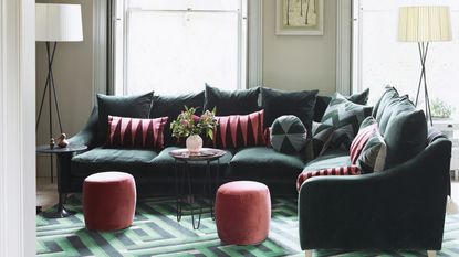
Living room

Although it wasn’t in bad shape, through living there Sam evolved a vision for making it serve the family better. Work started in 2014 with the initial focus on practicality and stylish storage ideas. ‘It’s hopeless if it’s not practical,’ says Sam.
‘There are seven of us (fourth son Kit was born in 2017) residing here including our nanny who lives in as Rob travels for work and I do night shifts. It needed to be highly functional and hard wearing, yet a pleasure for us all to return to at the end of every day.
The poulticed ball and dart cornices were painstakingly restored and left unpainted so their detail is more evident. Shades of green are a theme throughout the house, chosen for their earthy, calming quality. ‘Having calm walls means we can get away with statement art, often found on our travels,' she says.
Kitchen

’The design of the house is spatially very clever, again thanks to Sam knowing it so well prior to the renovation. Feet and inches have been stolen here and there - smaller hallways to make rooms bigger, the nanny’s en suite carved out of an area behind the Critall-style kitchen pantry idea and, at the top of the house, three bedrooms and a family bathroom were created by extending into the eaves and out into the landing.
'I avoided wall units on this side so I can have a display shelf that adds personality with constantly changing vases and objects,' she adds.
Pantry

'This was a must-have for me and I stubbornly refused to allow the architects to take it out of my wish list – I spent hours fiddling with the layout of the kitchen and adjacent nanny’s shower room to have enough space for both,' explains Sam.
If a pantry is on your wish list, or you're lucky enough to already have one, make sure you read our trips on how to organize a pantry.
Dining room

A vault in the basement was reclaimed for storage and a wine cellar and a utility area squeezed in next to the WC. ‘They were relatively micro changes but they improved every room that was affected,’ says Sam. It's important to know how to plan a basement extension properly before you begin as it's an enormous job but one that can add a lot of value and much-needed extra space.
The main space gain was with the lower ground floor’s cantilevered extension onto the outside patio. Without beams, the view from the dining area to the garden is seamless. ‘That took a lot of structural planning as well as a massive steel between ground and basement level holding up the back of the house,’ she smiles.
The underfloor heating throughout the dining room is pale but more practical than it looks and happily takes the hard knocks of family life.
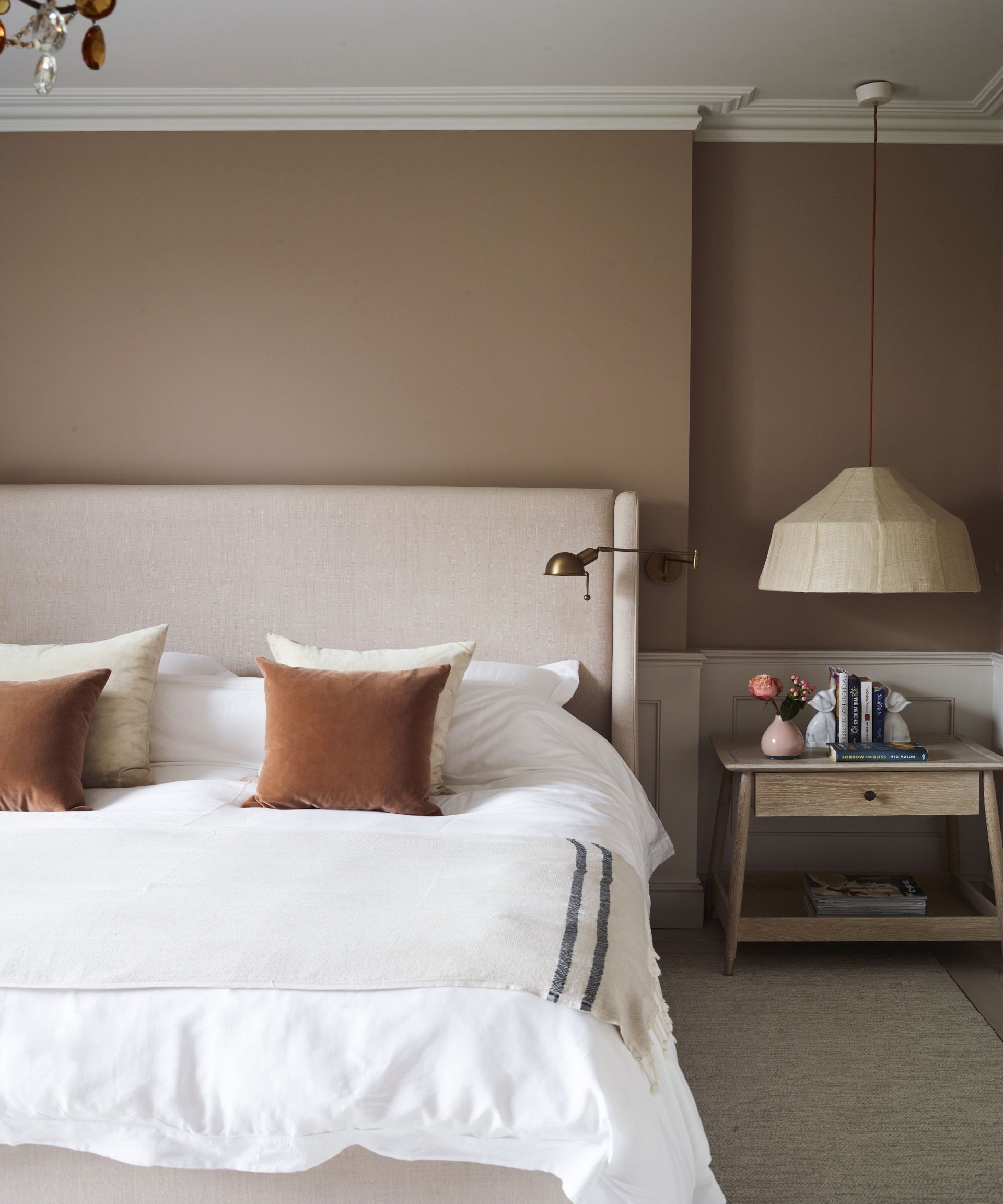
Main bedroom

Towards the end of the renovation she called upon interior designer Charlotte Griffin to help realise some ideas. ‘Charlotte grasped exactly what I was trying to achieve, always designing within that framework,’ says Sam.
She also worked with her mum, Susanne Blair, a garden designer, to reconfigure the outdoor space to accommodate football games and a in-ground trampoline (‘that I can’t recommend highly enough’) which are disguised with new planting right up to the house. ‘I couldn’t have cared less about gardening until about 10 years ago, but now I find it’s equivalent to therapy yet far cheaper – offering exercise, creativity and hours of quiet contemplation,’ says Sam.
'With such a busy household, our bedroom is a sanctuary to escape to with a seating area,' she adds. 'When we get a moment!' Discover more neutral bedroom ideas for a calm and restful bedroom scheme
Boy's bedroom

This space was reworked with skylights and bespoke joinery and designed to easily evolve as the children grow up.
Main bathroom

It was important that our bathroom was a calming space so we created plenty of storage space to help keep it that way. ‘Although the main colour scheme is soft and muted I like the sharp contrast of black metal to give it an edge.’
See more: this London terrace is a lesson in mixing traditional patterns, heritage hues and modern art
Be The First To Know
The Livingetc newsletter is your shortcut to the now and the next in home design. Subscribe today to receive a stunning free 200-page book of the best homes from around the world.
A legendary houses editor, Mary Weaver held the job of Homes Editor on Livingetc for over a decade. She set the aesthetic for which the brand has become known. She is now a freelance stylist, art director and writer, regularly contributing to Livingetc and overseeing the brand's successful House Tours franchises of live and webinar events.
-
 These 12 Best Table Lamps for Your Desk — Perfect Glows for a Creative Home Office
The best table lamps for your desk is have a soft, targeted glow. Elevate your WFH set-up with these stylish picks endorsed by Style Editor Brigid Kennedy
By Brigid Kennedy Published
-
 The Nespresso VertuoPlus is 30% Off for President's Day, and it's Kim Kardashian's Coffee Maker of Choice
This sleek and stylish coffee maker was spotted in Kim's home bar, and you can currently save $60 if you buy yours from Amazon
By Lilith Hudson Published

