One simple layout tweak transformed this once-dated Santa Monica townhouse – it now works so much better
The original 70s interior has had a much-needed modern uplift
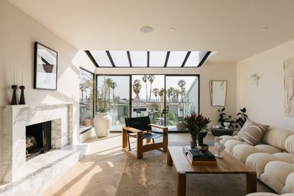

This bright and airy townhouse on the Santa Monica coast has had a beautiful modern uplift that now wholly embodies the minimaluxe trend. The two-bed home has gone from drab and dated to effortlessly luxurious and wonderfully calming, and it's all thanks to the work of LA-based design studio, Ome Dezin.
Headed by Joelle Kutner and Jesse Rudolph, the design team thoughtfully reimagined the 1,916 square feet of space, maximizing functionality and natural light. Inspired by the home's prime proximity to the beach, they brought the outdoors in through natural textures, an earth-toned palette, and light wood flooring for a serene, coastal feel.
'The home was built in the late 70s with an all-original interior,' explains Joelle. 'There was shag carpet mostly everywhere (including the bathrooms), lots of patterned wallpaper, dark woods, and drapes for the showers.'
The duo restored the home to eventually be put on the market, so design decisions were made with that in mind. 'We wanted to design a space that a potential buyer would love to move into, which is always a fun challenge,' says Jesse. 'The best starting point is that whoever the homeowner is, they're going to be living by the beach, so the interior should reflect the ocean and calming beach surroundings.'
Here, we take a look inside to see how the modern home took shape.
Kitchen

Prior to the renovation, dark wood cabinetry and tiled countertops made the kitchen feel seriously dated. The awkward layout also needed rethinking as the space really wasn't being used to its full potential (as proven by the inconvenient positioning of that fridge!)
'The kitchen is on the smaller side and similar to a galley kitchen, so we wanted it to feel as spacious as possible while still ensuring it was functional,' says Jesse of Ome Dezin.

That's exactly what Jesse and Joelle did with their beautifully simple modern update. With a small update to the floorplan, the removal of upper cabinets, and the addition of some custom built-ins, the space feels a whole lot brighter and airier.
'Removing the upper cabinets and putting in open shelving in wood or marble is a big trend we’ve been seeing lately,' says Joelle. 'Upper cabinets often feel synonymous with a 90s kitchen and feel a bit clunky and heavy. It’s also hard to maintain clean lines with upper cabinets framing the hood range.'
The beautiful marble countertop and backsplash also extend from the kitchen into the dining area to form a bar, helping to create a sense of flow between the two spaces. 'The countertop runs all the way to the corner and has enough room for a bar stool, making it the perfect spot for the homeowner to work or enjoy a meal while looking out onto the serene outdoor space,' says Jesse. This makes a great alternative to a central island in a small kitchen.
The duo also decided to retain the original greenhouse window which extends out from the sink, making it the perfect spot for plants thanks to its natural light.
Dining Area

Despite some generous floor-to-ceiling windows in the adjoining dining room, the space felt dark and dingy, in part owing to the closed-off floorplan. This was then worsened by the off-white walls, dark flooring, and disproportioned chandelier light. The space was crying out for a fresh lick of paint, to say the least.

Thanks to the removal of the adjoining kitchen wall the dining area is now flooded with natural light. Details like the woven rug and cane chairs give the space a rustic bohemian feel for an overall beachy vibe, while the lighter wood flooring is a great way to make a neutral palette and natural materials feel modern and fresh.
'The wood flooring we picked out for the dining area is a light-colored wood, which makes the space feel airy and calming,' Jesse explains. 'We decided on a herringbone installation for this area as it does have a European feel that is timeless and modern at the same time. We brought in bohemian design elements with the furnishings and styling, and the entire look is inspired by beach living.'
Living Room

The wonderfully warm living room has stunning beach views, offering a ton of potential. Unfortunately though, the strange layout and dated architecture before the renovation really didn't work in the room's favor.

Now though, the space is one of the most beautiful examples of a minimaluxe living room we've yet to see, the boucle cloud couch, marble fireplace, and jute rug making it feel at once elevated yet calming. The clean, comforting aesthetic owes a lot to the mix of clean lines contrasted with soft plush textiles, a technique that evokes a sense of 'quiet luxury'.
'The living room is on the top floor and made for entertaining with its large balcony and view of the ocean,' says Joelle. 'The rich marble extending from the fireplace to below the office door, the soft boucle Mario Bellini couch in white, plaster lighting sconces, and leather accent chairs provide the perfect combination of materials that radiates quiet luxury.'
Arguably, though, it's the marble surround that steals the show. 'A fireplace in Southern California, especially in a home close to the beach, is the perfect balance of warmth mixed with a cool ocean breeze,' Jesse notes. 'Granted, it’s gratuitous, but it also feels like a bit of luxury everyone deserves. The idea that you could jump in the ocean and then come home to warm up by your fireplace while watching the sunset is always a reason to keep the fireplace.'
Get the look

Nothing says luxury like boucle furniture. For some cloud-like texture, add this ottoman to your living room. The round shape offers a unique, modern feel and it's practical as well as stylish, complete with a storage compartment for organizing toys, throws, and other knick-knacks.

These black candlesticks are slender and sleek, perfect for introducing contemporary clean lines to your space. Style them on a mantelpiece as Joelle and Jesse have done, or add them to the center of a coffee table as the asymmetric design makes it easy stand them next to each other.

When it comes to living rooms it's all about the detail, and soft textures like this woven cotton throw pillow bring the ultimate comfort. The abstract wave pattern has a modern feel while the balanced tones offer a great springboard for a neutral color palette.
Bedroom

Another fireplace can be found in the bedroom but again, the dated tiling instantly aged the room. Combined with the carpeted flooring, off-white walls, and popcorn ceiling, the space really fell short of any noticeable qualities.

Now, the primary bedroom is a rustic haven, where thoughtful colors, textiles, and wood finishes have been used to subtly maximize the warmth.
As Jesse explains: 'It feels warm and cozy due to the drapes that we installed and the shades of cream and pink we used in the furnishings and textiles. We also used a lot of warm woods in this room and on the floor to add even more warmth and coziness.'
Bathroom
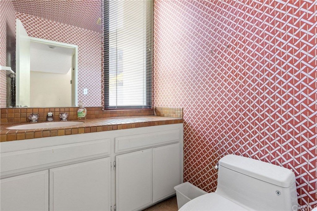
Of all the bathroom transformations, it's the powder room that's most worthy of a mention. Dated wallpaper and a terracotta tiled countertop made this an overstimulating space that was far from calming and serene - the qualities we look for in contemporary bathroom spaces.
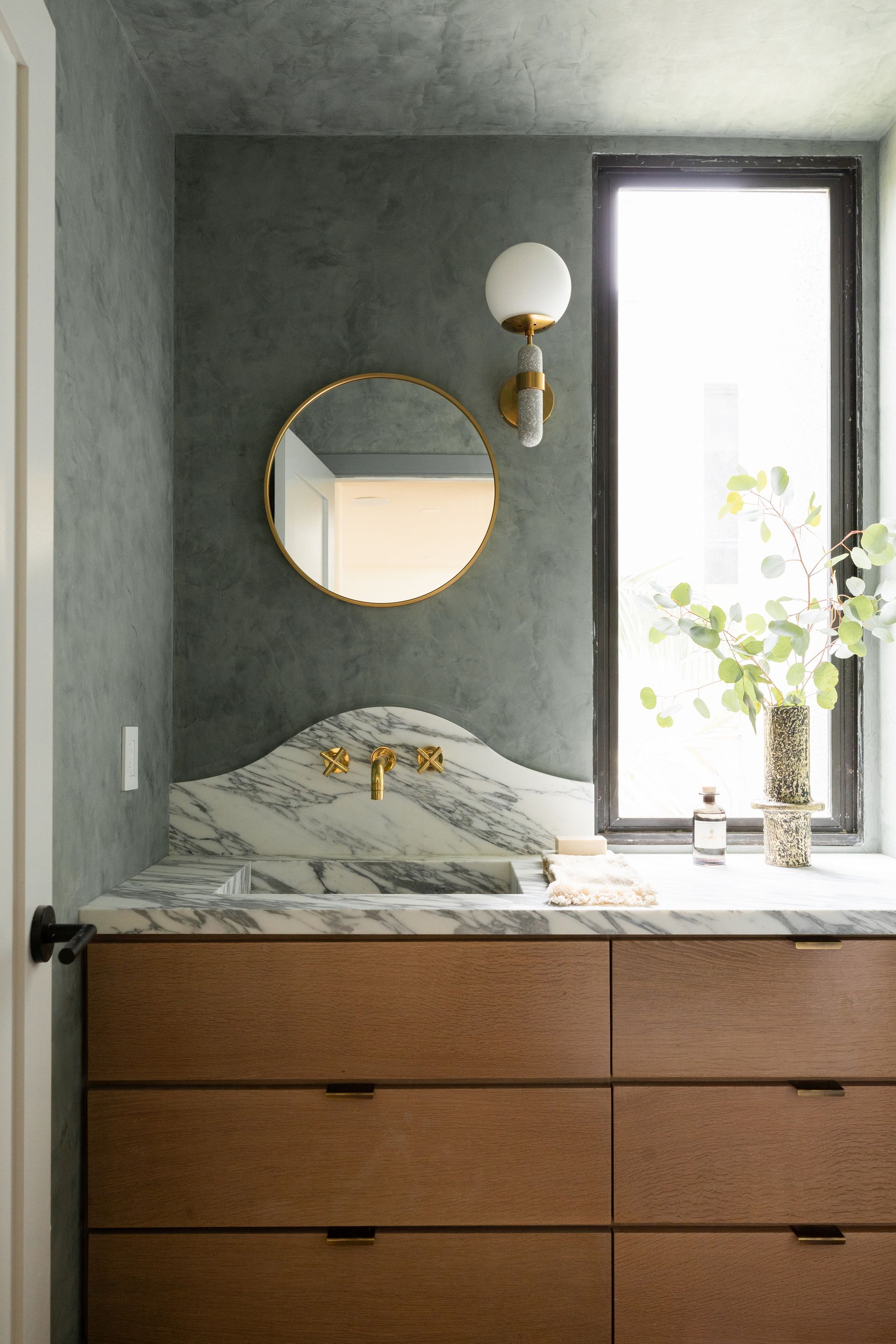
Now though, those are exactly the right words to describe the modern bathroom. The soft green on the walls is a cooler tone compared to the reds and pinks in the previous space, far more conducive to that spa-like feel we're all searching for.
'We picked a green lime wash for this powder bathroom and blue tiles in the primary shower and bath as we feel these colors give a soothing and relaxed vibe,' says Joelle. Paired with the marble veining and the thoughtful detail of the eucalyptus branch, the mottled walls also give an oceanic feel. 'We love how these colors emulate the deep and calming color palette of the ocean, which can be seen from the balcony,' Joelle adds.
Safe to say it's the sort of bathroom we'd never tire of. We'll be taking design inspo from this whole home for years to come!
Be The First To Know
The Livingetc newsletter is your shortcut to the now and the next in home design. Subscribe today to receive a stunning free 200-page book of the best homes from around the world.

Lilith Hudson is the News Editor at Livingetc, and an expert at decoding trends and reporting on them as they happen. Writing news, features, and explainers for our digital platform, she's the go-to person for all the latest micro-trends, interior hacks, and color inspiration you need in your home. Lilith discovered a love for lifestyle journalism during her BA in English and Philosophy at the University of Nottingham where she spent more time writing for her student magazine than she did studying. After graduating, she decided to take things a step further and now holds an MA in Magazine Journalism from City, University of London, with previous experience at the Saturday Times Magazine, Evening Standard, DJ Mag, and The Simple Things Magazine. At weekends you'll find her renovating a tiny one-up, one-down annex next to her Dad's holiday cottage in the Derbyshire dales where she applies all the latest design ideas she's picked up through the week.
-
 The 12 Best Table Lamps for Reading —I'm a Certified Bookworm (and Shopping Expert)
When it comes to table lamps for reading, I don't mess around. If you're the same, this edit is for YOU (and your books, or course — and good recommendations?)
By Brigid Kennedy Published
-
 "It's Scandi Meets Californian-Cool" — The New Anthro Collab With Katie Hodges Hits Just the Right Style Note
The LA-based interior designer merges coastal cool with Scandinavian simplicity for a delightfully lived-in collection of elevated home furnishings
By Julia Demer Published
