A West Village apartment with the secret to open-plan living on a small scale
A retreat from the bustle of New York City, this open-plan apartment showcases how a restful palette can work wonders for small space living


Apartment spaces have their own unique set of design challenges, where they give with one hand, they take away with another. The layout of your home, for example, is more rigidly set and will undoubtedly be smaller than a comparable house, but you might also have the benefit of beautiful loft proportions, open-plan areas and vast windows. It's small space living on a grand scale.
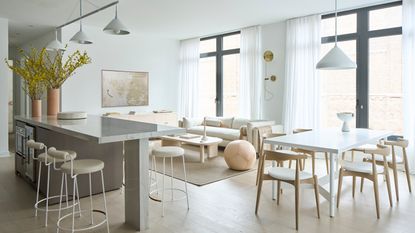
For this apartment located in New York City's West Village, interior designers Chelsea Reale and Diana Rice of SISSY+MARLEY Interiors had this very challenge. With floor-to-ceiling windows and an open-plan living space, it's not the typical picture of a small home. Yet its footprint says otherwise, and with the demands of a family on their hands, it was a modern home that needed to work hard.
The designers created a lived-in atmosphere through soft materials and warm finishes. The palette is soft and the textiles are natural and organic complementing the natural sunlight that fills the space. 'We used lots of white paint,' says Chelsea, 'creating a crisp backdrop to the creamy pieces that were added.'
In the living space, this makes for a restful feel, where the different functions of the room co-exist harmoniously, while in the bijou-proportioned bedrooms, function had to be carefully considered to pull the most out of this apartment's compact, but charming floorplan.
Hallway

Apartment entryways can be small, dark recesses in the belly of the building, the furthest points from natural light from the external windows. Yet, in this case, the designers from SISSY+MARLEY Interiors managed to create a space that set the airy, organic feel of the apartment interiors.
'The entry to the apartment is a pretty narrow space, so to make it feel grander we added a beautiful oak oval mirror by Pinch London which opens up the space,' says Diana. 'In addition we made the space feel special and warm by adding texture in the shearling and leather wall hanging by Moses Nadel and a shearling rug.'
Living room

The casual seating arrangement of this apartment living room helps open up the apartment to be a more sociable space, facing out to the kitchen and dining table. While its soft, off-white palette blends in with the rest of the open-plan scheme, it's also demarcated with a large area rug.
With much of the apartment dominated by the wrap-around windows, this is one of the only spaces that provide a canvas for wall decor. 'There wasn’t much room for art in the home,' Chelsea explains, 'so we chose one very special and beautiful piece by Armando Mesias, a Columbian Artist that lives in Madrid at the moment.'
The leather ball ottoman, which introduces a playful feel to the space, is by Moses Nadel, while the Finn Coffee Table is by Egg Collective. An industrial sconce, by Workstead, is sculptural and interesting, standing in as a functional alternative to more living room wall art.
Dining room

The apartment dining room furniture is laidback, yet refined, backlit ethereally by a corner of vast glazing dressed in linen.
'We covered the windows in beautiful linen drapery that we left long intentionally to create a dreamy feel to the space,' says Diana. 'Mounted to a ceiling track, when they're closed these drapes give the feeling of being at The Delano Hotel, which is a feeling our client dreamed of creating in the space,' she adds.
Kitchen

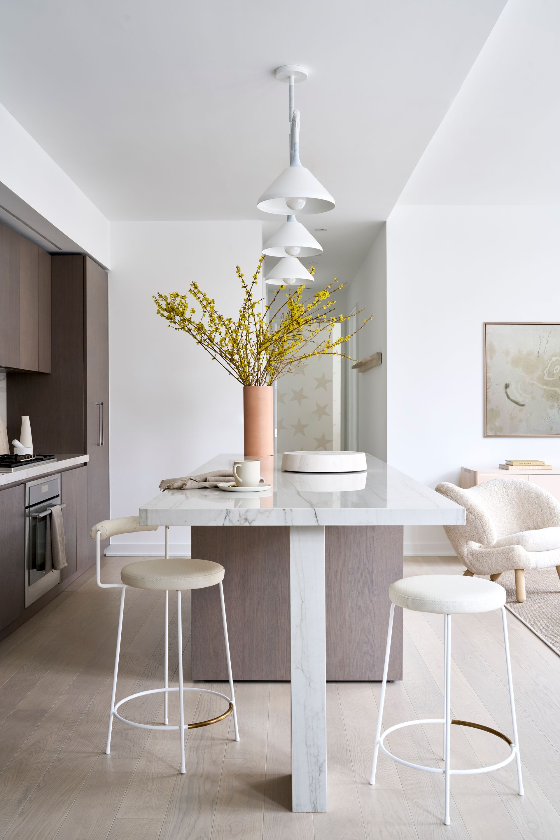
The apartment kitchen was inherited when the clients' bought the property, and while the modern Italian style was adaptable to the scheme the interior designers were creating, it required a little work to make it a fully-realized part of the apartment's new look. 'These kitchens often lack character, so we added a beautiful powder coated metal fixture wrapped with leather cord above the counter, perforated leather and powder coated stools, and lots of accessories that make the space feel warm,' explains Chelsea.
Bedroom

Exiting the more generously-proportioned living space, Chelsea and Diana were tasked with adding big character to some small bedrooms. 'This was one of the smallest primary bedrooms we have designed before,' Chelsea says, 'so it was important that each piece really drew you in. While every piece was petite in its footprint, they packed a lot of power in their aesthetic.'
In the bedroom a small table has been added to the narrow walkway, creating a vanity and casual workspace, required by the client for working from home during the pandemic and beyond.
The bedroom continues the crisp white walls, balanced out with light, but warm beige tones in furniture and textiles.
Nursery

While the nursery doesn't eschew the apartment's color story, it's certainly a more playful take on a neutral nursery.
'The goal was to make this a very dreamy space for our client' Chelsea says. 'She was going through a renovation in her old apartment when she had her first baby and it was very stressful for her. So, we wanted to make the second time around to be a wonderful experience.'
'To come to a fully organized, functional and chic nursery was super important to us,' Diana adds. 'In our opinion the wallpaper by Marley + Malek Kids sets the stage for a very dreamy night's sleep.'
Low storage not only plays well against the nursery's large window, dressed with a vast blackout Roman shade, but also provides toddler-height surfaces.
Be The First To Know
The Livingetc newsletter is your shortcut to the now and the next in home design. Subscribe today to receive a stunning free 200-page book of the best homes from around the world.

Hugh is the Editor of Livingetc.com. From working on a number of home, design and property publications and websites, including Grand Designs, ICON and specialist kitchen and bathroom magazines, Hugh has developed a passion for modern architecture, impactful interiors and green homes. Whether moonlighting as an interior decorator for private clients or renovating the Victorian terrace in Essex where he lives (DIYing as much of the work as possible), you’ll find that Hugh has an overarching fondness for luxurious minimalism, abstract shapes and all things beige. He’s just finished a kitchen and garden renovation, and has eyes set on a bathroom makeover for 2024.
-
 What are the Most Comfortable Pillowcases? From Temperature Regulating to the Best for Your Skin
When you're looking for comfort in your pillowcases, material matters. These are the best you can buy
By Faaizah Shah Published
-
 5 Simple, but Genius Bathroom Layout Tricks That Will Make Your Space Work so Much Harder
Small switches to how you lay out your bathroom that help make the most of a small space
By Luke Arthur Wells Published

