This elegant London home has the coziest of hangout spaces in a potentially surprising spot
Tollgård design studio has crafted this listed London home to create a modern and luxurious feel, including an epic basement dedicated to entertaining
This modern home in Belgravia has been designed to combine its original architecture with a modern interior design aesthetic. London-based design studio Tollgård introduced elegant furniture and statement lighting to create a fun yet luxurious space.
'We were asked by long-standing clients to bring a unique cultural and personal energy to a magnificent London home,' say designers Staffan and Monique Tollgård. 'The architecture and interiors had been painstakingly realized by the original owners; our work was to bring the family’s belongings and artwork into this traditional canvas and make it sing.'
According to Monique and Staffan, re-designing this modern home, Belgravia Mansion, has been a "pinch-yourself" design moment. 'For both Monique and I, our favourite part has been working with our long-standing clients to write a new chapter in their design journey together,' says Staffan.
'This wasn’t a project about starting over and replacing everything with the new, it was firmly about reinventing the past in a way that felt authentic and exciting. I’m thrilled to say that our clients love it because it does exactly that.'

This home was designed by the Tollgard Design Group. Partners in design and in life, Staffan and Monique Tollgård are the interior designers behind the brand. The duo trained at London’s Inchbald School of Design. Staffan describes their style as 'bold without being brash, clean but not minimal, rich in texture or color, but often not both.' This Belgravia home is one of many residential projects in London, but their portfolio includes commercial and international projects too.
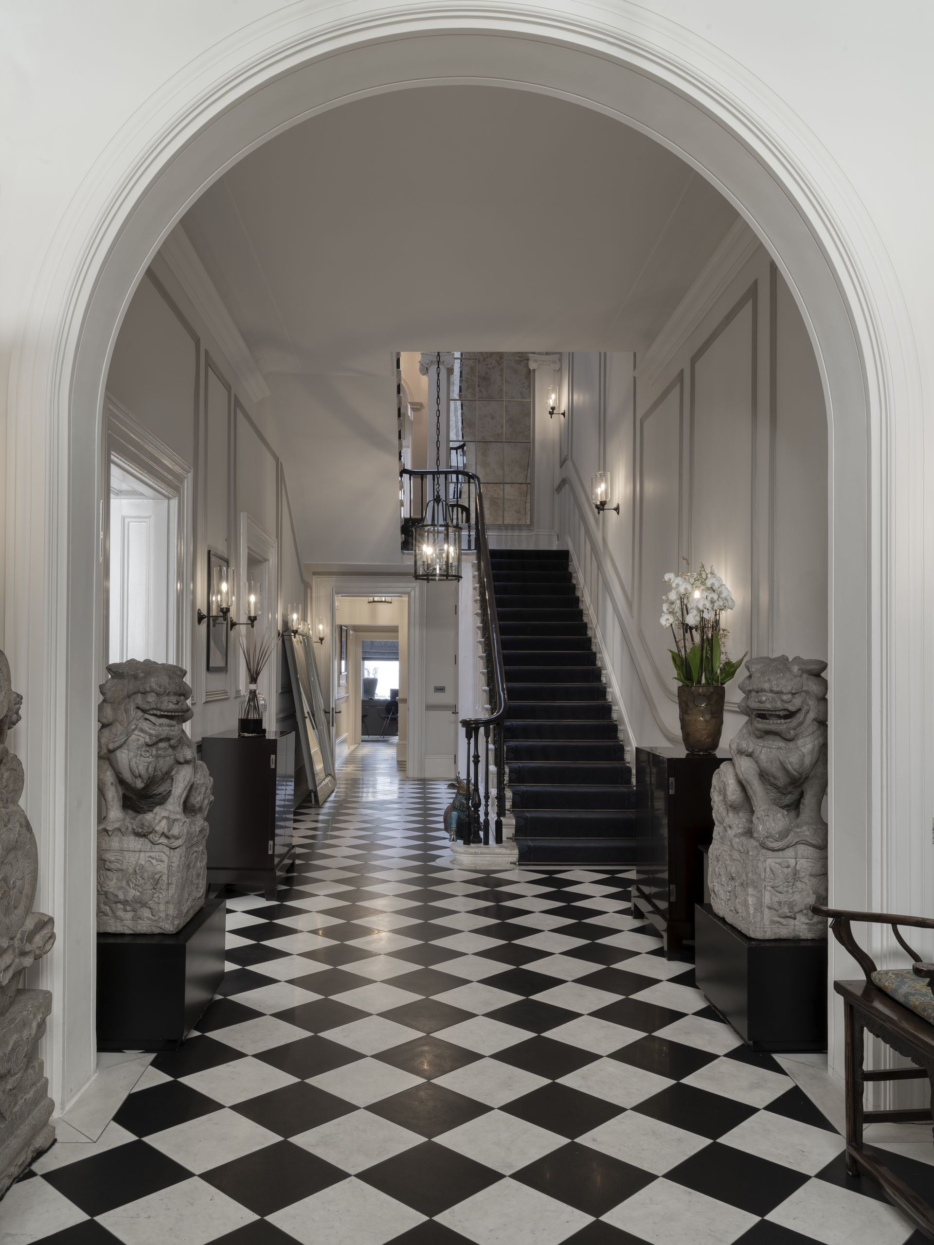
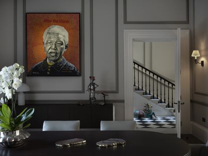
A large entryway on arrival offers a glimpse of a sweeping stairway, instantly introducing the feelings of luxury and sophistication throughout Belgrave Mansion. The arched doorway and black and white checkerboard flooring reinstate the home's traditional past as a listed building, while the lighting and furnishings give it a more modern edge.
'As our client’s step through their front door, they are also welcomed by a pair of antique foo dogs,' explains Staffan and Monique of Tollgård design studio. 'Carved with exquisite detail, these pieces were rediscovered from the client’s collection of artworks and work incredibly well with the more modern elements like the Amarcord cabinets from fine Italian furniture makers Promemoria. Heirlooms of the past, present and future work in perfect harmony.'
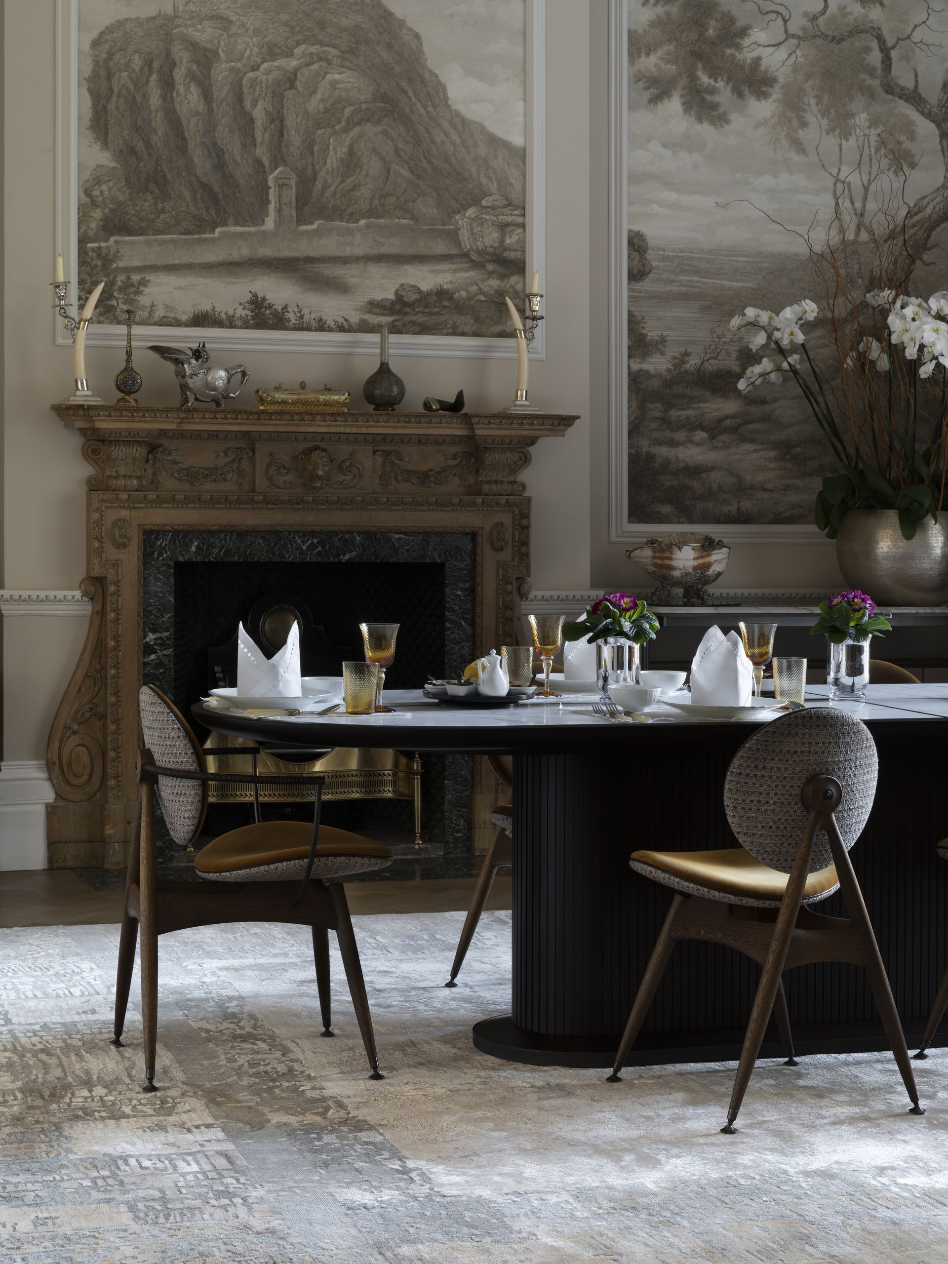
The dining room offers more muted colors than the entryway, held together by the sketched style art featured on the walls and the stony rug underfoot. With the contemporary dining table and original fireplace, the room exudes elegance.
'We were keen to make the most of pre-existing architectural and interior features within this space,' explain Staffan and Monique. 'The wallpaper and original fireplace gave the room a neutral warmth and we wanted to help elevate these features.'
One of the designers' favourite pieces that were commissioned are the Overgaard & Dyrman chairs. 'There is something so compelling about the geometric curves of the Circle chair sitting against the robust lines of Ceccotti’s stained walnut dining table,' they explain.
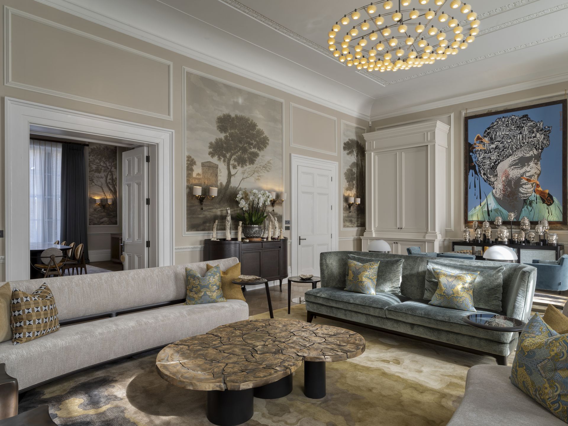
A traditional style is expertly contrasted with pops of color in the modern living room wall art. Hints of gold can be found in the rug, cushions and coffee table, which, paired with the soft velvet couches, offer continuity of the luxury feel.
'We were inspired by the extraordinary architectural features of the rooms, but with a contemporary story to tell, we needed to find the right language to fuse old and new,' Monique and Staffan add. 'The answer was a cast of strong characters: future heirloom pieces that could hold their own in this period setting together with works from the client’s art collection that possess a similar strength of voice for this new setting.'
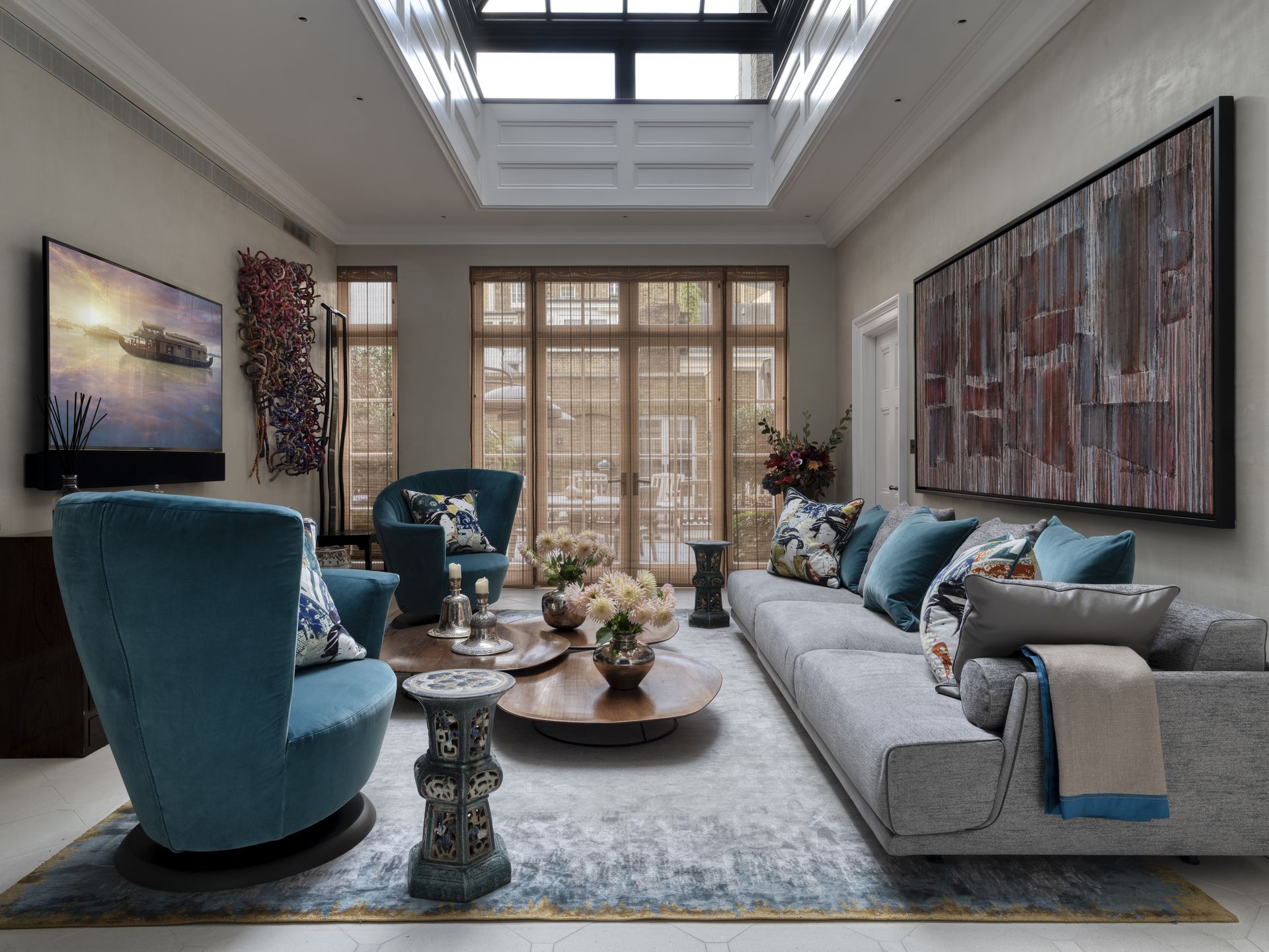
The skylight and French windows allow plenty of natural light to saturate the space in the orangery. A convivial feel is introduced with the blue swivel chairs and a palette of oranges and reds, while the low coffee tables make it the perfect space for socialising with friends or family.
'In essence, lighting is a language,' explain Staffan and Monique. 'When spoken beautifully, it promotes warmth and communication. It draws focus to what needs to be illuminated, and creates darker, moodier pools where the eye doesn’t need to be drawn.'
'For each room, we focused on the functionality of the space – what would our clients be doing and how could the lighting help elevate that experience,' they add.
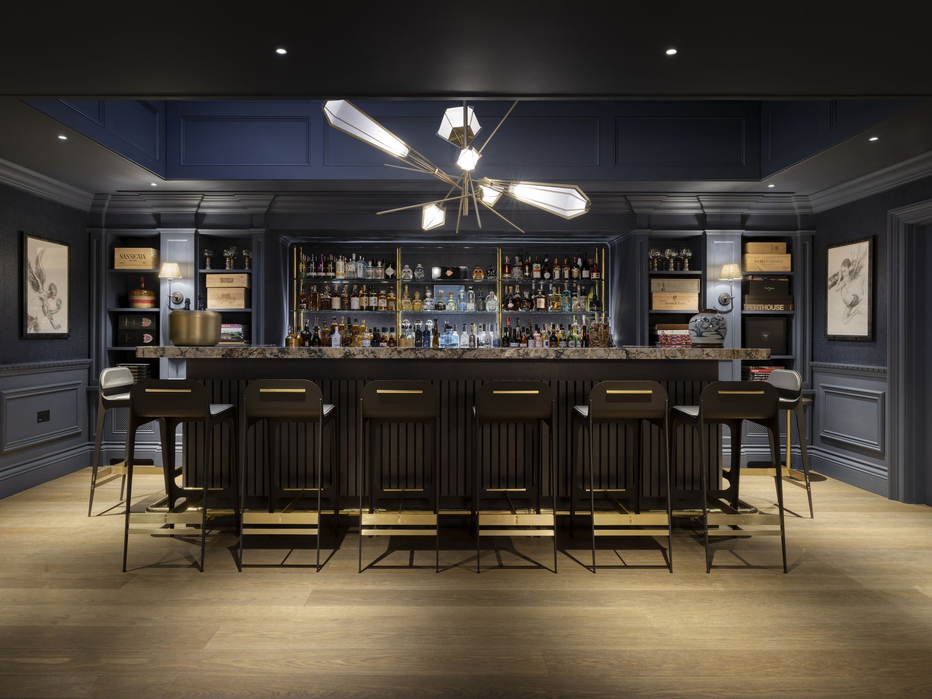
The client's basement is an entire floor dedicated to entertaining guests. Dark walls and ceilings in the bar area make it the perfect place to relax and unwind, complemented by the statement lighting fixture.
As Monique and Staffan note: 'Darker walls and ceilings can feel quite intimidating at first but they work especially well when you want to help your clients escape daily life and go somewhere fun. The key is to not fight the darkness but to work with it.'
This was their approach with the basement, 'a space for our clients to disconnect from the world and find fun with friends and family,' say Staffan and Monique. 'The deep inky blue paneling and walls were the perfect backdrop for the bar.'
Design decisions like the furniture and lighting were all centered around adding stars to the feel of the night sky. 'Pieces like the striking pendant lighting paired with the elegant bar stools from the fantastically talented Gabriel Scott make this inviting space even more alluring,' they say. 'It reminds us simultaneously of dried flowers, shooting stars and very elegant jewelry.'
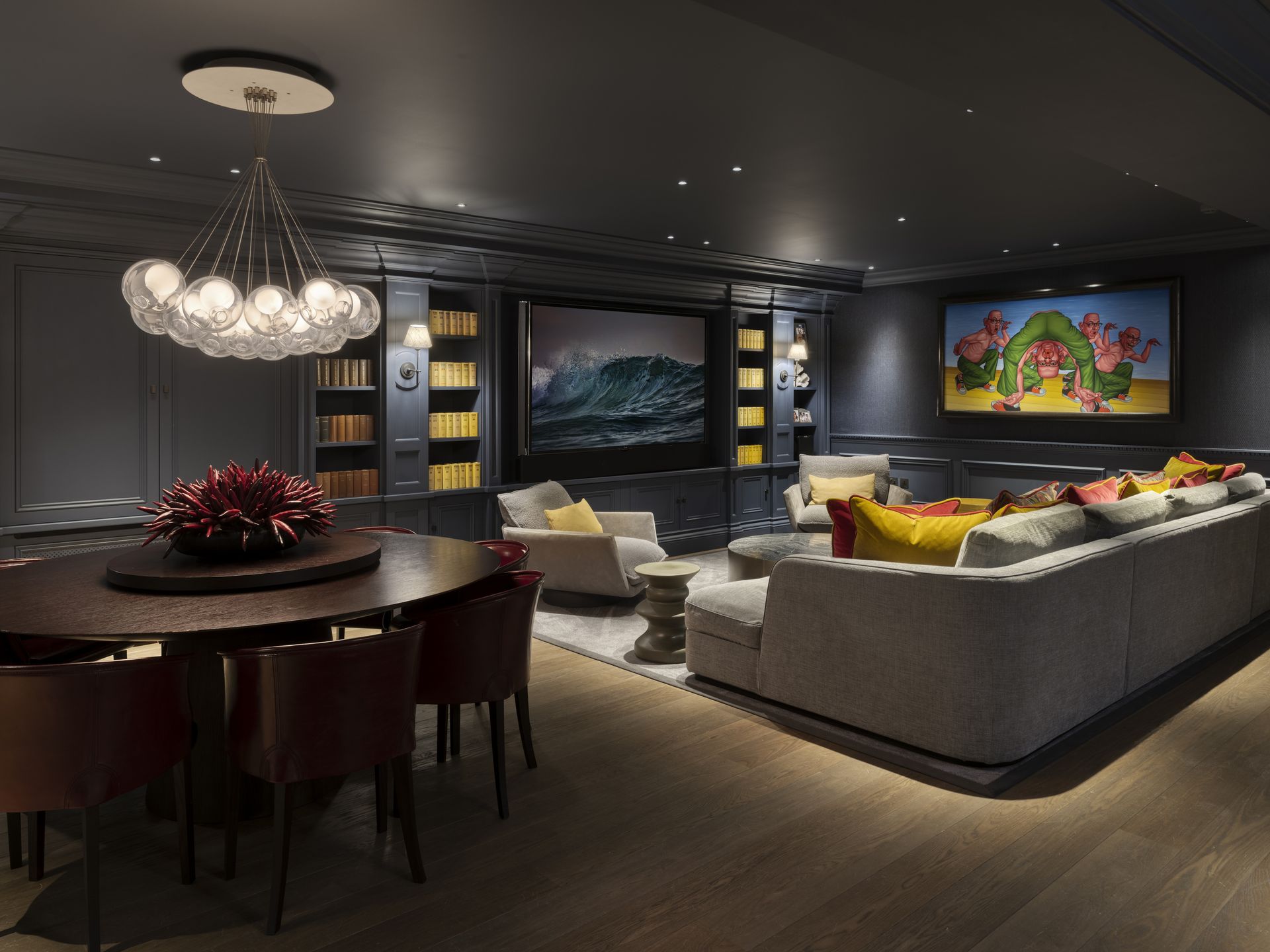
Continuing the dark theme, the basement also offers a media room. Here, ambient lighting played an important role in replicating a theater and setting a playful mood.
'Spaces for entertaining feature expressive pendant lighting to add character and a subtle illumination,' say Staffan and Monique. 'These aren’t spaces that need to be extensively lit. The softer lighting and structural form create more of a relaxed feel.'
Be The First To Know
The Livingetc newsletter is your shortcut to the now and the next in home design. Subscribe today to receive a stunning free 200-page book of the best homes from around the world.

Lilith Hudson is the News Editor at Livingetc, and an expert at decoding trends and reporting on them as they happen. Writing news, features, and explainers for our digital platform, she's the go-to person for all the latest micro-trends, interior hacks, and color inspiration you need in your home. Lilith discovered a love for lifestyle journalism during her BA in English and Philosophy at the University of Nottingham where she spent more time writing for her student magazine than she did studying. After graduating, she decided to take things a step further and now holds an MA in Magazine Journalism from City, University of London, with previous experience at the Saturday Times Magazine, Evening Standard, DJ Mag, and The Simple Things Magazine. At weekends you'll find her renovating a tiny one-up, one-down annex next to her Dad's holiday cottage in the Derbyshire dales where she applies all the latest design ideas she's picked up through the week.
-
 Things People With Low Maintenance Kitchens Never Have — 5 Decisions To Stay Away From
You may be aiming for a low-maintenance kitchen that is easy to work in but have you chosen the right materials for it? Designers point out the most common errors in decisions
By Aditi Sharma Maheshwari Published
-
 People With Spa Bathrooms Will Likely Have These 8 Things — Get the Look With Our Checklist
Homeowners with spa-like bathrooms typically have these seven things, how many do you have?
By Oonagh Turner Published
