This Texas home teaches us how to use rich contrasts to create an impactful focal point within a room
It masters the art of subtle contrast while creating an elegant point of interest in every room
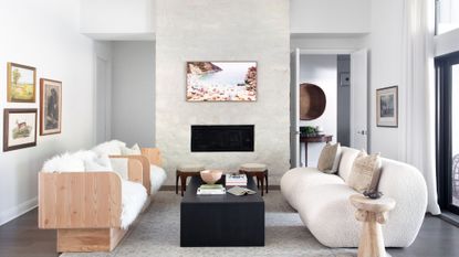

This young family's home had all the right elements going for it: ample space, natural light, and beautiful tall beamed ceilings. What it lacked, however, was character and warmth, and a design aesthetic that suited the owners and their lifestyle. What started as a white box with underwhelming decor went on to become a space where clever materials add points of contrast for a more modern aesthetic, alongside some important tricks on creating a focal point that all of us can learn from.
While the color palette stays neutral, a balanced contrast is created with the addition of subtle black elements throughout. This in turn is used to draw the eye towards different focal points which give meaning to each room of the home. The space is a prime example of how contrast doesn’t have to be overpowering when used wisely, and here, the designers share some tips on how to achieve the same effect in your modern home,
A contrasting scheme is balanced by natural textures and rich textiles
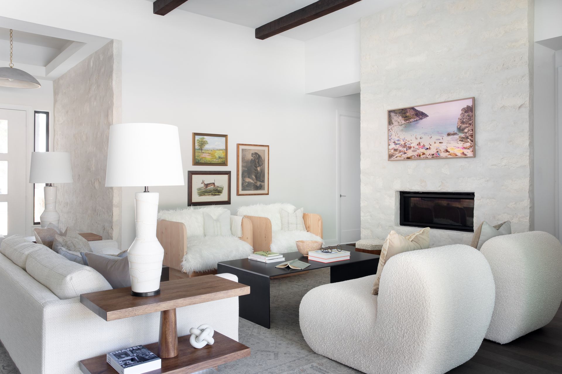
This generous-sized home in Austin, Texas, originally had large black sliding doors. During the renovation, the designers at Daley Home used these as a starting point for the further use of black which, together with white, makes such a timeless combination.
That said, the decision to use black and white meant that the highly contrasting palette needed to be softened to take away what could have been a rough edge to the final look.
‘We wanted to capture the modern and clean feeling that black and white add to a space,’ explains Shelby Van Daley, Founder and Principal Designer of Daley Home. ‘We did, however, want to make sure that where there was black and white, we also added in other tones and textures. In the dining room, for example, we went with a basket weave light. We also added wood elements through other furniture pieces to add warmth to the black-and-white scheme.'
‘When deciding to design a space that will have high contrast we love adding woven wood, washed wood tones, and heavy textures in textiles,' she adds. 'By adding different wood tones you can soften high-contrast rooms.’
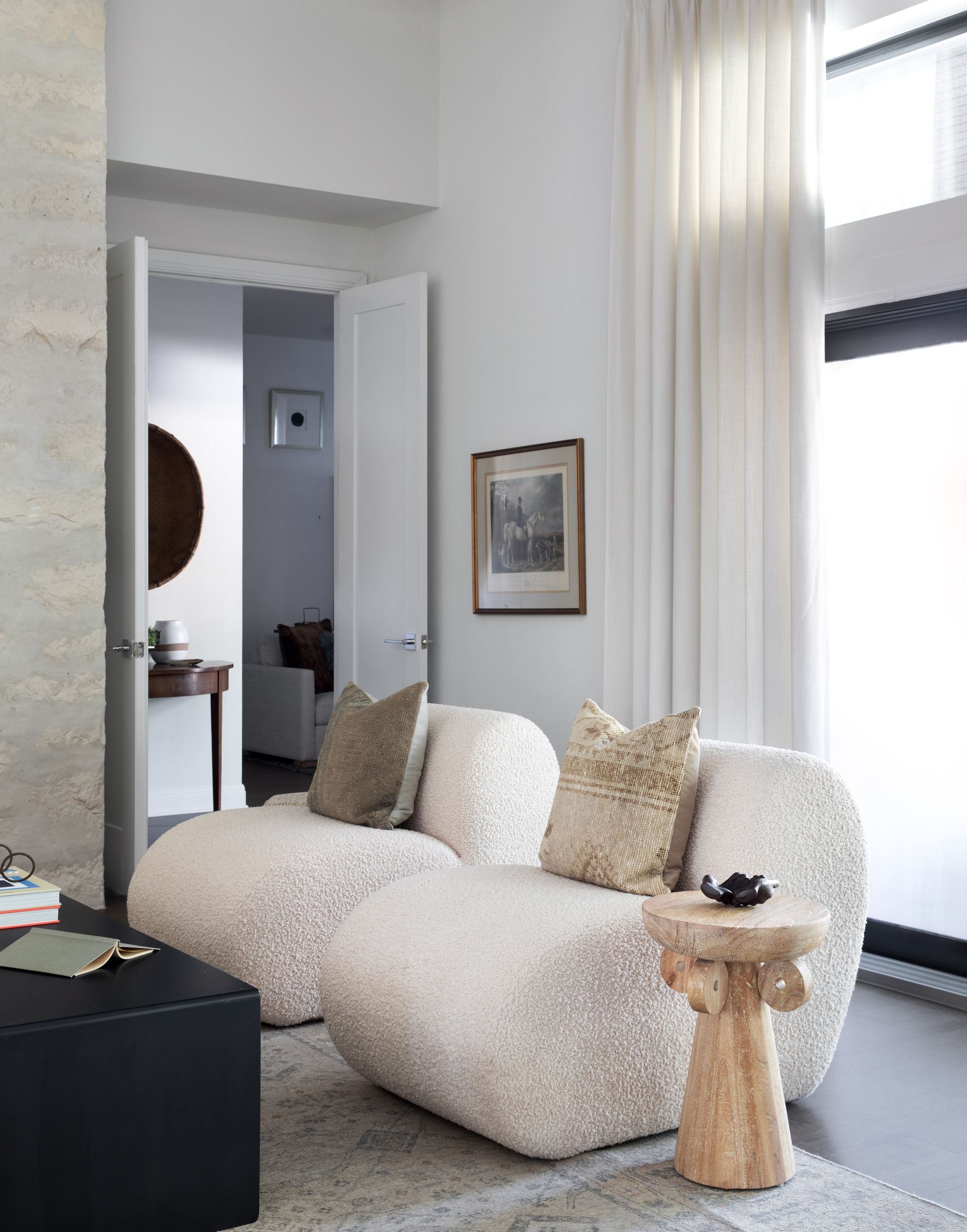
Contrast is used to create focal points in every room
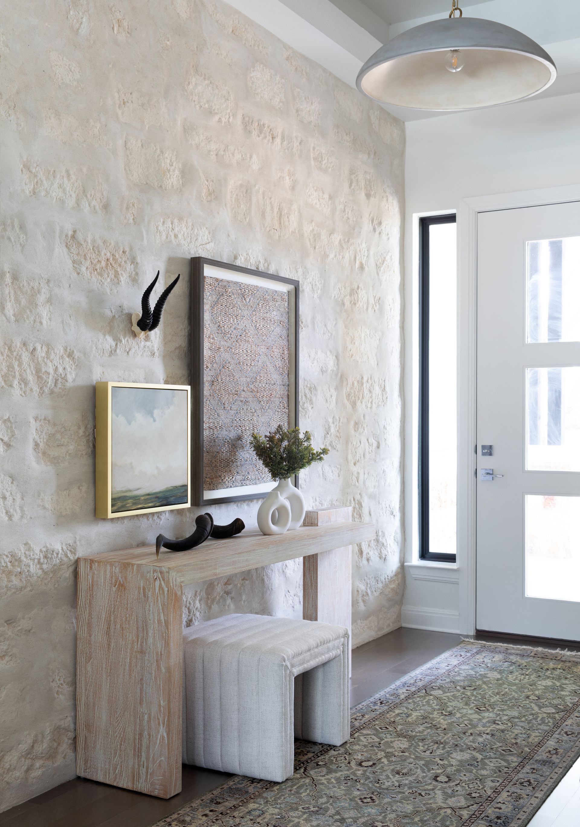
While the whole home has cohesiveness in its design, each room is individual and has its own story to tell with a different focal point that pulls it all together seamlessly. ‘Focal points are always necessary, so we chose to stone the fireplace wall so that we could add a strong focal point,’ Shelby explains. A stone wall can be seen in the entryway, too, where a focal point is created above the wood console thanks to contrasting accessories like black framed art and white objects. It's clear that even small areas of the home were not forgotten.
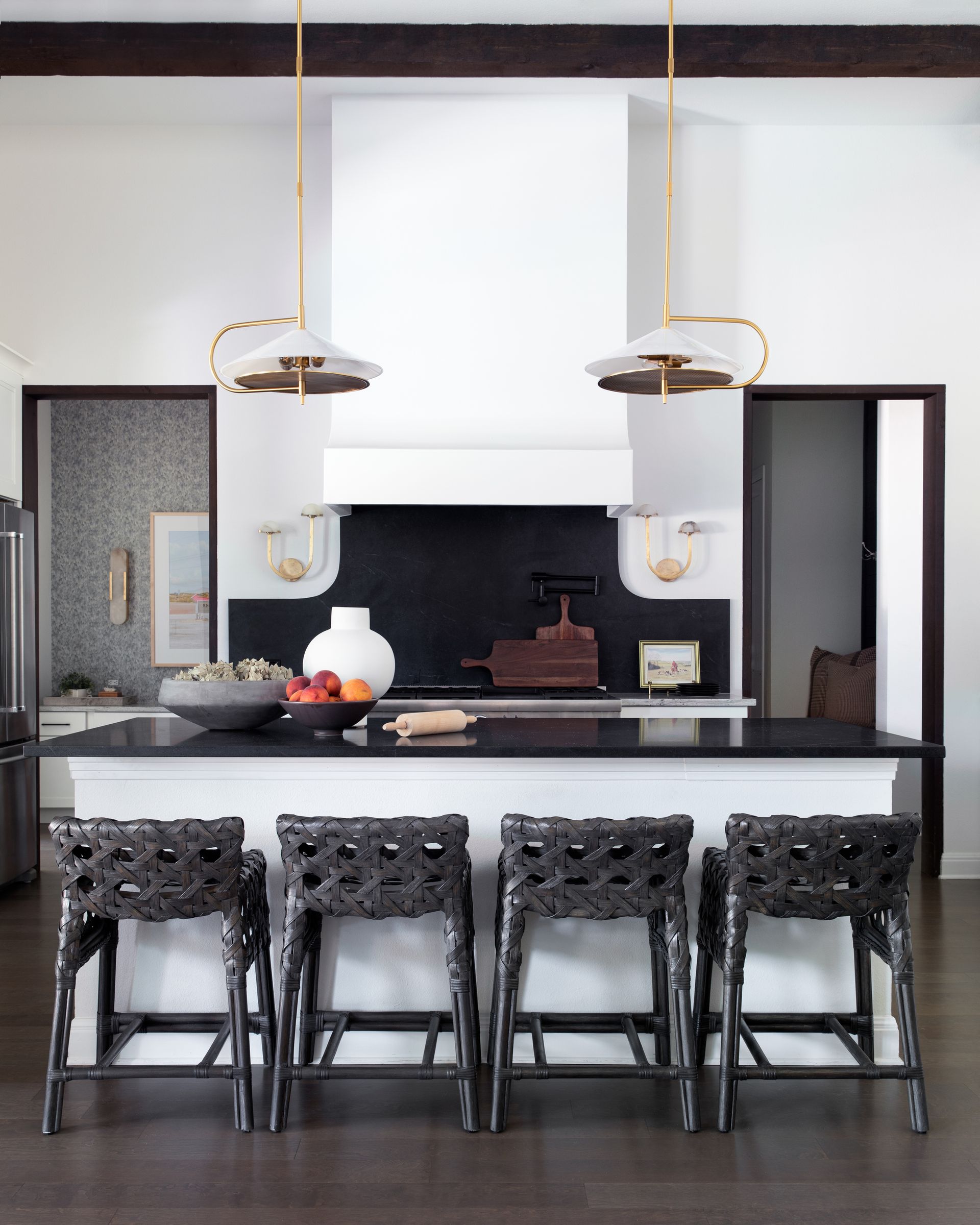
That said, larger rooms feature even stronger focal points to draw the eye and invite you into the space. 'The living room is open to the dining and the kitchen so we knew we needed it to be a powerful moment,’ explains Shelby. Here, the white kitchen island with a black worktop and black woven stools create a strong point of interest. On the opposite side, it’s the stone fireplace wall with a colorful piece of art that pulls you in.
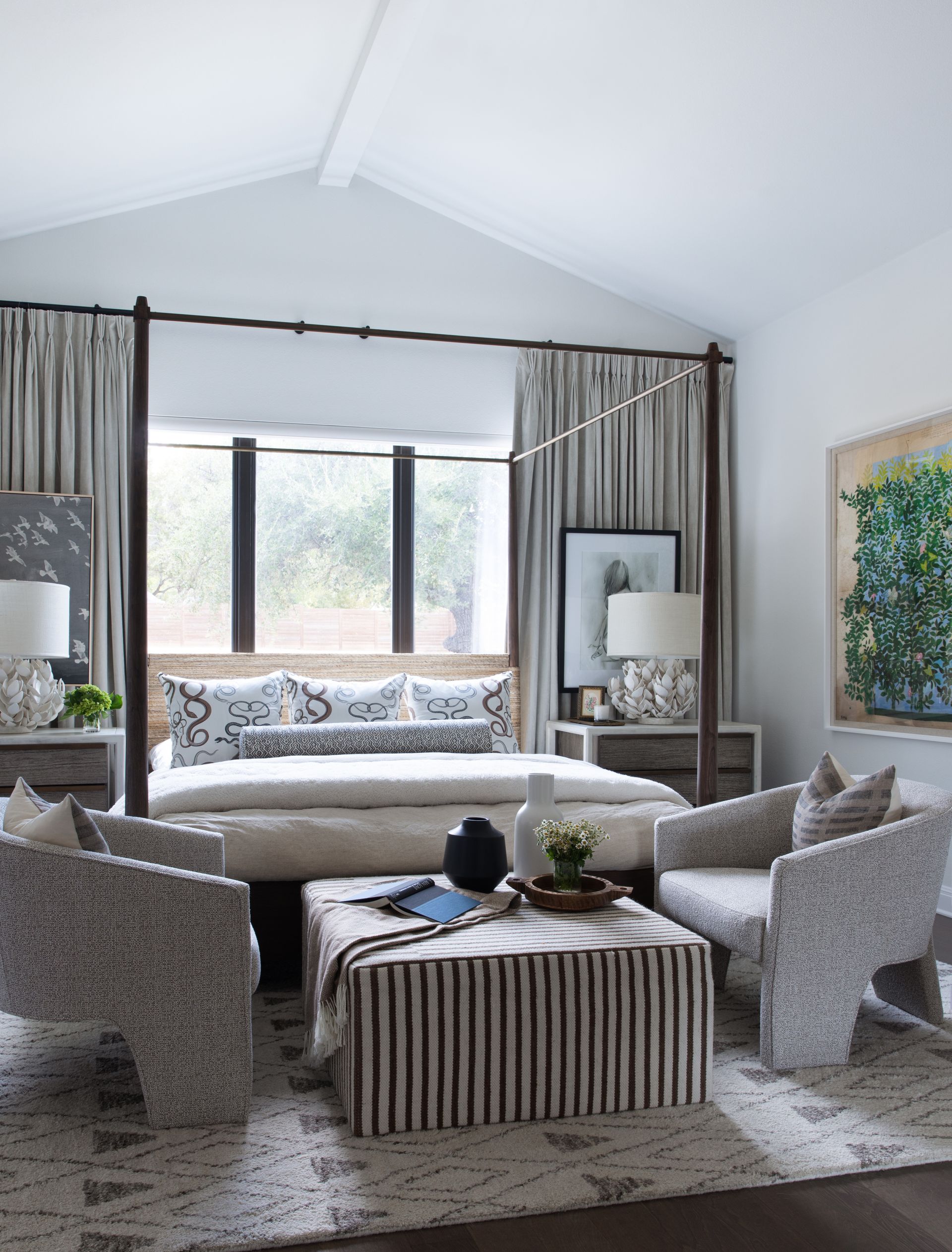
The master bedroom also offers a real standout design moment. ‘We chose to put the primary bed on the bed wall with drapes and layered artwork that span the wall to create drama when you walk in,' Shelby says. 'The placement of the windows was perfect to add all the layers.'
With a careful curation of contrasting colors, natural textures, and curated focal points, the design studio managed to create a space that's cohesive and beautifully designed, but warm, inviting, and perfectly cozy for a family to enjoy.
Get the look
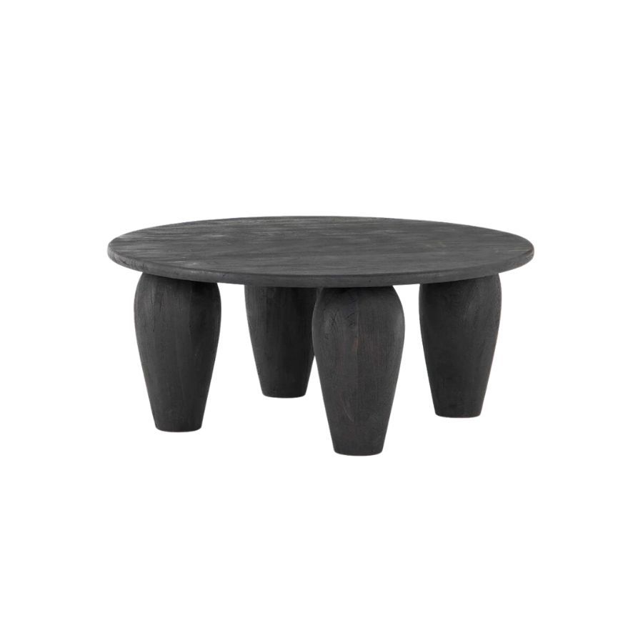
Price: $900
Create contrast in your home by placing a black wood coffee table next to a white boucle chair. The two textures will add further interest to the pairing.

Price: $18.99
This two-tone glass vase is the perfect addition to any black-and-white color palette. Style it on a set of shelves or use it to hold a single-stem flower.
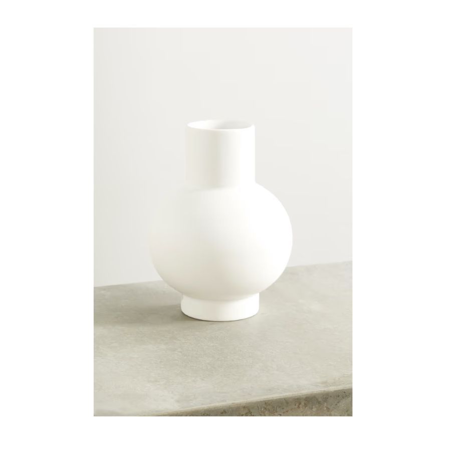
Price: $100
Accessorize your black coffee table or console with white decorative objects in sculptural shapes like this vase. Break the contrast by adding another element in a natural color.
Be The First To Know
The Livingetc newsletter is your shortcut to the now and the next in home design. Subscribe today to receive a stunning free 200-page book of the best homes from around the world.

Raluca is Digital News Writer for Livingetc.com and passionate about all things interior and living beautifully. Coming from a background writing and styling shoots for fashion magazines such as Marie Claire Raluca’s love for design started at a very young age when her family’s favourite weekend activity was moving the furniture around the house ‘for fun’. Always happiest in creative environments in her spare time she loves designing mindful spaces and doing colour consultations. She finds the best inspiration in art, nature, and the way we live, and thinks that a home should serve our mental and emotional wellbeing as well as our lifestyle.
-
 The 12 Best Table Lamps for Reading —I'm a Certified Bookworm (and Shopping Expert)
When it comes to table lamps for reading, I don't mess around. If you're the same, this edit is for YOU (and your books, or course — and good recommendations?)
By Brigid Kennedy Published
-
 "It's Scandi Meets Californian-Cool" — The New Anthro Collab With Katie Hodges Hits Just the Right Style Note
The LA-based interior designer merges coastal cool with Scandinavian simplicity for a delightfully lived-in collection of elevated home furnishings
By Julia Demer Published
