With a designer's help, this small apartment's once-awkward corner kitchen is now its highlight
In this small, open-plan apartment, a designer's touch turned this uncomfortable kitchen layout into the heart of this home


Sometimes, there's little you can do with an inherited floorplan. For this small apartment in Barcelona, for example, there was little the owner could do about the awkward arrangement of the space which saw a kitchen wrapping around an external corner.
'The apartment had a very poorly distributed living area that created an uncomfortable kitchen corner that narrowed and darkened the space,' explains Andrea Serboli and Matteo Colombo, cofounders of Colombo and Serboli Architects. 'The project had to revert this without changing the existing partitions.'
However, by embracing the right materials, this kitchen has become the highlight of this modern home – while also become a more functional room to use. Take a tour below.

Hugh is Livingetc.com's deputy editor, and an experienced homes and design journalist. Here, he shows you around a compact apartment in Barcelona with an interesting layout.
Style and substance

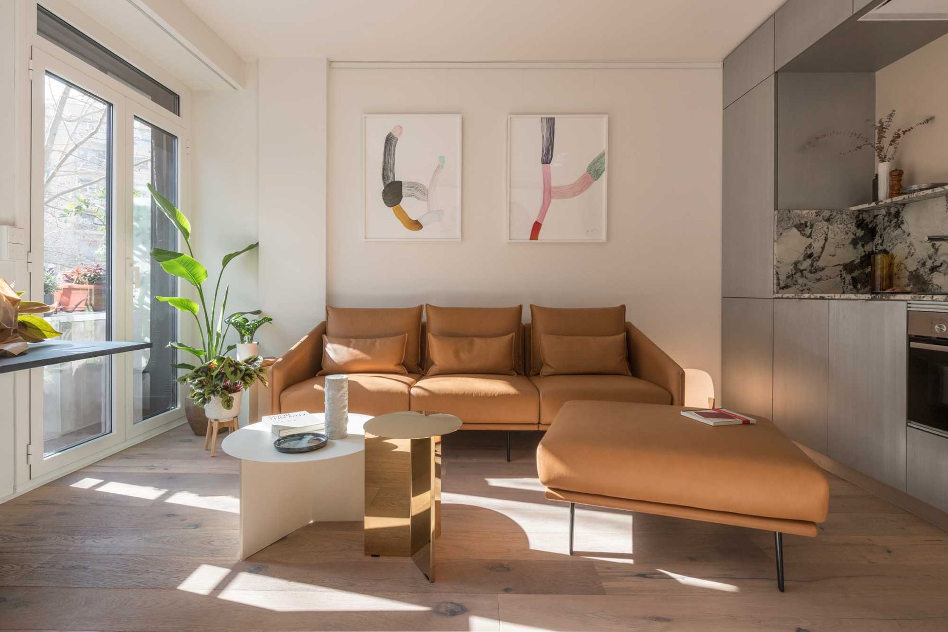
Decorating the apartment saw the architects introduce three units to define the scheme. 'On the side of the entrance, [we introduced] a blue-black storage unit separated the day area from the night area, while dramatically creating a backdrop to the new central piece of the project: the kitchen and bar area.' Andrea and Matteo of Colombo and Serboli Architects explain. 'Clad in hand-brushed aluminum panels, they form two elements in conversation, that wrap around existing pillars and installation, regularizing shapes.'

The aluminum cabinetry softly reflects the light, too, helping bounce it around the small apartment.
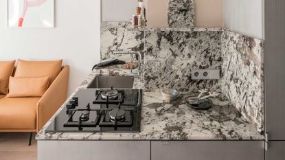
Meanwhile, the range top sits on the corner of the small kitchen, effectively increasing the access and adjacent countertop space available, helping improve the functionality of the kitchen.
Receding volumes

While two of the built-ins embrace this metallic finish, the third is designed to recede into the background. 'The blue-black entrance unit creates a very dark background for the whole living area, making the space feel deeper and disguising the entrance,' Matteo and Andrea explain.
For another trick to make this area look bigger, a mirrored kitchen backsplash has been introduced. 'To enhance the contrast with the dark blue lacquered surfaces, the carved unit has a mirror strip reflecting the large living room windows,' the designers say.
Creating daylight

Beyond the kitchen, the inner volumes of the apartment are small and starved of natural light. The architects' solution? Introduce clever LED lighting that creates the suggestion of natural light creeping in from a hidden window.
To make the most of this particularly small bedroom, built-ins have been utilized. 'The suite has a quite simple, made to measure bed in walnut, designed to integrate two small side tables, a bedhead with dimmable lights,' Andrea and Matteo explain. 'The same walnut is used to create a small unit in an existing niche, topped in Tourmaline Sky granite.'
'Two large, grooved and lacquered sliding doors hide the capacious wardrobe,' the designers add.

The trick has also been utilized in the apartment's small bathroom, which was transformed into a wet room to make the best use of the space. 'It features niches, and a custom-made ring of light mounted on the celling around the shower faucet and a micro ribbed glass door.'
Be The First To Know
The Livingetc newsletter is your shortcut to the now and the next in home design. Subscribe today to receive a stunning free 200-page book of the best homes from around the world.

Hugh is the Editor of Livingetc.com. From working on a number of home, design and property publications and websites, including Grand Designs, ICON and specialist kitchen and bathroom magazines, Hugh has developed a passion for modern architecture, impactful interiors and green homes. Whether moonlighting as an interior decorator for private clients or renovating the Victorian terrace in Essex where he lives (DIYing as much of the work as possible), you’ll find that Hugh has an overarching fondness for luxurious minimalism, abstract shapes and all things beige. He’s just finished a kitchen and garden renovation, and has eyes set on a bathroom makeover for 2024.
-
 These 12 Best Table Lamps for Your Desk — Perfect Glows for a Creative Home Office
The best table lamps for your desk is have a soft, targeted glow. Elevate your WFH set-up with these stylish picks endorsed by Style Editor Brigid Kennedy
By Brigid Kennedy Published
-
 The Nespresso VertuoPlus is 30% Off for President's Day, and it's Kim Kardashian's Coffee Maker of Choice
This sleek and stylish coffee maker was spotted in Kim's home bar, and you can currently save $60 if you buy yours from Amazon
By Lilith Hudson Published

