From tongue and groove to gingham, this designer made country chic contemporary in her own modern farmhouse
This home designed by Light and Dwell seamlessly blends European and Pacific Northwest influences, creating a soothing farmhouse vibe

Perhaps the most challenging client an interior designer has to work with is themselves. At least, this was the case with Molly Kidd, co-founder of Light and Dwell, who along with the firm's other partner Aymee Kuhlman, decided to take on the task of designing her Oregon farmhouse. With fresh ideas, vibrant mood boards, and creativity abound, and with a need to have a beautiful, snug family nest, Molly found, both comfort and a big learning opportunity while taking on the reigns of this project.
'The biggest learning from this project was experiencing the footprint and living in the space after designing it,' says Molly. 'We are already dreaming up our next one!'
While putting together a cohesive plan that was both functional and tasteful was no small feat, in the end, the home is a culmination of European and vintage 'ranch-style' elements, with some inspiration drawn from the Pacific Northwest. Stylish yet timeless – just the ideal modern home.
From custom furniture pieces to whimsical decor elements and warm paint colors, the house perfectly captures the mix of classic and contemporary of a transitional style home. We take a tour.

Aditi is a homes writer and editor with several years of experience. Her articles, backed by expert insights, offer suggestions aimed at helping readers make the best home design choices. For this article, she spoke to Light and Dwell to understand how this home was designed.
Entrance

In the entrance, light freely enters through the glass door and the small window above. The small entryway is a neutral space punctuated with deeper tones emanating from the black door and console from Four Hands. A mirror from Rejuvenation placed atop the console, plus a lamp from the brand’s vintage shop adds a wonderful peppering to the scheme.
For the ideal farmhouse feel, a whimsical lantern from Circa Lighting hangs next to the door. A brown and beige rug lays on the floor; the wood bench was a vintage find.
'We used a rug in the entryway for added texture and interest,' says Molly. 'It creates a cozy mood as soon as you enter the home and sets the tone for the neutral palette. We also adore a checkered pattern.'

Vintage Iron Cage Lantern, Amazon
This metal lantern polished in bronze uses three candelabra size bulbs, and is the ideal fixture for hallways, entrances and bathrooms.
Living room
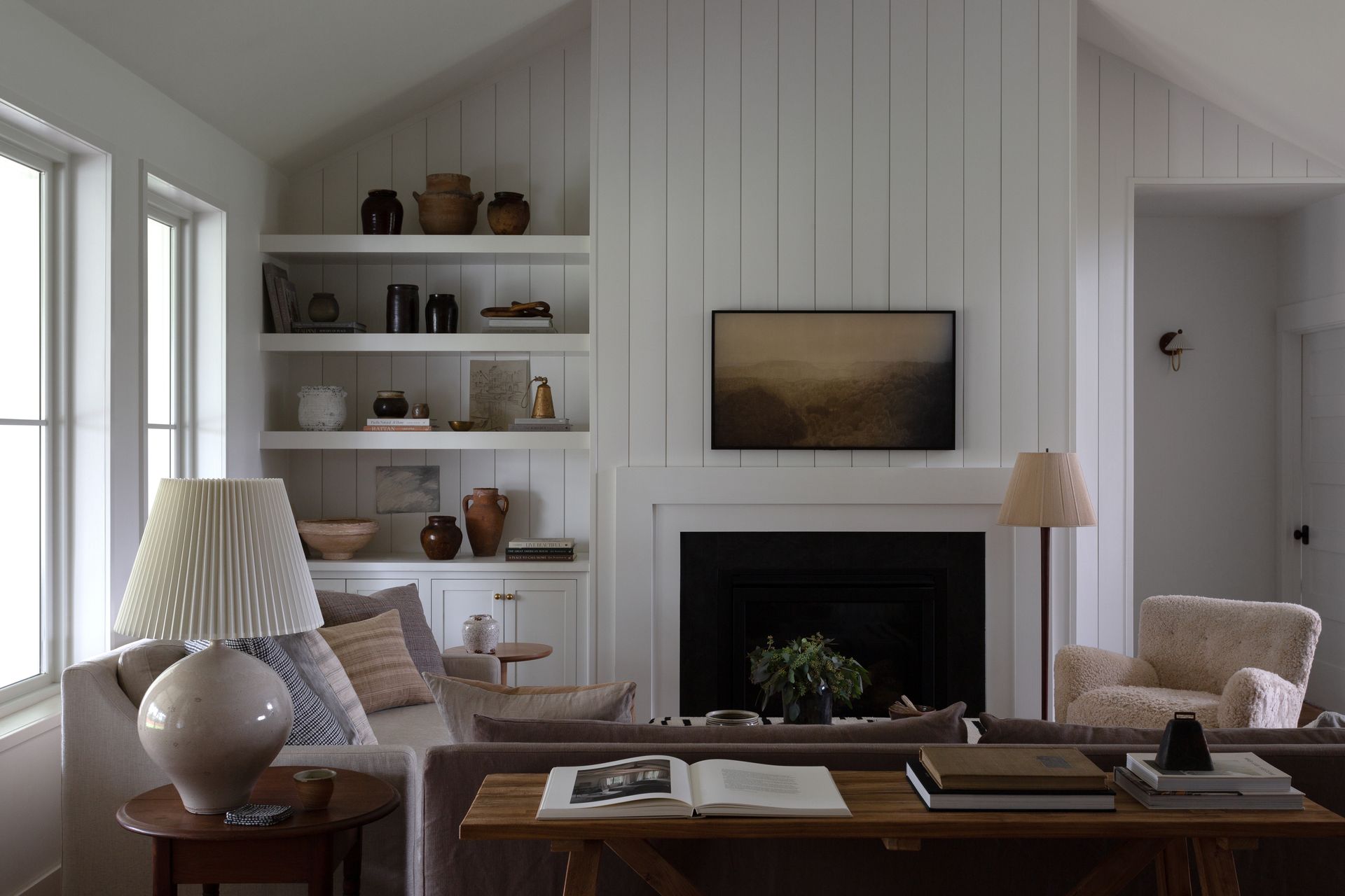
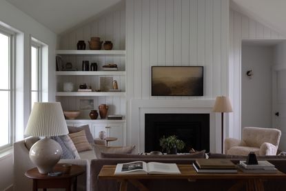
The cozy living room is designed such that the entire family can spend hours here, talking, reading, or lounging around. The sink-in sofas, plenty of cushions, and a fireplace create a wonderful mood. Not to forget the wall paneling that further adds a warm feeling.
'Classic tongue and groove in a vertical presentation are timeless and versatile,' says Molly. 'It is a great backdrop for an eclectic mix of styles.'

This room, much like the entrance, is bathed in neutral tones, while a wood table from McGee & Co(placed behind the couch) as well as a vintage wood side table with a ceramic lamp from Circa Lighting add a snug vibe.
The white and brown living room with an earthy sofa from LuLu and Georgia and another beige loveseat to match create layering. The coffee table upholstered in a Vintage Kilim Rug made of Thimblecloth adds a softness to the room. The vintage, beige patterned rug from Found Home Shop ties everything together.
'We wanted to incorporate lots of warm, neutral hues inspired by the nature of the Pacific Northwest,' says Molly. 'Warm whites, creams, and browns were the focal point in this home. Olive green is also my favorite color so we had to sprinkle that throughout.'
Kitchen

When it comes to designing spaces, the kitchen is Molly's favorite to design. The same was true in her own home.
'I love an open kitchen to act as a communal space,' says Molly. 'It is the heart of the home and so creating a space where conversation, cooking, and hospitality can all happen simultaneously was important.'
The open-plan kitchen with a moody palette, along with open and closed storage is the ideal space to cook and even socialize in. The tall wooden stools from Ballard Designs placed by the island ensure that the family can gather here to help with the cooking or even enjoy quick meals.
'We were intentional with the layout and minimizing clutter,' says Molly. 'There is a pantry right off the kitchen that stores dry provisions and not-so-pretty counter items like appliances, etc.'

The kitchen cabinet color is Sherwin Williams’ Natural which plays into the cooler tones of the kitchen, and the living room. The countertop in leathered black granite adds dimension to the rest of the space. The sleek pendants from deVOL Kitchens provide extra lighting in the workspace.
Molly wanted to incorporate some brass details as well with the sink faucet, also from deVOL Kitchens, and the sconces by Circa Lighting. She placed a vintage rug under the sink to make the wood floor feel cozier.
'We wanted an organic and earthy element in the kitchen,' says Molly. 'We love the look of handmade imperfect perfection with the tiles. Plus, adding a vintage runner creates warmth and is the perfect lived-in layer.'
Laundry room
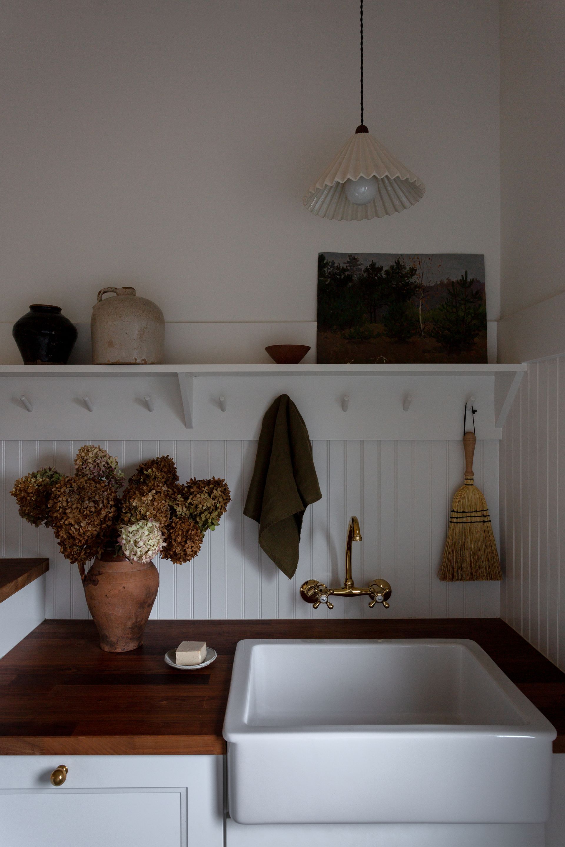
The laundry room is highlighted with wood accents on the countertop, along with wall paneling to further accentuate the farmhouse feel. The faucet from Kingston Brass and a fan-like pendant from Huey Lightshop add a soft, calming touch to the space.

To elevate this area and add extra functionality, a small seating nook was created. 'We wanted a casual dining space,' says Molly. 'Sixpenny did not disappoint with its elevated yet relaxed banquette'
The reading corner is made cozy with cushions, with custom gingham patterns from ThimbleCloth. The space is also adorned with an array of vintage pillows from Etsy, making it the perfect spot to curl up with a good book and cup of coffee.
Powder room

Off of the laundry room is a powder room; small yet impactful. This space offers another moody moment in the home's color story. The dark green walls add depth to the room and Molly incorporated gold accents with the mirror from 1stDibs and a sconce from Huey Lightshop to add a sparkle to the scheme.
Stone accessories from Shoppe Amber Interiors are found on the sink as well as a patterned towel hanging from Heather Taylor Home.
'We wanted a moody space that was unexpected in the home,' says Molly. 'The powder bath was the perfect place to do that.'
Studio Green by Farrow & Ball
This dark green shade almost black unless in very well lit rooms, and is a great color for both interiors and exteriors.
Master bedroom

The wonderful paneling seen in the laundry room and living room makes another appearance in the master bedroom. The wooden bed frame from Crate & Barrel is topped with plush Parachute bedding, giving rise to an elegant, yet cozy, warm bedroom, perfect for sleep.
A patterned rug from Interior Define adds layering to the room, and a nightstand from McGee & Co. with a ceramic lamp from Troy Lighting contributes to the comfort.
'For the rug, we thought 'Go big or go home,' says Molly. 'The rug should have a calculated ratio to the size of your bed. Rugs are all about scale and impact.'

An armchair placed in the corner of the bedroom offers an extra space to relax. Plus a standing lamp offers the perfect task lighting for any kind of focused work. Storage unit by the OFFCUT Handmade dresser is placed next to it.
'Coziness was the main factor,' says Molly. 'We wanted to maximize seating whether it was to read a book, put on your shoes or place your laundry while folding.'
Master bathroom

The master bathroom is calm and serene with a big white tub at the center of the room. Molly brought in gold accents for the bathroom with the pendant from Rejuvenation and faucets. The vintage stool and wooden dresser add dimension to the white walls. To add movement to the scheme, dainty checks on the gingham curtains and rug lift the mood.
A Carrara Marble is used on the countertops on the vanity with custom cabinets. Hanging above the vanity is a mirror from CB2 and sconces with gold details from Circa Lighting.
'We chose to use a rug in the bathroom for warmth, texture, color, and comfortability in the bathroom,' says Molly.
Daughters' bedroom
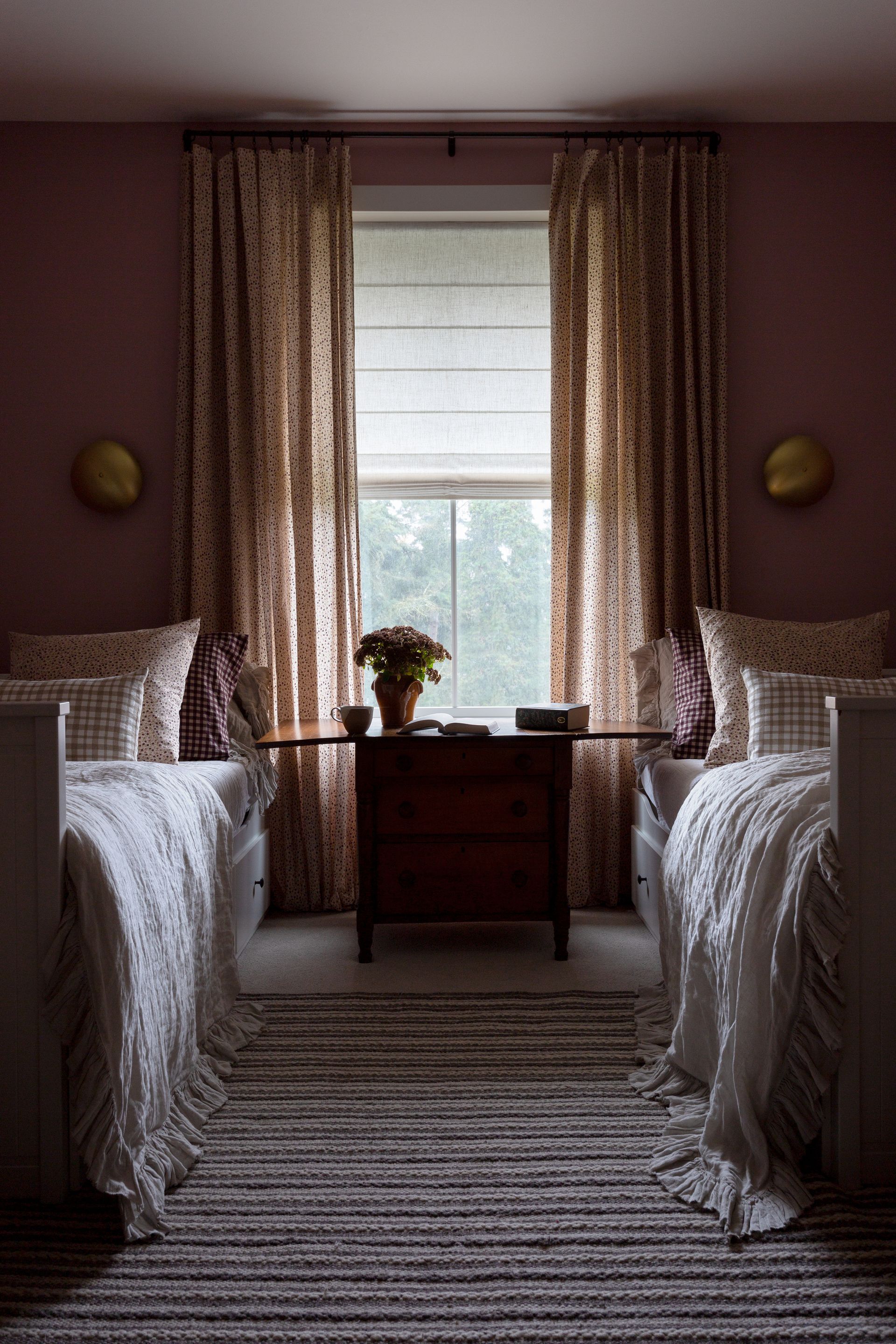
Molly's two daughters' shared bedroom drenched in deep pink is an embracing, cocooning space. For the beds, Molly chose a mixture of patterns with ginghams and polka dots using pillows from McGee & Co. Above each bed, a bronze sconce was added from Mullan lighting. A striped rug on the floor makes the room feel homier and a dark wood table divides the two beds.
'We knew we wanted our girls to share a room so I placed a window right in the middle for natural light and an organic barrier between sides to create a little bit of individuality,' says Molly.
Son's bedroom

The son's green bedroom, with the color, splashed across the walls and bedding, is a lively yet perfect space to wind down in. The throw pillows add comfort to the bed, and dimension. On the walls are artworks by Chelsea Pataja and a sconce from Schoolhouse.
'My son and I share the same favorite color – olive green – so this was a nod to him,' says Molly.
See more of Light and Dwell projects.
Be The First To Know
The Livingetc newsletter is your shortcut to the now and the next in home design. Subscribe today to receive a stunning free 200-page book of the best homes from around the world.
Aditi Sharma Maheshwari is an architecture and design journalist with over 10 years of experience. She's worked at some of the leading media houses in India such as Elle Decor, Houzz and Architectural Digest (Condé Nast). Till recently, she was a freelance writer for publications such as Architectural Digest US, House Beautiful, Stir World, Beautiful Homes India among others. In her spare time, she volunteers at animal shelters and other rescue organizations.
-
 5 Trees You Should Prune in Your Backyard in February — 'It Makes Much Sense to Cut These Ones Back Now'
If you think pruning trees is best left to spring, think again. These trees all could use some cutting back now for several very important reasons
By Hugh Metcalf Published
-
 The 4 Things People With Really Organized Kitchen Drawers Always Have
Level up your ‘drawer decor’ and keep things tidy and organized with these 4 essential ideas for uncluttered storage
By Becca Cullum-Green Published
