In his dark, tiny New York apartment, this architect's clever lighting trick is key to a bright, feel-good space
Martin Hopp's New York micro apartment demonstrates how effective design in your home can contribute to wellbeing
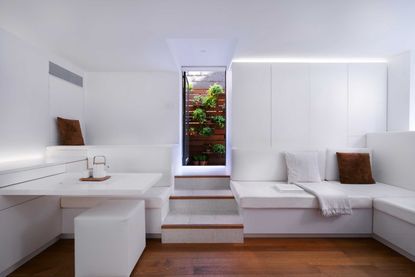

In a very confined space, it can be easy to feel overwhelmed by the nearness of everything. But clever design can enable us to feel happy in a small home, instead making the most of its compact nature. It's possible to create a calm, serene place in which to relax, a clutter-free environment where we can work effectively, and an beautiful home that allows us to entertain our friends with pride and comfort.
In the bustling city of New York, every inch of real estate must be used as effectively as possible. It is also crucial to be able to escape the noise, pace and frenetic atmosphere of the city and have somewhere tranquil in which to unwind, host and work.
This multi-functional small apartment fulfills every need. During the design and build, deep consideration went into every detail and decision, which the architect, Martin Hopp, describes as a way to 'introduce more lightness, joy, and purpose into this once unremarkable space.' Take a tour of this clever micro apartment below.
Materials matter in a small space

Designer and architect Martin Hopphas several ways in which he brings these intentions to life. He uses quality materials throughout to convey a sense of comfort and luxury. For example, the wood wall paneling is finished using only oil to enhance the grain, illustrating how a minimalist yet thoughtful finish can be effective without taking attention away from the natural materials.
One of the ways the architect manages to create the sense of calm and space in the home, while also helping the space feel larger, is by focusing on simple and consistent use of color. The predominantly white kitchen units, worktops and backsplash combine effortlessly, almost merging into each other, bringing a unity of design and an absence of distraction. It takes a small space and turns it into a series of experiences that adds up to something far greater than the individual pieces,' Martin explains.
Within the overall white palette the use of terrazzo, stone, matte paint and white oak creates a sense of consistency which again creates a minimalist and calming atmosphere.
Transformative, multi-functional spaces


A key thing to consider when designing and decorating micro apartments is the potential to maximize form and function.
Throughout the apartment, there are several flexible aspects to the design which, while providing clever space-saving ideas, also provide talking points for visiting guests. A perfect example of this is the rotating dining table. 'It always generates comments and people want to interact with it to see how it works,' Martin says.
The other amazing thing about the design is that Martin manages to provide seven different functions within the apartment's 720 square feet – alongside the expected kitchen, bathroom and living areas, there is even the chance to accommodate a guest bedroom home office with a clever Murphy bed. ''To have a separate workspace that can transform to host guests for a weekend and then flex back makes a huge difference to how you can live and enjoy your life,' the architect explains. All the room dimensions in the apartment are carefully calculated to ensure there's a feeling of space and proportion.
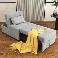
Ottoman sofa bed, Amazon
A Murphy bed system can be expensive, so if you're on the hunt for an affordable alternative with a similar useful multi-function and contemporary style, this Ottoman sofa bed might be the answer.
Lighting and character in the design

The apartment is designed with wellbeing in mind, especially the clever use of lighting in such a small, dark home. 'Lighting is hidden within the built-in elements and used to reinforce the feeling of natural light,' Martin explains. 'Lighting has such a strong impact on wellbeing that we really emphasized its integration.'
The bathroom lighting uses panels behind the shelves to brighten the room and create the effect of sunlight to compensate for the absence of natural light.
There is contrast and variety in the lighting choices, adding dimension to the space with Martin explaining, 'Dimming gives that space a wide range of characteristics and has always brought delight to anyone who has used it.'
In the modern hallway, a minimalist approach reduces the visual clutter. While streamlined and simple, relying on natural materials to add interest, there is no lack of hidden storage. Simple, unobtrusively designed cupboards constructed in locally and custom-built millwork, with doors that fold and pivot, are an easy way to provide flexible living.


As the apartment is also there to provide a working environment when needed. The clean, simple design enables clarity of thought, while the flexible built-in furniture ideas mean you can switch to work mode easily. Similarly, when it's time for relaxation, the luxurious feel of the modern bathroom allows for a complete switch-off from the pressures of the day. Added to this the green planted accessway to the apartment building provides a natural relief from the noise of the city.
Living and working in a small space can be challenging, but one as cleverly designed as this has undoubted advantages. It is a perfect illustration of less is more in design.
Be The First To Know
The Livingetc newsletter is your shortcut to the now and the next in home design. Subscribe today to receive a stunning free 200-page book of the best homes from around the world.

Alex is a MA Magazine Journalism student at City University of London, with experience writing for several online magazines for students and young women in film, lifestyle and politics. Proud and particular about her bedroom decor, Alex has always found interest in interior design, insisting on full control over Christmas tree decorating each year. Her favourite aesthetic is definitely small cozy spaces, cluttered with cushions and throws of different colors and textures, surrounded by warm fairy lights and candles. Her only strict rule is, 'Never have the big light on.'
-
 The 12 Best Table Lamps for Reading —I'm a Certified Bookworm (and Shopping Expert)
When it comes to table lamps for reading, I don't mess around. If you're the same, this edit is for YOU (and your books, or course — and good recommendations?)
By Brigid Kennedy Published
-
 "It's Scandi Meets Californian-Cool" — The New Anthro Collab With Katie Hodges Hits Just the Right Style Note
The LA-based interior designer merges coastal cool with Scandinavian simplicity for a delightfully lived-in collection of elevated home furnishings
By Julia Demer Published
