I’ve never seen a piece of furniture work as hard – this built-in unit makes a minimalist, open-plan barn feel cozy
An entry closet, bench, bar, and media center rolled in one – this clever piece of furniture is perfect for a minimalist home


When we think about the concept of minimalism and how it translates to interior design, we picture sleek, refined spaces that are sparse in decor, materials inspired by nature, and top-tier storage.
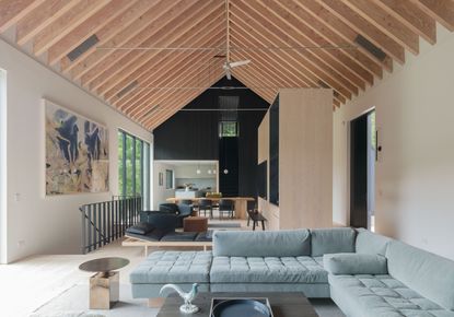
This Upstate New York family home designed by Worrell Yeung certainly delivers with this clever four-in-one unit. The dominating freestanding piece of furniture is a device for dividing up the space and carving out zones. All the while, its floated position in the room allows the white walls to breathe, drawing visitors' eyes up to the dramatic cathedral-like ceiling.
But its multifunctionality is what's really impressive - a four-in-one piece of carpentry that's perfect for the rigors of family life. 'The house is at once simple and complex—something we are continuing to explore in our work,' says co-founder Jejon Yeung. We speak to Jejon to hear more about what this clever design does to the space and why it's the perfect solution for a minimalist modern home.
Multifunctionality at its best

So what are the four-in-one functions? It's an entry closet, with clever storage for a mini mud room moment. There is a bench area and a mini bar too. It's also a media center, with a TV placed on one side making it a key piece of furniture for the living room.
It's an example of why you should float your furniture. 'By placing the unit in the center, it supports different types of functions. It creates a living area by fireplace, a smaller TV watching area, there is the bar, as well as a dining area, all within a large open and connected space on three of its sides.
'It's also a small foyer/vestibule area to sit and take your shoes off and hang your coats in the closet built into the center object.'
Minimalist credentials

Minimalism is so often characterized by storage that is discreet - hidden away so as to avoid creating anything too visually jarring. This furniture idea flips this concept on its head entirely, instead embracing the storage instead of shying away from it, and really helping to break the space up.
'Large vaulted and expansive rooms are impressive but can be uncomfortable and awkward to furnish and inhabit,' explains Jejon.
'We came up with a freestanding object in the room that helps define and create intimate spaces around it without physically separating them.
'Our interest in minimal and unembellished detailing is also paired with larger organizations that maximize spatial complexity experienced while moving between spaces and rooms.'
Perfect for open plan living

Another aspect is how it works to carve up a large, open plan space. Placement by the front door creates a mini corridor and hallway, and the unit almost acts as a stage curtain, creating a moment of anticipation that is unveiled the moment you walk behind it to discover the rest of the room.
It gives the guest options of where in the space to discover first and creates destinations - so often a problem with open plan spaces where you're greeted with just one open room.
'Although the overall palette is quite minimal, the location of solid walls and openings orchestrate a sense of carving, pushing and pulling of forms,' says Jejon.
'The object floating in the middle almost appears as if it were pulled from the central stair or removed from the wall to reveal a corridor in its place; adding interesting layering to spaces and parallax experiences to discover.'
Relationship to the rest of the space

Douglas fir wood used throughout the space and a light color palette helps the room stay light and airy. Douglas fir is used throughout, including on the unit and exposed ceiling rafters that stretch from one end to the other. It's the perfect color palette for a minimalist living room and creates a relationship with nature, (the beautiful southern views of the pond and hills are framed by floor-to-ceiling windows inspired by the Giacometti Gallery at the Louisiana Museum of Modern Art where tall vertical mullion pattern exaggerates the vertical of both the interior and exterior).
'The douglas fir throughout (floors, ceiling joists, and walls) all have a translucent white wash finish that helps lighten and soften their appearance,' says Jejon.
'Combined with the large windows, this helps to maintain a light and airy environment where little to no electric lighting is required during the day.'
'We kept to a minimal but rich material palette using materials that are common in farm properties (zinc, douglas fir ceiling joists, floors and walls, wood battens and soapstone). These natural materials pair well with and become a nice backdrop to the expressive accent colors in the furniture and artwork we and the clients curated.'
It's only the walls that bookend the large living room space with a batten textured wall stained black where we see darkness. 'The clients told us they love dark walls, and we do as well. This adds visual and experiential drama, especially when going up and down the stairs to the second floor, and also to contrast and heighten the lightness and views out the window wall.'

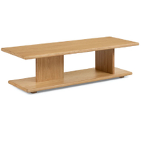
Lafora coffee table, Article
If you're looking to bring natural hardwood into your minimalist home, go for a solid wood coffee table. I love the look of this structural piece, with the natural grain exposed - and it's currently on sale.

Be The First To Know
The Livingetc newsletter is your shortcut to the now and the next in home design. Subscribe today to receive a stunning free 200-page book of the best homes from around the world.

Oonagh is a content editor at Livingetc.com and an expert at spotting the interior trends that are making waves in the design world. Writing a mix of everything and everything from home tours to news, long-form features to design idea pieces on the website, as well as frequently featured in the monthly print magazine, she's the go-to for design advice in the home. Previously, she worked on a London property title, producing long-read interiors features, style pages and conducting interviews with a range of famous faces from the UK interiors scene, from Kit Kemp to Robert Kime. In doing so, she has developed a keen interest in London's historical architecture and the city's distinct tastemakers paving the way in the world of interiors.
-
 What are the Most Comfortable Pillowcases? From Temperature Regulating to the Best for Your Skin
When you're looking for comfort in your pillowcases, material matters. These are the best you can buy
By Faaizah Shah Published
-
 5 Simple, but Genius Bathroom Layout Tricks That Will Make Your Space Work so Much Harder
Small switches to how you lay out your bathroom that help make the most of a small space
By Luke Arthur Wells Published

