How do I make mid-century style feel modern? This Tribeca penthouse is a masterclass
The NYC apartment has a retro look that still feels contemporary and on-trend
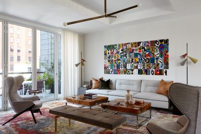

A New York City-based interior design firm has styled this Tribeca penthouse apartment into a mid-century modern haven. Sat atop one of the trendy industrial buildings in Lower Manhattan, this retro home fits right in with the cultural hub of its metropolitan surroundings.
Founder of boutique residential design studio Butter & Eggs, Judy Dunne, created a chic yet comfortable modern home for her clients, a professional couple and their teenage daughter. Taking inspiration from classic mid-century modern characteristics like clean lines, muted brown tones, graphic shapes, and geometric patterns, she's created a cozy yet sophisticated interior fit for the modern family.
The 3,500-square-foot duplex is bookended with generous terraces on the north and south side which provide ample terrace space and brilliant views of the neighboring Manhattan skyline. Inside, Butter & Eggs designed a custom rift oak millwork with black satin that runs throughout the home, offering a retro look with a contemporary edge. We take a look inside.

Lilith is an expert at following news and trends across the world of interior design. She has an eye for appealing designs and interesting spaces which she regularly shares with readers through home tours, such as this one. After seeing this beautiful mid century modern home in NYC's Tribeca district, she was keen to impart the design lessons we can learn from such an expertly styled space.

First up, the kitchen. In this functional room of the home, Butter & Eggs has introduced a sleek, timeless design with the simple grey-white cabinets and classic marble countertops.
The cylindrical lighting makes a wonderful statement and gives the space an industrial interior design feel, in keeping with NYC's heritage. Paired with the chrome finishes on the cabinetry and the large mirror as the oven hood, this kitchen feels at once classically elegant and excitingly unique.

The living room is a prime example of how to elevate the mid-century modern style, complete with wingback armchairs, a burlwood coffee table and a white leather sofa and accompanying cushions. A patterned area rug with warm red and brown tones ties the calming color scheme together, as well as the graphic wall art design above the sofa.
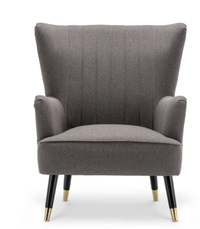
Wingback armchair, Wayfair
Taking its influence from the oversized shapes of mid century design, there are some incredibly affordable pieces on Wayfair that suit the aesthetic.

Another living area doubles up as a listening room with a record player and guitar hung on the wall - the perfect space to unwind in the afternoon or host guests in the evening. Eclectic furnishings and talking points like the tree stump coffee table and statement light fixture make this room feel unique and personal to the homeowners.

Large windows and French doors allow tonnes of natural light to flood the dining room, which opens out onto the garden terrace. Bright red chairs add a pop of color to the room, while the velvet material introduces softer textures to an otherwise harsh space. Meanwhile, the oak millwork in the credenza adds a lightness to the room that contrasts with the dark wood of the dining table.

The same varnished oak is used in the home office for the built-in desk and cupboards creating a soft, vintage feel. Aided by the classic mid century style wooden armchair, the vinyl record collection and the red retro lamp, entering this room feels like you've stepped back in time (in the best way possible).
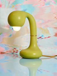
Entler Studio ceramic lamp, Coming Soon
This distinctive table lamp from Entler Studio contributes to the cherry red throughline in this stylish apartment.

In the neutral bedroom, the black lines in the spokes of the statement lighting fixture offer an edgy contrast while other geometric motifs can be found in the lamp shade bases and the patterned recliner chair. They're carefully balanced together to create visual intrigue at different levels within the room.
Because of the minimal use of color, the brighter items contribute more to the space than they otherwise would. We love how well the deep green of the chair pairs with the burnt orange of the lumbar pillow.

Finally, the bathroom is all about contrasts. It has a classic, timeless design that still feels very on-trend for the mood of now, with the white bath being evidence of the enduring curved bathroom trend. The curves contrast dramatically with the clean, crisp lines in the grey marble wall and the shower niche, contributing to the luxurious spa-like feel.
The use of marble in this bathroom really elevates the space with the colors being mirrored in the opposing wall's veining to give a cohesive feel. If there was ever a lesson on how to pair white and grey marble together in a space, let this be it.
Be The First To Know
The Livingetc newsletter is your shortcut to the now and the next in home design. Subscribe today to receive a stunning free 200-page book of the best homes from around the world.

Lilith Hudson is the News Editor at Livingetc, and an expert at decoding trends and reporting on them as they happen. Writing news, features, and explainers for our digital platform, she's the go-to person for all the latest micro-trends, interior hacks, and color inspiration you need in your home. Lilith discovered a love for lifestyle journalism during her BA in English and Philosophy at the University of Nottingham where she spent more time writing for her student magazine than she did studying. After graduating, she decided to take things a step further and now holds an MA in Magazine Journalism from City, University of London, with previous experience at the Saturday Times Magazine, Evening Standard, DJ Mag, and The Simple Things Magazine. At weekends you'll find her renovating a tiny one-up, one-down annex next to her Dad's holiday cottage in the Derbyshire dales where she applies all the latest design ideas she's picked up through the week.
-
 The 12 Best Table Lamps for Reading —I'm a Certified Bookworm (and Shopping Expert)
When it comes to table lamps for reading, I don't mess around. If you're the same, this edit is for YOU (and your books, or course — and good recommendations?)
By Brigid Kennedy Published
-
 "It's Scandi Meets Californian-Cool" — The New Anthro Collab With Katie Hodges Hits Just the Right Style Note
The LA-based interior designer merges coastal cool with Scandinavian simplicity for a delightfully lived-in collection of elevated home furnishings
By Julia Demer Published
