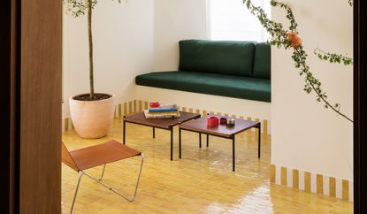
A different color tile in every room may sound odd, but it's what brings so much joy to this small apartment
With the owners seeking to bring color to their Madrid apartment, this interior designer introduced bold, rustic charm with primary-hued tiling throughout


Primary shades of red, yellow, green and blue might sound like a challenging palette when it comes to creating a color scheme across your home, but for interior designer Inés Sierra, this combination was the answer for the interiors of this Madrid apartment.
'Our clients wanted to bring part of their origins to Madrid,' Inés, co-founder of Sierra + de la Higuera, tells us. 'She is Mexican and he Galician, so they yearned to bring a family influence to their new home. This project is the outcome of a quest to find color in Madrid, a characteristic marked by the owners’ journeys and origins.'
This inspiration, alongside the locale, lent itself well to a flooring option across the home seen more in Spanish-style properties than other modern homes. Color-glazed clay tiles have been used across the apartment, apart from the carpeted bedroom. 'As they're made in a handmade way, the imperfection of the finishes is what gives beauty to these floors,' Inés explains.
With a different, vibrantly-colored tile used across the living room, kitchen and bathrooms, creating a design that hangs together across the apartment could be seen as complex. Yet, the clarity of the idea actually makes it simple, with every room has its own magic, introduced through color and texture.

Founded in 2017, Sierra + de la Higuera work in the fields of industrial design, residential architecture, commercial interior design and art direction. Each of their projects, whether it involves interior architecture, design or art direction, is imbued with the same intrinsic quality: a quiet simplicity fuelled by big ideas.
Entryway

Sunshine yellow tiling welcomes you into the apartment through the entryway. However, this space also sets a markedly different tone to the rest of the scheme. 'The idea was to make an entrance hall that would serve as a connection between two rooms, which are accessed by two arched passages,' Inés explains. 'The envelope is a matte orange oak wood paneling, arranged in panels, which manages to give a noble character to this space, and manages to transmit the necessary warmth to then move to the adjoining spaces, which are much cooler.'
The yellow floor tiles continue into the living space almost seamlessly, bar a border of tiles which marks a transition from a herringbone layout to the more contemporary stacked grid tiles of the living room.
Living room

In the living room, the glazed clay tiles are used across the entire floor. 'It's a material that stands out for its properties and characteristics,' Inés says. 'It has high resistance, durability and low absorption, it provides that timeless, fresh and natural style.'
A built-in seating area introduces a pop of emerald green to the space, something that will rear its head again as we continue through the apartment, while an indoor olive tree helps ground this primary palette in nature.
Balcony

To punctuate the floors, a candy-striped tile border has been used around the living room and bathrooms - a maximalist design detail which elevates this scheme into something more playful and modern.
It continues out onto the balcony, where the yellow tiling is used as an exterior flooring, too. Natural light, reflecting from the tiles through the large picture window, ensures this room feels effortless sunny, no matter the time of year.
Kitchen

The kitchen is the only space in the home, bar from the bedroom, to eschew the colorful clay tiles for something more natural. Instead, the rich emerald green first seen in the living room is introduced on the kitchen splashback and to clad the peninsula.
This green perhaps best shows off the variation in the tiles, highlighting the depth of color that perfectly balances this apartment's embrace of rustic textures vs bold, near-primary colors.
Bathrooms


Hints of what's hidden behind the bathroom doors can be seen throughout the apartment - a red mug here, a blue book there - but even then, these bathroom colors feel unexpected, yet totally fitting with the idea of 'cool materials in bright colors brought from distant, exotic locales,' that Inés looked to use.
In one, a rich, earthy red is used for the bathroom flooring, and to line the shower walls, along with that signature candy stripe trim. The rest of the space is simple and pared-back, allowing the tile to do the heavy lifting once again.
The same idea extends to the ensuite bathroom, where a deep blue tile has been used in the same manner.
Be The First To Know
The Livingetc newsletter is your shortcut to the now and the next in home design. Subscribe today to receive a stunning free 200-page book of the best homes from around the world.

Hugh is the Editor of Livingetc.com. From working on a number of home, design and property publications and websites, including Grand Designs, ICON and specialist kitchen and bathroom magazines, Hugh has developed a passion for modern architecture, impactful interiors and green homes. Whether moonlighting as an interior decorator for private clients or renovating the Victorian terrace in Essex where he lives (DIYing as much of the work as possible), you’ll find that Hugh has an overarching fondness for luxurious minimalism, abstract shapes and all things beige. He’s just finished a kitchen and garden renovation, and has eyes set on a bathroom makeover for 2024.
-
 The 12 Best Table Lamps for Reading —I'm a Certified Bookworm (and Shopping Expert)
When it comes to table lamps for reading, I don't mess around. If you're the same, this edit is for YOU (and your books, or course — and good recommendations?)
By Brigid Kennedy Published
-
 "It's Scandi Meets Californian-Cool" — The New Anthro Collab With Katie Hodges Hits Just the Right Style Note
The LA-based interior designer merges coastal cool with Scandinavian simplicity for a delightfully lived-in collection of elevated home furnishings
By Julia Demer Published

