This Brooklyn townhouse has a genius trick for increasing its entryway storage –and any home short on space can copy it
There’s no reason why designing storage can’t be both functional and fun, and this home shows us exactly how that’s possible


A modern home needs to adapt and shift to cater to the needs of our changing lives. Great design shows what can be achieved working with what is already there, as opposed to packing up and moving out. When a family grows, the need for more space and storage ideas for small spaces grows too.
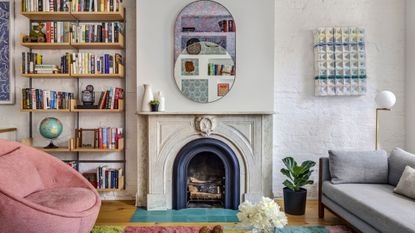
A family of four, husband and wife working in the publishing field, and their two daughters, lived in their Brooklyn townhouse for ten years before deciding to do an extension to expand and create a modern kitchen and bigger rooms for their two daughters. The result features joyful use of color, pattern, texture, cozy nooks, and lots of clever storage.
Particularly of notice is the integration of storage space around this modern home, in creative ways that make it not only practical but good to look at too. Whether it’s using cabinetry or wall space, you’ll be as surprised as I was to see what is possible and will definitely feel inspired by ideas to take away and recreate in your own space. I love how this home is such a good example of design’s most noble mission: to show us what is possible to make our living easier, in ways we hadn’t thought of.
A custom wall with multiple, surprising uses

If there’s one thing a family of four needs, it's storage. For this project, Barker Associates Architecture Office (BAAO) came up with practical solutions that respond to the way this home is being used. The design changed to adapt to its inhabitants’ lifestyle, not the other way around, and that is the point of good design.
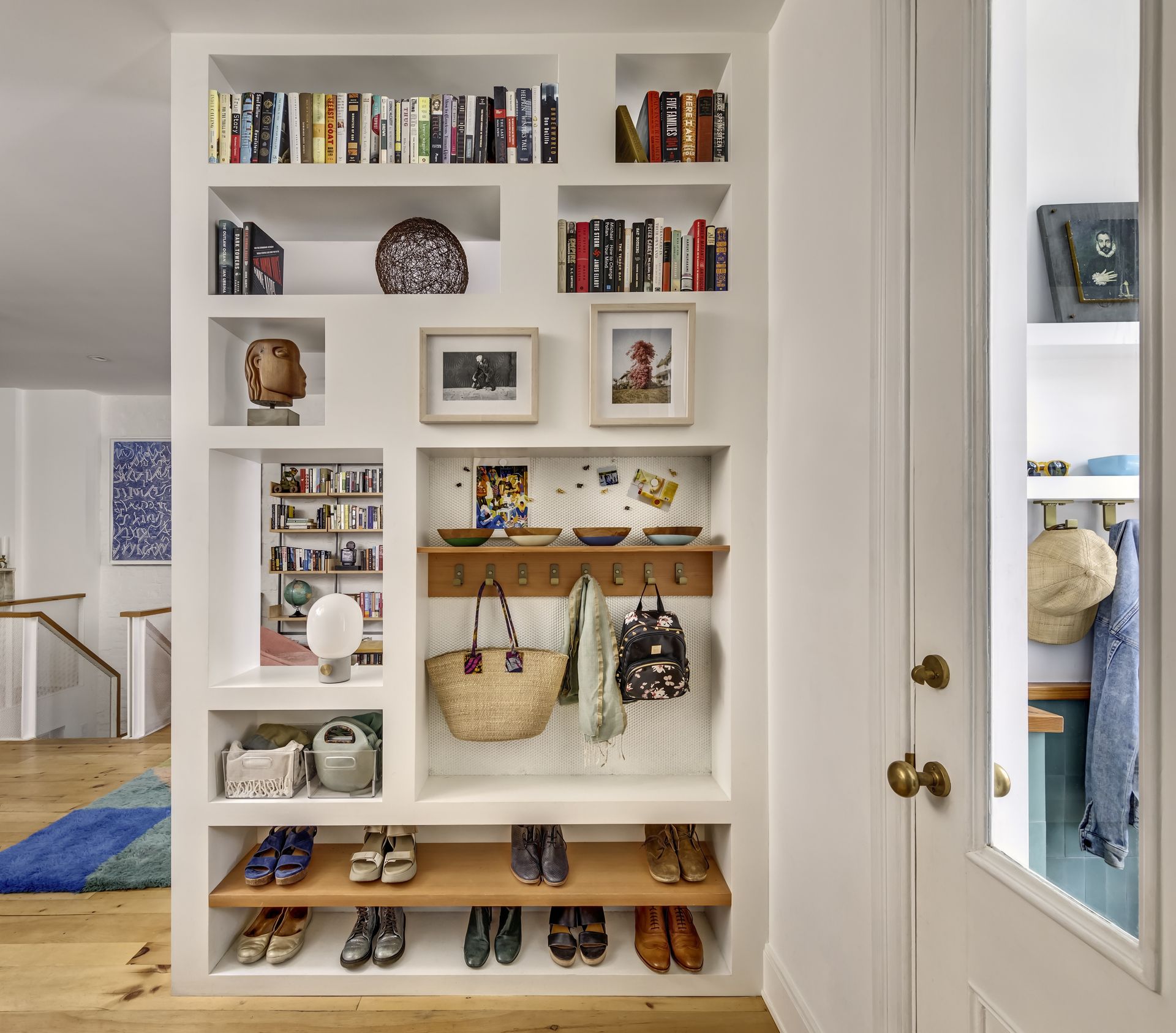
To create more space, the parlor floor was opened up and designed with built-ins for storage. A great hallway idea, a custom wall at the entry provides storage for coats, books, shoes, and keys on one side, and books on the other. I mostly love the look of this wall on its multi-use side - it looks like a built-in bookcase, but it’s been cleverly used to add hooks for hanging coats and bags, store shoes on the bottom shelves, display artwork, and store books at the top. It’s a wonderful mix of uses that is totally practical and looks great.
A pegboard wall makes a fun display of recreational items

On the garden level, a custom pegboard hanging system at the entry organizes the family’s recreational gear. It fits bags, hats, tennis rackets, skates, scooters, you name it. All are on display like a shop window, which also makes it much more practical to see and get to, rather than everything being stacked in a cupboard. If you're wondering how to declutter a room where multiple items are in constant use, a pegboard wall might just be the solution.
Items that are always in use are on hand, and with them being so easy to store away (you just hang them or put them on a shelf), I can see how easy this is to keep tidy and look as fun as it does. Placing this in the immediate vicinity of the garden, where they would be most in use, is a practical solution that just makes sense.
Open-plan kitchen and dining room storage

The dining room and kitchen storage ideas are plenty, but so seamlessly integrated into the design. The kitchen is built of custom lacquer and fir cabinetry with a warm tone that matches the rustic pine floors. The cabinetry units cover the wall that takes to the stairs floor to ceiling. The design of the doors is minimalist and because they are flush and the same color as the wall, they are barely noticeable, which creates a very streamlined, clutter-free look.

The dining room is located in the extension and features a window bench overlooking the rear yard. The long built-in unit along one wall, with its countertop being used as a mini bar provides ample storage space, but also in a very discreet way, with its light tone that blends in so well with the floors, and white countertop that matches the walls, flush doors, there is no contrast to distract the eye.
This home has achieved a great blend of incredibly practical storage solutions for small spaces in such a streamlined and fun way. The effect created is a peaceful, calming, and minimalist look where you would never guess that behind beautifully camouflaged flush doors hide the possessions of a family of four.
Increase your storage at home with these fun and clever solutions

Price: $30
A great way to store items but keep them visible at the same time for more practicality, a pegboard can be very useful in a utility room, office, kids' room, or kitchen.

Price: $125.99
This wall unit features both a shelf and hooks to maximise storage, and looks modern too. It can be used in a hallway, but also a kitchen to hang utensils and pans or crockery on top.

Price: $3,959
This is an investment piece but you will make great use of it. Its minimalist, streamlined design features four super useful cabinets, plus a shelf underneath for books or magazines. It's a great sideboard for your dining room, and you can use the worktop as a mini bar.
Be The First To Know
The Livingetc newsletter is your shortcut to the now and the next in home design. Subscribe today to receive a stunning free 200-page book of the best homes from around the world.

Raluca is Digital News Writer for Livingetc.com and passionate about all things interior and living beautifully. Coming from a background writing and styling shoots for fashion magazines such as Marie Claire Raluca’s love for design started at a very young age when her family’s favourite weekend activity was moving the furniture around the house ‘for fun’. Always happiest in creative environments in her spare time she loves designing mindful spaces and doing colour consultations. She finds the best inspiration in art, nature, and the way we live, and thinks that a home should serve our mental and emotional wellbeing as well as our lifestyle.
-
 The 12 Best Table Lamps for Reading —I'm a Certified Bookworm (and Shopping Expert)
When it comes to table lamps for reading, I don't mess around. If you're the same, this edit is for YOU (and your books, or course — and good recommendations?)
By Brigid Kennedy Published
-
 "It's Scandi Meets Californian-Cool" — The New Anthro Collab With Katie Hodges Hits Just the Right Style Note
The LA-based interior designer merges coastal cool with Scandinavian simplicity for a delightfully lived-in collection of elevated home furnishings
By Julia Demer Published

