How do you make beautiful original features stand out? Just paint them white, says this designer
Why bright white paint was this designer's best friend for highlighting elegant crown molding in this Brooklyn brownstone
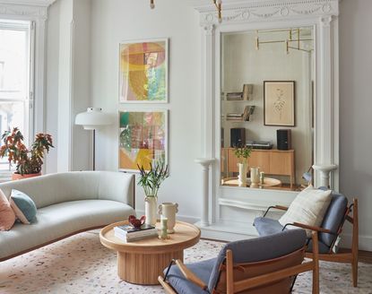

On the tree-lined streets of Brooklyn's Park Slope is a beautiful Victorian townhouse that has been refined by the team at Studio Nato. Outside, the brownstone's intricate details and barrel-shape give a strong impression and don't look out of place in the neighborhood, which is known for its historic homes. But the interiors were in need of a good spruce up, and the team at the Clinton-based design studio was keen to create a modern home that reflected the building's heritage all the while incorporating contemporary furniture, organic curves and a playful palette.
Studio Nato helped the homeowners - a young family - buy new art for the space, purchase furniture, and bring a unified color palette through pared-back yet considered decor.
The dazzlingly white crown molding is where the home really shines, which was chosen during a previous renovation. Studio Nato kept the white as it was, but tweaked molding and custom millwork to bring out the essence of the home and highlight its historic charm.
Crown molding

The intricate crown molding is the common theme in each room of this Victorian brownstone, leading visitors from room to room with intricate carvings and floral motifs that bring interest and texture to the walls. Studio Nato were determined to allow the molding to really shine and left the walls a bright shade of white to really accentuate the details.
'The crown molding had been painted white by the previous owner,' explains Nathan Cuttle, Studio Nato's founder and director. 'We kept it so because it kept the space bright and light.
'With intricate molding like this, the white paint tends to accentuate the shadows. The floral reliefs and carved details really come forward in an interesting way that isn't overwhelming.'
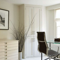
All White by Farrow & Ball
If you're looking for a brilliant white to help your walls really shine, this from Farrow & Ball is near perfect. A totally pure white, All White contains no other pigment except for white, creating a soft color without those cold blue undertones.
The entryway

In the hallway, the crown molding makes an impression on all those who step foot through the doors. 'We wanted to keep a sense of continuity throughout the space - keeping the molding white helped to emphasize this.
The only color comes from the beautiful wooden flooring. Instead of covering the space up with an entryway rug, the hardware was left to breathe. 'The floorboards were existing but we enjoyed working with walnut flooring - it's not something you see often. We liked the depth and richness of the color.'
The living spaces

In the living room, the crown molding wraps its way around the mirror, which was an existing detail that was preserved and painted. The living room window treatment is left without curtains, highlighting yet again the intricacy of the molding.
'It wasn't so much a focal point as a source of discussion for delineating the living room into two spaces,' explains Nathan. 'We have the sitting area that makes use of the light from the bay window, and which is reflected in the mirror, and the more intimate piano space to the right of it.'
'We also made use of the fact that it was less volumetric than a fireplace which allowed for the layout of the living room to be less symmetrical and conventional.'
In the center of the room, two Lawson Fenning living room chairs float upholstered in a cornflower blue float on a Jardan rug, facing the Carl Hansen curved sofa and the bay window.

Where the walls are left white, Studio Nato have been granted space to have fun with the color palette of the decor, bringing playful pastels to warm up the space. To decorate a room with white walls, introduce color, which Nat has done through art and fabric.
'One of the clients works a lot with fabrics and makes custom pillows,' explains Nathan. 'From the beginning, we knew we wanted to include art that would either include textiles or have the textural quality of fabric. This led us to do quite a bit of research on tapestries and woven works.
'The inspiration for the color palette stemmed from this research: soft, neutral grounds interwoven with colorful details. The two living room wall art pieces by Ky Anderson cemented it all together.
'As a whole, we wanted to keep it light and airy as the existing walnut floors brought weight and a serious quality to the house.'
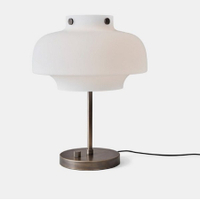
Copenhagen LED table lamp, Lumens
Get the look of this elegant floor lamp with the mini version of the Copenhagen lamp. An LED table lamp for ease of use, the design is minimalist and sculptural.

Walking through the home, and the more formal, conversational space by the bay window sits next to a more intimate TV room. Studio Nato made the custom media cabinet in white oak with brass hardware and was designed to be modular.
'The living room tv area is about connecting the family with the kitchen and can be another space for the children to play within eyesight,' says Nathan.
'The cabinet was designed to be modular so that the layout of the pieces could be rearranged. It is made up of two credenzas and the shelving boxes are all dovetailed white oak.'
The bedroom

The beautiful detailing in the master bedroom is a highlight of this room. 'The ceiling was original,' says Nathan.
'We removed the original bedroom wallpaper along the bed wall and repainted the room white in order to brighten the space. It was about creating a bedroom that felt calming and inviting.
'The soft color palette also brought into focus the uniqueness of the materials and the interesting textures.' For example, the beautiful wood grain of the maple dresser and the subtle texture of the leather on the drawer fronts of the bedside tables. 'This project was very much about the tactile qualities of the selected materials,' says Nathan.
Bedroom furniture pieces were purchased from Croft House and the sconces were from Allied Maker.
Be The First To Know
The Livingetc newsletter is your shortcut to the now and the next in home design. Subscribe today to receive a stunning free 200-page book of the best homes from around the world.

Oonagh is a content editor at Livingetc.com and an expert at spotting the interior trends that are making waves in the design world. Writing a mix of everything and everything from home tours to news, long-form features to design idea pieces on the website, as well as frequently featured in the monthly print magazine, she's the go-to for design advice in the home. Previously, she worked on a London property title, producing long-read interiors features, style pages and conducting interviews with a range of famous faces from the UK interiors scene, from Kit Kemp to Robert Kime. In doing so, she has developed a keen interest in London's historical architecture and the city's distinct tastemakers paving the way in the world of interiors.
-
 How to Thaw a Frozen Pipe — Learn Everything You Need to Know in 5 Minutes With This Guide
Winter storm caught you off guard? We asked an expert — just how do you thaw a frozen pipe?
By Hugh Metcalf Published
-
 The 12 Very Best Silk Bedding Pieces — As Our Style Editor Says: 'It's What Dreams Are Made Of!'
Slumber in lustrous luxury with the very best silk bedding sheets, duvets, pillowcases, and more — your sleep score will thank us later
By Julia Demer Published

