4 lessons in small space living to take from this architect's tiny house
This tiny house, designed by an architect and built during the pandemic, is full of small space solutions and minimalist style ideas
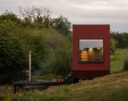

We all love designs that embrace small spaces, but this cabin home takes the meaning of tiny houses to a whole new level. Nestled in the heart of England's Dorset countryside, the vacation rental is full of modern small space living ideas to inspire.
The Bide was designed and built by Scott and Caroline after a visit to the Bauhaus Archive design museum in Berlin. After seeing a student exhibition of small homes on flatbed trailers, they were inspired to start their own project using innovative design ideas on a little mobile home.
'When we came back from our holiday the idea kept coming back to us and we wondered what we might design a cabin for,' says Caroline. 'Eventually we settled on a compact and contemporary countryside retreat.'

Lilith is an expert at following news and trends across the world of interior design. She has an eye for appealing designs and interesting spaces which she regularly shares with readers through home tours, such as this one. After chatting with the architect/designer couple behind the project, maximizing space through design was a lesson she was keen to impart while covering the quaint cabin rental.
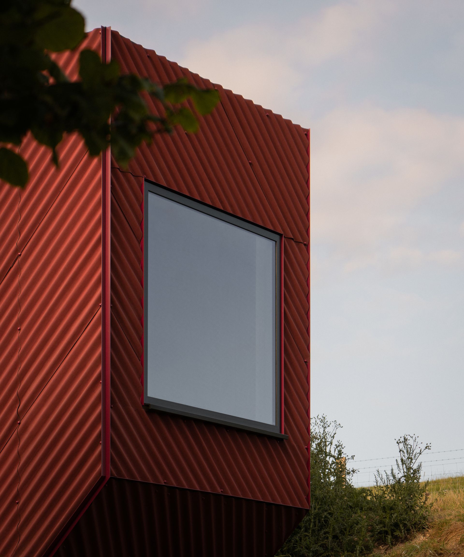
With Scott's background as an architect and Caroline’s experience in design, the couple set to work building The Bide during Covid lockdowns. Their aim was to create a unique vacation rental that kept living and sleeping areas separate despite the limited space available.
'This resulted in a 1.5 story structure with the super king size bed located on a mezzanine above the generous bathroom and kitchenette,' explains Caroline. 'It was important that the space didn't feel claustrophobic.'
They fashioned the cabin in a contemporary architectural style with sustainability as a key focus, using low carbon materials and eco-friendly technologies. Meanwhile, a minimalist interior design style helps give The Bide a fresh, contemporary feel. The result is an inviting, cozy space to enjoy a peaceful getaway in the Dorset countryside. Here's how they did it.
1. Pare down design
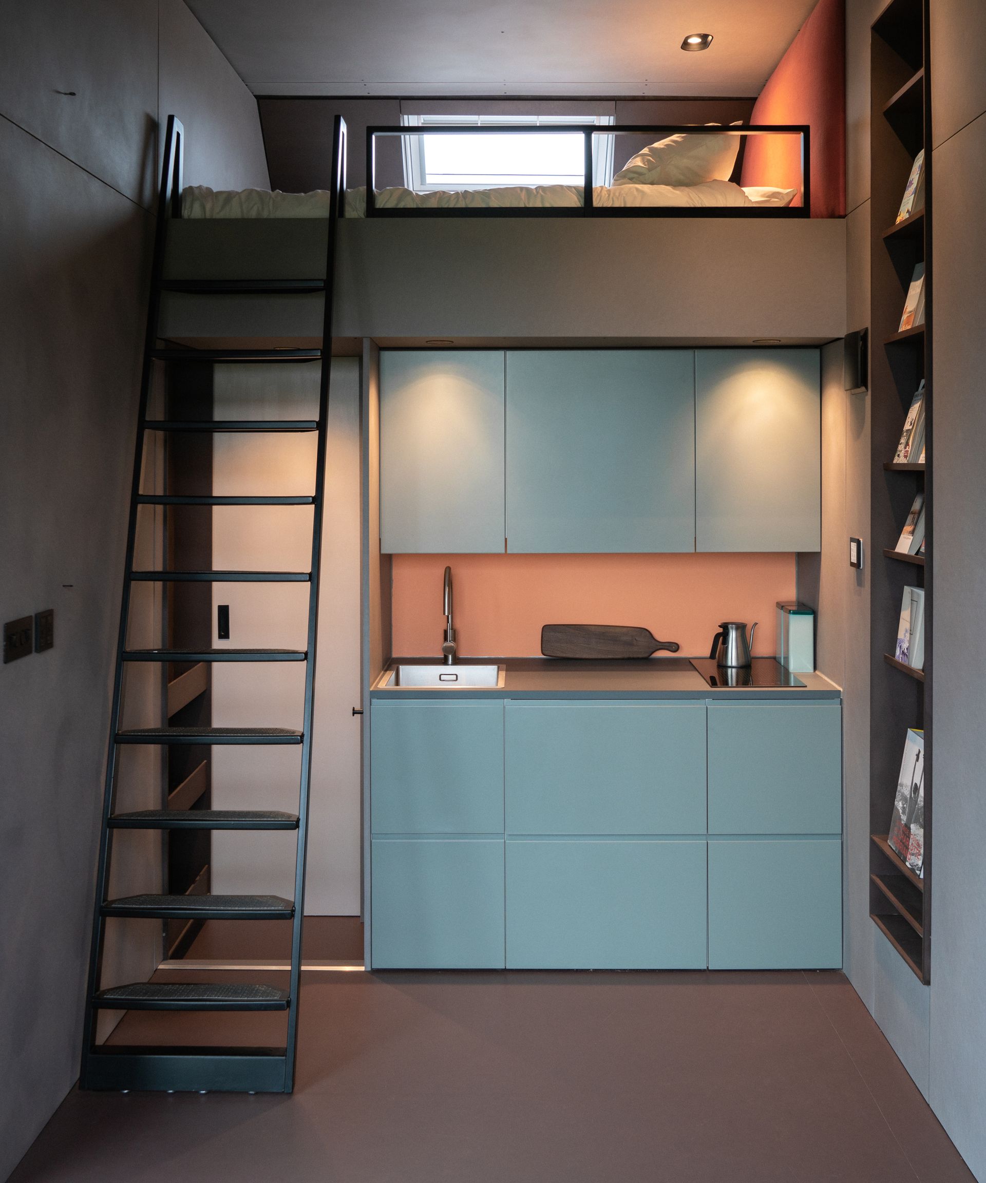
Embracing a simple design that only offered the essentials necessary for a short stay quickly became Scott and Caroline's focus for The Bide. This involved considering the intended use of each space within the cabin, and paring down the design to cater for those activities only.
'For us, these were a super-king bed, a generous bathroom and a separate space for relaxing and eating,' explains Caroline. 'This created a series of small zones based on activities allowing us to focus on these key aspects and ensure they weren't compromised by the size of the space.'
With The Bide's natural setting, Caroline and Scott also had a more meaningful reason for presenting an honest vacation rental with such a simple approach to living. 'Our overriding design ethos for ensuring clever small space solutions was built upon a decision to give people a taste of not only living closer to nature, but also living with less,' Caroline says. 'We chose to deliberately pare down modern possessions to the essentials, to enable guests to connect to nature and themselves in a different way.'
Despite the off-grid living approach, The Bide offers an element of luxury with its modern design and unique touches, such as a wood-fired hot tub. As Caroline puts it: 'We wanted people to be able to turn up with a bag for the weekend safe in the knowledge that all the fundamentals were taken care of.'
2. Bespoke furniture and storage solutions
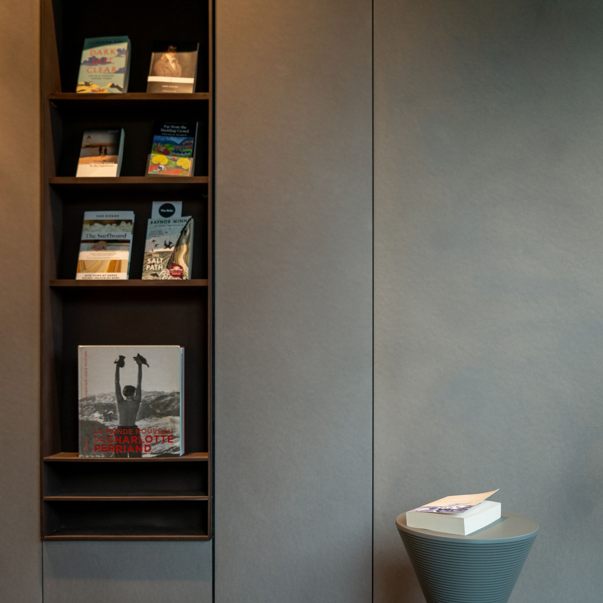
The Bide offers its own miniature bookshop for visitors to purchase a holiday read during their stay. Such a thoughtful addition was only made possible thanks to a clever shelving idea in the form of a bespoke recessed bookcase Scott and Caroline had designed for the living area.
'Integration of bespoke furniture is a key part of the design,' Caroline notes. Alongside the bookshelves recessed into the wall, there are sliding cupboards under the seats and a recessed open wardrobe. 'Whilst these bespoke solutions cost more on the face of it, they allowed us to reduce the footprint of the cabin which resulted in significant cost savings,' she adds.
3. Make spaces intentional
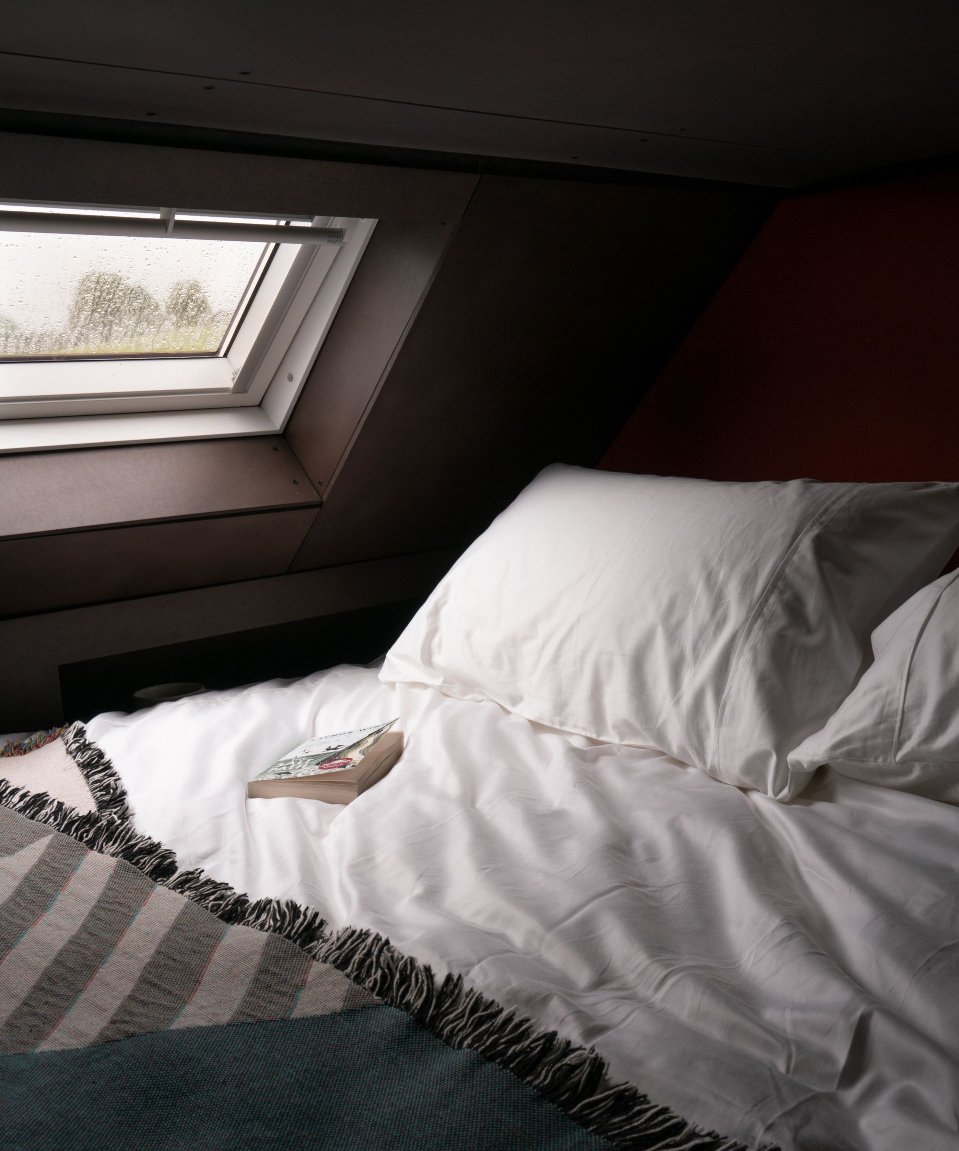
Scott and Caroline wanted The Bide to be a restful and restorative retreat, and so every space within the cabin was designed with that in mind. No area prioritized this more than the relaxing bedroom idea - the mezzanine features a super-king bed and organic Naturalmat mattress to guarantee a blissful sleep.
'One thing we wanted to achieve was to help guests be conscious of how they should relax,' says Caroline. 'For this reason, we didn't want to provide a TV where people would unconsciously channel hop. Instead, we installed a projector in the cabin, for movie nights which consciously involves our guests pinning up the screen and lowering the blinds.'
Creating links to the landscape and surrounding outdoors was also imperative to creating a calming space. 'For us, this included a skylight in the mezzanine for gazing at the skies,' Caroline notes. 'We wanted the idea of a picture frame of nature to be free from clutter, so we ensured minimal framing and concealed blinds to ensure maximum impact.'
4. Integrate wall-mounted furnishings
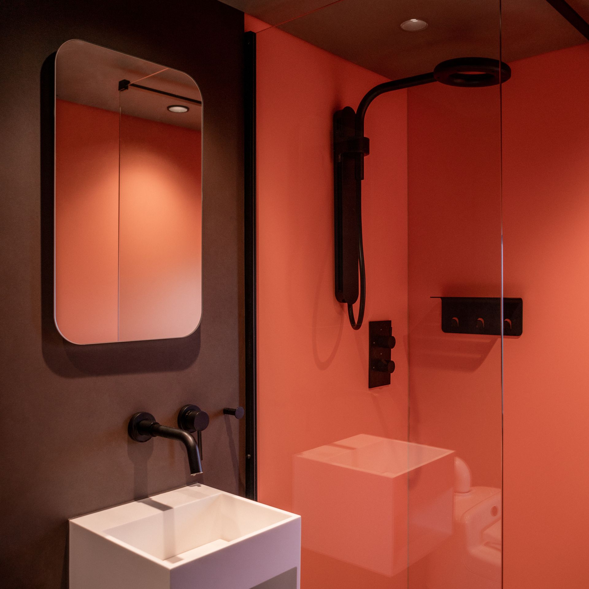
One of the more practical methods of ensuring space was maximized in the cabin was by using wall-mounted bathroom and kitchenware. This allowed Caroline and Scott to seamlessly integrate items to offer more floor space and create a more clean look.
A wall-mounted sink and wet-room style shower are just two ways the small bathroom has been utilized to its full potential. 'It declutters the space and increases the sensation of space and openness,' explains Caroline.
Of course, being a short-term holiday rental rather than a full-time home, Caroline recognizes that it was easier to embrace smaller, wall-mounted furnishings. 'Since we were only designing a space for two people, we could appropriately size the kitchen, sitting area and storage with this in mind,' she says. 'This also resulted in a smaller compact size which has the benefits of a lower carbon footprint and reduced energy demands.'
Be The First To Know
The Livingetc newsletter is your shortcut to the now and the next in home design. Subscribe today to receive a stunning free 200-page book of the best homes from around the world.

Lilith Hudson is the News Editor at Livingetc, and an expert at decoding trends and reporting on them as they happen. Writing news, features, and explainers for our digital platform, she's the go-to person for all the latest micro-trends, interior hacks, and color inspiration you need in your home. Lilith discovered a love for lifestyle journalism during her BA in English and Philosophy at the University of Nottingham where she spent more time writing for her student magazine than she did studying. After graduating, she decided to take things a step further and now holds an MA in Magazine Journalism from City, University of London, with previous experience at the Saturday Times Magazine, Evening Standard, DJ Mag, and The Simple Things Magazine. At weekends you'll find her renovating a tiny one-up, one-down annex next to her Dad's holiday cottage in the Derbyshire dales where she applies all the latest design ideas she's picked up through the week.
-
 The 12 Best Table Lamps for Reading —I'm a Certified Bookworm (and Shopping Expert)
When it comes to table lamps for reading, I don't mess around. If you're the same, this edit is for YOU (and your books, or course — and good recommendations?)
By Brigid Kennedy Published
-
 "It's Scandi Meets Californian-Cool" — The New Anthro Collab With Katie Hodges Hits Just the Right Style Note
The LA-based interior designer merges coastal cool with Scandinavian simplicity for a delightfully lived-in collection of elevated home furnishings
By Julia Demer Published
