A stroke of genius! This designer made a luxe bathroom work on a budget with one slab of marble used five ways
With the budget for this project renovation only stretching to one marble slab, designer Emily Brown got creative with its application


Including texture in bathrooms is a growing interior design trend – a reaction to the overly sleek, less-than-cozy designs of yesteryear. Today's modern bathroom has more soul to it, while still embracing luxurious fixtures and finishes to bring a spa-like quality to them.
But while these on-trend finishes are beautiful, they're also expensive – so how do you recreate the look when you're on a budget? In this project for a home in Austin, Texas, that was exactly the brief for interior designer Emily Brown of Emily Lauren Interiors. 'Our client wanted this bathroom to feel calm and casual with a modern, unique look,' Emily tells us. 'She's a professional painter who loves rich texture, color, and movement, so it was important that we incorporated those characteristics in the materials we selected.'
With major remodeling of the space also required, the budget for creating this luxuriously textured feel took a hit. However, with a few clever tricks to hand, Emily spun straw into gold. Here's how she created this on-trend modern bathroom.

Hugh is Livingetc.com's deputy editor, and an experienced homes journalist. He spoke to interior designer Emily Brown of Emily Lauren Interiors about this small bathroom renovation in which they designer used clever ideas to keep the budget on track while achieving a luxurious look.
The remodel

Before the renovation, the original bathroom was small and dated: 'there was a small corner sink directly across from the toilet and an alcove tub with an 80s glass block partition wall,' Emily recalls.
The small bathroom layout also required some attention to expand it and make it more functional. 'The bathroom sits on the corner of the house on the second story,' Emily explains. 'The first level extends beyond the second, giving us the structural integrity needed to expand the bathroom, so we bumped out the rear wall roughly 42", allowing for an economical 5-piece layout, including a separate tub and shower, and a double vanity. It was important to be thoughtful about the existing architecture so the addition would look integrated as if it had always been there,' she adds.
The marble

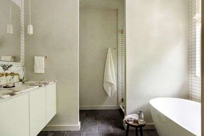
This beautiful marble, called Rose Gold Calacatti Vagli, was a jumping off point that set the tone for the entire space. 'When we began discussing materials and looking at options, the homeowner fell in love with the marble we found at a local stone yard,' Emily tells us. 'The pinks, browns, golds, and greens are so rich in person.'
The original design for the space saw the marble carried from the shower across to the wall behind the bathtub, however, the budget only allowed for one slab, which Emily quickly realized wouldn't cover both. 'Since we had a large piece of marble for the bathroom vanity, we removed the marble at the tub, leaving two marble focal points at opposite ends of the room,' she explains. 'From there, we strategically sprinkled in marble from the remnant we had left.'
With some marble to play with, Emily wanted to stretch it as far as possible, while still ensuring it was used thoughtfully, only where it should be. That meant that alongside the bathroom vanity and shower wall, the marble could be used for shower niche, the window sills and a nook behind the toilet. 'Our favorite details with the marble is the accent trim along the shower wall and vanity backsplash edges,' Emily adds.' This detail created a unique, intentional transition from marble to tile and added subtle depth, all while using up every last bit of the slab.'

When it came to designing around the marble, the designer had two choices: 'Either design around the marble with complementary colors or mute the color palette to showcase the marble,' Emily explains. 'We decided to let the marble be the star of the show without any distractions and pared back the color palette for the other materials but made sure to mix in visual and tactile texture with terracotta bathroom flooring, handmade wall tiles, limewash, and raw brass taps.'
The textured walls

Limewash paint isn't often used in bathrooms, as Emily will tell you herself, however the client wanted a 'plaster'-like textural wallcovering in the space. Usually, Emily says, they'd suggest a material like Tadelakt, a water-proof Moroccan plaster, however, this was not in the budget for this project.
'For a similar look that was more budget-conscious, we painted the walls and ceiling in limewash and coated them with a water-resistant sealant,' Emily explains. 'The sealant also protects the limewash from mold and mildew.' While Tadelakt can be used in wet areas, Emily doesn't recommend using limewash in the same way. 'We tiled the shower and splash areas behind the vanity and tub and used the limewash and sealer combination only where it was appropriate,' she says.
The finishing touches

The dedication to bringing texture into the space extends to the finishing touches, too. 'It made perfect sense to use unlacquered brass taps for this bathroom, given our client is not afraid of living, aging materials. The raw brass highlights the gold tones in the marble and warms up the other finishes, and the patina adds richness to the space,' Emily adds.
The choice of bathroom lighting is purposefully meek: 'We kept it quiet and sweet,' Emily says. 'As a nod to the handmade wall tiles, we sourced handmade clay pendants from In Common With, which hang on either end of the vanity.'
Emily chose a relaxed linen Roman shade for the bathroom window treatment ('the bathroom is nestled in mature Pecan trees, so the casual pleats flow with the natural movement out the window', she says). In the shower, the lower window is frosted, while the upper panel is left un-obscured, as it's high enough to allow a view of the trees without compromising privacy.
Be The First To Know
The Livingetc newsletter is your shortcut to the now and the next in home design. Subscribe today to receive a stunning free 200-page book of the best homes from around the world.

Hugh is the Editor of Livingetc.com. From working on a number of home, design and property publications and websites, including Grand Designs, ICON and specialist kitchen and bathroom magazines, Hugh has developed a passion for modern architecture, impactful interiors and green homes. Whether moonlighting as an interior decorator for private clients or renovating the Victorian terrace in Essex where he lives (DIYing as much of the work as possible), you’ll find that Hugh has an overarching fondness for luxurious minimalism, abstract shapes and all things beige. He’s just finished a kitchen and garden renovation, and has eyes set on a bathroom makeover for 2024.
-
 These 12 Best Table Lamps for Your Desk — Perfect Glows for a Creative Home Office
The best table lamps for your desk is have a soft, targeted glow. Elevate your WFH set-up with these stylish picks endorsed by Style Editor Brigid Kennedy
By Brigid Kennedy Published
-
 The Nespresso VertuoPlus is 30% Off for President's Day, and it's Kim Kardashian's Coffee Maker of Choice
This sleek and stylish coffee maker was spotted in Kim's home bar, and you can currently save $60 if you buy yours from Amazon
By Lilith Hudson Published

